Amazing Spider-Man #252 Before and After Being Shipped to CBCS.8228
 -Our Odin- -Our Odin-Rest in Peace |
Jesse_O private msg quote post Address this user | |
Here are the sections that @CaptainCanuck highlighted blown up. They sure look identical to me.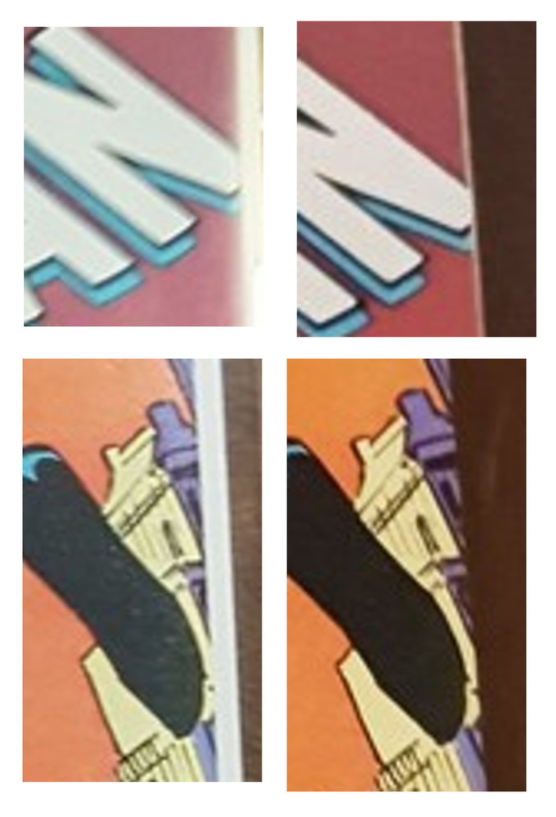 |
||
| Post 51 • IP flag post | ||
 I'd like to say I still turned out alright, but that would be a lie. I'd like to say I still turned out alright, but that would be a lie.
|
flanders private msg quote post Address this user | |
| @Terry88 right now I'm only suspicious of my photography and comic book assessment skills. I'll gladly do business with CBCS again in the future and I'm happy that I've been given some good advice on how to ship comics properly even though I watched a handful of youtube videos, even one from CGC, before shipping. | ||
| Post 52 • IP flag post | ||
 Captain Corrector Captain Corrector
|
CaptainCanuck private msg quote post Address this user | |
| @Savage_Spawn Quote: Originally Posted by Savage_Spawn The reason that it looks as though the building has less windows in the original is because a glare from a flash/overhead light runs along the right edge of the cover and washes out some of the imagery. |
||
| Post 53 • IP flag post | ||
|
I'd like to say I still turned out alright, but that would be a lie.
|
flanders private msg quote post Address this user | |
Quote:Originally Posted by CaptainCanuck The things you should learn from this thread: 1. Never trust a noob 2. Never trust a photo 3. Definitely never trust a photo from a noob. |
||
| Post 54 • IP flag post | ||
 Collector Collector
|
poka private msg quote post Address this user | |
Quote:Originally Posted by flanders I always aim for this forum to be better than CGC. There is no need to be personal. OP asked for our assistance. |
||
| Post 55 • IP flag post | ||
 Collector Collector
|
CatCovers private msg quote post Address this user | |
Quote:Originally Posted by poka flanders is the OP. |
||
| Post 56 • IP flag post | ||
|
I'd like to say I still turned out alright, but that would be a lie.
|
flanders private msg quote post Address this user | |
Quote:Originally Posted by poka Yea, sorry for the confusion. I was making fun of my own noobness. I'm very surprised and impressed that there's actually a place on the internet where people are respectful though. Thanks for not giving me a hard time. |
||
| Post 57 • IP flag post | ||
|
Captain Corrector
|
CaptainCanuck private msg quote post Address this user | |
| @CatCovers Quote: Originally Posted by CatCovers  |
||
| Post 58 • IP flag post | ||
|
Collector
|
poka private msg quote post Address this user | |
Quote:Originally Posted by CatCovers LOL  |
||
| Post 59 • IP flag post | ||
 Collector Collector
|
Wraith private msg quote post Address this user | |
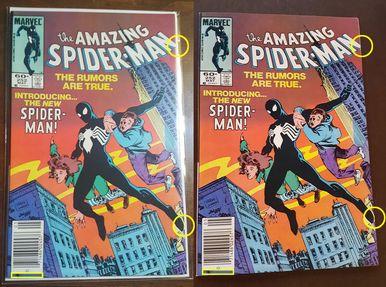
Quote:Originally Posted by Jesse_Olook at window to right of spiderman foot.. Larger in second image, and then further down the page below is a window below the Web that is only slightly seen on the first book which makes it appear like slightly different cut angle on cover.(hence why n is the same. Fiolow that angle and look at the windows in the bottom right corner, and again appears slightly different. Which doubles with what looks like a different spine.. Purely speculation as only photos, but I don't believe it's same book |
||
| Post 60 • IP flag post | ||
 Collector Collector
|
BrianGreensnips private msg quote post Address this user | |
| This has been a pretty good topic. @flanders welcome aboard. | ||
| Post 61 • IP flag post | ||
|
I'd like to say I still turned out alright, but that would be a lie.
|
flanders private msg quote post Address this user | |
| @Wraith @BrianGreensnips Thanks for the welcome, although somewhat embarrassing I'm learning a lot from this. Once again I'm 100% positive it's the same book, far too hard to compare a bagged and unbagged comic in different lighting at slightly different angles. Time to put this to rest. CBCS did a great job with my comics and if I find anything else worth grading in my limited collection I'll definitely be sending them to CBCS again. Also if you're still not convinced go to the previous post of multiple before pictures. To me it looks like the spine creases are more clear towards the top of the spine on the photo of the front cover along the spine when you zoom in. Surprisingly this makes me feel better knowing that my comics likely weren't damaged at all from the time I packed them to when they were returned to me. | ||
| Post 62 • IP flag post | ||
 Collector Collector
|
Savage_Spawn private msg quote post Address this user | |
Quote:Originally Posted by Jesse_O Again, it's probably the angle, lighting, and bag but the buildings to the right of Spideys foot look significantly different to me. |
||
| Post 63 • IP flag post | ||
|
Captain Corrector
|
CaptainCanuck private msg quote post Address this user | |
| It’s the glare from the lighting on the bag that is washing away some graphic elements on the edge of the original book. Look at the “N” in “Spider-Man”, it’s also getting washed out at the edge of the original photo on the left. It’s the same book. |
||
| Post 64 • IP flag post | ||
|
Collector
|
Wraith private msg quote post Address this user | |
Quote:Originally Posted by CaptainCanuckthere is very little glare at the bottom right corner of the book and it looks different there too.. p.s. all in good fun.. But I see a lot of difference on the right side, (different cut) and left side (spine roll that doesnt account for bag/glare imo. I wish I still had a photoshop license at home.. I really want to review this in detail. Eg.. Look at window in right vs left. Added 0.5mm - 1mm to page edge in grading process? 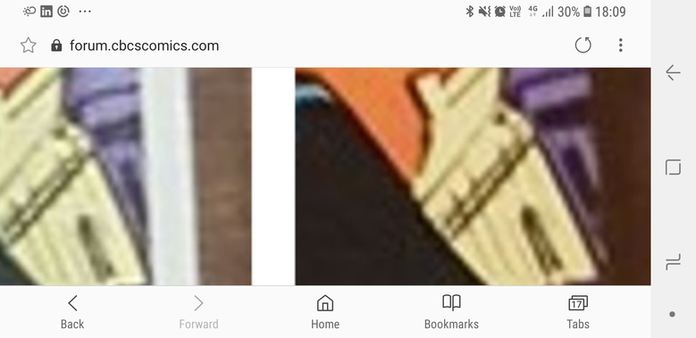 |
||
| Post 65 • IP flag post | ||
 Collector Collector
|
GanaSoth private msg quote post Address this user | |
| @Wraith I agree with ya Wraith. It's a different cut. | ||
| Post 66 • IP flag post | ||
This topic is archived. Start new topic?