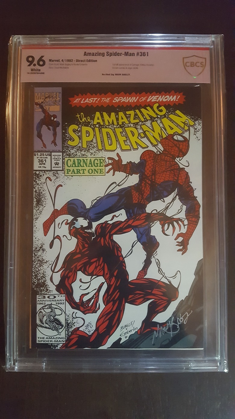
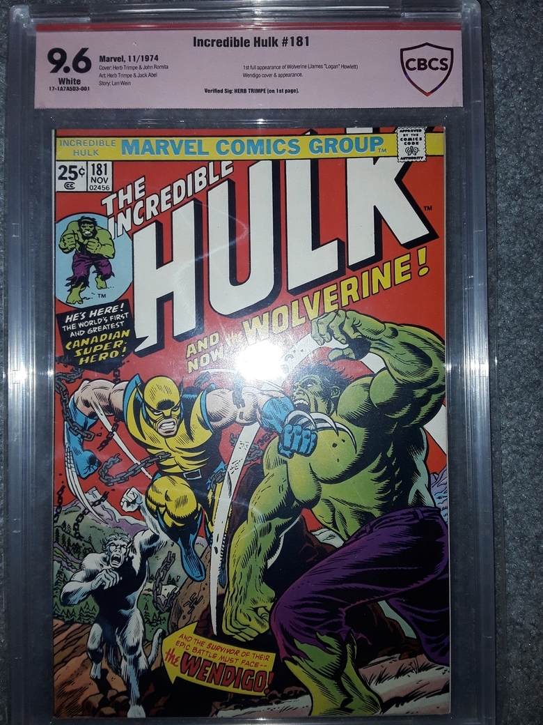
I hate red labels7904
 Collector Collector
|
DJC_II private msg quote post Address this user | |
Quote:Originally Posted by GAC @GAC compare it to the new CGC cases To be fair, unprofessional is not the word I would use. Inferior is better |
||
| Post 76 • IP flag post | ||
 Beaten by boat oars Beaten by boat oars
|
Studley_Dudley private msg quote post Address this user | |
| The CGC slab 2.0 and 2.5 are glorified paperweights in my opinion. Seriously, they're heavy for no reason, Some folks my like the added rigidity, I don't. They take up more space in the box too. As far as the CBCS label, I loved the first label, not keen on the rivet label, and the new one is an improvement on a substandard label that was a downgrade on the original label. | ||
| Post 77 • IP flag post | ||
 Collector Collector
|
MR_SigS private msg quote post Address this user | |
Quote:Originally Posted by Nuffsaid111 I collect comics so I'd rather choose the better looking book rather than the better looking label. |
||
| Post 78 • IP flag post | ||
 Collector Collector
|
mrelowe private msg quote post Address this user | |
| I am thankful that they give authenticity to books that otherwise would get dinged for ink on cover. The new label is sleek and clean and I don’t mind the color. Definitely don’t want anything to remind me of pgx. | ||
| Post 79 • IP flag post | ||
 I'd like to say I still turned out alright, but that would be a lie. I'd like to say I still turned out alright, but that would be a lie.
|
flanders private msg quote post Address this user | |
Quote:Originally Posted by GAC The label is at a slant. Everything else looks fine. Unprofessional may not be the correct word. But the labeling and the job done to insert and center the labels could be better. |
||
| Post 80 • IP flag post | ||
 It was a one trick pony show but always hilarious. It was a one trick pony show but always hilarious.
|
GAC private msg quote post Address this user | |
Quote:Originally Posted by flanders Oh..I see it now...I was looking at the type on the label...the actual card itself is in crooked. |
||
| Post 81 • IP flag post | ||
 Collector Collector
|
Drogio private msg quote post Address this user | |
Quote:Originally Posted by mediaslave How about A bronze label? Or orange? |
||
| Post 82 • IP flag post | ||
|
|
Jklugh private msg quote post Address this user | |
Quote:Originally Posted by Studley_Dudleysorry new to the grading scene but what is rivet gate? |
||
| Post 83 • IP flag post | ||
 Beaten by boat oars Beaten by boat oars
|
Studley_Dudley private msg quote post Address this user | |
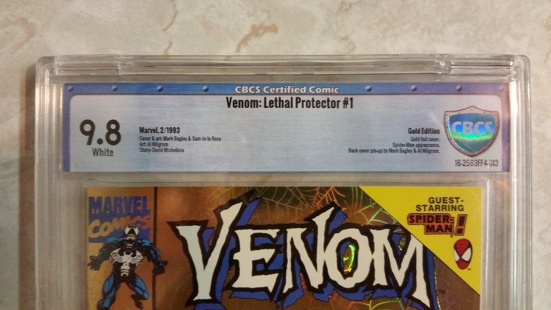 It was basically when this gem of a label design was dropped on an unsuspecting public. |
||
| Post 84 • IP flag post | ||
 Collector Collector
|
MR_SigS private msg quote post Address this user | |
| How can they expect people to believe this book is a 9.8 with a label like that?!? | ||
| Post 85 • IP flag post | ||
 Collector Collector
|
mediaslave private msg quote post Address this user | |
Quote:Originally Posted by GAC You must be joking. Everyone knows: CGC Yellow = Top dollar CBCS Yellow = Less CBCS Red = Even less. you can't even pretend you aren't aware of that, unless you've never tried to sell a slabbed book. |
||
| Post 86 • IP flag post | ||
 Collector Collector
|
mediaslave private msg quote post Address this user | |
Quote:Originally Posted by MR_SigS You comment suggests you can't have both. I disagree. |
||
| Post 87 • IP flag post | ||
 Collector Collector
|
mediaslave private msg quote post Address this user | |
| Look, its impossible to argue that the current labels actually look good. A first-year graphic designer could do better. They don't look like something produced by a professional company. They aren't aligned, they print them on toilet paper and use food colouring to tint them. Again, not saying mine are the way to go, but they are better I'd say. So was the one done by the other guy (early in the thread). The current CBCS labels look like they were designed in Mircosoft Word by a receptionist named Florence, who was chosen because she took art classes in high school. |
||
| Post 88 • IP flag post | ||
 I'm good with splotches. I'm good with splotches.
|
Nuffsaid111 private msg quote post Address this user | |
Quote:Originally Posted by mediaslave Florence? I thought it was Margaret? (Marge for short) |
||
| Post 89 • IP flag post | ||
 Beaten by boat oars Beaten by boat oars
|
Studley_Dudley private msg quote post Address this user | |
Quote:Originally Posted by mediaslave Is it 2 ply? |
||
| Post 90 • IP flag post | ||
 Collector Collector
|
poka private msg quote post Address this user | |
Quote:Originally Posted by mediaslave Depends on the book |
||
| Post 91 • IP flag post | ||
Thread locked. No more posts permitted. Return home.

