CBCS launches New Logo and Brand756
 COLLECTOR COLLECTOR
|
dielinfinite private msg quote post Address this user | |
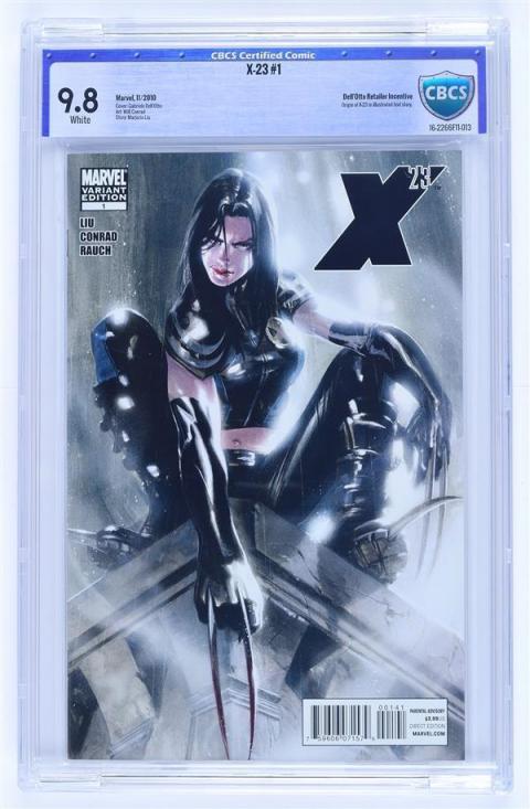
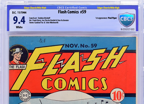
Here's a blast from the past. This is from an article announcing CBCS in mid-2014. I don't think any books actually went out with this label but it's interesting to see how labels have progressed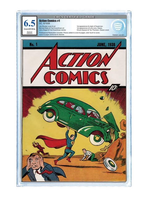 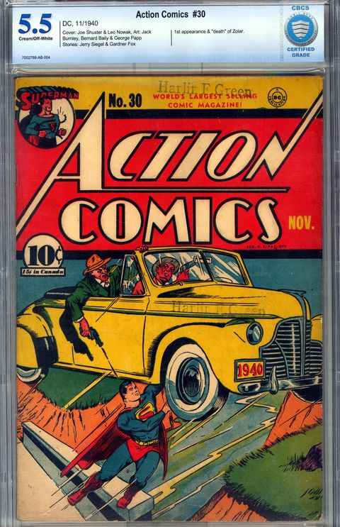 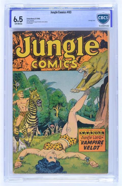 |
||
| Post 726 • IP flag post | ||
 Collector Collector
|
Oxbladder private msg quote post Address this user | |
| There have been a couple of tweaks the middle style, too. There was someone on the FB page that had an image of the various iterations of the middle label. | ||
| Post 727 • IP flag post | ||
 COLLECTOR COLLECTOR
|
dielinfinite private msg quote post Address this user | |
| I wasn't going for a comprehensive history, just the broad strokes | ||
| Post 728 • IP flag post | ||
 Collector Collector
|
Oxbladder private msg quote post Address this user | |
| Right. | ||
| Post 729 • IP flag post | ||
 Collector Collector
|
D84 private msg quote post Address this user | |
Quote:Originally Posted by dielinfinite I personally like the label on the Action Comics 1. Wonder why that was dropped? |
||
| Post 730 • IP flag post | ||
 Collector Collector
|
sterlingcomics private msg quote post Address this user | |
| To be perfectly honest, I've been incognito for a while (5 years or so), so I've been completely oblivious to the industry. It's nice to see CGC has competition, and with much of the gang that made it happen there. I'm a bit mixed on the changes, as I am with CGC's changes as well. Maybe this old dog needs to be laid out to pasture. | ||
| Post 731 • IP flag post | ||
 COLLECTOR COLLECTOR
|
JWKyle private msg quote post Address this user | |
Quote:Originally Posted by Oxbladder  |
||
| Post 732 • IP flag post | ||
 Leftover Sundae Gnus Leftover Sundae Gnus
|
CatmanAmerica private msg quote post Address this user | |
| @D84 That early design would've been a non-starter for me. Reminds me of the worst elements of the new CGC label (oversized grade box, lack of balanced label design, unattractive aesthetics), but OMMV. Like the second version (very close to the final iteration CBCS went with). PS: Here's the tweaked version of my earlier effort from the previous page (lighter, with better contrast and color)...  This may not be everyone's cuppa tea, but my sincere hope is that it'll inspire designs that incorporate the best elements (gradient blue tones and a softer, more complimentary color scheme that meshes well with the new shield design). |
||
| Post 733 • IP flag post | ||
 COLLECTOR COLLECTOR
|
DarthLego private msg quote post Address this user | |
| @JWKyle Just imagine how sexy that book would look under the old label. | ||
| Post 734 • IP flag post | ||
 Moderator Moderator
|
The_Watcher private msg quote post Address this user | |
Quote:Originally Posted by sterlingcomics Just wade in the shallow end for a while. You'll be back up to speed in no time |
||
| Post 735 • IP flag post | ||
 COLLECTOR COLLECTOR
|
Foghorn_Sam private msg quote post Address this user | |
Quote:Originally Posted by Oxbladder Ok, so here's the label I've been working on pasted back on the book I originally took it from. 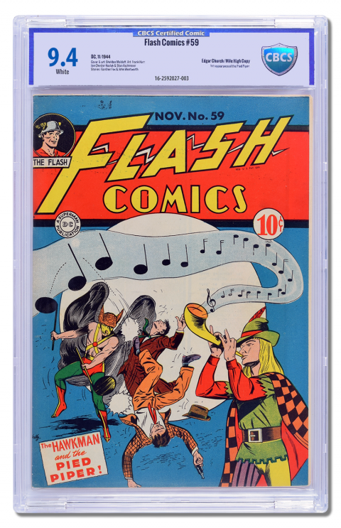 |
||
| Post 736 • IP flag post | ||
 Collector Collector
|
SilverAgeFan private msg quote post Address this user | |
| @Foghorn_Sam, I think it is absolutely perfect Sam! One question:if multiple artists had signed the book, would there be enough room for the additional information? Great job again!!! | ||
| Post 737 • IP flag post | ||
 COLLECTOR COLLECTOR
|
DarthLego private msg quote post Address this user | |
| @Foghorn_Sam I think the text boxes for the book information could ride a bit higher to allow for more information on signed books. As it is extra information will run smack into the serial number. I'm still on the fence about the side borders. Also I think a nice gradient in the background instead of the solid color might help it. | ||
| Post 738 • IP flag post | ||
 Collector Collector
|
zosocane private msg quote post Address this user | |
| @Foghorn_Sam Respectfully, it looks wimpy. | ||
| Post 739 • IP flag post | ||
 COLLECTOR COLLECTOR
|
Foghorn_Sam private msg quote post Address this user | |
Quote:Originally Posted by zosocane  |
||
| Post 740 • IP flag post | ||
 Collector Collector
|
Oxbladder private msg quote post Address this user | |
Quote:Originally Posted by JWKyle Paid $17 CAD for it |
||
| Post 741 • IP flag post | ||
 Leftover Sundae Gnus Leftover Sundae Gnus
|
CatmanAmerica private msg quote post Address this user | |
Quote:Originally Posted by Oxbladder So, you got a discount for the rivet label? |
||
| Post 742 • IP flag post | ||
 I've spent years perfecting my brand of assholery. I've spent years perfecting my brand of assholery.
|
DrWatson private msg quote post Address this user | |
Quote:Originally Posted by TimesChange The printer is only going to print in black ink. The color or foil portions of the label would have to be pre-printed or static items that would appear on every label. |
||
| Post 743 • IP flag post | ||
 I've spent years perfecting my brand of assholery. I've spent years perfecting my brand of assholery.
|
DrWatson private msg quote post Address this user | |
| The new shield logo is bad design whether it's flat, raised, or foiled. It isn't proportioned correctly. It looks like it has been squished to fit in the allotted space. | ||
| Post 744 • IP flag post | ||
 COLLECTOR COLLECTOR
|
JWKyle private msg quote post Address this user | |
Quote:Originally Posted by DrWatsonActually I just looked at a old label under a X10 printers loop and the Blue grade on the old label looks like it was printed on a ink system along with the black text. The old shield and the screen background had dithering patterns in it so that leads me to believe that is part of the blank label. This would lead me to believe CBCS in printing the labels on a color base ink system were they could lay down a different color on the label if they wanted to. But they could not overlay yellow in that bold blue boarder it just wouldn't come out right. |
||
| Post 745 • IP flag post | ||
 COLLECTOR COLLECTOR
|
DarthLego private msg quote post Address this user | |
| I'm not digging the yellow pedigree. | ||
| Post 746 • IP flag post | ||
 COLLECTOR COLLECTOR
|
JWKyle private msg quote post Address this user | |
| One of the main hurdles I think in CBCS changing the label again is they probably have some sort of contract or startup costs associated with this label with the printer. The printer probably has a supply of the foil for the new shield that they go to when CBCS says send us a couple of boxes of blanks. | ||
| Post 747 • IP flag post | ||
 Collector Collector
|
Oxbladder private msg quote post Address this user | |
Quote:Originally Posted by Foghorn_Sam Thanks a bunch for putting the book back in the image for overall effect. I think the changes look pretty good. However, even without the rivets that dark outside border is still just not right. Perhaps taking out the border on the side and shortening the top bar might work out better. The balance inside that border is really great IMHO. I also wonder what the logo would look like a bit taller and narrower, drop the rivets, and have the the CBCS run diagonally down from top left and in black? |
||
| Post 748 • IP flag post | ||
 Collector Collector
|
Oxbladder private msg quote post Address this user | |
Quote:Originally Posted by JWKyle You are probably right. They might have to run through their initial stack before rolling out the modified version. However, that gives them and fan base time to get the details worked out. |
||
| Post 749 • IP flag post | ||
 Collector Collector
|
Oxbladder private msg quote post Address this user | |
Quote:Originally Posted by CatmanAmerica Pfft! I bought the book for $17, you silly goose |
||
| Post 750 • IP flag post | ||
 Collector Collector
|
The_Curmudgeon private msg quote post Address this user | |
Quote:Originally Posted by DarthLego It's gold ink, and it will print just fine over the blue. I think it adds something for the pedigrees. |
||
| Post 751 • IP flag post | ||
 COLLECTOR COLLECTOR
|
DarthLego private msg quote post Address this user | |
| Yellow and Blue makes Green boys and girls. | ||
| Post 752 • IP flag post | ||
 Collector Collector
|
The_Curmudgeon private msg quote post Address this user | |
Quote:Originally Posted by DarthLego Gold sits on top of all. |
||
| Post 753 • IP flag post | ||
 COLLECTOR COLLECTOR
|
DarthLego private msg quote post Address this user | |
| If CBCS doesn't have magic gold ink, it'll come out green. | ||
| Post 754 • IP flag post | ||
 You think I'm joking, I'm not. You think I'm joking, I'm not.
|
earthshaker01 private msg quote post Address this user | |
| I can't believe there are 30 pages of comments on this. Do I hear 31? | ||
| Post 755 • IP flag post | ||
This topic is archived. Start new topic?

