CBCS launches New Logo and Brand756
 COLLECTOR COLLECTOR
|
JWKyle private msg quote post Address this user | |
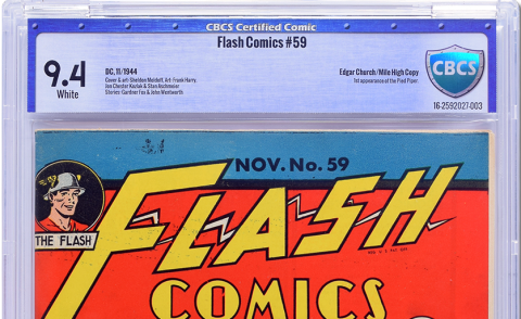 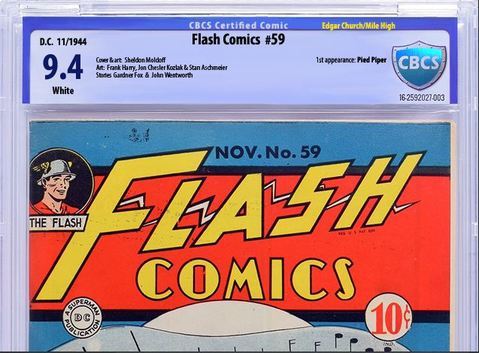 I would be curious how this vote would come out. |
||
| Post 676 • IP flag post | ||
 COLLECTOR COLLECTOR
|
DarthLego private msg quote post Address this user | |
| The point of the roundabout is you don't have to come to a complete stop because if you follow the arrows to get to the street you want you will not cross paths with on coming traffic. | ||
| Post 677 • IP flag post | ||
 COLLECTOR COLLECTOR
|
DarthLego private msg quote post Address this user | |
| @TimesChange I like most of what you did, but I think putting the pedigree up top is throwing it off balance. | ||
| Post 678 • IP flag post | ||
 I've spent years perfecting my brand of assholery. I've spent years perfecting my brand of assholery.
|
DrWatson private msg quote post Address this user | |
Quote:Originally Posted by CFP_Comics I would keep them on the standby. |
||
| Post 679 • IP flag post | ||
 COLLECTOR COLLECTOR
|
DarthLego private msg quote post Address this user | |
| And is it just me or is their new shade of blue way way way too purple looking? | ||
| Post 680 • IP flag post | ||
 COLLECTOR COLLECTOR
|
DarthLego private msg quote post Address this user | |
| @DrWatson good call | ||
| Post 681 • IP flag post | ||
 Why just the women? I like bears. Why just the women? I like bears.
|
Gaard private msg quote post Address this user | |
| Is it possible to vertically center the name of the comic between the top of the info (to the right of the grade) and the bottom of the border? | ||
| Post 682 • IP flag post | ||
 COLLECTOR COLLECTOR
|
DarthLego private msg quote post Address this user | |
| Are folks going to mistake blue labels for PLODs? | ||
| Post 683 • IP flag post | ||
 Collector Collector
|
matterus023 private msg quote post Address this user | |
| Lets just go back to the old label with thicker better paper and make the colours ping a bit more. Winner Change the logo to holofoil but keep the old logo perhaps. The old label was almost perfect. |
||
| Post 684 • IP flag post | ||
 COLLECTOR COLLECTOR
|
DarthLego private msg quote post Address this user | |
| I think part of the reason for the logo change is they wanted to have the CBCS letters big and inside the shield. I think the same effect could easily been accomplished with the old shields shape made bigger to allow the lettering inside. | ||
| Post 685 • IP flag post | ||
 COLLECTOR COLLECTOR
|
Foghorn_Sam private msg quote post Address this user | |
Quote:Originally Posted by JWKyle I like what you did here. Still it looks like the information is crowded to much to the left and right edge of the label. In my version I posted earlier I tried to bring everything away from being so close to the left and right edge and more toward the center to give a little better balance and aesthetic. Unfortunately my photo shop prowess is very limited or I may have tried to do more with it. |
||
| Post 686 • IP flag post | ||
 COLLECTOR COLLECTOR
|
JWKyle private msg quote post Address this user | |
Quote:Originally Posted by matterus023I don't disagree with you on that if you take what you have, don't blow it away completely but tweak it here and there you build on what you have instead of starting over. If you do go to a complete rework then it better be great with a huge majority singing your praises or your just changing for the sake of change. |
||
| Post 687 • IP flag post | ||
 Collector Collector
|
Kinzebac private msg quote post Address this user | |
| @JWKyle I like the improved font you used. |
||
| Post 688 • IP flag post | ||
 COLLECTOR COLLECTOR
|
DarthLego private msg quote post Address this user | |
| I'm also curious what the heck happened to the designer or design team that worked on the original label design two years ago? I can't imagine the same person or team worked on this one. | ||
| Post 689 • IP flag post | ||
 COLLECTOR COLLECTOR
|
Foghorn_Sam private msg quote post Address this user | |
| What's the name of that font, I like it a lot. | ||
| Post 690 • IP flag post | ||
 Collector Collector
|
matterus023 private msg quote post Address this user | |
Quote:Originally Posted by Foghorn_Sam Simple but effective |
||
| Post 691 • IP flag post | ||
 COLLECTOR COLLECTOR
|
DarthLego private msg quote post Address this user | |
| Ok, now the mobile forum has the new logo. | ||
| Post 692 • IP flag post | ||
 COLLECTOR COLLECTOR
|
Foghorn_Sam private msg quote post Address this user | |
| From a distance, the 9.4 in the font CBCS is using becomes hard to tell if it's 9.0, 9.4 or 9.6. JWKyle's font looks like 9.4 from any distance. | ||
| Post 693 • IP flag post | ||
 Collector Collector
|
Stronguy private msg quote post Address this user | |
Quote:Originally Posted by DarthLego What makes you think there was a design team? Two years ago there were about a dozen employees busting their butts to get the first books out the door. Before that it was about 5 guys trying to get a building built and open for business. |
||
| Post 694 • IP flag post | ||
 COLLECTOR COLLECTOR
|
JWKyle private msg quote post Address this user | |
Quote:Originally Posted by Kinzebac I didn't do this I just took the image and put them on top of each other Quote: Originally Posted by TimesChange |
||
| Post 695 • IP flag post | ||
 Collector Collector
|
The_Curmudgeon private msg quote post Address this user | |
| I like the idea of putting the pedigrees in gold ink, I think it really adds something special that makes them stand out in the crowd. | ||
| Post 696 • IP flag post | ||
 COLLECTOR COLLECTOR
|
DarthLego private msg quote post Address this user | |
Quote:Originally Posted by Stronguy Whoever it was did a good clean professional looking job at the time. |
||
| Post 697 • IP flag post | ||
 Collector Collector
|
Kinzebac private msg quote post Address this user | |
| @JWKyle I still will give you credit for bringing it to my attention. |
||
| Post 698 • IP flag post | ||
|
|
TimesChange private msg quote post Address this user | |
Quote:Originally Posted by Foghorn_Sam Thanks, I agree with you on balance, The reason I did it this way, and why CBCS does this, is because you have to leave room for some books that have more info, also need to leave room at the bottom next to the page quality is for condition notes. So balance will not be perfect on most books. |
||
| Post 699 • IP flag post | ||
 Leftover Sundae Gnus Leftover Sundae Gnus
|
CatmanAmerica private msg quote post Address this user | |
This is my first attempt, admittedly rough because I put this together using Photobucket tools and borrowing the basic template from Times Change design (left off the Edgar Church pedigree as it was too difficult incorporating the attribution using Photobucket fonts). This is just to provide an idea of my thoughts along the lines of simplicity and color coordination. It isn't finished piece by any means, just a design concept... |
||
| Post 700 • IP flag post | ||
|
|
TimesChange private msg quote post Address this user | |
Quote:Originally Posted by DarthLego I know, I agree and I struggled with that, but in the end I liked pedigree issues to stand out, and it does:-) What about this to balance it? it would just be on pedigree issues, actually I thought about the idea of changing the entire label color for pedigree. 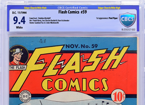 |
||
| Post 701 • IP flag post | ||
|
|
TimesChange private msg quote post Address this user | |
Quote:Originally Posted by Foghorn_Sam The font I used was Myriad pro, condensed and condensed bold, It's a very nice basic font. |
||
| Post 702 • IP flag post | ||
 Leftover Sundae Gnus Leftover Sundae Gnus
|
CatmanAmerica private msg quote post Address this user | |
Quote:Originally Posted by TimesChange My personal preference would be a softer blended color scheme that compliments the new hologram shield without competing with the comic for attention. Something simple and elegant, perhaps with a touch of art deco...  The Church pedigree would've been on the right side just under the first appearance attributions. The solid color bracket is one of the elements that doesn't work for me (on the rivet design as well). Your grade font and color background improved on the CBCS design. IMO, emphasizing the pedigrees at the top in a different color is ...well, over the top, but I have a lot of pedigreed books in my collection, so I do appreciate what you did there. BTW, I don't mind criticism of this. It's a rough design based on another suggested label template. My expectations are as low as the methods used to fascilitate the design. |
||
| Post 703 • IP flag post | ||
|
|
Mio private msg quote post Address this user | |
10 minutes with MS Paint, and I like this one better. Minor tweaks to the original, and we are all set. I don't even mind working for free on this one! |
||
| Post 704 • IP flag post | ||
 Collector Collector
|
Spideyfan73 private msg quote post Address this user | |
Quote:Originally Posted by SteveRicketts I'm sure it will be riveting. Anyone remember some years back KFC tried changing their name unannounced to Kitchen Fresh Chicken? And.... how'd that go? They obviously didn't learn with the imposter Colonel. Great that CBCS is taking it all under advisement to sort this out. |
||
| Post 705 • IP flag post | ||
This topic is archived. Start new topic?

