CBCS launches New Logo and Brand756
 CBCS Head Grader CBCS Head Grader
|
SteveRicketts private msg quote post Address this user | |
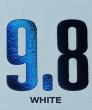
| Comic Book Certification Service, the revolutionary comic book grading company, just introduced the company’s enhanced logo and updated corporate brand. CBCS’s rebranding represents the company’s emergence as the industry leader for providing reliable, trustworthy grading standards and secure preservation options for comic books from every era. The logo redesign reflects CBCS's growing strength and its confidence that the company will continue to improve the industry well into the future. Based on the original CBCS design, which signified dependability and durability, the new logo was designed to evoke a greater sense of confidence, strength, service and protection. To the team at CBCS, the logo represents a broader ideal that a grading company should not only assign grades to these prized collectibles, but also be dedicated to protect them as well. The newly designed label serves as a bold, easily identifiable counterpart to the company's crystal clear holder, that does not detract from the eye-appeal of a graded and encapsulated comic book. The label's design and new text allows for collectors to easily identify key features of a CBCS graded book—even from several feet away. We've also branded the label with the new CBCS logo, containing a field of holofoil, to enhance the presentation of your treasured comic books. The new CBCS label went into live production on Monday, July 11th. Any order that went into slab production on, or after, that date will get the new label. All orders that were encapsulated before that date received the last of the prior version labels. |
||
| Post 1 • IP flag post | ||
 Collector Collector
|
Bluespeyer private msg quote post Address this user | |
| Sorry steve, don't like it. It's not even that I don't like it as much as the old one... it's that I don't like it at all. I have a couple of books in the system that haven't reached the grading stage yet. Can I request they be encapsulated with the old label, or is it too late? |
||
| Post 2 • IP flag post | ||
 Please continue to ignore anything I post. Please continue to ignore anything I post.
|
southerncross private msg quote post Address this user | |
| nice | ||
| Post 3 • IP flag post | ||
 Collector Collector
|
Revan_Q private msg quote post Address this user | |
| This looks cleaner and nicer than the previous design. In the past I wondered if the logo would be changed up to a foil. Very excited now for the books I'm looking to submit at Tampa Bay Comic Con. | ||
| Post 4 • IP flag post | ||
|
Collector
|
Bluespeyer private msg quote post Address this user | |
| PS: Still better than CGC or PGX labels tho |
||
| Post 5 • IP flag post | ||
 Collector Collector
|
Thanos_of_Titan private msg quote post Address this user | |
| Looks even more out of date than the last one. Did you guys use a professional designer? That's some 90's looking graphics. | ||
| Post 6 • IP flag post | ||
 COLLECTOR COLLECTOR
|
dielinfinite private msg quote post Address this user | |
| I will admit that the new logo looks better as a foil stamp but it still looks incredibly cheap and ugly, especially when used as a standalone image. The old logo was simple but projected professionalism. This new one looks like something from a 20 year old video game. I'm afraid I don't feel much better about the new labels themselves. I think the new fonts are unattractive and the new brush metal texturing looks ugly. They remind me a lot of CGC's previous labels but with an amateur-ish attempt to make them look cool by adding unnecessary textures. |
||
| Post 7 • IP flag post | ||
 Collector Collector
|
The_Curmudgeon private msg quote post Address this user | |
| No, I'm not going to love that new label! It's garish and detracting from the book that I want to look at. Well I guess the money is what drives the market(and their priorities.) The label hoes bitched about the label not being the center of attention, so they got what they wanted. A brightly colored attention grabbing, peacock of a label. The new Kardashian label, not much substance, but tons of flash. It's as bad as CGC's new label. Wow, thanks a lot CBCS. Can we request that the old label design be used on our submissions? Something subdued and tasteful for the collectors, something loud and garish for the flippers? |
||
| Post 8 • IP flag post | ||
 Collector Collector
|
WalkinWillie private msg quote post Address this user | |
| I'm definitely on the side of not liking the new logo at all. Thought CBCS had a nice winner with the first one. This one looks PGX-ish to me. | ||
| Post 9 • IP flag post | ||
|
Collector
|
Thanos_of_Titan private msg quote post Address this user | |
Quote:Originally Posted by dielinfinite Agree 100%. This is not what pro design looks like anymore. I know...I've been an art director for 14 years. |
||
| Post 10 • IP flag post | ||
 Collector Collector
|
TruckJohnson private msg quote post Address this user | |
| Yikes! Just took another look at the new label. In addition to the new ugly amateur hour logo, the font choice for the number grade is all kinds of wrong. How about making the number grade bold, thick, large, and EASY to read? (hmmmm, where have I seen something like that before?) I nominate this horrible rebrand for ESPN's His and Hers show, "Doin' too Much" countdown. | ||
| Post 11 • IP flag post | ||
|
|
Mio private msg quote post Address this user | |
| The lack of border on the bottom edge will drive me nuts. | ||
| Post 12 • IP flag post | ||
|
Collector
|
TruckJohnson private msg quote post Address this user | |
Quote:Originally Posted by Thanos_of_Titan Correct. We would have also accepted, "Microsoft graphics circa 1989." |
||
| Post 13 • IP flag post | ||
 You think I'm joking, I'm not. You think I'm joking, I'm not.
|
earthshaker01 private msg quote post Address this user | |
| Like the foil emblem should have left the test the same. But honestly I don't care. | ||
| Post 14 • IP flag post | ||
 Collector Collector
|
Stelbert_Stylton private msg quote post Address this user | |
Quote:Originally Posted by The_Curmudgeon I love this idea! |
||
| Post 15 • IP flag post | ||
 Collector Collector
|
DertyComix private msg quote post Address this user | |
| @Stelbert_Stylton i am with you on this. Im thinking of call customer service today to request the old label for my submission. | ||
| Post 16 • IP flag post | ||
|
COLLECTOR
|
dielinfinite private msg quote post Address this user | |
Moore's been getting a lot of use recently but I think it's appropriate: |
||
| Post 17 • IP flag post | ||
 Collector Collector
|
Oxbladder private msg quote post Address this user | |
| There things I like and dislike about the new label. Honestly though I didn't have a problem with the original label. I am disappointed that a new label was the announcement because it is such a superficial thing to me. The web site and forum needed the work. There is no ecoupon function built in at all so many people are not getting to use them because they don't know of the current process, such as myself, and even when we do try and get them applied they are not. I would have loved to knock close to $100 off my recent bill considering our Canadian Dollar is in such crap shape. As some have stated this is not a very hard thing to incorporate. People have been clamoring for a registry and census as well. I can live with the label change and will obviously keep submitting books but consider me very disappointed that CBCS decided to change something so unsubstantial. |
||
| Post 18 • IP flag post | ||
|
Collector
|
TruckJohnson private msg quote post Address this user | |
| So, were you guys feeling left out because CGC was getting all the attention with their "oily rainbow case" scandal? So you one-upped them with your own "amateurish logo hideous label font" scandal? Mission accomplished! | ||
| Post 19 • IP flag post | ||
 Collector Collector
|
ThisLand private msg quote post Address this user | |
This guy loves it...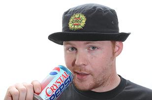 |
||
| Post 20 • IP flag post | ||
|
Collector
|
Stelbert_Stylton private msg quote post Address this user | |
Quote:Originally Posted by Stelbert_Stylton They should make it mandatory that any variant covers get the loud and garish  |
||
| Post 21 • IP flag post | ||
|
Collector
|
The_Curmudgeon private msg quote post Address this user | |
| It's like telling a 5 year old they're getting a surprise, taking them to the pet store, they think they're getting the puppy they've been asking for, then you get them a goldfish! | ||
| Post 22 • IP flag post | ||
|
Collector
|
DertyComix private msg quote post Address this user | |
| @Oxbladder i agree an ecoupon, or a registry/census would have been more efective for a relese like this. I can live with the horrible labels, but to make the fuctionality and experience of submitting and searching for books would have benefited cbcs a whole lot more. | ||
| Post 23 • IP flag post | ||
|
Collector
|
TruckJohnson private msg quote post Address this user | |
Quote:Originally Posted by The_Curmudgeon With any luck, maybe this goldfish will die before we even get home. |
||
| Post 24 • IP flag post | ||
 Collector Collector
|
Gwenlocke_Variant private msg quote post Address this user | |
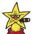
go with this lol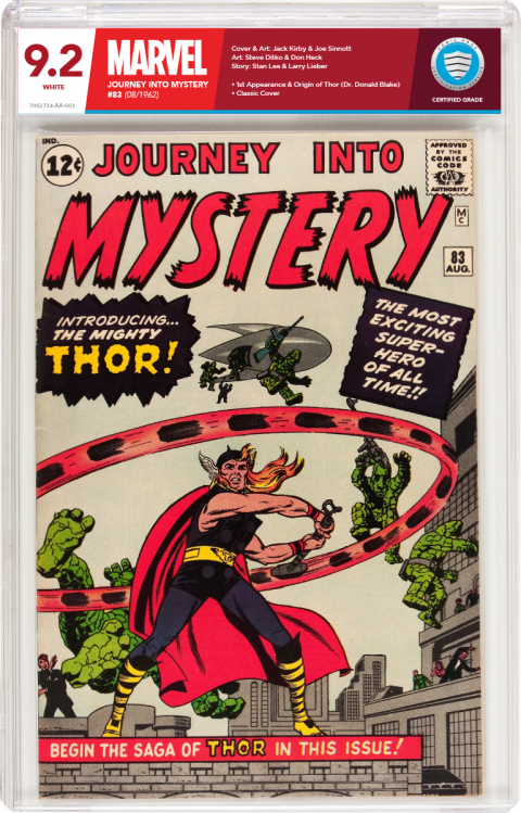 |
||
| Post 25 • IP flag post | ||
|
Collector
|
DertyComix private msg quote post Address this user | |
Quote:Originally Posted by ThisLandwow.... a crystal pepsi. Loved that drink. Wish they could bring that back like the previous logo. |
||
| Post 26 • IP flag post | ||
|
Collector
|
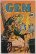
DertyComix private msg quote post Address this user | |
Quote:Originally Posted by Gwenlocke_Variantsee now thats a label. |
||
| Post 27 • IP flag post | ||
|
Collector
|
The_Curmudgeon private msg quote post Address this user | |
| Maybe they should have built a polling feature into the forums so they could get some actual user feedback before just implementing arbitrary changes. You know, market research. |
||
| Post 28 • IP flag post | ||
|
Collector
|
Thanos_of_Titan private msg quote post Address this user | |
Quote:Originally Posted by The_Curmudgeon Exactly! |
||
| Post 29 • IP flag post | ||
|
Collector
|
TruckJohnson private msg quote post Address this user | |
Quote:Originally Posted by Gwenlocke_Variant Now THAT'S a freakin' label you can be proud of! Hire this person!! |
||
| Post 30 • IP flag post | ||
This topic is archived. Start new topic?