7.15.16685
 Collector Collector
|
MR_SigS private msg quote post Address this user | |
| Sub forums. I wanted sub forums. | ||
| Post 276 • IP flag post | ||
 Collector Collector
|
Stelbert_Stylton private msg quote post Address this user | |
Quote:Originally Posted by MR_SigS + 1 This place needs a Comics General. |
||
| Post 277 • IP flag post | ||
|
Collector
|
Stelbert_Stylton private msg quote post Address this user | |
Quote:Originally Posted by CatmanAmerica |
||
| Post 278 • IP flag post | ||


 Collector Collector
|
BrianGreensnips private msg quote post Address this user | |
| I just watched the video for the new design and I think it looks pretty clean. I am not sure if I like the hologram as much though. Reminds me of Upper Deck cards from the 90's. I was not a fan of the original logo either. It had an uptight feel to it. Still 50/50 at this point. | ||
| Post 279 • IP flag post | ||
 Leftover Sundae Gnus Leftover Sundae Gnus
|
CatmanAmerica private msg quote post Address this user | |
Quote:Originally Posted by Despain Ribbits! ...Really? Books should be riveting, ...not labels.  |
||
| Post 280 • IP flag post | ||

 Collector Collector
|
D84 private msg quote post Address this user | |
| Honestly, the rivets are the only thing I don't like. Overall, it's a decent design. Not perfect, but it could be worse. | ||
| Post 281 • IP flag post | ||
 COLLECTOR COLLECTOR
|
DarthLego private msg quote post Address this user | |
| Remove all the rivets and I could at least live with it. Not crazy about the fonts, but oh well. Prefer the old logo, but I could learn to love/hate it. But those rivets have to go. | ||
| Post 282 • IP flag post | ||
 Collector Collector
|
DannyBoy private msg quote post Address this user | |
Quote:Originally Posted by Stelbert_Stylton Bloody, Bloody Hippies! |
||
| Post 283 • IP flag post | ||
|
Leftover Sundae Gnus
|
CatmanAmerica private msg quote post Address this user | |
Quote:Originally Posted by DarthLego I hear ya. Collectors shouldn't be forced into a love/hate position. Was it really crucial to change the label at this time? I haven't seen any serious outcry for it. The complaints seemed periphrial at best, and decidedly mixed. Most folks liked the old label well enough even if tweaks (such as strengthening the color gradations) have been recommended. Consistency is extremely important for a grading service and changes should be thoroughly vetted before being incorporated by a clearly defined need. One reason that consistant label design and color is crucial (and changes kept to a minimum) is confusion on dealer walls and auction sites. Of course, this is just my opinion; OMMV. |
||
| Post 284 • IP flag post | ||
|
COLLECTOR
|
DarthLego private msg quote post Address this user | |
Quote:Originally Posted by CatmanAmerica I agree with everything you just said. Well put. |
||
| Post 285 • IP flag post | ||
|
COLLECTOR
|
DarthLego private msg quote post Address this user | |
| Even in this teaser thread from day one, people were saying "hope it's not a new label" multiple times. You think somebody at CBCS would have blown the time out whistle. | ||
| Post 286 • IP flag post | ||
 Collector Collector
|
Despain private msg quote post Address this user | |
Something CBCS could've done is come up with 3 to 5 different designs and had a customer / member vote. One of the options would be to keep the design as is. The option with the most votes wins.    |
||
| Post 287 • IP flag post | ||
|
Leftover Sundae Gnus
|
CatmanAmerica private msg quote post Address this user | |
Quote:Originally Posted by Despain Good suggestion. Certainly better than doubling down on a controversial design without broad support. My counter suggestion would be to offer customers options, old design or new, ...that simple. There are no other concerns that need addressing such as holder issues, so that'd be workable if they chose to do it. |
||
| Post 288 • IP flag post | ||
|
|
TimesChange private msg quote post Address this user | |
| You would think after the CGC fiasco they would have held off on this or at least take baby steps. These companies have to realize they are dealing with OCD collectors, a tiny stress line FREAKS us out, what do you think adding rivits would do? LOL I feel really bad for these companies, but holy heck didn't anyone say um lets see what the customers think first. OR, make a huge marketing campaign "help us design the new label!" Then have people send in concepts or ideas, then let the community vote on these. The winner could get a free membership. |
||
| Post 289 • IP flag post | ||
 Collector Collector
|
Evangelon private msg quote post Address this user | |
Quote:Originally Posted by SteveRickettsI get it now! He meant the label was going to look as good as those guys! Same era of style even! |
||
| Post 290 • IP flag post | ||

 I've spent years perfecting my brand of assholery. I've spent years perfecting my brand of assholery.
|
DrWatson private msg quote post Address this user | |
Quote:Originally Posted by Evangelon Even more cowbell wouldn't improve the new new... new? logo and labels. |
||
| Post 291 • IP flag post | ||
|
COLLECTOR
|
DarthLego private msg quote post Address this user | |
I've got a fever. And the only cure is more cowbell!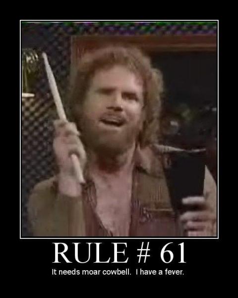 |
||
| Post 292 • IP flag post | ||
This topic is archived. Start new topic?