Label Critique5501
 Collector Collector
|
thelastbard private msg quote post Address this user | |
@ozonetv Oh yeah, that looks pretty good.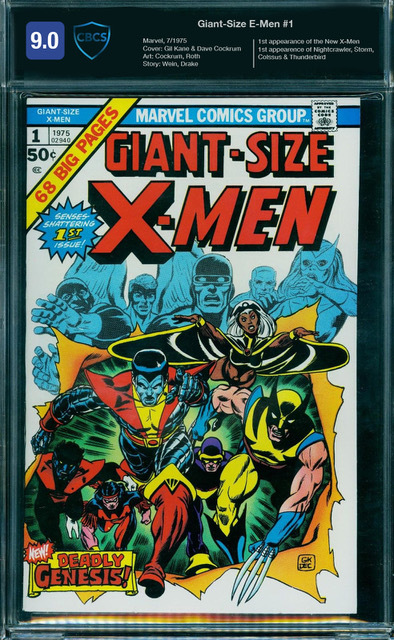 |
||
| Post 26 • IP flag post | ||
 COLLECTOR COLLECTOR
|
conditionfreak private msg quote post Address this user | |
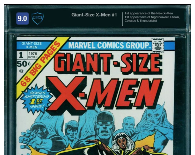
Quote:Originally Posted by thelastbard Who are the "E-Men"? |
||
| Post 27 • IP flag post | ||
 Collector Collector
|
ozonetv private msg quote post Address this user | |
| HA! I know...they're the guys behind e-cigs and e-commerce. :-) | ||
| Post 28 • IP flag post | ||
 Collector Collector
|
DJC_II private msg quote post Address this user | |
Quote:Originally Posted by ozonetv I agree. But again, I think like you pointed out, some more timeless features should be used instead for labels I also think the red labels are harsh looking in general. They should be: Blue for regular Yellow for SS Orange for SS unverified Black for restored |
||
| Post 29 • IP flag post | ||
 Collector Collector
|
MR_SigS private msg quote post Address this user | |
| I agree labels are being made busier than they really need to be, but I guess I'm just lucky that I'm able to focus on the comic. | ||
| Post 30 • IP flag post | ||
 Rock, Paper, Scissors, Lizard, Spock Rock, Paper, Scissors, Lizard, Spock
|
Tedsaid private msg quote post Address this user | |
Quote:Originally Posted by DrWatson Yeah, I haven't sent in any comics to CBCS since the label debacle. It's not just the bad art/design, but the fact that the labels look cheap in the slab. The ones I got are actually perforated ... just printed and torn off a sheet. Well ... CGC's are perforated, too, looks like. But it's hard to tell. (I just looked, but had never noticed before. Maybe the perforations are smaller?) Anyway, at least those ones lay flat in the case. My CBCS ones, more often than not, are bowed out, adding to the cheap look of the design. Hmm. I guess I'm still pissed that they talked me into waiting for the "new" labels, after they unilaterally decided not to use the original ones I'd actually bought. They were nice about it, and earnest. Someone pretty high up got on the phone that last time and asked me to wait another couple of weeks (after six months or whatever.) It was a nice gesture, so I waited again, but I really shouldn't have. Well. At least I can be glad I didn't get those damn rivets, amirite? |
||
| Post 31 • IP flag post | ||
 Collector Collector
|
Savage_Spawn private msg quote post Address this user | |
Quote:Originally Posted by ozonetv I spent some time looking at multiple slabs, cases, top loaders, and other display devices. This one, if "maxed" out, is by far the best. It would be a bold and game changing move. |
||
| Post 32 • IP flag post | ||
 I've spent years perfecting my brand of assholery. I've spent years perfecting my brand of assholery.
|
DrWatson private msg quote post Address this user | |
Quote:Originally Posted by Tedsaid I have two rivet labels. I pull them out and look at them when I think that life couldn't possibly get any worse. So, I suppose everything serves a purpose. |
||
| Post 33 • IP flag post | ||
|
Collector
|
ozonetv private msg quote post Address this user | |
Quote:Originally Posted by Savage_Spawn Thanks- I think its a good start. More thought should be put into what info really needs to be put on a label, and whats better off on an associated webpage. I actually love cbcs's notes. Its a great resource for finding out the specifics of the grading (not to mention free - as opposed to cgc's charging $10). That webpage is the place to put the book's credits and it's highlights. That would eliminate the need for such a massive label, so a small strip carrying name of the book, grade, reg. number, company logo, color and category is all you'd need. Doing something like that would be game changing, and the visual sensitivity would go a long way in telling collectors that the grading company really gets it. |
||
| Post 34 • IP flag post | ||
 Collector Collector
|
Redshade private msg quote post Address this user | |
| My two penn'orth : I agree that colour coding is a good idea as an aid to picking out comics on a back wall. Do we really need writer and artist names on the front as well as first appearance of... etc? This is the type of information that you would probably know if you were eyeing up a particular comic. All this could be on the back label. I would just have the grade at one end and the CBCS logo at the other with the title and issue number in as big a font as possible in a banner headline and nothing else at all on the front label. |
||
| Post 35 • IP flag post | ||
|
Collector
|
ozonetv private msg quote post Address this user | |
Quote:Originally Posted by Redshade Agreed- Minimalism would solve a lot of problems for sure. |
||
| Post 36 • IP flag post | ||
|
Collector
|
DJC_II private msg quote post Address this user | |
Quote:Originally Posted by Tedsaid I hope they fired the designer who came up with that, and their boss that approved it |
||
| Post 37 • IP flag post | ||
This topic is archived. Start new topic?