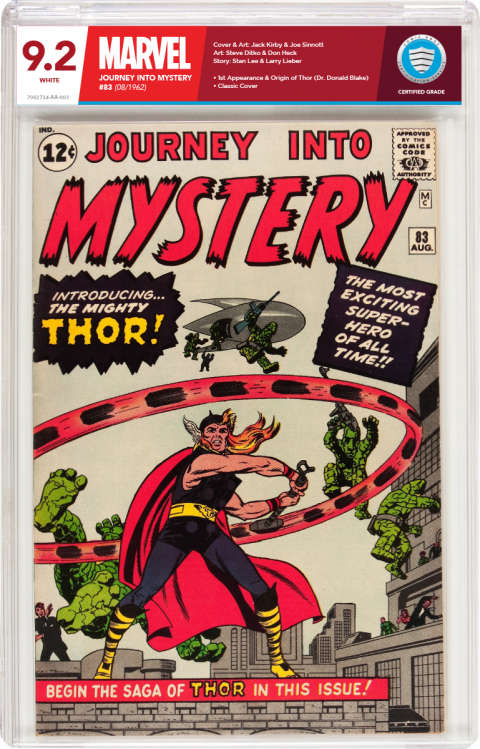
New Labels-Concept Design for CBCS518
 COLLECTOR COLLECTOR
|
Foghorn_Sam private msg quote post Address this user | |
| I think the current CBCS label is the best looking one on the market now. Allows the comic book itself to be the focus while providing in a non-obtrusive way the information that's the purpose of it being graded and slabbed in the first place. It's is obviously very hard to reach that balance given all the different opinions being expressed here. We seem to want the label to not be too flashy, but still have some style and appeal that compliments, not detracts from the comic book held within. |
||
| Post 51 • IP flag post | ||
 COLLECTOR COLLECTOR
|
JWKyle private msg quote post Address this user | |
| I was looking at a slab and wanting to say maybe a blue boarder or maybe making the CBCS shield more pronounced. But to be honest I too think I'm fine with the label. If down the road They decide to tweak it here or there a little I would probably be OK with that also but please no major attention grabbing labels. And I'm a little older now so please no super small fonts like in CGC gen. 1 labels I have a heck of a time with the cert numbers. | ||
| Post 52 • IP flag post | ||
 COLLECTOR COLLECTOR
|
DarthLego private msg quote post Address this user | |
| I could go for a watermark that shows up under black light that says "Suck it CGC!" |
||
| Post 53 • IP flag post | ||
 I bought a meat grinder on amazon for $60 and it's changed my life. I bought a meat grinder on amazon for $60 and it's changed my life.
|
kaptainmyke private msg quote post Address this user | |
| I like the design idea. A lot actually. Compliments the comic book as a frame does a piece of art. I understand how complex that would be to re-slab existing books when CBCS has been around now to have established a permanent style of headers for labels. | ||
| Post 54 • IP flag post | ||
 Collector Collector
|
cjbehr948 private msg quote post Address this user | |
| @Thanos_of_Titan: Gotta say. That's a sexy looking slab! Nice work! @DarthLego: All I could think of when I saw you bring up the watermark. 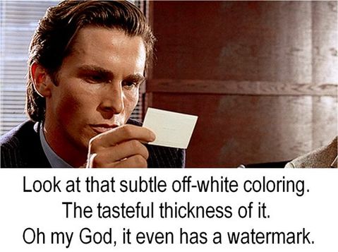 |
||
| Post 55 • IP flag post | ||
 Collector Collector
|
Despain private msg quote post Address this user | |
| @JWKyle I like the idea of making the shield more pronounced too. I've said this before, but I think it would look neat if the silver around the shield and the shield itself had a foil stamping. | ||
| Post 56 • IP flag post | ||
 I'll probably wake up constipated. I'll probably wake up constipated.
|
Pre_Coder private msg quote post Address this user | |
| Seems I've read recently about a foil or maybe a holographic type CBCS shield. I think that would be pretty cool as long as there was a way to keep it subtle and not throw the label off-balance. If the shield is too gawdy, the label is going to tilt to the right, just like that big-ass number on the CGC FrankenSlab tilts the label to the left. IMO, the CBCS label is perfect the way it is - it's not distracting, it's very professional, and it's very balanced. "You KNOW who we are, now here's the book!" But ya know, this really is a beautiful shield and maybe just a very very subtle holographic touch in the blue field, leave everything else alone, and the shield would probably appear to be hovering over a 3d background. OOPS!,... that would be a distraction! LOL  |
||
| Post 57 • IP flag post | ||
|
|
Kanaloa private msg quote post Address this user | |
| To be able to see spin clear would be great but also a difficult task. definitely would put CGCS way above other holders if could be done. No holder company has come close to achieving this, yet. | ||
| Post 58 • IP flag post | ||
 COLLECTOR COLLECTOR
|
DarthLego private msg quote post Address this user | |
| @Kanaloa I'm not following what you're saying, I think some typos are throwing off what you wrote. | ||
| Post 59 • IP flag post | ||
 Collector Collector
|
KenWorthing private msg quote post Address this user | |
| The present label's fine as is the case .. apart from one small thing, which would be great if it was fixable in the future .. That damn frosting in the middle of the two long-edges of the case |
||
| Post 60 • IP flag post | ||
|
|
Kanaloa private msg quote post Address this user | |
@DarthLego Quote:Originally Posted by DarthLego e didn't type in spine |
||
| Post 61 • IP flag post | ||
 COLLECTOR COLLECTOR
|
DarthLego private msg quote post Address this user | |
| Ah gotcha, amazing what one little e can do to throw off the brain. | ||
| Post 62 • IP flag post | ||
 Collector Collector
|
mattness private msg quote post Address this user | |
| I personally like the label. It is refreshing, no added mumbo jumbo, just whats needed to identify the book. I have been collecting original art as well as animation art since the mid 1990's. One thing I have learned is that the first thing a person or business does to attract a buyer is put a holo-foil sticker or reflective sequence of numbers on their item. Thus, giving the impression that the item is valid or authenticated. Unfortunately, many people fall for that, like fish to a lure. The first thing crooks and fraudulent dealers do is print up some holio-foil stamps, or seal of approval. I have seen it so many times. So many put their faith in that little sticker So CBCS your label is fine with me. Spend your time on something more constructive. IMHO |
||
| Post 63 • IP flag post | ||
 COLLECTOR COLLECTOR
|
DarthLego private msg quote post Address this user | |
| What I always disliked about the CGC holofoil sticker was it is on the slab instead of the label. Anyone could crack the slab and insert a fraudulent label and reseal the slab. I like that CBCS has some subtle security measures in it's label and the slab itself can't be opened easily without noticeable damage. | ||
| Post 64 • IP flag post | ||
 I bought a meat grinder on amazon for $60 and it's changed my life. I bought a meat grinder on amazon for $60 and it's changed my life.
|
kaptainmyke private msg quote post Address this user | |
| I like the OP logo best. I would prefer this label on a book I paid good money to have graded. | ||
| Post 65 • IP flag post | ||
 Collector Collector
|
Kinzebac private msg quote post Address this user | |
Quote:Originally Posted by kaptainmyke I agree. The OP's logo is easy to read and stands out. My only question would how would a restored or conserved label look. Where would you put the restoration or conserved information? |
||
| Post 66 • IP flag post | ||
 Collector Collector
|
matterus023 private msg quote post Address this user | |
Quote:Originally Posted by Thanos_of_Titan Ok so my INSTANT reaction to this when I saw it the other day was....not for me. But each time I see it now I like it more and more. I feel that a jim 83 works well for this specific label and not sure about some of your ideas....however you have took the time to do this and you have done a good job of it. As you said before (I think) it isn't perfect and a few things would need changing but it is a good solid basis to work from for sure. I agree that the label shouldn't draw the eye from the comic but this is vibrant, bold etc which has all those elements but I still like it. If a label is more bland but badly done maybe that draws the attention away from the comic more as you can't stop looking at it with slight annoyance. Where as if a label is more colourful, more vibrant, more in your face but done well and looks great then it doesn't infact draw the eye as you eventually become used to it and are at ease with how it looks. Worded that badly I know lol. Very tough to get this label kerfuffle thing right |
||
| Post 68 • IP flag post | ||
 Collector Collector
|
Oxbladder private msg quote post Address this user | |
| It isn't bad but: 1. The colours are far to loud and you should never use white text on a dark background. Most people cannot cope with it. 2. The publisher text is way too big and the title is way too small. 3. The only colours that should be used are those which indicate the different services ASP, VSP, etc. It would be way too much and maybe not even legal to use the publisher colours on the label. In this current incarnation the label draws the eye away I think even more than the new label. |
||
| Post 69 • IP flag post | ||
 Collector Collector
|
The_Curmudgeon private msg quote post Address this user | |
| Never mind the nightmare of having to keep some 40-odd different printers loaded with the different publishers specific labels. | ||
| Post 70 • IP flag post | ||
 COLLECTOR COLLECTOR
|
DarthLego private msg quote post Address this user | |
| I agree the publisher specific idea is far to complex to implement. Remove that idea from the equation and I think Thanos was onto some very good design cues that could have been tweaked into something great. | ||
| Post 71 • IP flag post | ||
 Collector Collector
|
The_Curmudgeon private msg quote post Address this user | |
Quote:Originally Posted by DarthLego Maybe, but I really think you need something more subdued because of all the different colors available. The red may work well with that JIM 83, but red is not what you want with something like Uncanny X-Men 234 or 251, I think it would clash too much and make my eyes hurt. |
||
| Post 72 • IP flag post | ||
 COLLECTOR COLLECTOR
|
DarthLego private msg quote post Address this user | |
| Just stick with CBCS's current color scheme. There will only be three label types. | ||
| Post 73 • IP flag post | ||
 COLLECTOR COLLECTOR
|
DarthLego private msg quote post Address this user | |
| I mean old current, not new current lol. | ||
| Post 74 • IP flag post | ||
 Collector Collector
|
The_Curmudgeon private msg quote post Address this user | |
Quote:Originally Posted by DarthLego Well, hopefully there will be three more, if they offer "collector labels" and "dealer labels." |
||
| Post 75 • IP flag post | ||
 COLLECTOR COLLECTOR
|
DarthLego private msg quote post Address this user | |
| I did like the subdued colors on the old label design. | ||
| Post 76 • IP flag post | ||
 COLLECTOR COLLECTOR
|
DarthLego private msg quote post Address this user | |
| You think CBCS will follow CGC's playbook with labels like the Stan Lee label? | ||
| Post 77 • IP flag post | ||
 Collector Collector
|
The_Curmudgeon private msg quote post Address this user | |
Quote:Originally Posted by DarthLego I certainly hope not. |
||
| Post 78 • IP flag post | ||
 COLLECTOR COLLECTOR
|
DarthLego private msg quote post Address this user | |
| @The_Curmudgeon Me either. | ||
| Post 79 • IP flag post | ||
 COLLECTOR COLLECTOR
|
DarthLego private msg quote post Address this user | |
| I thought the Stan Lee labels were pretty tacky. | ||
| Post 80 • IP flag post | ||
This topic is archived. Start new topic?


