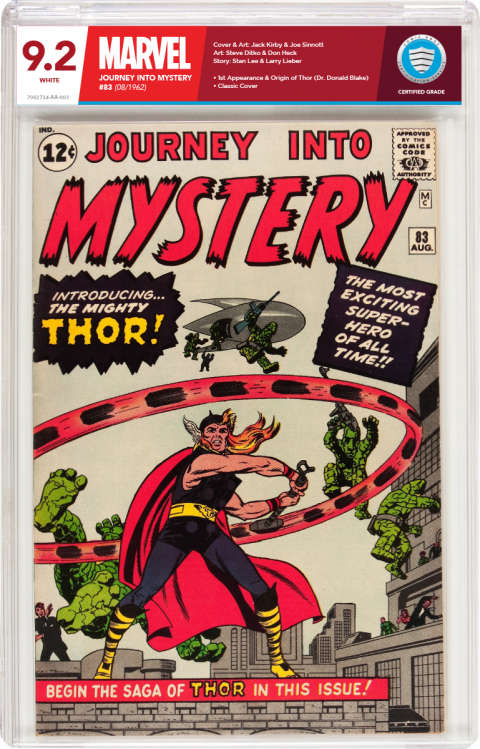
New Labels-Concept Design for CBCS518
 Collector Collector
|
Stelbert_Stylton private msg quote post Address this user | |
| Why is it that you can be irrational but I can't? | ||
| Post 26 • IP flag post | ||
 I've spent years perfecting my brand of assholery. I've spent years perfecting my brand of assholery.
|
DrWatson private msg quote post Address this user | |
| Why is it that posts were deleted from this thread? Perhaps that should be taken as a hint to amend the tone and style of posting while exchanging relevant ideas & information instead of calling people names and posting as if engaging in guerrilla warfare for kindergartners. I don't know... just a guess on my part. |
||
| Post 27 • IP flag post | ||
 COLLECTOR COLLECTOR
|
Wolverine private msg quote post Address this user | |
| I like the red label. I've always wanted to see black instead of clear plastic. Would look pretty sweet to display. Any reason why that hasn't been done yet by any major company's? | ||
| Post 28 • IP flag post | ||
|
|
Kanaloa private msg quote post Address this user | |
| I just wish we could see the comics spine better in the case. | ||
| Post 29 • IP flag post | ||
 Collector Collector
|
Thanos_of_Titan private msg quote post Address this user | |
| :o | ||
| Post 30 • IP flag post | ||
 Collector Collector
|
Thanos_of_Titan private msg quote post Address this user | |
Quote:Originally Posted by Wolverine But wouldn't it be hard to see the comic through black plastic? Or maybe I just missed what you mean. |
||
| Post 31 • IP flag post | ||
|
|
Muggyman84 private msg quote post Address this user | |
| Love the label of course everyone will have 2 cents about what would make it better for them personally but overall i think this works if not its a great step in yhe right direction | ||
| Post 32 • IP flag post | ||
 COLLECTOR COLLECTOR
|
DarthLego private msg quote post Address this user | |
| Like I said, which seems to have been overlooked, CBCS could implement different label options, those who want the old label can still get the old label. I'll never understand those who think just because they themselves like something exactly the way it is, that no one else should ever ask for anything different. Fresh ideas prevent stagnation. And since it takes months to years for a company to design, test, and roll out new products it is never too soon or the "wrong time" to share ideas for innovation with a company. | ||
| Post 33 • IP flag post | ||
 Collector Collector
|
Stelbert_Stylton private msg quote post Address this user | |
Quote:Originally Posted by DarthLego You also have to remember that this whole label debate has been going on for 16 years, and I'm positive CBCS considered those opinions when creating their label. |
||
| Post 34 • IP flag post | ||
 Collector Collector
|
ThisLand private msg quote post Address this user | |
| @DarthLego Well said. And I don't really understand the infantile personal attacks being thrown around. It takes work to create something and put it out there for peer review. You would hope for constructive and respectful criticism. Not playground nonsense. |
||
| Post 35 • IP flag post | ||
 Collector Collector
|
Despain private msg quote post Address this user | |
| I can appreciate the artistry that went into creating that new label, but in my opinion, it's too busy. I much prefer the label that CBCS is using now. I wouldn't mind if CBCS added a foil stamp to their shield logo, but other than that, I'm happy with the current look. |
||
| Post 36 • IP flag post | ||
 Collector Collector
|
ThisLand private msg quote post Address this user | |
Quote:Originally Posted by Stelbert_Stylton You're positive? In those 16 years CGC's label has undergone multiple changes. Are you saying CBCS's customers should expect that a label change won't even be considered if a better option/design is pitched to them? |
||
| Post 37 • IP flag post | ||
 Collector Collector
|
Stelbert_Stylton private msg quote post Address this user | |
Quote:Originally Posted by ThisLand If they hadn't we'd have Yellow, Purple, and Green CBCS labels, no? Quote: Originally Posted by ThisLand I only know of 2 times it changed, once when they went to the Big Number (2004?) and the most recent change. At what other times did they change their labels? Quote: Originally Posted by ThisLand That's what I hope! |
||
| Post 38 • IP flag post | ||
 COLLECTOR COLLECTOR
|
DarthLego private msg quote post Address this user | |
| Here's an idea. How about we forego the label altogether and laser etch the information right onto the plastic slab? Nothing to distract from the comic. | ||
| Post 39 • IP flag post | ||
 Collector Collector
|
ThisLand private msg quote post Address this user | |
Quote:Originally Posted by Stelbert_Stylton I guess I should have been more literal. Yes two changes. That would be more than one and therefore...multiple. I just think CBCS holders would look better with an improved label. I'm getting a very subtle feeling you don't agree though. |
||
| Post 40 • IP flag post | ||
 Collector Collector
|
CopperAgeKids private msg quote post Address this user | |
Quote:Originally Posted by Thanos_of_Titan Not to slight your takung initiative, but changing label colors based on the company that created the book would create a lot of confusion. Given the current state of the graded comic marketplace, I think it is safe to say that CBCS will see about a 10% increase in market share over the coming months. A revamp of the CBCS labels would not hurt during this time, the label could use a bit more of an aesthetic "pop" to it but not a complete overhaul. OTOH, I think the CBCS labels look just about fine, how they currently arem |
||
| Post 41 • IP flag post | ||
 Collector Collector
|
Stelbert_Stylton private msg quote post Address this user | |
Quote:Originally Posted by ThisLand FTFY |
||
| Post 42 • IP flag post | ||
 Collector Collector
|
Stelbert_Stylton private msg quote post Address this user | |
Quote:Originally Posted by DrWatson I did respond to this but I guess the Mods didn't like it - just a guess. I only collect slabs with labels that match the color of my eyes, that's why my collection is all Qualified CGC slabs. There, I think I sanitized it. |
||
| Post 43 • IP flag post | ||
|
|
DocDiMento private msg quote post Address this user | |
| i prefer something a little bit more simplistic. This has a bit too much color too it for my liking and I dont know if the publisher should be the most prominent thing on the label. With that said, very impressive effort, love the idea of people pitching label redesigns |
||
| Post 44 • IP flag post | ||
 Collector Collector
|
SpiderTim private msg quote post Address this user | |
Quote:Originally Posted by DarthLego CBCS couldn't implement two methods of payment what makes people think that they can implement thousands of label options? Really guys! |
||
| Post 45 • IP flag post | ||
 COLLECTOR COLLECTOR
|
DarthLego private msg quote post Address this user | |
| Well CBCS certainly has bigger fish to fry, which is probably why this thread was buried over 20 days ago. Thanks for digging it up |
||
| Post 46 • IP flag post | ||
 Collector Collector
|
DannyBoy private msg quote post Address this user | |
| Don't change anything with the label. Please. Just don't. Please. |
||
| Post 47 • IP flag post | ||
 Collector Collector
|
Verde private msg quote post Address this user | |
| I liked that laser etched idea. The concept label the OP made looks beautiful, but would cut into the profit margin to pull off, or just a spike in grading fees to cover losses | ||
| Post 48 • IP flag post | ||
 Collector Collector
|
Ghost_Town private msg quote post Address this user | |
| For what it's worth, I do think the CBCS label could use some tweaks. In the overall scheme of things, it's not that important. But I think if it looked a little more professional and tasteful, it would go a long way. | ||
| Post 49 • IP flag post | ||
|
|
Rafel private msg quote post Address this user | |
Quote:Originally Posted by Ghost_Town I'm with you. I like there older style better. There seemed to be more information on the back and information is a powerful selling tool. |
||
| Post 50 • IP flag post | ||
 COLLECTOR COLLECTOR
|
Foghorn_Sam private msg quote post Address this user | |
| I think the current CBCS label is the best looking one on the market now. Allows the comic book itself to be the focus while providing in a non-obtrusive way the information that's the purpose of it being graded and slabbed in the first place. It's is obviously very hard to reach that balance given all the different opinions being expressed here. We seem to want the label to not be too flashy, but still have some style and appeal that compliments, not detracts from the comic book held within. |
||
| Post 51 • IP flag post | ||
 COLLECTOR COLLECTOR
|
JWKyle private msg quote post Address this user | |
| I was looking at a slab and wanting to say maybe a blue boarder or maybe making the CBCS shield more pronounced. But to be honest I too think I'm fine with the label. If down the road They decide to tweak it here or there a little I would probably be OK with that also but please no major attention grabbing labels. And I'm a little older now so please no super small fonts like in CGC gen. 1 labels I have a heck of a time with the cert numbers. | ||
| Post 52 • IP flag post | ||
 COLLECTOR COLLECTOR
|
DarthLego private msg quote post Address this user | |
| I could go for a watermark that shows up under black light that says "Suck it CGC!" |
||
| Post 53 • IP flag post | ||
 I bought a meat grinder on amazon for $60 and it's changed my life. I bought a meat grinder on amazon for $60 and it's changed my life.
|
kaptainmyke private msg quote post Address this user | |
| I like the design idea. A lot actually. Compliments the comic book as a frame does a piece of art. I understand how complex that would be to re-slab existing books when CBCS has been around now to have established a permanent style of headers for labels. | ||
| Post 54 • IP flag post | ||
 Collector Collector
|
cjbehr948 private msg quote post Address this user | |
| @Thanos_of_Titan: Gotta say. That's a sexy looking slab! Nice work! @DarthLego: All I could think of when I saw you bring up the watermark. 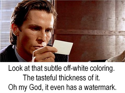 |
||
| Post 55 • IP flag post | ||
This topic is archived. Start new topic?

