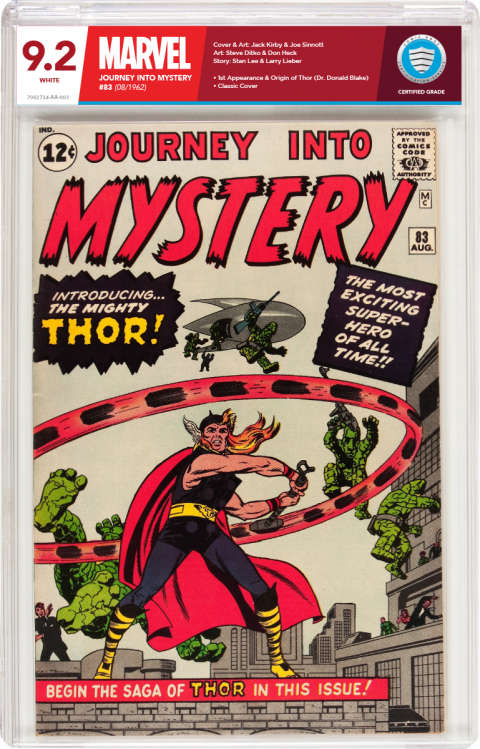
New Labels-Concept Design for CBCS518
 Collector Collector
|
Thanos_of_Titan private msg quote post Address this user | |
| CBCS is definitely my choice for grading but in my opinion the labels for all companies out there at this point are just not what I want. They all stand out and detract from the comic book art rather than framing it in and complimenting the comic as I think it should. I was apprehensive for years to get my books graded just to have all my great Kirby covers plopped next to a generic, cheap printed, low quality label. Below I created a label that brands the comic to whatever company it belongs to. Here, Marvel is shades of red to match the logo, DC would be shades of blue, Darkhorse shades of Black & gray...you get the idea. The thin blue strip at the bottom of the label tells if it's a universal grade, Signature Series,Restored and so on. Yes, it's subtle, but I'm sorry those yellow and orange labels have got to go..they are hideous! Would you like to see your comics framed in with a label that looks like it actually brands and compliments your comic? If so, let CBCS know with your comments below. I openly offer to design all these labels for them at a very low cost. I just want to see this industry move to better labels. CBCS are the best graders out there. To me they kill the competition and have much better business practices. I feel that adding these labels would steal even more business from the competition and give CBCS more attention that I think they deserve.  |
||
| Post 1 • IP flag post | ||
 -Our Odin- -Our Odin-Rest in Peace |
Jesse_O private msg quote post Address this user | |
| I gotta admit - it IS impressive!!! | ||
| Post 2 • IP flag post | ||
 Beaten by boat oars Beaten by boat oars
|
Studley_Dudley private msg quote post Address this user | |
| It's a worthwhile proposal. | ||
| Post 3 • IP flag post | ||
 Collector Collector
|
VillageIdiot private msg quote post Address this user | |
| I do like it as well. However as a former creative director in advertising, i'd pass. Its simply not "Corporate/Business" centric enough, to convey its presence. Its only MY opinion, but you have to truly conceptualize what i'm writing. |
||
| Post 4 • IP flag post | ||
 Collector Collector
|
Chubbyfresh77 private msg quote post Address this user | |
| That is friggen AWESOME!!! But wouldn't there be copyright issues with the company logos? | ||
| Post 5 • IP flag post | ||
 Collector Collector
|
Thanos_of_Titan private msg quote post Address this user | |
Quote:Originally Posted by VillageIdiot As a current creative director, I disagree, but that's ok. To me it's about the whole package. It should fit together and look nice. Comics are a visual form of media. Why detract with a bland, weak label. |
||
| Post 6 • IP flag post | ||
 Collector Collector
|
Thanos_of_Titan private msg quote post Address this user | |
Quote:Originally Posted by Chubbyfresh77 Like anything, it would have to be worked out. If they simply didn't want to deal, then yes...game over. Copyright issues are strange. Sometimes they are not an issue, other times they make things impossible. We'd need to look into it. |
||
| Post 7 • IP flag post | ||
|
|
Rafel private msg quote post Address this user | |
| I like it. The label compliments the comic book nicely. Plus if it's color coded then you would be able to tell what was what at a distant by just looking at the top. Very nicely done. | ||
| Post 8 • IP flag post | ||
 Collector Collector
|
VillageIdiot private msg quote post Address this user | |
Quote:Originally Posted by Thanos_of_Titan Well, to answer your last statement; the label should not be that intrusive to begin with. Its the BOOK that matters, not the label. The label should be pleasant to the eye, subtle in its color & presentation, and direct in its purpose. Anything else is simply superfluous |
||
| Post 9 • IP flag post | ||
 COLLECTOR COLLECTOR
|
DarthLego private msg quote post Address this user | |
| I like it, I like it a lot. That's a very well designed cover, sleek, modern, and cool without being too flashy. I like matching the color to the publisher. I like the subtle color code stripe at the bottom rather than having the whole label be blue, yellow or red. I have to admit, I don't like the look of the current red labels, I see a whole bunch of red and my first instinct is something is wrong with the book. If I didn't already know what it means and was seeing a CBCS slab for the first time I would assume restoration was what that red label is used for. As far as the comic company logos, even if CBCS failed to get permission they could just type the company name in a big bold universal font and the design would still look good. Thanos, can you work up a DC version with a authentic signature gold stripe just for another example of the concept? |
||
| Post 10 • IP flag post | ||
 Collector Collector
|
D84 private msg quote post Address this user | |
| I like it, but would rather the name of the publisher be smaller than the title of the comic. But, it's a beautiful design that blows away anything on the market. |
||
| Post 11 • IP flag post | ||
 COLLECTOR COLLECTOR
|
DarthLego private msg quote post Address this user | |
Quote:Originally Posted by D84 I agree, the title and issue number should be the most prominent text. I'd like to add another idea. Even if CBCS adopted this idea, they could still offer the classic label as an option for anyone who prefers the label as it is now. Does not have to be one or the other. Give the collector more options as to how they want their collection to look. I'm sure there are some who would stick with the classic just so everything in the collection matches. |
||
| Post 12 • IP flag post | ||
 Collector Collector
|
dpiercy private msg quote post Address this user | |
| Like the monochromatic colors, but it is far too LOUD, needs more subtlety. The slanted lines aren't symmetric and distract from the book. Don't think you really need the comic companies logo on there either. There were some really fantastic CBCS label reworks on the CGC boards when the company 1st started, but of course CGC killed the thread. |
||
| Post 13 • IP flag post | ||
 Leftover Sundae Gnus Leftover Sundae Gnus
|
CatmanAmerica private msg quote post Address this user | |
| Personally, I'm fine with the current label design. Not against modest tweaking, but this seems like the wrong time to me. There's just too much instability in the grading community from the other guys. Consistency is the key to success, IMO. While the current CBCS label may look a little bland to some folks, it doesn't detract from the comic at all. Big white grade boxes vis-a-vis the new CGC torture holder do detract. I applaud creativity in design, and Thanos's concept is certainly ambitious. |
||
| Post 14 • IP flag post | ||
 Collector Collector
|
zosocane private msg quote post Address this user | |
| Very creative, but we need to stay with same-colored labels, and CBCS got that right. Purple CGC labels have done so much damage to perfectly acceptable restored books. CBCS thankfully has got us in the right direction. Also, and maybe I'm wrong, but I'm not sure Marvel and DC would license the use of their logos on CBCS slabs. I will say that the size and font of the grade on the left most side of the label looks awesome. |
||
| Post 15 • IP flag post | ||
 Collector Collector
|
Thanos_of_Titan private msg quote post Address this user | |
Quote:Originally Posted by VillageIdiot Well, I guess everybody has their own opinion. To me, The problem is the label in its current state is already intrusive. A powder blue/white label above the comic is very distracting to me. If the book was all that matters why get it graded. Put it in a nice Mylite bag...no distraction. When you grade something you are essentially packaging it for life. Imagine an action figure in all white or powder blue packaging. No one would elect to have that over a nice design that blends the product and looks like it was designed to fit it. |
||
| Post 16 • IP flag post | ||
 Collector Collector
|
Balidoosti private msg quote post Address this user | |
| Love it. Really think it would be a game changer in terms of setting CBCS apart from the competition. Well done. | ||
| Post 17 • IP flag post | ||
 Collector Collector
|
Stelbert_Stylton private msg quote post Address this user | |
Quote:Originally Posted by DarthLego Why? |
||
| Post 18 • IP flag post | ||
 Collector Collector
|
SpiderTim private msg quote post Address this user | |
| Changes could profit the brand. However I think that the color changes in the label would represent a problem. | ||
| Post 19 • IP flag post | ||
 Beaten by boat oars Beaten by boat oars
|
Studley_Dudley private msg quote post Address this user | |
| I wonder whose dad could beat up whose dad. | ||
| Post 20 • IP flag post | ||
 Collector Collector
|
fingfangfoom private msg quote post Address this user | |
| I really like the label design. The color box surrounding the CBCS logo highlights the company better than the current design where the logo is somewhat lost in a sea of white. The size of the Marvel logo should not exceed the grading company logo though. Nice job all around. |
||
| Post 21 • IP flag post | ||
 COLLECTOR COLLECTOR
|
dielinfinite private msg quote post Address this user | |
| My main concern is that you're talking hundreds of different labels to cover each and every publisher cbcs might have to grade a book for. Many are now defunct, some changed names or were absorbed by a bigger company. Then you get into the mess that intercompany crossover and have to represent two, if not three, companies on a label. And would imprints like Vertigo, or MAX be represented somehow as well? Additionally, many publisher logos throughout the years have simply been black and/or white. So while the examples you gave for Marvel, DC, and Dark Horse would be distinctive enough, of the hundreds of publishers that are and have been, it seems like more than a few would be very similar in appearance. You also asked why get it graded if you wanted a non-distracting label, well aside from the impartial assessment of it's condition, the grade, which is still nicely prominent in your design, the restoration check has been one of the recurring reasons I have heard. There are already complaints about CBCS' label not indicating restoration loudly enough and now that the whole label designation has been even further reduced, I think that problem will only be exacerbated. There seems to be little space for a general description of the book's condition, which I'm sure there is space for on the back, but that certainly is one of the major reasons people get books graded and should probably be given more focus and space on the front label than it currently is in your deaign. Additionally, I certainly don't think people are getting books slabbed because they need a large reminder about who published the comic, which seems to be the main approach of this label design. As big a hobby as comics are, publishers, as major as they are, seem an almost arbitrary element to make the focus of the label as there may be just as many collections following a specific character, creator, or pedigree that may span several publishers. Finally, though not quite the same thing, CGC has experimented with creator-specific labels to limited success:   Now it may be that CGC's conditions for getting these labels (I think they had to be at specific, cgc sponsored signings or something) prevented them from really taking off as I've seen very few books, even those signed by these specific creators, for sale, maybe there are too few creator labels to really spark the public's interest, or maybe it could be that the slabbing community simply prefers a certain uniformity and prefers certain general elements, signatures and restoration, called out above things like creators or even publishers on a graded label. All this is not to say that many or all of these cannot be worked out but they, along with a large helping of "if it ain't broke don't fix it" mentality for the current labeling conventions, will certainly make widespread acceptance of a radical label change like this very difficult. |
||
| Post 22 • IP flag post | ||
 Collector Collector
|
ThisLand private msg quote post Address this user | |
| Love the design! I agree that the current labels look a little bland. This concept, or a variation of it, would be a welcome change for me. I understand some don't want the label to distract but the current one is a little utilitarian for my tastes. As with most marketed products a good balance of form and function always seems best. I think CBCS would do well to at least consider some tweaks. |
||
| Post 23 • IP flag post | ||
 Collector Collector
|
Stelbert_Stylton private msg quote post Address this user | |
Quote:Originally Posted by dielinfinite Yay, someone who gets it! |
||
| Post 24 • IP flag post | ||
 Collector Collector
|
Thanos_of_Titan private msg quote post Address this user | |
Quote:Originally Posted by Stelbert_Stylton Yeah, did you notice how he respectfully gave intelligent reasons for his opinion instead of being a confrontational jerk. You should try that sometime. |
||
| Post 25 • IP flag post | ||
 Collector Collector
|
Stelbert_Stylton private msg quote post Address this user | |
| Why is it that you can be irrational but I can't? | ||
| Post 26 • IP flag post | ||
 I've spent years perfecting my brand of assholery. I've spent years perfecting my brand of assholery.
|
DrWatson private msg quote post Address this user | |
| Why is it that posts were deleted from this thread? Perhaps that should be taken as a hint to amend the tone and style of posting while exchanging relevant ideas & information instead of calling people names and posting as if engaging in guerrilla warfare for kindergartners. I don't know... just a guess on my part. |
||
| Post 27 • IP flag post | ||
 COLLECTOR COLLECTOR
|
Wolverine private msg quote post Address this user | |
| I like the red label. I've always wanted to see black instead of clear plastic. Would look pretty sweet to display. Any reason why that hasn't been done yet by any major company's? | ||
| Post 28 • IP flag post | ||
|
|
Kanaloa private msg quote post Address this user | |
| I just wish we could see the comics spine better in the case. | ||
| Post 29 • IP flag post | ||
This topic is archived. Start new topic?
