 Leftover Sundae Gnus Leftover Sundae Gnus
|
CatmanAmerica private msg quote post Address this user | |
Quote:
Originally Posted by matterus023
Quote:
Originally Posted by Thanos_of_Titan
CBCS is definitely my choice for grading but in my opinion the labels for all companies out there at this point are just not what I want. They all stand out and detract from the comic book art rather than framing it in and complimenting the comic as I think it should. I was apprehensive for years to get my books graded just to have all my great Kirby covers plopped next to a generic, cheap printed, low quality label.
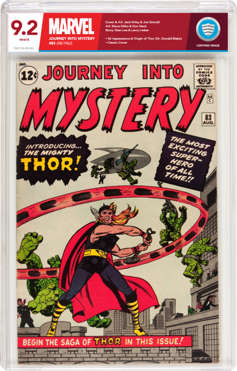
Below I created a label that brands the comic to whatever company it belongs to. Here, Marvel is shades of red to match the logo, DC would be shades of blue, Darkhorse shades of Black & gray...you get the idea.
The thin blue strip at the bottom of the label tells if it's a universal grade, Signature Series,Restored and so on. Yes, it's subtle, but I'm sorry those yellow and orange labels have got to go..they are hideous!
Would you like to see your comics framed in with a label that looks like it actually brands and compliments your comic? If so, let CBCS know with your comments below. I openly offer to design all these labels for them at a very low cost. I just want to see this industry move to better labels.
CBCS are the best graders out there. To me they kill the competition and have much better business practices. I feel that adding these labels would steal even more business from the competition and give CBCS more attention that I think they deserve.

Ok so my INSTANT reaction to this when I saw it the other day was....not for me. But each time I see it now I like it more and more. I feel that a jim 83 works well for this specific label and not sure about some of your ideas....however you have took the time to do this and you have done a good job of it. As you said before (I think) it isn't perfect and a few things would need changing but it is a good solid basis to work from for sure.
I agree that the label shouldn't draw the eye from the comic but this is vibrant, bold etc which has all those elements but I still like it. If a label is more bland but badly done maybe that draws the attention away from the comic more as you can't stop looking at it with slight annoyance. Where as if a label is more colourful, more vibrant, more in your face but done well and looks great then it doesn't infact draw the eye as you eventually become used to it and are at ease with how it looks.
Worded that badly I know lol. Very tough to get this label kerfuffle thing right 
Sorry, I'd never be at ease with this design. I applaud the ambitious design elements, but deplore the brash colors, font, and angular style. It's slick and professional, but more abstract than elegant and definitely would detract from many comics ...especially those with contrasting color schemes in logo and art.
No offense to the designer, but this doesn't work any better for me than the "riveting" new CBCS label. I'd rather have the old label back than a change that makes me walk away. I've witnessed no mass outcry for a new label. And those who've made overtures along those lines may be feeling a twinge of buyer's remorse about now. When idle speculation turns to public debate the old adage "be careful what you wish for" comes to mind.
In the wake of the CGC fiasco, CBCS has been gaining respect among collectors because of the consistent quality of the product and folks who stand behind it. This was absolutely the wrong time to muddy the waters with a stark departure of trademark and design. This is just my POV, other's mileage may vary. |
| 8 years ago |
Post 82 • IP
flag post |
 COLLECTOR
 COLLECTOR
 Collector
 COLLECTOR
 COLLECTOR
 Collector
 Leftover Sundae Gnus
 Collector

