Unusual Comic-Related Items4369
 Collector Collector
|
X51 private msg quote post Address this user | |
| As a side note, Neal Adams draws (or did draw) like Tom Scheuer who is best know as being a writer for Murder She Wrote on television. He uses the pen name Thomas B. Sawyer. http://todaysinspiration.blogspot.com/2008/04/comic-strip-ad-artist-tom-scheuer.html http://thomasbsawyer.com/ |
||
| Post 51 • IP flag post | ||
 Collector Collector
|
DocBrown private msg quote post Address this user | |
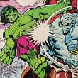
Quote:Originally Posted by X51 Yes, Giffen's first published work was Marvel Preview #4 (Jan 76 cover date.) He worked at Marvel for a few years, most notably on Defenders, where he co-created...Lunatik!...who bore an interesting resemblance to....well, I'll leave it a mystery for now... 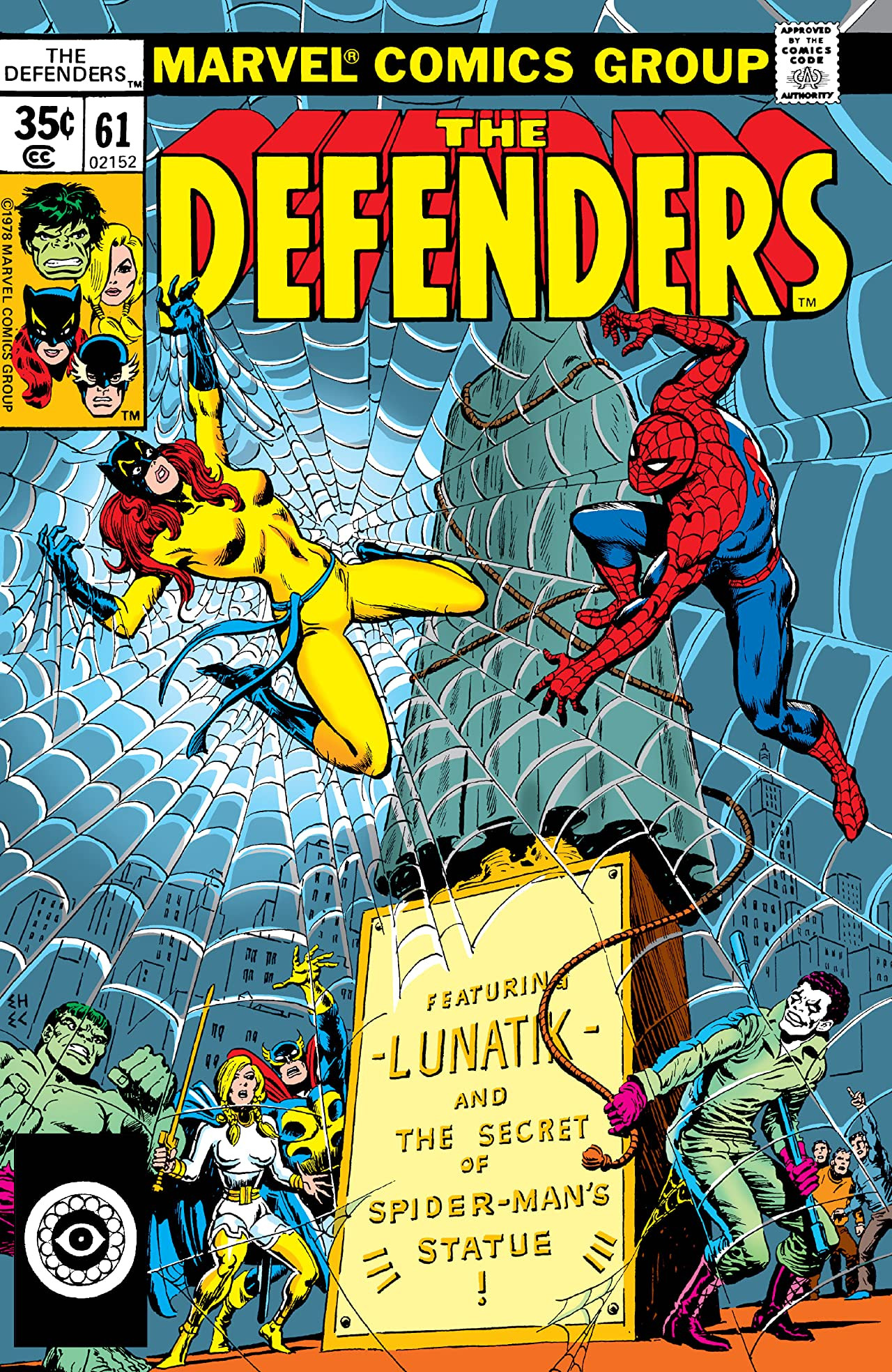 By the time he reached Legion in 1982, his art had developed his familiar blocky style...frankly, I preferred that look in Legion from 1982-1984 to his later stuff...but I still love his later stuff, too, especially Legion #1-20ish (1989.) Speaking of unusual comic related items, I have these two:   (not my pics) Comic beer! |
||
| Post 52 • IP flag post | ||
|
Collector
|
X51 private msg quote post Address this user | |
| I have Armstrong Ale, but no box and no card. | ||
| Post 53 • IP flag post | ||
 Collector Collector
|
Logan510 private msg quote post Address this user | |
Quote:Originally Posted by X51 I posted on Byrne's site asking if it was his work. It doesn't look like his work to me ( or Adams for that matter ), but sometimes if you get a certain type of inker, they can take away a lot that's normally recognizable from a penciler. One of Byrne's first Marvel jobs was in Giant Size Dracula #5 and as inked by Rudy Nebres it is virtually unrecognizable as Byrne art. |
||
| Post 54 • IP flag post | ||
|
Collector
|
Logan510 private msg quote post Address this user | |
Quote:Originally Posted by Logan510 Direct from John Byrne: "no, that is not my work" |
||
| Post 55 • IP flag post | ||
 Collector Collector
|
VictorCreed private msg quote post Address this user | |
These were give aways at Jeremy Hauns table at Fan Expo Canada last year.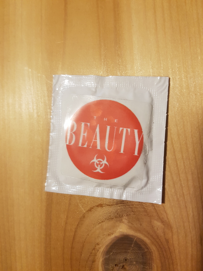 |
||
| Post 56 • IP flag post | ||
|
Collector
|
DocBrown private msg quote post Address this user | |
| Is that what I think it is...? Starts with a "c", ends with an "ondom"...? lol |
||
| Post 57 • IP flag post | ||
|
Collector
|
VictorCreed private msg quote post Address this user | |
| @DocBrown yup lol | ||
| Post 58 • IP flag post | ||
|
Collector
|
X51 private msg quote post Address this user | |
Quote:Originally Posted by Logan510 I didn't really think it was Byrne art because he's better with perspective than that. The rocks in the background do look like Byrne art, but that could have been done by anyone who'd inked Byrne art. The rough layout of his body with a curved shape might narrow it down and the wide chin might narrow it down. |
||
| Post 60 • IP flag post | ||
|
Collector
|
Logan510 private msg quote post Address this user | |
Quote:Originally Posted by X51 Speculation among some Byrne board members is early Jerry Ordway, at least the inks. Looks more like Ordway to me than Byrne( who has confirmed it's not his) or Adams. |
||
| Post 61 • IP flag post | ||
|
Collector
|
X51 private msg quote post Address this user | |
| Ordway did do art for Western prior to 1983. He shared a studio with Broderick in the mid-80's... Hmmm! Broderick/Ordway collaboration? Broderick was part of Continuity Studios artists being credited as "Crusty Bunkers". That might explain why people see an Adams characteristic to it. I could see this being rough Broderick layout pencils finished by Ordway. I've never seen anything that Ordway did that was as this far exaggerated... not as far as perspective goes. Overall, I think of Adams, Ordway, and Byrne as all being better artists than this piece. |
||
| Post 62 • IP flag post | ||
 Collector Collector
|
The_Curmudgeon private msg quote post Address this user | |
Copyright 1977 |
||
| Post 63 • IP flag post | ||
|
Collector
|
DocBrown private msg quote post Address this user | |
Quote:Originally Posted by X51 Broderick, as in Pat Broderick...? (Not that there are that many Brodericks in the comic art industry.) Hmmm... Broderick has such a distinctive style, even at that time. I see where a case might be made, but it's a stretch... Contemporary Broderick art:  His faces are unique, and I don't see Broderick in Supes' face. |
||
| Post 64 • IP flag post | ||
|
Collector
|
X51 private msg quote post Address this user | |
| That's why I contemplated a rough layout sketch finished by Ordway. The curvature of Superman stands out in that picture as well as the wide jaw. I'll admit that someone tried for a classic Adams face, but they missed it. Adams used to redraw faces on the art drawn for Continuity comics because he wanted consistency. You're probably right though. It could be drawn by an unknown and we'd be wasting our time guessing. I think I'll give up. |
||
| Post 65 • IP flag post | ||
|
Collector
|
VictorCreed private msg quote post Address this user | |
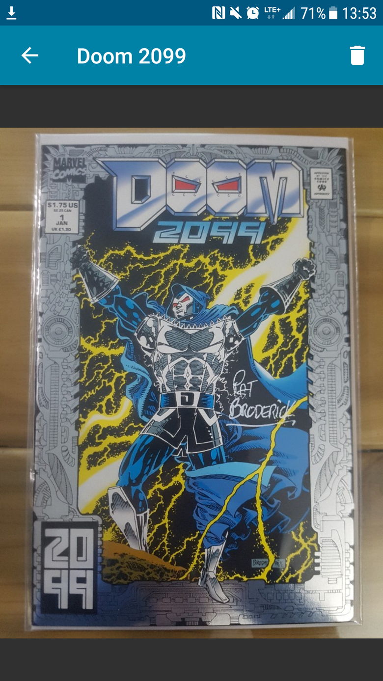 One of the many Doom 2099 books I had signed by Broderick at Fan Expo Canada this yr. |
||
| Post 66 • IP flag post | ||
 Collector Collector
|
VaComicsGuy private msg quote post Address this user | |
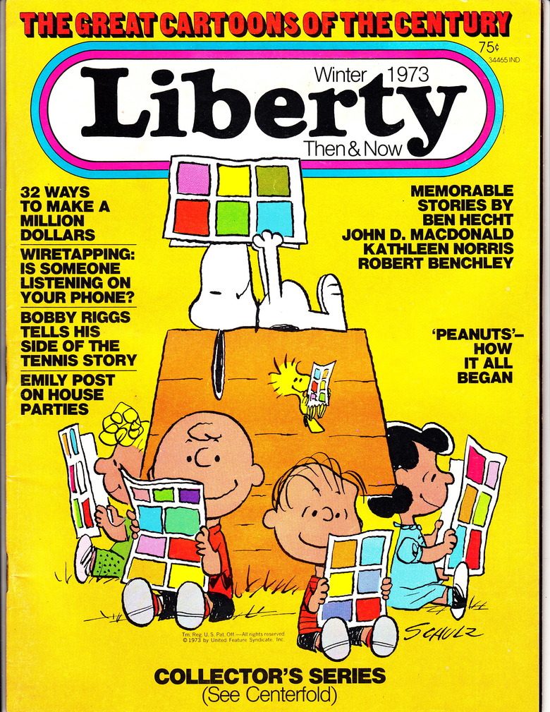
| @martymann That's a great cover. Peanuts (specifically Snoopy) is my other collecting habit. Collected since I was a kid. |
||
| Post 68 • IP flag post | ||
|
Collector
|
Logan510 private msg quote post Address this user | |
Quote:Originally Posted by X51 We have something of a confirmation. One of the Byrne board members contacted Ordway via Twitter and Ordway says he peniclled, inked and colored it. |
||
| Post 69 • IP flag post | ||
|
Collector
|
X51 private msg quote post Address this user | |
| Early work. LOL. | ||
| Post 70 • IP flag post | ||
|
Collector
|
VictorCreed private msg quote post Address this user | |
Anyone remember this game?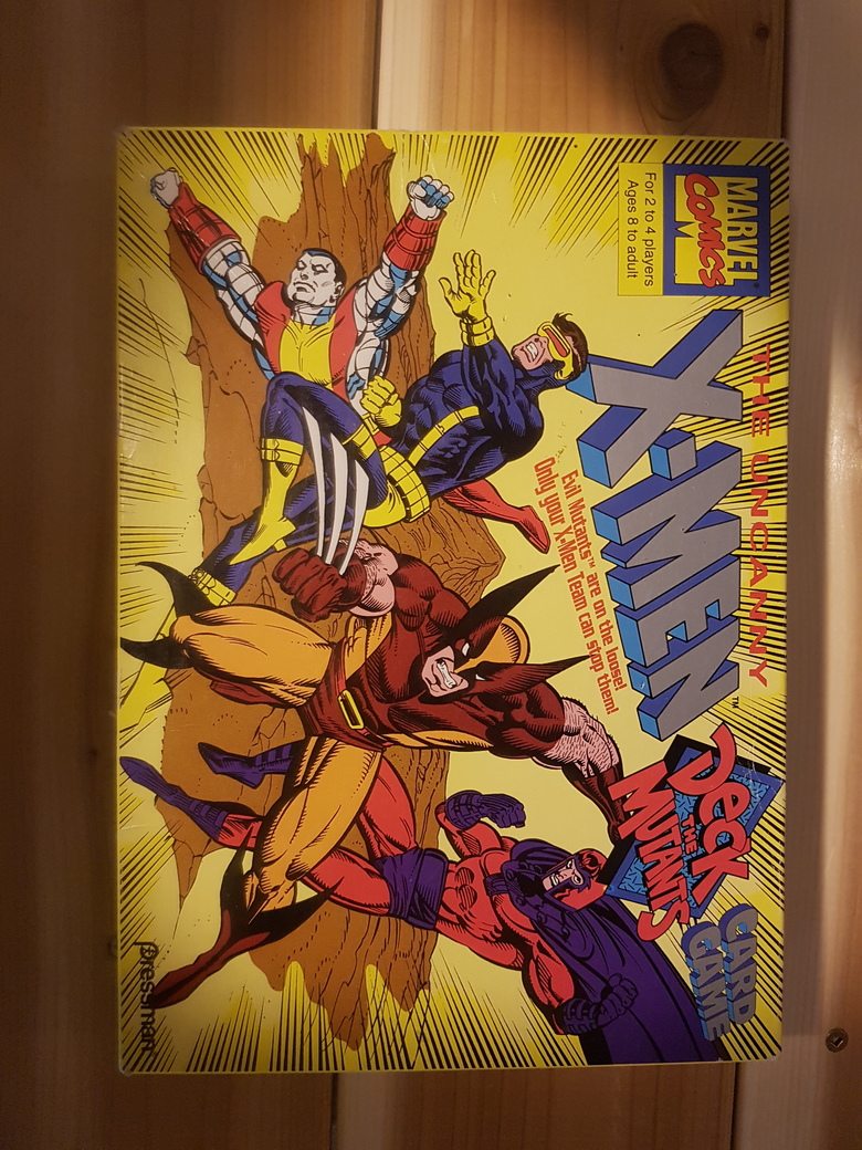 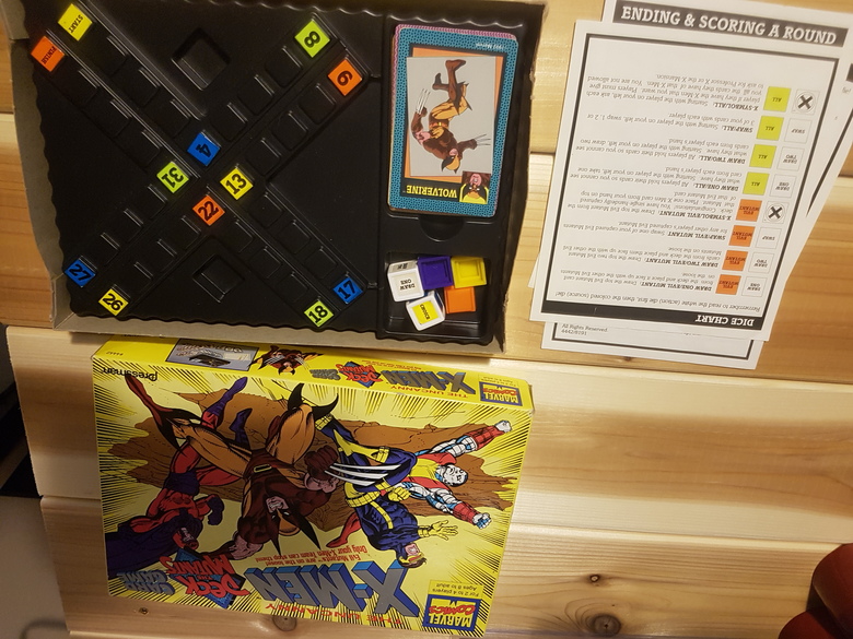 |
||
| Post 71 • IP flag post | ||
This topic is archived. Start new topic?