New label ?19650
 past performance is no guarantee of future actions. past performance is no guarantee of future actions.
|
KatKomics private msg quote post Address this user | |
Quote:Originally Posted by EbayMafia I would think partial?? i.e. that holofoil stuff seems like it would need to be heat applied or something - so maybe only the issue specific info is added as needed?? |
||
| Post 101 • IP flag post | ||
 Masculinity takes a holiday. Masculinity takes a holiday.
|
EbayMafia private msg quote post Address this user | |
Quote:Originally Posted by Nuffsaid111 “None of the above” always wins in a landslide. |
||
| Post 102 • IP flag post | ||
 I've spent years perfecting my brand of assholery. I've spent years perfecting my brand of assholery.
|
DrWatson private msg quote post Address this user | |
Quote:Originally Posted by EbayMafia The background label design exists in inventory. The rest is printed on demand. |
||
| Post 103 • IP flag post | ||
 It gets old smelling it everytime I go outside my door. It gets old smelling it everytime I go outside my door.
|
Nearmint67 private msg quote post Address this user | |
| Uuuumm... There's more to come.... | ||
| Post 104 • IP flag post | ||
 Have I told you about the time I dropped off 3,000 comics at SDCC? Have I told you about the time I dropped off 3,000 comics at SDCC?
|
Scifinator private msg quote post Address this user | |
Quote:Originally Posted by Nearmint67 Yup |
||
| Post 105 • IP flag post | ||
 Leftover Sundae Gnus Leftover Sundae Gnus
|
CatmanAmerica private msg quote post Address this user | |
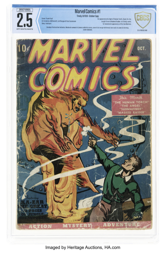
Quote:Originally Posted by Sagii I've tried to stay out of this discussion as folks know my critical opinion of the changes CGC made to their label years ago that I'm still profoundly unhappy about. On the plus side, the Marvel Comics October issue is a cool bragging rights copy for sure and should have collectors perking up and taking notice. Bottom line, is this new CBCS concept label horrible? Well, no, but it's unattractive in several ways the current label isn't and the idea of an arrow pointing toward the oversized digital style grade font is like saying CBCS labels have been redesigned by Univac for Mr. Magoo. It's an "arrow" in judgment, IMO. So, how would I tweak the change if my opinion merited consideration? I'd suggest looking for a more appealing grade font and recommend either dropping the pointing arrow or make it a tad less obvious that the grade is the only thing that matters (...maybe a curve instead of a point and balance it the same way on the other side where the CBCS hologram is located with the slightly stronger blue containing all of the key information in the center section). |
||
| Post 106 • IP flag post | ||
 I've spent years perfecting my brand of assholery. I've spent years perfecting my brand of assholery.
|
DrWatson private msg quote post Address this user | |
Quote:Originally Posted by CatmanAmerica But with the majority of customers who use a grading service, isn't that the case? No one says, "Damn, I was that would have come back lower." When was the last time you added a 6.0 to your collection? Yeah, me neither. I did buy a 7.0 a few years back, but only because I think a CPR will yield a higher grade. Personally, I'm not a fan of the arrow either. However, it would have made more sense to me to have the arrow if they would have tried something new, bold, and different by placing the grade on the right hand side. At this point, most label changes, by either company, is simply an attempt to reinvent the wheel. |
||
| Post 107 • IP flag post | ||
|
|
GAC private msg quote post Address this user | |
  I like the dark blue strip at the top of both labels. I prefer the darker blue of the current label more than the blue on the new label (assuming the difference in colour is not camera trickery) I do not like the "arrow" pointing to the grade. I'd prefer the colour gradient on the new label to start white on the left side and start to fade to blue right after the grade. I prefer the colour of the current CBCS hologram logo on the right as opposed to new gold one. The serial # moved from the left side (old label) to right side on the new label....that's fine. I prefer the fonts of the old label. I don't like the restored designation boxed...I'm assuming everything placed there will be boxed (Conserved etc.). The new label is growing on me. I still prefer the old label though. I wish they kept more elements of the old label...even just the font would be nice but I think the main thing that should go from the new label is the arrow....but like I said, the new label is growing on me. |
||
| Post 108 • IP flag post | ||
 -Our Odin- -Our Odin-Rest in Peace |
Jesse_O private msg quote post Address this user | |
| Here's something for everyone to consider. One of the main complaints about the CBCS label was that the grade did not stand out enough from the label. Right or wrong, that was a major complaint. Since CGC already does a box around the grade, they wanted to do something more original. I know they tried several ideas before landing on the arrow. I think I would have preferred the color gradient also. I know they looked into it and decided against it. So, the arrow beat out the other designs and that's what we have now. | ||
| Post 109 • IP flag post | ||
|
|
GAC private msg quote post Address this user | |
Quote:Originally Posted by Jesse_O CBCS accomplished this. I know the new label is a done deal. I'm not trying to be argumentative or pushy here but CGC doesn't own boxes. Boxes, to highlight an important aspect of something is universal. I completely understand where CBCS is coming from in wanting to do something different but "boxes" are shapes that nobody owns and universally used to accentuate something. The new labels are pretty good... I'm sure I'll grow to like them alot actually. |
||
| Post 110 • IP flag post | ||
 -Our Odin- -Our Odin-Rest in Peace |
Jesse_O private msg quote post Address this user | |
| @GAC oh, I'm sorry. I didn't take what you said as argumentative. I was just trying to add another perspective to the conversation. I've tried to think of other ways to set the grade apart and haven't really had any good ideas. I think a white circle, hexagon or any other shape is just kind of tacky, but that's just me. | ||
| Post 111 • IP flag post | ||
|
|
GAC private msg quote post Address this user | |
@Jesse_O I hear you...I meant I didn't want my response to you above to come across as argumentative....your posts are awesome as usual.  Definitely a very good perspective because you're 100% correct....most people complained about that. I agree with you as well that different shapes to highlight the grade wouldn't work. EGS puts their grade is a circle...personally, I don't like it. I do think the box is the best way. Regardless, I do think this new label design will/should satisfy most complaints. The new label is growing on me for sure. |
||
| Post 112 • IP flag post | ||
 I've spent years perfecting my brand of assholery. I've spent years perfecting my brand of assholery.
|
DrWatson private msg quote post Address this user | |
Quote:Originally Posted by GAC The cgc sued CBCS when they tried to use stars on the label. |
||
| Post 113 • IP flag post | ||
|
|
GAC private msg quote post Address this user | |
Quote:Originally Posted by DrWatson Seriously!? wow....I know anyone can sue anyone but wouldn't that lawsuit be considered as frivolous or even a nuisance? CGC doesn't own stars or boxes....so weird. Here's a mock up of the new label with the arrow removed and the old/current cbcs logo...my computer skills are very very basic.   |
||
| Post 114 • IP flag post | ||
 -Our Odin- -Our Odin-Rest in Peace |
Jesse_O private msg quote post Address this user | |
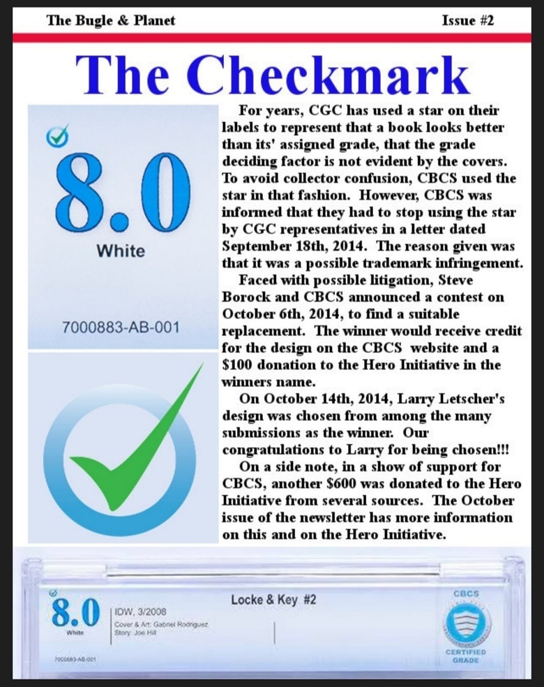
Quote:Originally Posted by DrWatson Yep. I remember the contest to come up with something new. That's how we got the check mark. |
||
| Post 115 • IP flag post | ||
 -Our Odin- -Our Odin-Rest in Peace |
Jesse_O private msg quote post Address this user | |
Quote:Originally Posted by Jesse_O For anyone interested in the story ...  |
||
| Post 116 • IP flag post | ||
|
|
GAC private msg quote post Address this user | |
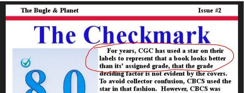
Quote:Originally Posted by Jesse_O CGC threatened lawsuit over an asterisk.. isn't that what the star represents? It acts as a footnote to the grade/book does it not? |
||
| Post 117 • IP flag post | ||
 Collector Collector
|
Sagii private msg quote post Address this user | |
| Isn't it CBCS's 10th anniversary next year? | ||
| Post 118 • IP flag post | ||
 past performance is no guarantee of future actions. past performance is no guarantee of future actions.
|
KatKomics private msg quote post Address this user | |
| I know it's too late..but wouldn't a phased roll out work a bit better? We've done it multiple times with our larger brands....just like a colour change first then 1 or 2 design changes then ta da!!! you're at the new normal? could have stayed with current - then changed colour pallet, then font/grade info box (looks like they moved some notations to the top of the grade #), then either add the arrow or start with box at lighter colour then arrow... It could take a year or two but you don't loose customers because it is gradual. We had once brand in particular where we changed the packaging overnight and saw sales plummet!!! they had to write off all the new packaging then re-run the old...and take the gradual approach to a new "new" design since they burnt any chance of using the old "new" design!! - cost big $$ and probably a head or two rolled!! I've lost track - but 10 yrs and at least 4? major design changes - that's not a good look |
||
| Post 119 • IP flag post | ||
 Collector Collector
|
cesidio private msg quote post Address this user | |
| Label is just eye candy. What matters is case quality and grading accuracy. Label is going to change over time. Regardless which third party grades. | ||
| Post 120 • IP flag post | ||
 -Our Odin- -Our Odin-Rest in Peace |
Jesse_O private msg quote post Address this user | |
Quote:Originally Posted by GAC Yes, you have that correct. That's what they threatened a lawsuit over. Originally, on the label, CBCS had a star and not a check mark. That was it. |
||
| Post 121 • IP flag post | ||
 It's like the Roach Motel for comic collectors. It's like the Roach Motel for comic collectors.
|
chester15 private msg quote post Address this user | |
| In design patents, similarities can be a violation of the patent. The test is usually whether the average consumer could be confused by the similarities, thinking it is one brand when it is another. Design elements are vigorously defended. It doesn't necessarily mean it's an infringement, but you would have to be ready to fund the cost of litigating it, win or lose. |
||
| Post 122 • IP flag post | ||
|
|
GAC private msg quote post Address this user | |
Quote:Originally Posted by Jesse_O I understand businesses allocating funds for the most profitable ventures but I wish CBCS would have called CGC's bluff on this because I can not imagine a company can copyright (I think that's the correct term) an asterisk/star. I'm not a lawyer but I would be shocked if CGC had any legal rights on that. |
||
| Post 123 • IP flag post | ||
 Leftover Sundae Gnus Leftover Sundae Gnus
|
CatmanAmerica private msg quote post Address this user | |
Quote:Originally Posted by GAC CGC can't take credit for the idea of an antique gold pedigree label. When they received criticism for the lackluster silver label a request was made for input. While I'm not taking credit for the suggestion ...even though I was among the first to suggest it... the decision to go with antique gold was the change that stuck. Even though I dislike the aesthetics of CGC's oversized white grading box, the gold pedigree label is a winner in the opinion of most folks. |
||
| Post 124 • IP flag post | ||
 Collector Collector
|
robertofredrico private msg quote post Address this user | |
 That can't be true. In 23 years, I have never once seen a CGC label that used a star, for any reason. |
||
| Post 125 • IP flag post | ||
 I've spent years perfecting my brand of assholery. I've spent years perfecting my brand of assholery.
|
DrWatson private msg quote post Address this user | |
| It was typically used by the other grading companies that fall under the same umbrella. It was mainly currency, if I remember correctly. | ||
| Post 126 • IP flag post | ||
 -Our Odin- -Our Odin-Rest in Peace |
Jesse_O private msg quote post Address this user | |
Quote:Originally Posted by robertofredrico Yeah, I messed that up. Tbh. I didn't care for grading until CBCS got into the game. I checked out CGC after they had been around for a few years and got turned off of grading by them. At that time, I saw grading as an elitist thing that only comic book snobs cared about. My initial forays into their forum just solidified that in my mind. Being in rural Minnesota (nearest lcs was over an hour away and that one sucked) and not attending cons, I never bothered to keep up on what CGC was doing. When I finally had a few books that I thought would be cool to have graded, I heard of Borock starting a new grading company. I waited and watched for CBCS to go online. I got involved with the CBCS Comic Collectors Club on Facebook when another fan set it up. I started doing a newsletter for the club. I got my facts twisted around when I wrote this. @DrWatson is correct. The star is used by one of CGC's sister companies. When this newsletter came out, I was corrected on the facts then also. Mea culpa. |
||
| Post 127 • IP flag post | ||
 Collector Collector
|
Sagii private msg quote post Address this user | |
| Well CGC is about to 'officially' announce Pulp Grading at the NYCC, so CBCS having some major newness news at about the same time is a good thing. Good luck to both ! |
||
| Post 128 • IP flag post | ||
 I've spent years perfecting my brand of assholery. I've spent years perfecting my brand of assholery.
|
DrWatson private msg quote post Address this user | |
| I've never been a fan of pulps. I would think treasuries would come before pulps. Maybe the slab would just be too heavy. | ||
| Post 129 • IP flag post | ||
 Collector Collector
|
Sagii private msg quote post Address this user | |
Quote:Originally Posted by DrWatsonI'm thinking the same thing. Storage? Could you imagine the size of a long box for slabbed treasuries? Lol But, who knew there'd be a clamor for slabs for pulps (though the long timers are against it). If enough folks keep banging the drum... |
||
| Post 130 • IP flag post | ||
This topic is archived. Start new topic?

