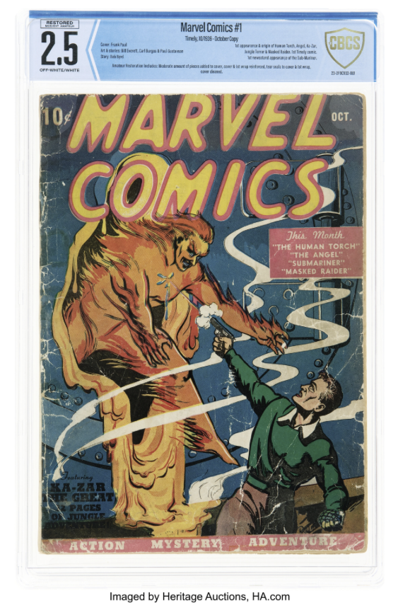
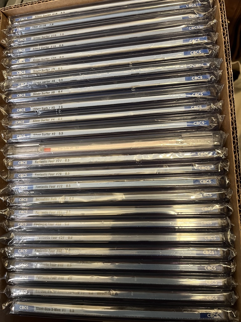
New label ?19650
 I don't want to brag, but cashiers are always checking me out. I don't want to brag, but cashiers are always checking me out.
|
power_struggle55 private msg quote post Address this user | |
| its ironic because one pro I had for reholding my absolute carnage #1 was...at least with a new case it would match all my other graded. now will likely have 5 of the current and 4 of the new | ||
| Post 51 • IP flag post | ||
 It gets old smelling it everytime I go outside my door. It gets old smelling it everytime I go outside my door.
|
Nearmint67 private msg quote post Address this user | |
Quote:Originally Posted by Scifinator I understand that. And I keep all of the signed books in a separate box (well boxes...lol..) Blue with Blue... Yellow with Yellow... |
||
| Post 52 • IP flag post | ||
|
|
GAC private msg quote post Address this user | |
These are my preferred labels in this order.  |
||
| Post 53 • IP flag post | ||
 I've spent years perfecting my brand of assholery. I've spent years perfecting my brand of assholery.
|
DrWatson private msg quote post Address this user | |
| I've noticed that we talk 100 times more about the labels as opposed to the books they represent. | ||
| Post 54 • IP flag post | ||
 I'd like to say I still turned out alright, but that would be a lie. I'd like to say I still turned out alright, but that would be a lie.
|
flanders private msg quote post Address this user | |
Quote:Originally Posted by GAC I think it might look better without the blue stripe at the top |
||
| Post 55 • IP flag post | ||
 I'll probably wake up constipated. I'll probably wake up constipated.
|
Pre_Coder private msg quote post Address this user | |
Quote:Originally Posted by GAC I am the reverse. |
||
| Post 56 • IP flag post | ||
 I've spent years perfecting my brand of assholery. I've spent years perfecting my brand of assholery.
|
DrWatson private msg quote post Address this user | |
Quote:Originally Posted by Pre_Coder I agree. The other seems nothing more than an attempt to look like the cgc. |
||
| Post 57 • IP flag post | ||
 Pretty sure the Thing and my wife aren't the same height. Pretty sure the Thing and my wife aren't the same height.
|
PhilCoulson private msg quote post Address this user | |
| Labels are like picture frames and generally you want a decent frame on a picture. CGC has always had a better looking label, in my opinion, and I think the newer label design looks much better and on par. The old CBCS labels are so plain. My opinion. | ||
| Post 58 • IP flag post | ||
 Masculinity takes a holiday. Masculinity takes a holiday.
|
EbayMafia private msg quote post Address this user | |
Quote:Originally Posted by Pre_Coder I agree, I always thought the bottom label was the classiest label from either company. |
||
| Post 59 • IP flag post | ||
 Collector Collector
|
Travis private msg quote post Address this user | |
| I like how the op started the post with the hey look at the new cbcs label and it’s of a poorly blurred photo or photoshopped blurry image and just dropped it there and everyone just accepts that it’s a real thing. Maybe it is maybe it ain’t but I wouldn’t worry to much about it until it’s officially announced. | ||
| Post 60 • IP flag post | ||
 would be nice to have a snugger fit. would be nice to have a snugger fit.
|
Sigur_Ros private msg quote post Address this user | |
Quote:Originally Posted by Travis Did he? |
||
| Post 61 • IP flag post | ||
 I've spent years perfecting my brand of assholery. I've spent years perfecting my brand of assholery.
|
DrWatson private msg quote post Address this user | |
Quote:Originally Posted by Sigur_Ros No, he just pinned it to the wall to see if it would stick. |
||
| Post 62 • IP flag post | ||
 " . " " . "
|
Davethebrave private msg quote post Address this user | |
| Neither company offers an ideal product for presentation (IMO). I’d prefer no visible label on the front OR an etched label option that is discrete. Get rid of the top label space entirely and it would: 1) Emphasize comic art front and >>>center<<< 2) Allow more traditional framing options Custom frames for fine art regularly run into the hundreds or thousands. But they complete the piece for presentation. My option above could be offered with premium UV resistant materials and be priced at a substantial premium. Edit: not suggesting scrapping the mass market slabs. But they should offer an alternative. |
||
| Post 63 • IP flag post | ||
 Collector Collector
|
Sagii private msg quote post Address this user | |
| ...idk, I kinda like it. I've always liked the original label best, but the current one has grown on me over time. But.... Aside from 'the competition gets higher returns', 'I don't like the label' seems to be the #1 gripe about why collectors I've spoken to don't submit to CBCS. I think it's cool, and if this could move the needle and make a book pop more in a holder when compared to the other guys, I say go for it. CBCS is making moves, much heavier IG presence even, with high quality videos, magazine case, faster turnarounds, etc. Need that extra oomph to make a splash and grab the headlines on you tube and the cons and IG. New label is probably just what the doctor ordered. Now let's see if those hesitant folks put their money where their mouths are once it's launched.. |
||
| Post 64 • IP flag post | ||
 Thank you sir. May I have another? Thank you sir. May I have another?
|
Siggy private msg quote post Address this user | |
Quote:Originally Posted by GAC I like the grade font on this one the most. It really stands out and is far more esthetically pleasing than the solid black generic font. Why on earth did they make a change that appears amateur? (rhetorical) I'm also one of the few, or couple, that didn't mind the rivets label. |
||
| Post 65 • IP flag post | ||
 Collector Collector
|
Huntergreene2 private msg quote post Address this user | |
I still like my prototype from a couple years back. |
||
| Post 66 • IP flag post | ||
 I've spent years perfecting my brand of assholery. I've spent years perfecting my brand of assholery.
|
DrWatson private msg quote post Address this user | |
| @Huntergreene2 A little sparse, eh? | ||
| Post 67 • IP flag post | ||
 Collector Collector
|
SidTheSquid private msg quote post Address this user | |
| Surprised that nobody has mentioned the video CBCS posted yesterday on IG and Facebook: https://www.instagram.com/p/Cx_bmWEsKbM/ |
||
| Post 68 • IP flag post | ||
 Collector Collector
|
Sagii private msg quote post Address this user | |
| Was waiting for the follow-up video for confirmation. Excitement |
||
| Post 69 • IP flag post | ||
 Collector Collector
|
Sagii private msg quote post Address this user | |
| If you check out the previews for the next HA signature auction, the cats out of the bag! Major major key in an 'ahem' interesting standout slab.  Get the announcement going guys! Good times ahead! Lots of buzz in my IG collectors dm group chat. |
||
| Post 70 • IP flag post | ||
 Collector Collector
|
Belarak private msg quote post Address this user | |
If you mean this label. I'm not a fan. I get the need to appeal to the CGC fan boys but I'm in the belief "If it ain't broke. Don't fix it" |
||
| Post 71 • IP flag post | ||
 Hmm... Moderated again! Hmm... Moderated again!
|
figment private msg quote post Address this user | |
| In this digital age one wonders why label choice and customization is so difficult given that it could be yet another profit center if done well. | ||
| Post 72 • IP flag post | ||
 I'm waiting.... (tapping fingers). I'm waiting.... (tapping fingers).Splotches is gettin old! |
Nuffsaid111 private msg quote post Address this user | |
| Probably a quick way to boost revenue. If this results in a tiny incremental percentage of OCD patients, woops, I meant hobbyists, to resubmit already slabbed books, then mission accomplished. If it results in a tiny incremental percentage of "Only CGC'ers" to now also submit to cbcs a bit, then mission accomplished As for the rest of us who care about quality and accuracy and are going with CBCS already, we'll just eat crow for a moment and forget anything happened in a year. |
||
| Post 73 • IP flag post | ||
 It gets old smelling it everytime I go outside my door. It gets old smelling it everytime I go outside my door.
|
Nearmint67 private msg quote post Address this user | |
| @Belarak I hope that's not what they came up with. I'm all for optional labels, especially for Pedigree books. But that is nothing to get excited about at all. | ||
| Post 74 • IP flag post | ||
 Collector Collector
|
Belarak private msg quote post Address this user | |
| @Nearmint67 This is an actual listing on Heritage. Quote: Originally Posted by Nuffsaid111 I agree. I won't stop submitting because of the change. I just prefer the current label. It would be nice if they gave us the option. |
||
| Post 75 • IP flag post | ||
 I’m not an ant. I’m a rootin tootin Hornet! I’m not an ant. I’m a rootin tootin Hornet!
|
Zombie_Head private msg quote post Address this user | |
| I agree I like the current label. I don’t really like this new label. | ||
| Post 76 • IP flag post | ||
 Collector Collector
|
Sagii private msg quote post Address this user | |
| I'm sure there will be many who don't like it, goes with the territory I really like it, and im.sure this will bring in some business from CGC. Maybe not all total swap over, but regular CGC submitters could be inticed to send maybe 5 to 15% of their business to CBCS if the label (and not resell profits, or thinking case was inferior) was the main reason they never submitted. Time will tell. I'm making a mark in my calendar to revisit this a year now from after many books have been on the market. Can't wait for the You Tube comic centered channels to start doing pieces on this. Either way, CBCS has people talking. Yes, I am mostly a CGC guy, but I do send CBCS some.business as well. I am a firm believer in competition/options |
||
| Post 77 • IP flag post | ||
 If you want to bludgeon someone with a comic, PSA should be your first choice. If you want to bludgeon someone with a comic, PSA should be your first choice.
|
James42 private msg quote post Address this user | |
| I feel like the font looks off. Like it's pinched or squeezed; the height of the characters in relation to the width and spacing is too tall. It's legible, but not what my eyes particularly want to look at. Still don't like the arrow. I do think making the entire grade end of the label white is a positive change, making the numbers "pop" over the old monocoloured label without being a blatant copy of the CGC floating box. Won't stop me from submitting to CBCS. The label is the least important part of the grading question. |
||
| Post 78 • IP flag post | ||
 I've spent years perfecting my brand of assholery. I've spent years perfecting my brand of assholery.
|
DrWatson private msg quote post Address this user | |
| If I can still find it, I'll show the design I wish they would have chosen. | ||
| Post 79 • IP flag post | ||
 I've spent years perfecting my brand of assholery. I've spent years perfecting my brand of assholery.
|
DrWatson private msg quote post Address this user | |
This is the one I would have chosen: |
||
| Post 80 • IP flag post | ||
This topic is archived. Start new topic?

