What do you want in your wallet...errr Collection? CBCS vs CGC19330
Pages:
1
 Have I told you about the time I dropped off 3,000 comics at SDCC? Have I told you about the time I dropped off 3,000 comics at SDCC?
|
Scifinator private msg quote post Address this user | |
| You pick it. And feel free to proffer your grades. Graders notes: Very light creasing to cover Very light soiling on cover Very light spine stress lines to cover 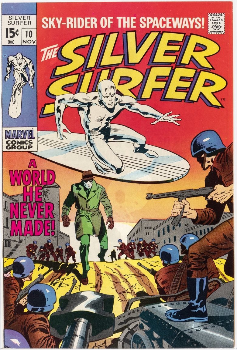 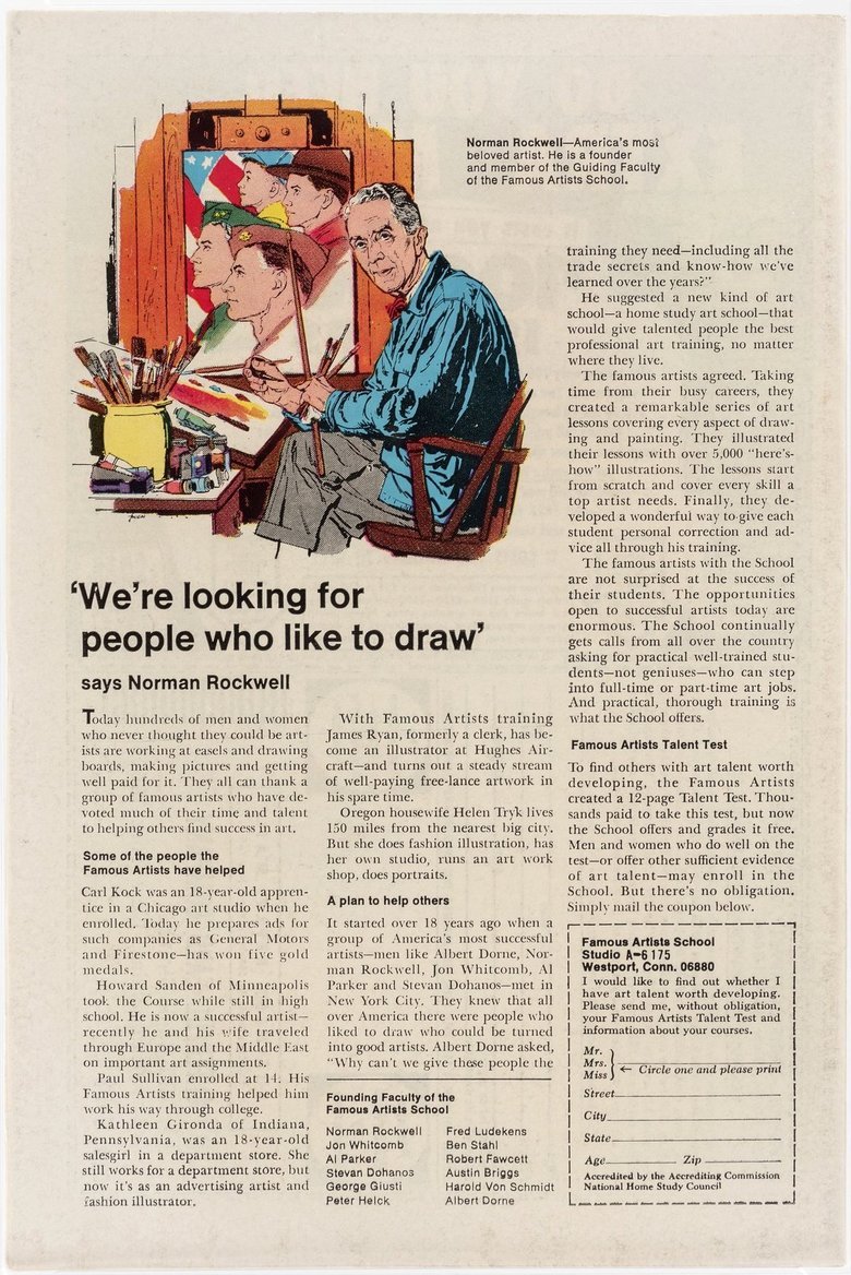 OR Graders notes: Few small spine stress barely breaks color Tiny spine corner wear breaks color Two 3/4" spine bends bottom back cover 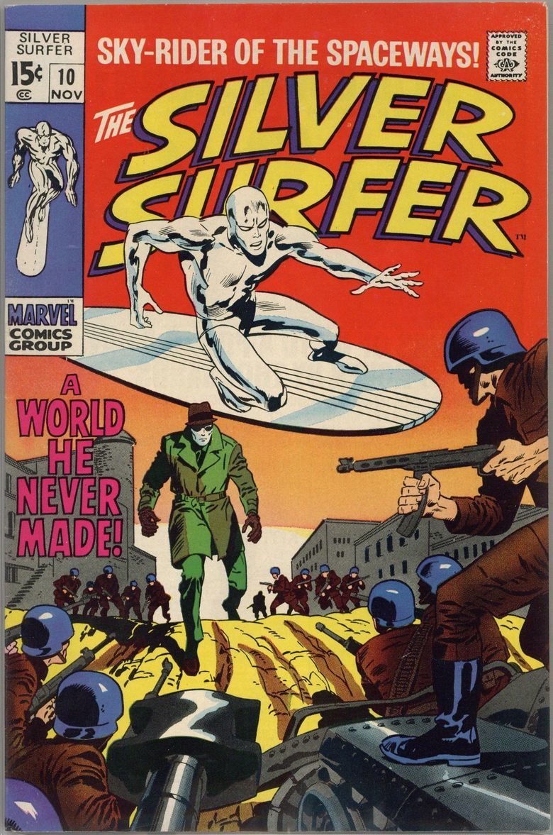 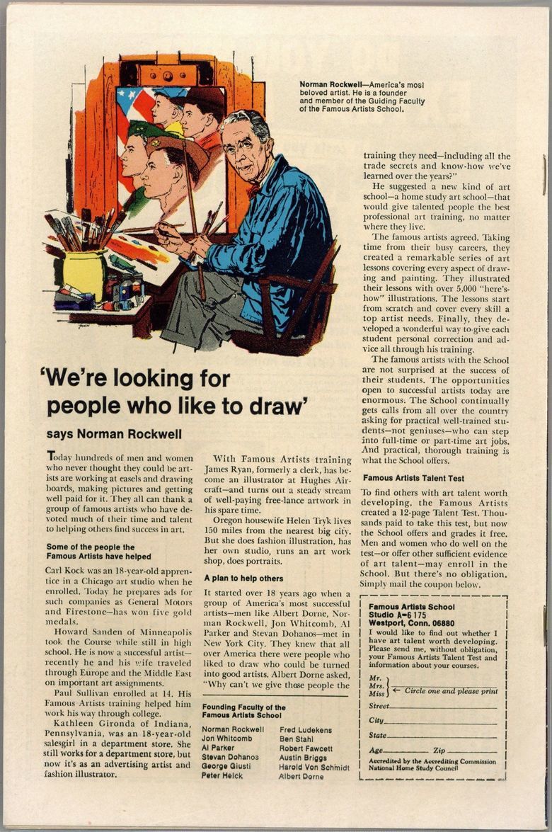 Unfortunately, these were taken by different scanners. I believe the first set was enhanced. One of these two is going to be placed for sale at MCS. Both were graded within the last year. |
||
| Post 1 • IP flag post | ||
 Collector Collector
|
codychunn private msg quote post Address this user | |
| I dunno, that top one looks like it's been cleaned or bleached or something. Somehow looks 'artificial'. | ||
| Post 2 • IP flag post | ||
 Have I told you about the time I dropped off 3,000 comics at SDCC? Have I told you about the time I dropped off 3,000 comics at SDCC?
|
Scifinator private msg quote post Address this user | |
| @codychunn - I believe it the scan was digitally enhanced. | ||
| Post 3 • IP flag post | ||
|
|
gecon private msg quote post Address this user | |
| The top one is CGC. You can see the newton ring on the cover. | ||
| Post 4 • IP flag post | ||
 -Our Odin- -Our Odin-Rest in Peace |
Jesse_O private msg quote post Address this user | |
Quote:Originally Posted by gecon LOL!! You're right!!! I wonder if that's why it was enhanced. They tried to minimize the Newton rings!!! 🤣🤣🤣  |
||
| Post 5 • IP flag post | ||
 Have I told you about the time I dropped off 3,000 comics at SDCC? Have I told you about the time I dropped off 3,000 comics at SDCC?
|
Scifinator private msg quote post Address this user | |
| UPDATED to include 2nd set of Graders Notes Quote: Originally Posted by Scifinator |
||
| Post 6 • IP flag post | ||
 " . " " . "
|
Davethebrave private msg quote post Address this user | |
| I’ll take the less expensive one. | ||
| Post 7 • IP flag post | ||
 Have I told you about the time I dropped off 3,000 comics at SDCC? Have I told you about the time I dropped off 3,000 comics at SDCC?
|
Scifinator private msg quote post Address this user | |
| So now we have both sets of Graders notes and it is clear the top has newton rings in the middle of the cover. But, which would you rather have in your collection? Also, both have at least "White Pages" quality. |
||
| Post 8 • IP flag post | ||
 It gets old smelling it everytime I go outside my door. It gets old smelling it everytime I go outside my door.
|
Nearmint67 private msg quote post Address this user | |
| @Scifinator I would prefer the bottom copy with the potentially pressable bends on the back cover. They appear to be in the 7.5 to 8.5??? |
||
| Post 9 • IP flag post | ||
 -Our Odin- -Our Odin-Rest in Peace |
Jesse_O private msg quote post Address this user | |
| As long as the discoloration on the top one is caused by Newton rings, I'd go with the top one. I like the staples to actually go through the spine and not be obviously visible on either cover. If it's actually discoloration on the top one (which I don't think it is), I'd pick the bottom one. Just my 2 cents. |
||
| Post 10 • IP flag post | ||
 I live in RI and Rhode Islanders eat chili with beans. I live in RI and Rhode Islanders eat chili with beans.
|
esaravo private msg quote post Address this user | |
| @Scifinator - I can’t really make a call based on the pictures or graders notes. The bottom one seems a little cleaner, based on the back covers. If you already have both, I would put them side by side and pick whichever one presents better (assuming that they are the same grade or very close in grade). There have been a few cases where I keep a slight lower-graded book over the higher graded one because of how they presented. | ||
| Post 11 • IP flag post | ||
 Hmm... Moderated again! Hmm... Moderated again!
|
figment private msg quote post Address this user | |
Quote:Originally Posted by esaravo I do this. I'll take a book with vivid cover colors over one that's faded. I'm willing to give up to two grade points for this at the low end, and one in the middle to upper grades. |
||
| Post 12 • IP flag post | ||
 would be nice to have a snugger fit. would be nice to have a snugger fit.
|
Sigur_Ros private msg quote post Address this user | |
| Tough. Bottom one has bad corners but the top one has a misaligned cover, a pet peeve of mine, and soiling. Bottom. Depending on grade. |
||
| Post 13 • IP flag post | ||
 Have I told you about the time I dropped off 3,000 comics at SDCC? Have I told you about the time I dropped off 3,000 comics at SDCC?
|
Scifinator private msg quote post Address this user | |
Quote:Originally Posted by Nearmint67 @Nearmint67 - The Bottom is already pressed. @SteveRicketts applied his craft and bumped it 7 levels up. |
||
| Post 14 • IP flag post | ||
 Have I told you about the time I dropped off 3,000 comics at SDCC? Have I told you about the time I dropped off 3,000 comics at SDCC?
|
Scifinator private msg quote post Address this user | |
Quote:Originally Posted by esaravo Honestly, this is a case whereby I am probably going to keep the "lower" grade in my collection. |
||
| Post 15 • IP flag post | ||
 Have I told you about the time I dropped off 3,000 comics at SDCC? Have I told you about the time I dropped off 3,000 comics at SDCC?
|
Scifinator private msg quote post Address this user | |
| So, here is some more...color...if you will: The page qualities are: Top - White Bottom - Exceptional White |
||
| Post 16 • IP flag post | ||

|
HAmistoso private msg quote post Address this user | |
 |
||
| Post 17 • IP flag post | ||
 I'm a #2. I'm a #2.
|
BigRedOne1944 private msg quote post Address this user | |
| #1 Newton Ring has nothing to do with grade of the book (Newton rings are on CBCS slabs as well) #2 I don't care if its CGC or CBCS #3 I Absolutely despise off centered covers The bottom one with the straight cover for me please |
||
| Post 18 • IP flag post | ||
 Have I told you about the time I dropped off 3,000 comics at SDCC? Have I told you about the time I dropped off 3,000 comics at SDCC?
|
Scifinator private msg quote post Address this user | |
Now for the rest of the story. The top was a recent auction win that was to potentially be an upgrade in my collection. I despise oil slick newton rings and dislike how cgc’s labels detract from focus on the comic. So my intention was to have CBCS regrade. But with cgc consistently overgrading and witnessing CBCS undergrading of recent I fear the 9.4 cgc coming back from CBCS at 8.5 or 9.0. So, i am thinking i will send in to MCS for sale. 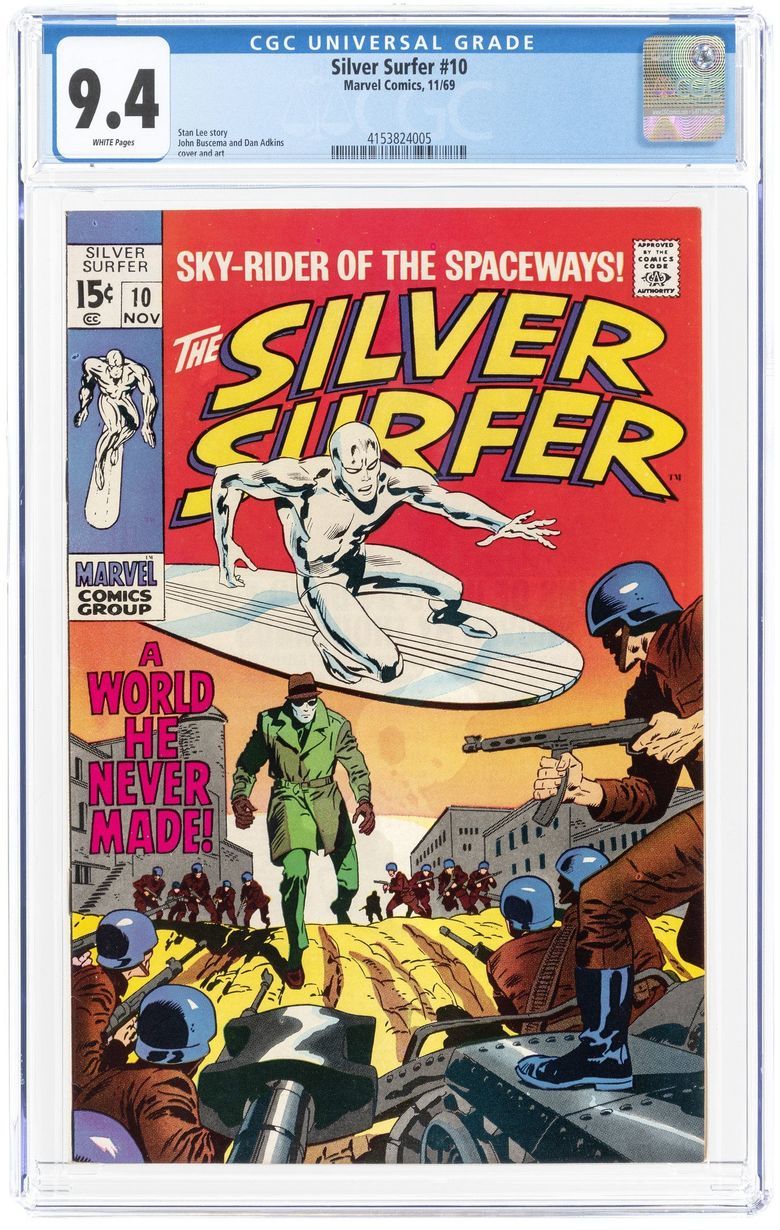 The comic below was acquired late last year as a 6.0 raw $65 purchase in need of @SteveRicketts services. Recently got it back from CBCS with grade of 9.0 Exceptional White. 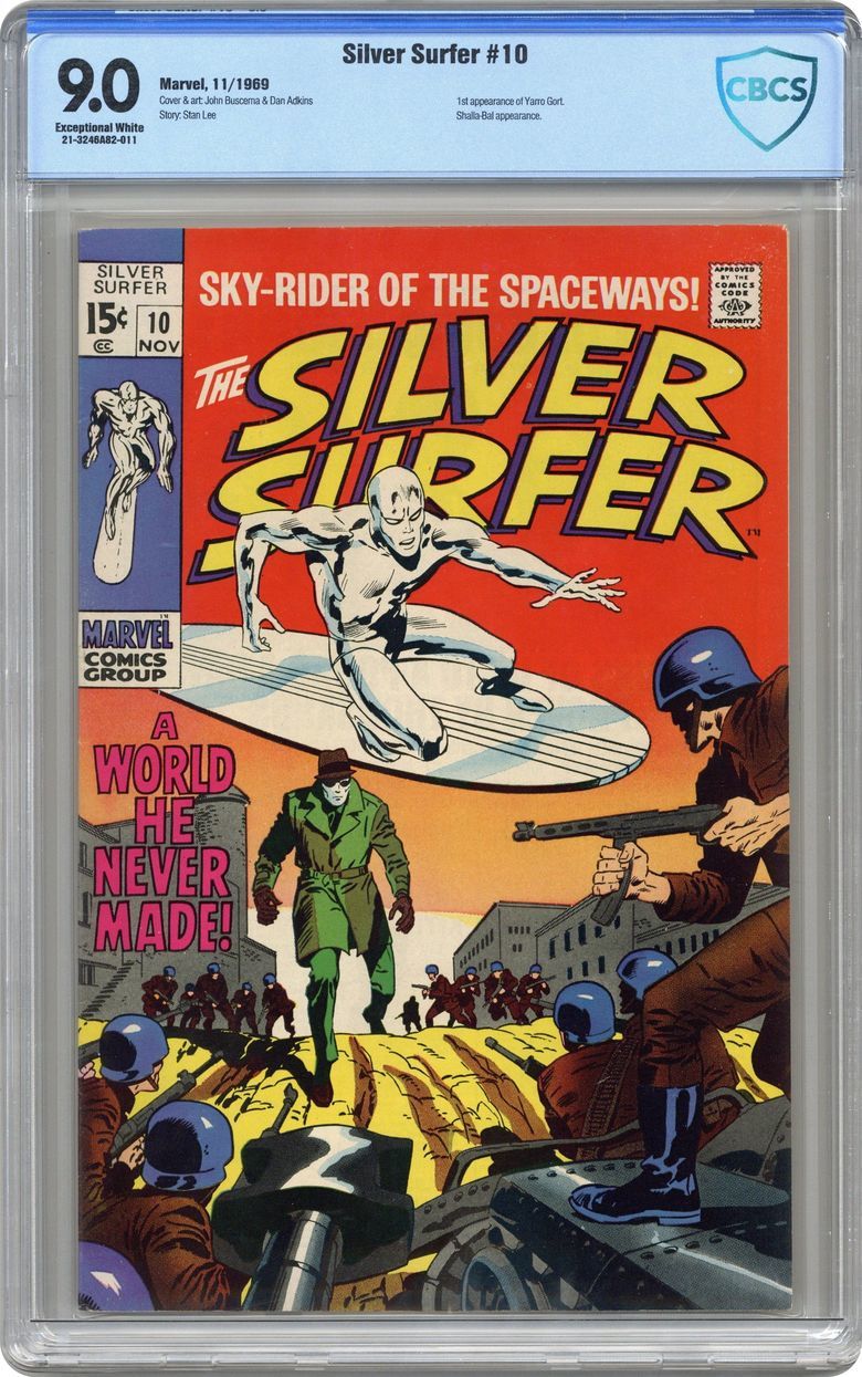 |
||
| Post 19 • IP flag post | ||
 PLOD PLOD
|
theCapraAegagrus private msg quote post Address this user | |
| The CGC copy has soiling, while the CBCS copy has larger bends to consider. Since the CBCS one is a lower grade and much cheaper, I'd go there. Edit: I didn't notice the wrap before. CBCS copy, for sure. |
||
| Post 20 • IP flag post | ||
 Have I told you about the time I dropped off 3,000 comics at SDCC? Have I told you about the time I dropped off 3,000 comics at SDCC?
|
Scifinator private msg quote post Address this user | |
| For those that mentioned the wrap, i have to say i think they are pretty equal. I believe that due to suspected digital enhancement, the inner well on the left side is giving the illusion of being white miswrap on the right side. | ||
| Post 21 • IP flag post | ||
 " . " " . "
|
Davethebrave private msg quote post Address this user | |
Quote:Originally Posted by Scifinator I agree the wraps are the same. |
||
| Post 22 • IP flag post | ||
|
|
GAC private msg quote post Address this user | |
| The CGC book has a miswrap on the spine. The white is widest at the bottom and tapers as you go up. | ||
| Post 23 • IP flag post | ||
 Have I told you about the time I dropped off 3,000 comics at SDCC? Have I told you about the time I dropped off 3,000 comics at SDCC?
|
Scifinator private msg quote post Address this user | |
@GAC - i hear what you are saying. At first glance from the scan, it looks like white spine, but it is actually white background through the clear. What appears to be the edge of the comic is actually the inner well.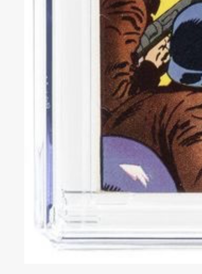 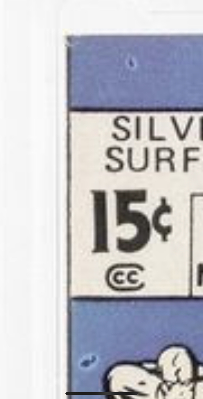 |
||
| Post 24 • IP flag post | ||
 -Our Odin- -Our Odin-Rest in Peace |
Jesse_O private msg quote post Address this user | |
| You can also see the staples. | ||
| Post 25 • IP flag post | ||
|
|
GAC private msg quote post Address this user | |
| @Scifinator You are correct!! I stand corrected! Wow....what an illusion there.....this is another example of advantages of having a book in hand. I swear I'd put money on that being a miswrap....it is not. |
||
| Post 26 • IP flag post | ||
 Have I told you about the time I dropped off 3,000 comics at SDCC? Have I told you about the time I dropped off 3,000 comics at SDCC?
|
Scifinator private msg quote post Address this user | |
| How about those two manufacturing splotches above and below the price box. While i don't think CBCS would mark down for those, it does catch my eye and as such almost makes the 9.0 cleaner to me. | ||
| Post 27 • IP flag post | ||
 Have I told you about the time I dropped off 3,000 comics at SDCC? Have I told you about the time I dropped off 3,000 comics at SDCC?
|
Scifinator private msg quote post Address this user | |
Here is a new comparison: Which would you rather have? Do close ups on the edges, especially the top and bottom.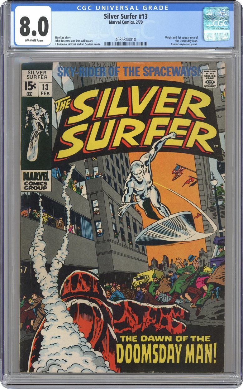 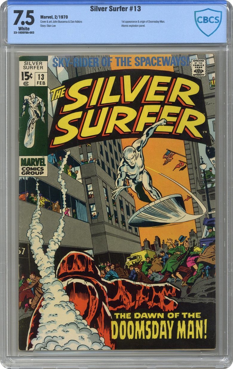 |
||
| Post 28 • IP flag post | ||
 Thank you sir. May I have another? Thank you sir. May I have another?
|
Siggy private msg quote post Address this user | |
Quote:Originally Posted by Scifinator I hate corner creases, but that edge crease on the 7.5 is a big one. Running parallel to the edge helps on the scan, but I wonder how much it stands out in hand. |
||
| Post 29 • IP flag post | ||
 Thank you sir. May I have another? Thank you sir. May I have another?
|
Siggy private msg quote post Address this user | |
Another comparison with back cover images.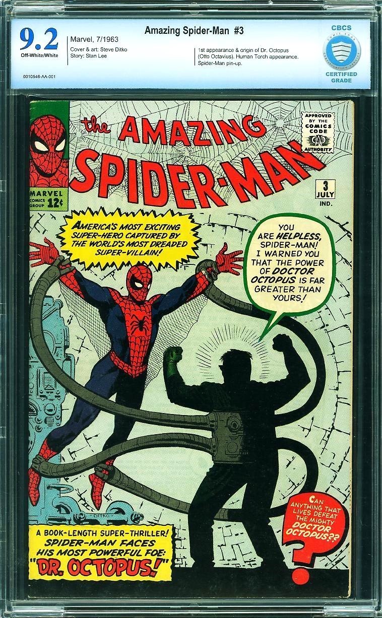 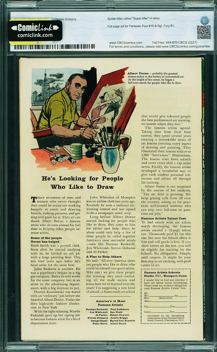 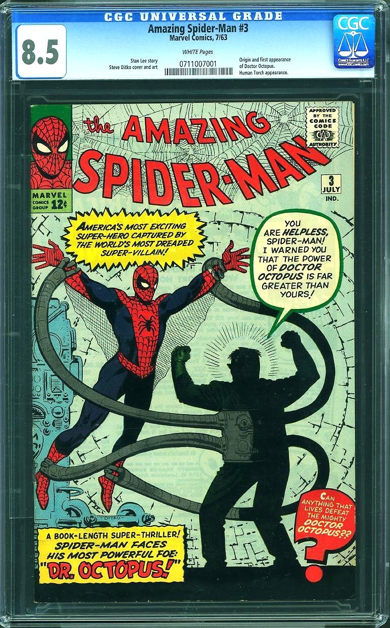 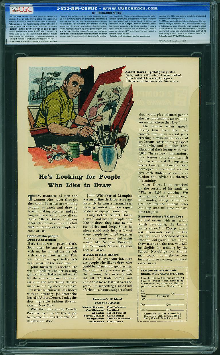 |
||
| Post 30 • IP flag post | ||
Pages:
1This topic is archived. Start new topic?
