The Golden Age of comics19
Pages:
123456789101112131415161718192021222324252627282930313233343536373839404142434445464748495051525354555657585960616263646566676869707172737475767778798081828384858687888990919293949596979899100101102103104105106107108109110111112113114115116117118119120121122123124125126127128129130131132133134135136137138139140141142143144145146147148149150151152153154155156157158159160161162163164165166167168169170171172173174175176177178179180181182183184185186187188189190191192193194195196197198199200201202203204205206207208209210211212213214215216217218219220221222223224225226227228229230231232
 Leftover Sundae Gnus Leftover Sundae Gnus
|
CatmanAmerica private msg quote post Address this user | |
MLJ leads the way! Here's PEP Comics #7 from 1940 featuring The Shield (pre-Dusty). He still has his super powers and original costume here. This is the Billy Wright pedigree copy, CGC graded, 9.2 OW/W)... 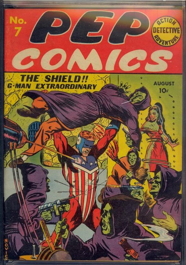 . |
||
| Post 2076 • IP flag post | ||
 PEDIGREED... Again! PEDIGREED... Again!
|
martymann private msg quote post Address this user | |
Wild splash from PEP COMICS #59. OO mm |
||
| Post 2077 • IP flag post | ||
|
Leftover Sundae Gnus
|
CatmanAmerica private msg quote post Address this user | |
PEP Comics #8 has another wild Irv Novick cover that's a whole new take on product branding. The Shield is having none of it, saying Tut, Tut to the proceedings... 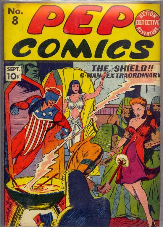 . |
||
| Post 2078 • IP flag post | ||
|
Leftover Sundae Gnus
|
CatmanAmerica private msg quote post Address this user | |
One of my favorite Irv Novick cover illustrations is PEP #9 which features The Shield saving victims from drowning in a subway tunnel. It may not have the same dramatic edge as knock-down drag-out fights with villains, but it has the heroism creds down pat... 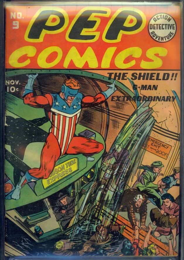 . |
||
| Post 2079 • IP flag post | ||
|
Leftover Sundae Gnus
|
CatmanAmerica private msg quote post Address this user | |
Here is the last pre-Dusty issue of PEP Comics featuring The Shield (9.2 old label CGC). This issue features a strong Irv Novick cover drawn from an interesting perspective that combines darkly nourish surroundings with vivid color... 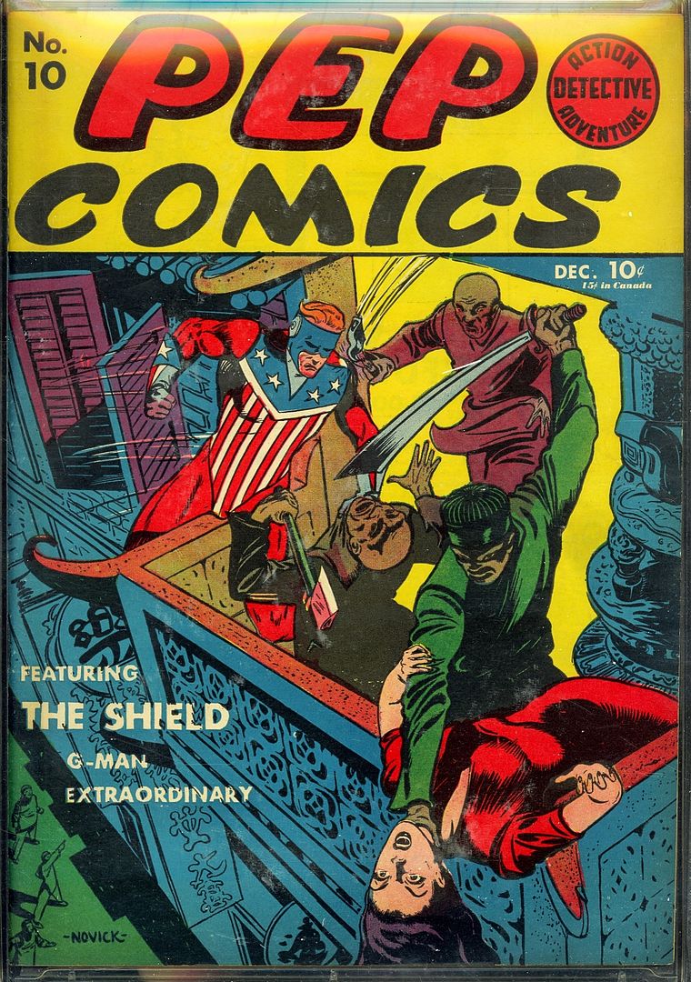 . |
||
| Post 2080 • IP flag post | ||
 Captain Accident Captain Accident
|
the420bandito private msg quote post Address this user | |
No intricate cover here. Just Oogie taking one for the team.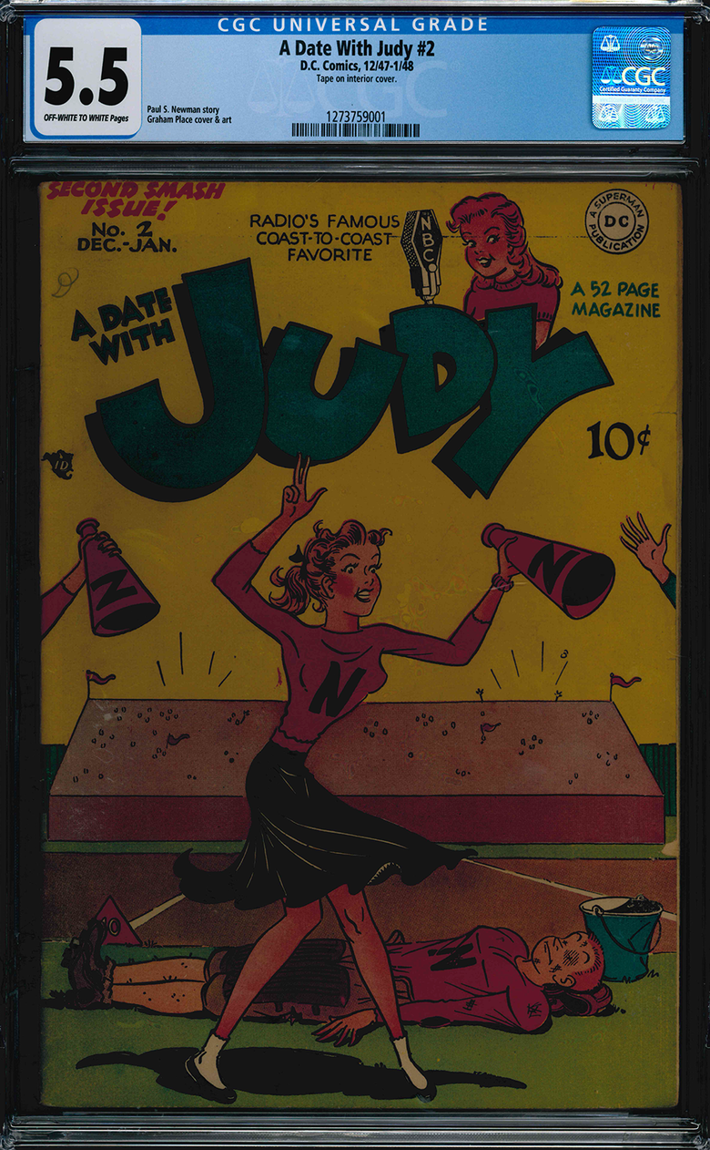 |
||
| Post 2081 • IP flag post | ||
|
Leftover Sundae Gnus
|
CatmanAmerica private msg quote post Address this user | |
Quote:Originally Posted by the420bandito Nice cover. Just a friendly suggestion, but check your scanner's brightness settings. Maybe it's just my failing eyesight (oh, no!), but that image of Judy looks extremely dark (darker, in fact, than a Graham Ingles horror cover, ...metaphorically speaking of course). Also, from what can be seen, you're apparently among the "lucky" beneficiaries of CGC's much discussed Newton Rings (the Exxon-Valdez of collector outrage). None of this takes away from the coolness of your book of course. Technically speaking, the "oil slick" is a mirage, and the darkness should be fixable with a bit of scanner/image tweaking to enhance brightness. At any rate, I'm giving your book positive feedback. |
||
| Post 2082 • IP flag post | ||
 You think I'm joking, I'm not. You think I'm joking, I'm not.
|
earthshaker01 private msg quote post Address this user | |
Quote:Originally Posted by CatmanAmericathere I fixed it for ya...sorta 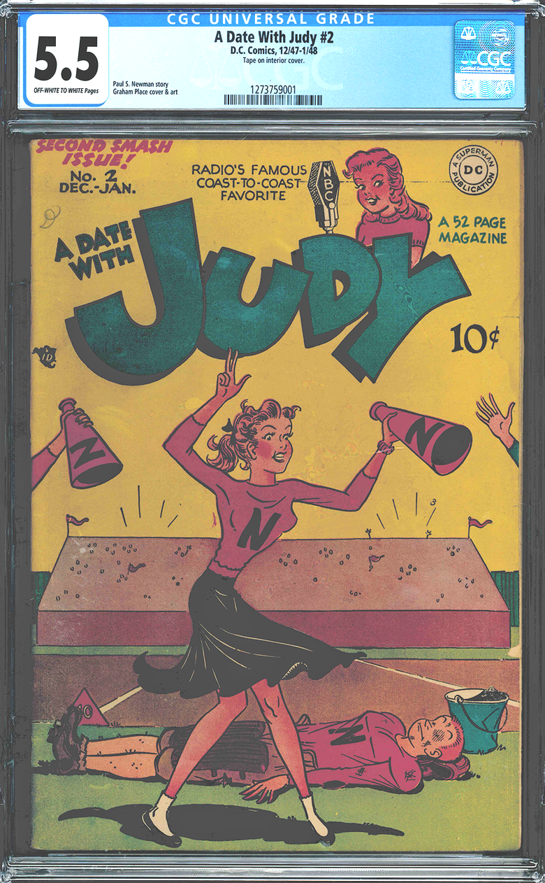 |
||
| Post 2083 • IP flag post | ||
|
Captain Accident
|
the420bandito private msg quote post Address this user | |
| The book in hand looks a little dark (maybe soiled) but no so bad. I scanned this book right after Judy #2 so I think my scanner is working right. I am wondering if using a white sheet of paper on top would help to brighten them up during scanning. I appreciate the input either way gents.  |
||
| Post 2084 • IP flag post | ||
|
Leftover Sundae Gnus
|
CatmanAmerica private msg quote post Address this user | |
| @earthshaker01 Applause! Well done, earthshaker! Resuming a post I'd just started: Here's a Schomburg Cap for which I have great fondness. It's an end-of-war issue, as readily indicated by the military theme. The action, cover balance and overall perspective are superb. This copy of Captain America #49 is 9.0 OW/W CGC (older label & slab)... 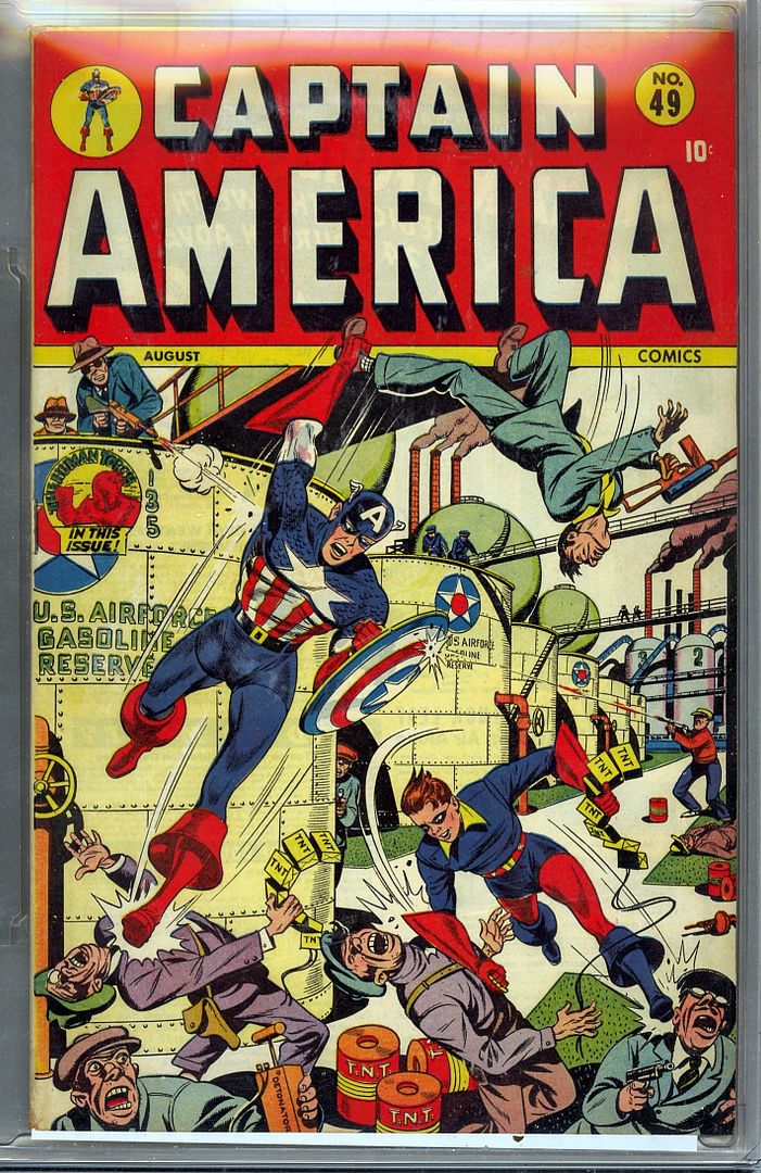 . |
||
| Post 2085 • IP flag post | ||
|
Leftover Sundae Gnus
|
CatmanAmerica private msg quote post Address this user | |
Quote:Originally Posted by the420bandito Yeah, that's pretty dark too. It's likely your scanner settings, but I could be mistaken. One thing you might try is scanning a few books with the lid open. That seems to improve the overall brightness on some images even though it's counterintuitive given the fact that light around the object being scanned escapes. Keep in mind that without knowledge of what brand of scanner you're using it makes it more difficult giving constructive advice that might remedy your particular situation. Hope this helps! . |
||
| Post 2086 • IP flag post | ||
|
Leftover Sundae Gnus
|
CatmanAmerica private msg quote post Address this user | |
| Off-topic note about scans and images photographed and uploaded. Those who use a scanner may use differing editing and storage techniques. I prefer to store images off site using the antiquated and often difficult Photobucket storage and simply link them here. The reason I still use Photobucket ...even though the site can be brutally frustrating at times... is that it allows editing (when it's working) to tweak brightness and color settings per what I'm seeing even if the scan occasionally doesn't cooperate. That said, my HP Scanjet 8300 rarely let's me down. Now that I have your undivided attention, here's another rambunctious Schomburg Cap from my collection... 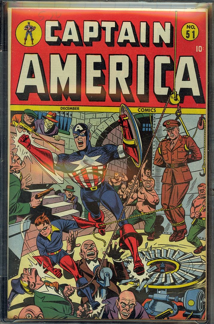 Captain America #51 (CGC 9.2 OW/W), is interesting because it may have been penciled some time prior to the end of WWII and then reconfigured. The reason I'm tossing this idea out is that the shirtless brutes torturing the high ranking military officer look a lot like Nazis without uniforms & helmets. Also, a closer examination of those directing this violence from the small balcony leave the distinct impression of a unified Nazi and Imperial Japanese command. In fact, the dude wearing the Peaky Blinder's cap, looks suspiciously like Hitler. Of course, other's impressions may vary, but this Timely Cap could be one of the few post war Hitler covers! . |
||
| Post 2087 • IP flag post | ||
|
You think I'm joking, I'm not.
|
earthshaker01 private msg quote post Address this user | |
Quote:Originally Posted by CatmanAmericathat's the last one lol, here a little brighter 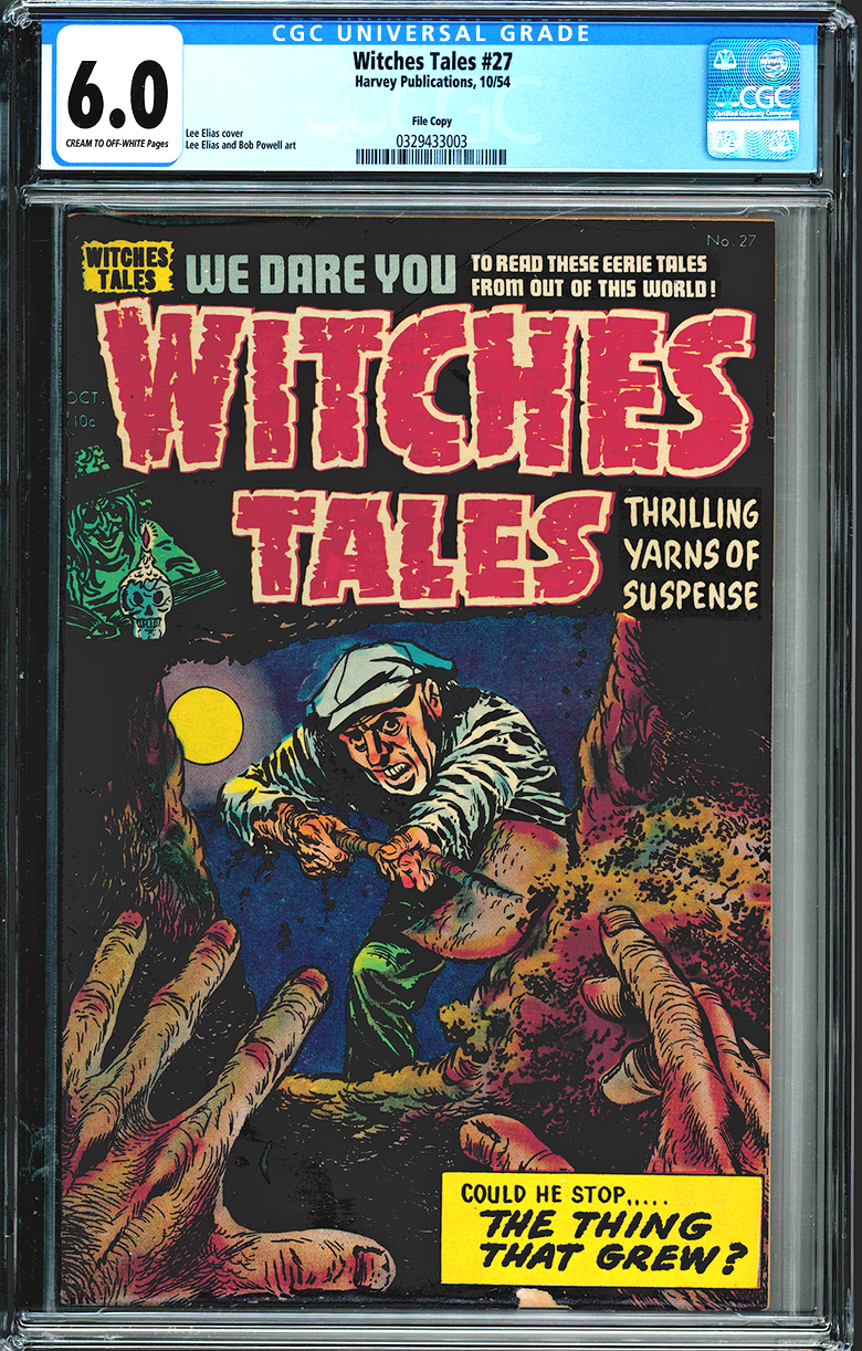 |
||
| Post 2088 • IP flag post | ||
 Collector Collector
|
Sagii private msg quote post Address this user | |
Loving the books! Superheroes, Teens and Horror, so very eclectic. Here's another one from my 'vault'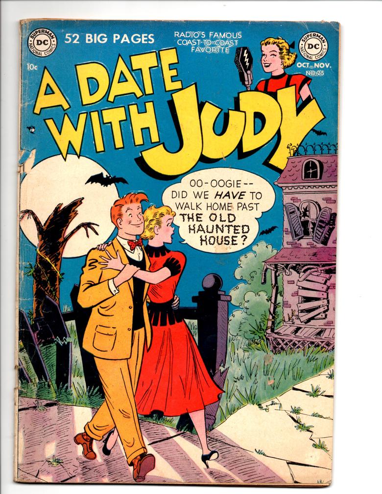 |
||
| Post 2089 • IP flag post | ||
|
Leftover Sundae Gnus
|
CatmanAmerica private msg quote post Address this user | |
Judy has good reason to be scared. This is what's behind the house... 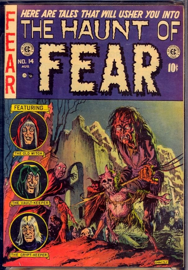 . |
||
| Post 2090 • IP flag post | ||
|
Collector
|
Sagii private msg quote post Address this user | |
| @CatmanAmerica She'd have good reason to be.. | ||
| Post 2091 • IP flag post | ||
|
Leftover Sundae Gnus
|
CatmanAmerica private msg quote post Address this user | |
Quote:Originally Posted by Sagii Thanks Sagii! Gaines File Copies are scary things indeed! . |
||
| Post 2092 • IP flag post | ||
|
Leftover Sundae Gnus
|
CatmanAmerica private msg quote post Address this user | |
| I think it's time to dig out another high grade copy of Captain America! This issue sports an impressive Vince Alascia cover ... 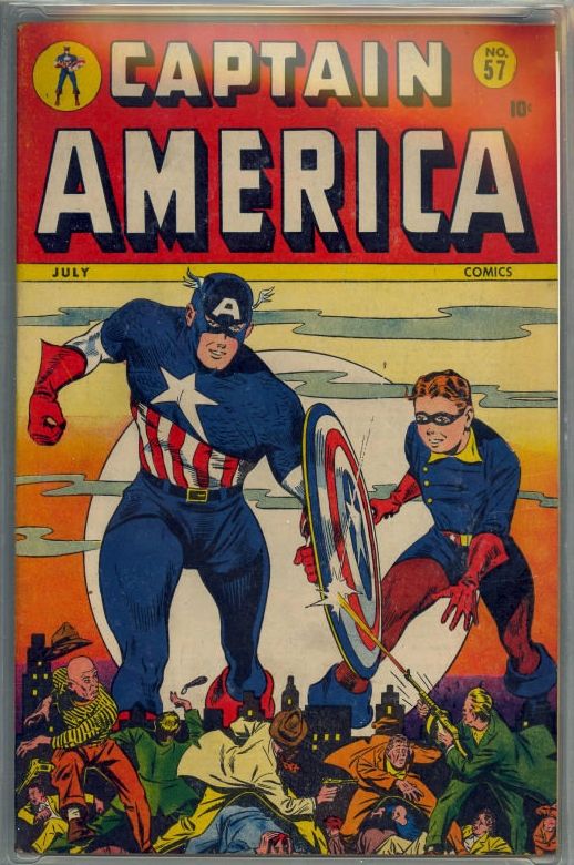 . |
||
| Post 2093 • IP flag post | ||
|
PEDIGREED... Again!
|
martymann private msg quote post Address this user | |
| Most of my ARCHIE COMICS came from the revolving rack at the Greyhound Bus Station. 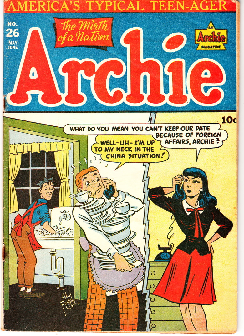 OO mm |
||
| Post 2094 • IP flag post | ||
|
Leftover Sundae Gnus
|
CatmanAmerica private msg quote post Address this user | |
Quote:Originally Posted by martymann It would appear that Veronica is about to levy a heavy tariff on Archie's poor communication skills. I'm just wondering if his confused behavior hasn't been exacerbated by the prolonged use of orange hair dye! Alas, my collection is virtually Archie-less. I even failed to save any of the comic strips that wrapped individual pieces of Super Bubble bubblegum! Irrespective of my oversight, I still fondly recall Archie & Jughead cornering the bubblegum market back then. Great characters. The few humorous super hero covers in my collection are pretty much limited to Jack Cole's Plastic Man. Those usually lean more towards the surreal or ironic than knee-slapping funny. . |
||
| Post 2095 • IP flag post | ||
|
Leftover Sundae Gnus
|
CatmanAmerica private msg quote post Address this user | |
OTOH, while Timely wasn't known for humorous double-entendres (especially in their super hero lines) this pun playing off the old adage "fat of the land" struck me as rather funny... 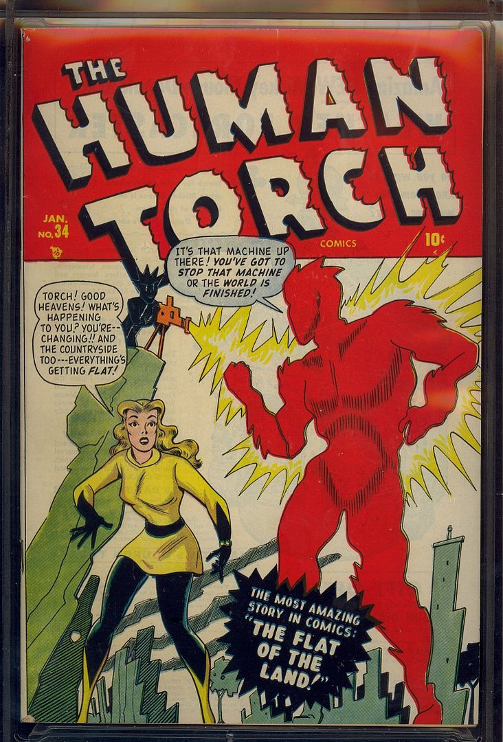 Now I'm curious as to who came up with the off-beat story title, ...Stan Lee, perhaps? . |
||
| Post 2096 • IP flag post | ||
|
Leftover Sundae Gnus
|
CatmanAmerica private msg quote post Address this user | |
| Always loved this issue! Syd Shores created an absolutely spectacular cover for Captain America #60. To start with, The Human Fly is a bizarre villain with suction-cups, goggled mask and tails and a distressed female kidnap victim under his arm. The elevated angle of the battle with Cap & Bucky from the free swinging water tower ladder is intense. Great stuff from a post-WW II Timely! 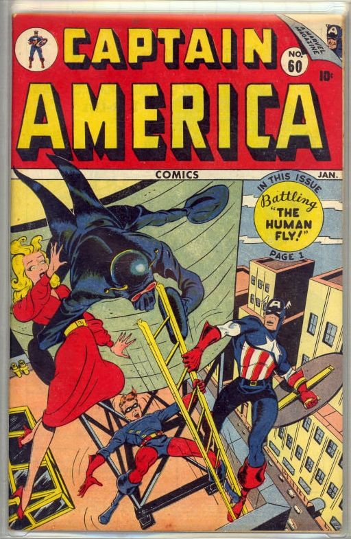 . |
||
| Post 2097 • IP flag post | ||
 COLLECTOR COLLECTOR
|
Foghorn_Sam private msg quote post Address this user | |
Quote:Originally Posted by CatmanAmerica Does that say "A MARVEL MAGAZINE" in the upper right corner? How much does this predate the the actual name change to Marvel? |
||
| Post 2098 • IP flag post | ||
 I don't believe this....and I know you don't care that I don't believe this. I don't believe this....and I know you don't care that I don't believe this.
|
GAC private msg quote post Address this user | |
Quote:Originally Posted by Foghorn_Sam Great observation and question! I'm interested in this answer myself. |
||
| Post 2099 • IP flag post | ||
 Collector Collector
|
X51 private msg quote post Address this user | |
The Marvel name was used a lot in 1949. 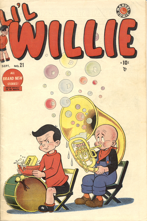 |
||
| Post 2100 • IP flag post | ||
 I'll probably wake up constipated. I'll probably wake up constipated.
|
Pre_Coder private msg quote post Address this user | |
Quote:Originally Posted by GAC This particular issue probably hit the stands Nov '46 and the publisher name change to Marvel was in '61 just prior to the launch of FF#1 |
||
| Post 2101 • IP flag post | ||
|
PEDIGREED... Again!
|
martymann private msg quote post Address this user | |
| The indicia in CAPTAIN AMERICA #64 lists the publisher as COMPLETE PHOTO STORY CORP. Marty |
||
| Post 2102 • IP flag post | ||
|
PEDIGREED... Again!
|
martymann private msg quote post Address this user | |
One of my all time favorite "One-Shots".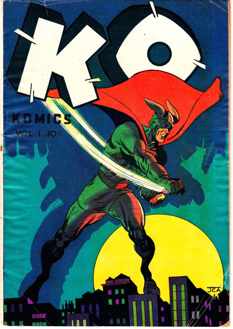 OO mm |
||
| Post 2103 • IP flag post | ||
|
I'll probably wake up constipated.
|
Pre_Coder private msg quote post Address this user | |
Quote:Originally Posted by CatmanAmerica I have this issue as well. The colors on this GA cover are vibrant considering the depiction is a dark, gloomy, eerie, night scene. The artist did a good job with the moon. |
||
| Post 2104 • IP flag post | ||
|
You think I'm joking, I'm not.
|
earthshaker01 private msg quote post Address this user | |
Quote:Originally Posted by martymanndude send me that book and I'll press it for ya |
||
| Post 2105 • IP flag post | ||
Pages:
123456789101112131415161718192021222324252627282930313233343536373839404142434445464748495051525354555657585960616263646566676869707172737475767778798081828384858687888990919293949596979899100101102103104105106107108109110111112113114115116117118119120121122123124125126127128129130131132133134135136137138139140141142143144145146147148149150151152153154155156157158159160161162163164165166167168169170171172173174175176177178179180181182183184185186187188189190191192193194195196197198199200201202203204205206207208209210211212213214215216217218219220221222223224225226227228229230231232