Could I get some insight on why my book got the grade it did?18588
Pages:
1|
|
SoulReaverDan private msg quote post Address this user | |
| I just got my first book from CBCS back after Baltimore Comic-Con... last year... and while I'm happy to have it back for my display wall, I was a bit surprised by how low the grade was. It's Deadpool's Secret Secret Wars #2 Gwenpool variant, signed and remarqued by Chris Bachalo (really nice guy, he was a lot of fun to talk to). It came back as a 7.5 with the following grader notes: -small impact top spine barely breaks color front cover -small tear & crease top edge back cover breaks color -surface wear along spine back cover breaks color I'm still kinda new to the graded comics game, and this is the first book I got back from any grading service that just felt off. Can I get some insight from folks that have more experience or understanding of things? I understand it's not a perfect copy, but all the way down to a 7.5 just felt too low. Thanks y'all! 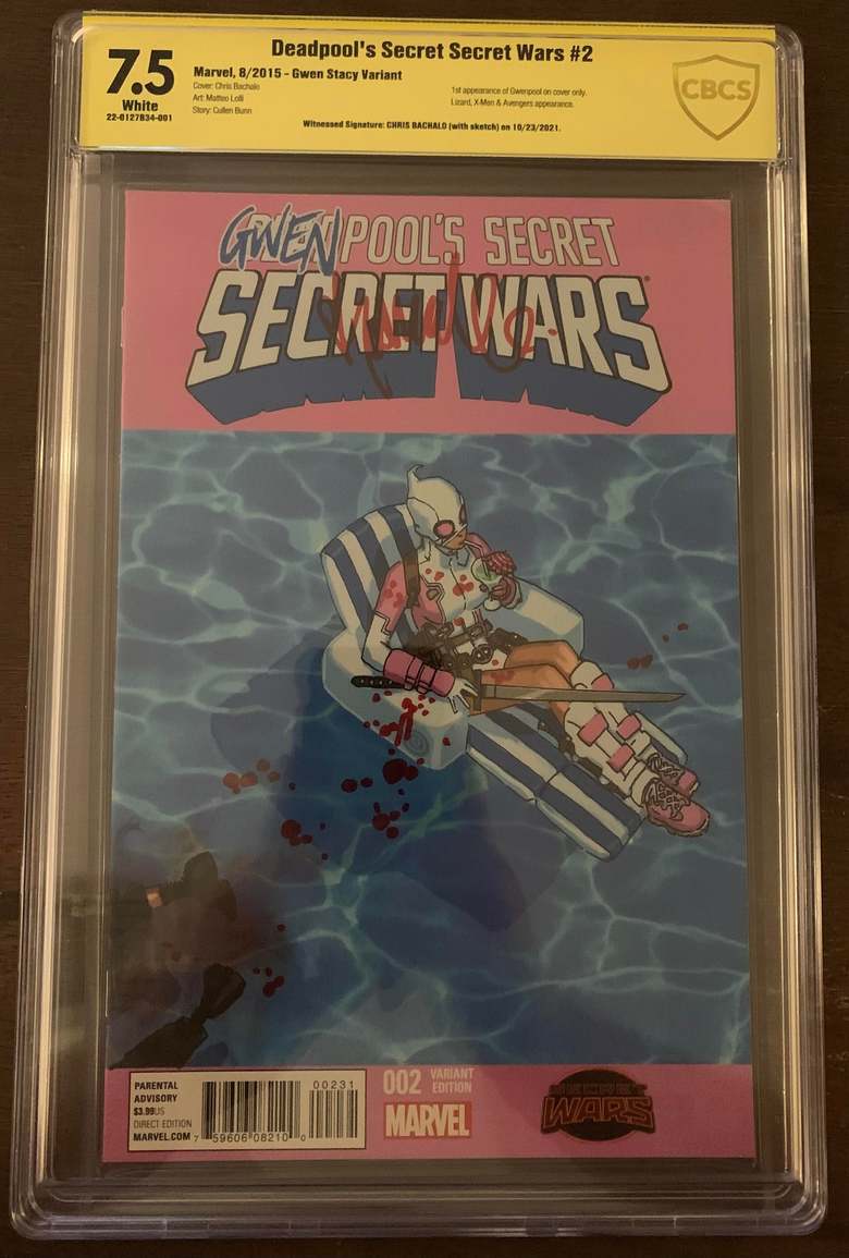    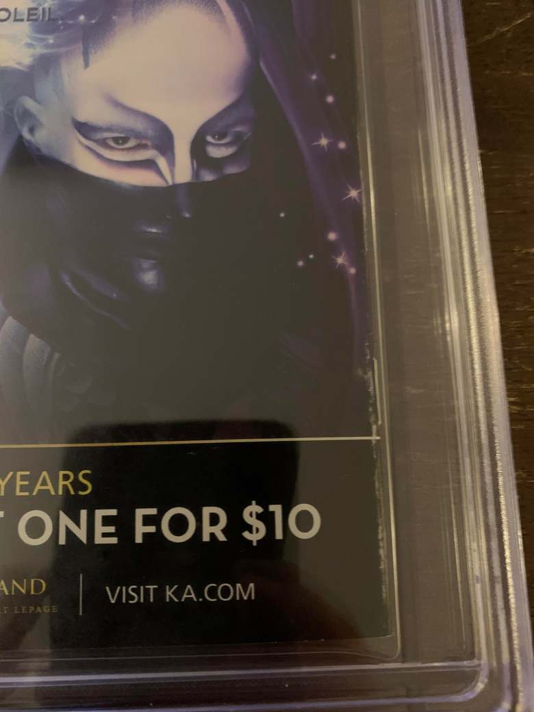 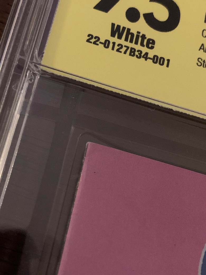 |
||
| Post 1 • IP flag post | ||
 Collector Collector
|
Bakersman private msg quote post Address this user | |
| Its hard to tell from the pics but any kind of tear will significantly bring the grade down.(Similar to foxing on a white cover). Along with minor spine wear and a crease will hurt the grade. This also plays into the idea that yellow label books get graded tight, recently. Very cool book though!! Enjoy it! |
||
| Post 2 • IP flag post | ||
 " . " " . "
|
Davethebrave private msg quote post Address this user | |
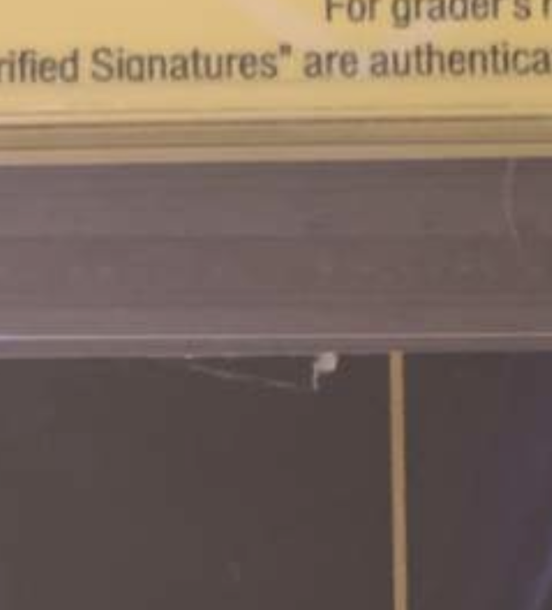
| My opinion, if the resolution of the photo is too low for the label text to be sharp, it is too low to properly assess the condition of the book. At least to distinguish grades in the upper half of the range. | ||
| Post 3 • IP flag post | ||
|
|
SoulReaverDan private msg quote post Address this user | |
Quote:Originally Posted by Davethebrave So not being snarky, genuine question - I took these on my phone (iPhone XR), is there a better way to get the pics at a better resolution? Should I hold it closer or something? Short of getting a new phone or buying a camera, I’m. It that incensed about the grade. |
||
| Post 4 • IP flag post | ||
 I live in RI and Rhode Islanders eat chili with beans. I live in RI and Rhode Islanders eat chili with beans.
|
esaravo private msg quote post Address this user | |
| @SoulReaverDan - Welcome to the CBCS forums, Dan. That grade does seem to be a bit low, but in my opinion modern books are almost expected to be perfect and are held to higher and tighter standards than older books. I would guess that the small tear at the top of the back cover was about a 1 point deduction, as was the 3 to 4-inch color rub along the lower spine. Add in another 0.5 deduction for the corner impact, and that would get you a 7.5. Again, this is just me trying to rationalize the grade. I know CGC just came out with a book on how to grade comics. I haven’t seen one yet, but would be curious to see what deductions they would list for these defects in modern comics. | ||
| Post 5 • IP flag post | ||
|
" . "
|
Davethebrave private msg quote post Address this user | |
Quote:Originally Posted by SoulReaverDan Do you happen to have a scanner? I think a combination is most helpful since a scanner isn’t ideal for all defects either. Also, more ambient lighting (ambient better than too many near point lights due to reflections). Btw, this is a general comment. I think grading from photos is extremely difficult - at least to ascertain grades that are “too low”… I have some CGC graded books that look better than the grade, if I didn’t know exactly where the defects are (or the accumulation of minor ones not obvious from a photo). Finally, I would dig deeper on the impact note with barely breaks color… can you see interior page damage from impact? Perhaps from a top angle? Just because it barely breaks color on cover doesn’t mean that impact didn’t cause other damage less visible from a front cover view… |
||
| Post 6 • IP flag post | ||
 would be nice to have a snugger fit. would be nice to have a snugger fit.
|
Sigur_Ros private msg quote post Address this user | |
Quote:Originally Posted by SoulReaverDan More light always helps. Then just make sure you're holding the phone still. More angles could help too. |
||
| Post 7 • IP flag post | ||
 Collector Collector
|
GanaSoth private msg quote post Address this user | |
| Welcome to the Forums! Looks like you have a lot of color rub on the rear cover near the spine. Folded corners front and back, and a tear in the top middle of the rear cover. Tears will really hurt the grade of any comic. Color breaking folds too. So that grade seems about right. |
||
| Post 8 • IP flag post | ||
 Please continue to ignore anything I post. Please continue to ignore anything I post.
|
southerncross private msg quote post Address this user | |
 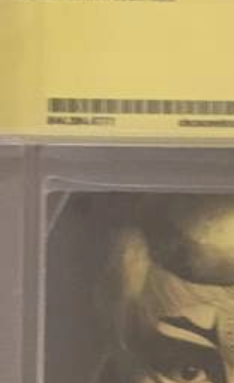  @SoulReaverDan welcome to the forum Looks like from the pics you have a corner crease that goes all the way through the book, the crease also breaks color. That looks like either a tear or a crease that also breaks color. A bit of wear for a modern book. That would be why it's graded so low |
||
| Post 9 • IP flag post | ||
 Collector Collector
|
Zombiebigfoot private msg quote post Address this user | |
| @SoulReaverDan Welcome to the forums Dan! If you have access to a scanner that’s a huge plus as @Davethebrave suggested. If not then the app PhotoScan can be used to take quality pics of your book(s). In either case you can get a better look at what the eye might miss with some hi-res pics. Again, welcome to the forums & what a fantastic book to share!   |
||
| Post 10 • IP flag post | ||
 past performance is no guarantee of future actions. past performance is no guarantee of future actions.
|
KatKomics private msg quote post Address this user | |
| yeah, 100% that edge tear on the top of the back cover is the culprit. There are some on-line tools to help if you are not sure of your own grading skills This one is ok (although not exhaustive in the examples to choose from) https://www.comicbookgradingtool.com/ clickable text I find the Overstreet grading guides are good too - again though not exhaustive in the examples (I have 2 editions - might get a 3rd?) but they will point you in the right direction! |
||
| Post 11 • IP flag post | ||
 I don't want to brag, but cashiers are always checking me out. I don't want to brag, but cashiers are always checking me out.
|
power_struggle55 private msg quote post Address this user | |
| the qr code should link you to what the issues were | ||
| Post 12 • IP flag post | ||
 Where's his Bat-package? Where's his Bat-package?
|
Byrdibyrd private msg quote post Address this user | |
| I'm with @KatKomics . The tear on the back cover hurts the most, and on a new(er) book, that will hurt a lot. As for that 'corner crease' back cover top left, I don't think that's a crease. Check that quarter panel to the right of it and you'll see a similar 'crease.' I think that's part of the artwork. @Sigur_Ros Happy B-day! |
||
| Post 13 • IP flag post | ||
|
would be nice to have a snugger fit.
|
Sigur_Ros private msg quote post Address this user | |
Quote:Originally Posted by Byrdibyrd Why thank you.  |
||
| Post 14 • IP flag post | ||
|
Collector
|
GanaSoth private msg quote post Address this user | |
| @Sigur_Ros Oh Yeah. I didn't even notice the Birthday Cake Icon. Happy B-Day. | ||
| Post 15 • IP flag post | ||
|
would be nice to have a snugger fit.
|
Sigur_Ros private msg quote post Address this user | |
Quote:Originally Posted by GanaSoth Thank you too  |
||
| Post 16 • IP flag post | ||
|
would be nice to have a snugger fit.
|
Sigur_Ros private msg quote post Address this user | |
Quote:Originally Posted by southerncross I think this explains it. |
||
| Post 17 • IP flag post | ||
 I'm waiting.... (tapping fingers). I'm waiting.... (tapping fingers).Splotches is gettin old! |
Nuffsaid111 private msg quote post Address this user | |
| I remember when this book came out; all the speculation associated with it, and thinking to myself "wth is a gwenpool"? 7 years later, I still don't know |
||
| Post 18 • IP flag post | ||
 I have not set up at a con since 2029. I have not set up at a con since 2029.
|
PolarisNuclearSS2020 private msg quote post Address this user | |
| 7.5 is accurate. Top left FC has a pretty severe impact ding. (breaks ink, that entire corner is bent frontwards) Top right corner of the FC is also bent full with a FC corner crease that breaks cover. Lighter bend than the left top FC corner and the "crease" noted by another poster is actually part of the BC cover art;not a crease You can see the "crease" is cover art on this raw copy much more clearly. https://www.ebay.com/itm/284707087072?chn=ps&mkevt=1&mkcid=28 Than there's the tear & CB creasing center of top BC...than the bottom of the spine on the BC has nearly 2 inches worth of edge abrasion.....those and the defects I noted above are the biggest defects, and I didnt even blow up the pics to look over the spine on the BC/FC for CB spine ticks/stress lines which the graders notes notate on the BC *Can't recall the name for a particular defect that looks much like that, just not nearly as severe...and it's present on the entire length of the spine. You'll see it on all CBCS and CGC 9.8 graded early issues of Sandman, as well as on Preacher #1. Pre-edit: It's called feathering, just remembered. Someething like fleckling or speckling. I don't think this book was graded too harshly. Could have gotten an 8.0 if pressed but may just have stayed at 8.0 as the CB issues & tear etc are pushing it for an 8.0 if it had been pressed. |
||
| Post 19 • IP flag post | ||
|
Where's his Bat-package?
|
Byrdibyrd private msg quote post Address this user | |
| Total agreement with @ComicHoarder . The thing that really did it was the tear and associated crease on the back cover. A defect like that on a new(er) book will bring the grade down everytime. It also doesn't help that the back cover is dark so the defects there show up really well. Keep in mind that while this comic may not help much as a retirement investment, it's a cool, signed book nonetheless, and front cover eye appeal is fantastic for the grade. Should you ever choose to sell, that will make a difference. |
||
| Post 20 • IP flag post | ||
 I'm a #2. I'm a #2.
|
BigRedOne1944 private msg quote post Address this user | |
| Hi Dan.... Welcome to the world of Comic Book Grading! It looks as though the board has pretty much covered the obvious reason for the grade(Which I believe is accurate) For a modern book you might be lucky it didn't go the other way and get a 7.0 Good Day Sir |
||
| Post 21 • IP flag post | ||
|
|
SoulReaverDan private msg quote post Address this user | |
Quote:Originally Posted by Nuffsaid111 It started as just this variant cover, part of a Gwen Stacy themed month of variants. It took off with cosplayers and fanartists, and they eventually made her a proper character. She's Gwen Poole, a Marvel fan from (presumably) our universe who got sucked into Earth-616 in the wake of Secret Wars. She did a little backup work in Howard the Duck, then got her own solo title for 25 issues, which was unironically one of the best books of the 2010's. She's a comic fan in a comic world, trying to leverage her knowledge of how comics work, but also faced with the reality that other than knowing some stuff about the world she shouldn't, she's basically a baseline human. And trying to reconcile that even though the characters around her are all fictional creations, the world she's in and they themselves consider themselves very, very real and how that comes into conflict with herself. Like, it's an incredible book, 100% recommended. |
||
| Post 22 • IP flag post | ||
|
|
SoulReaverDan private msg quote post Address this user | |
Quote:Originally Posted by Byrdibyrd I did get it signed and graded basically for my personal collection and display appeal (I have a wall of slabbed books) and the authentication for the remarque on it, so I'm not completely broken up over it. I'm still somewhat new to this and just wanted to see if I could get some greater insight - which y'all have given. Thanks! |
||
| Post 23 • IP flag post | ||
|
Where's his Bat-package?
|
Byrdibyrd private msg quote post Address this user | |
Quote:Originally Posted by SoulReaverDan At the end of the day, one of the best reasons to get a book slabbed is Because You Want To. Preserving a book that means something to you or just because you like it is a good move. |
||
| Post 24 • IP flag post | ||
 Moderators handing out titles: Boom. Roasted. Moderators handing out titles: Boom. Roasted.
|
Hcanes private msg quote post Address this user | |
| @SoulReaverDan welcome to the forum. I agree with you, Unbelievable Gwenpool was a fun read. It didnt take itself too seriously. I like how her character retconned herself to be a mutant. |
||
| Post 25 • IP flag post | ||
|
|
SoulReaverDan private msg quote post Address this user | |
Quote:Originally Posted by Hcanes Or was she actually one the whole time? mysterious wiggly fingers |
||
| Post 26 • IP flag post | ||
 SpongeBob Comics #1 sells for $991! SpongeBob Comics #1 sells for $991!
|
Joosh private msg quote post Address this user | |
The question has been answered thoroughly so all I want to say is this forum is the best. A valid question was asked. Valid answers were given; not a keyboard warrior in site.  |
||
| Post 27 • IP flag post | ||
Pages:
1This topic is archived. Start new topic?