Cool printing error color variants17840
Pages:
1
 Masculinity takes a holiday. Masculinity takes a holiday.
|
EbayMafia private msg quote post Address this user | |
| I noticed in this inking error I actually like the purplish variant more than the standard. Anyone agree? What else is out there where the error is maybe more interesting than the normal? Error 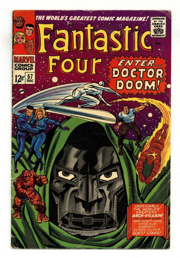 Normal 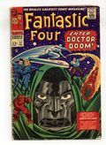 |
||
| Post 1 • IP flag post | ||
 Where's his Bat-package? Where's his Bat-package?
|
Byrdibyrd private msg quote post Address this user | |
I've always been fond of this one.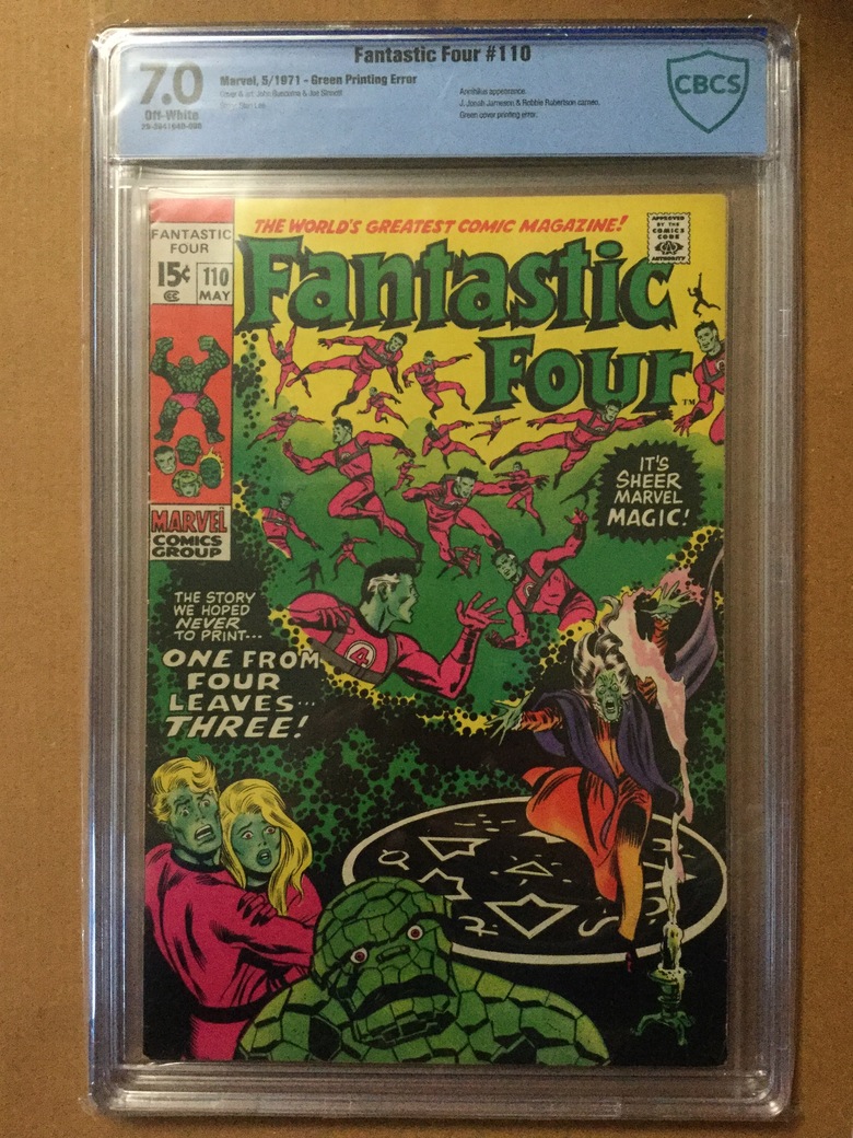 Kinda like this Superman one, too. It's supposed to be silver foil but a few got through with gold. 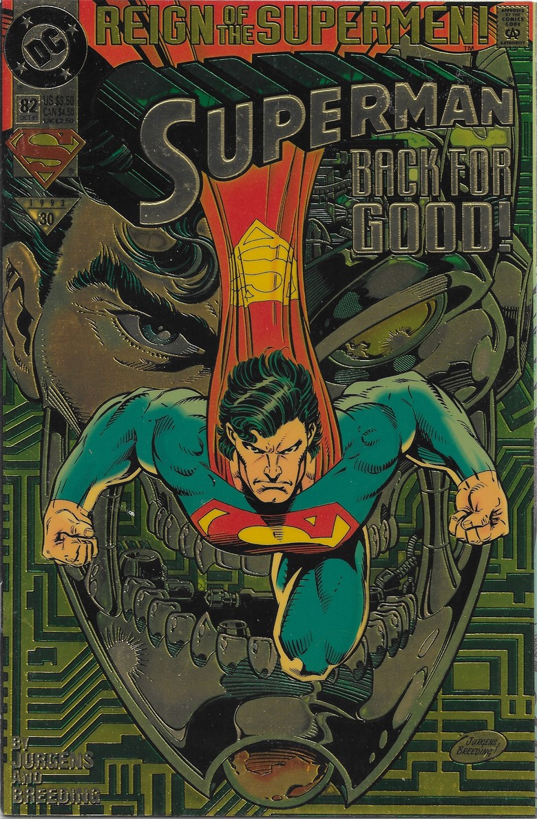 |
||
| Post 2 • IP flag post | ||
|
Masculinity takes a holiday.
|
EbayMafia private msg quote post Address this user | |
| The FF 110 is pretty famous but I've never seen the Superman one before. Pretty cool. | ||
| Post 3 • IP flag post | ||
|
Where's his Bat-package?
|
Byrdibyrd private msg quote post Address this user | |
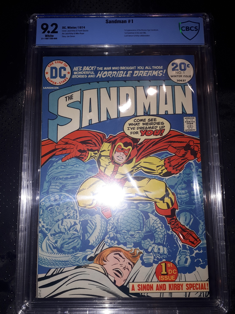
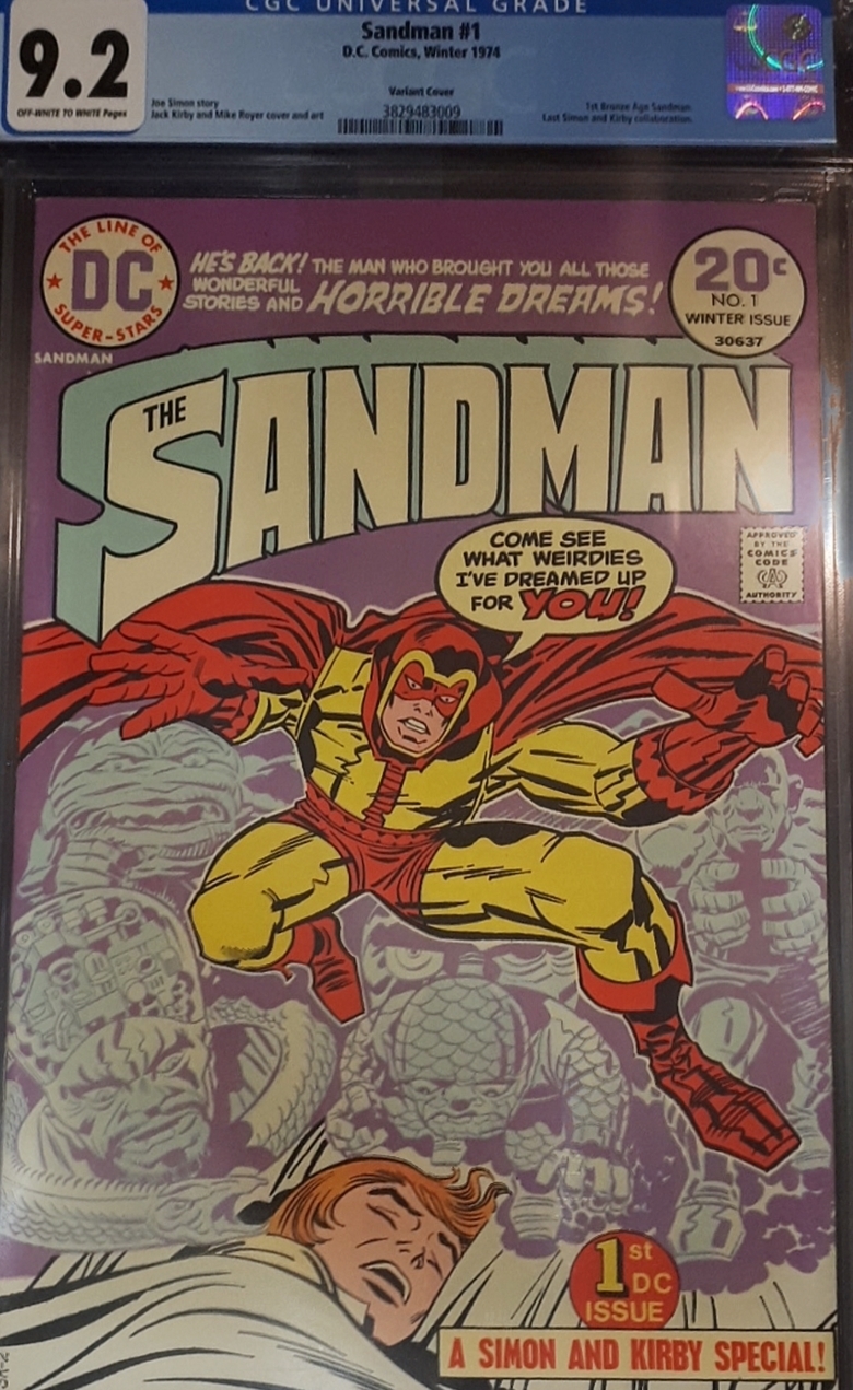
There's also the purple Bronze Age Sandman cover, but I don't happen to have a photo of mine handy. I do have this, though. I always thought the holograms were so gimmicky, and the error ones are such a lovely shade of blue! |
||
| Post 4 • IP flag post | ||
 I don't believe this....and I know you don't care that I don't believe this. I don't believe this....and I know you don't care that I don't believe this.
|
GAC private msg quote post Address this user | |
  |
||
| Post 5 • IP flag post | ||
|
Where's his Bat-package?
|
Byrdibyrd private msg quote post Address this user | |
| Those are both so much nicer than mine! Honestly, I think both look great. The blue one is so nice, but the purple one makes Sandman really pop out. | ||
| Post 6 • IP flag post | ||
Pages:
1This topic is archived. Start new topic?