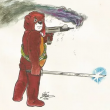
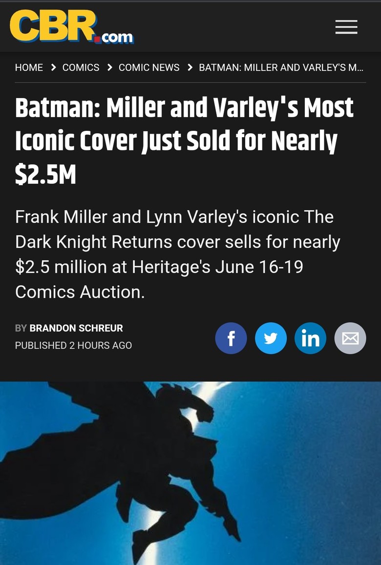
Dark Knight Returns Cover ILLUSION?17805
 Masculinity takes a holiday. Masculinity takes a holiday.
|
EbayMafia private msg quote post Address this user | |
Quote:Originally Posted by Darkseid_of_town You can't prove it! Could be a cold night for the Dark Knight. |
||
| Post 26 • IP flag post | ||
 Collector Collector
|
doog private msg quote post Address this user | |
| My brain saw it away. I remember seeing it for sale new back then in a comic book store I was in, I didn’t collect back then. Now I am gonna pick one up! |
||
| Post 27 • IP flag post | ||
 If the viagra is working you should be well over a 9.8. If the viagra is working you should be well over a 9.8.
|
xkonk private msg quote post Address this user | |
Quote:Originally Posted by Darkseid_of_town just more evidence that he's facing away from us! |
||
| Post 28 • IP flag post | ||
 Collector Collector
|
etapi65 private msg quote post Address this user | |
Quote:Originally Posted by xkonk In that body position, you'd still see something. Unless Bruce hits the steroids. |
||
| Post 29 • IP flag post | ||
 Collector Collector
|
dfoster43 private msg quote post Address this user | |
| So I know I'm probably the only one, but I HATE Frank Miller's art. I think it's sloppy, childish, lazy art and disrespectful to the medium. I also cannot STAND looking at this cover because my OCD takes over and can't get over the "split cape" , which NEVER has been a thing - ever. WHY did he split that cape? You look in the book and there's nothing about it being ripped up the middle ... just ... drives me crazy. But forget the cape, his art just sucks (to me) and I can name a dozen artists I'd take that SAME story and have them re-do and it would just make it all better. I'm not trolling, I know will probably get a lot of "you are an idiot" but I can't help it, I just cannot stand Frank Miller's style. That being said I can't draw a straight line without a ruler, but I know what I like. 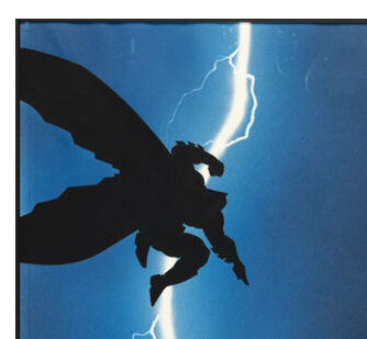 |
||
| Post 30 • IP flag post | ||


 Where's his Bat-package? Where's his Bat-package?
|
Byrdibyrd private msg quote post Address this user | |
| @dfoster43 Nothing wrong with having an opinion that goes against the 'norm.' I appreciate Frank Miller's art and I see the genius, and I think his early art is spectacular, but I've been less thrilled with his art lately. It's just not to my personal tastes. Remember that cover he did for Detective #1000? It's kinda ugly, IMHO. | ||
| Post 32 • IP flag post | ||
|
Collector
|
dfoster43 private msg quote post Address this user | |
Quote:Originally Posted by OGJackster This made me laugh out loud and today I needed that, Thanks @OGJackster |
||
| Post 33 • IP flag post | ||
|
Collector
|
dfoster43 private msg quote post Address this user | |
Quote:Originally Posted by Byrdibyrd Hmmm .. I was curious so i went to go look but every google i try brings up that book w/ Jim Lee as the cover artist. |
||
| Post 34 • IP flag post | ||
 Miss Chanandler Bong Miss Chanandler Bong
|
jake private msg quote post Address this user | |
@dfoster43  @Byrdibyrd I loved his earlier works, but since 1999, I feel the quality has gone down. If he was doing zombies, it would be understandable. It might be a style thing. |
||
| Post 35 • IP flag post | ||
 would be nice to have a snugger fit. would be nice to have a snugger fit.
|
Sigur_Ros private msg quote post Address this user | |
Quote:Originally Posted by dfoster43 All 84 variants: https://borg.com/2019/03/24/all-variant-covers-checklist-detective-comics-reaches-landmark-issue-1000-this-week/?amp=1 Miller's was one of the many bad ones: 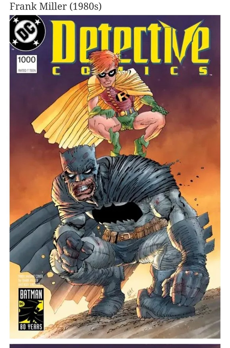 |
||
| Post 36 • IP flag post | ||
|
Collector
|
dfoster43 private msg quote post Address this user | |
Quote:Originally Posted by jake Ah THANK you for that, this is not Jim Lee LOL But yeah, okay this EXACTLY illustrates my point. It's childish scrawling garbage. It's like the worst single-story panels of 2000AD from the 80's ... just amateurish. Maybe that style is supposed to be "edgy and punky and cool" but ... nah. It's not for me. |
||
| Post 37 • IP flag post | ||
 I don't believe this....and I know you don't care that I don't believe this. I don't believe this....and I know you don't care that I don't believe this.
|
GAC private msg quote post Address this user | |
Quote:Originally Posted by dfoster43 I totally get where you're coming from. While I may not dislike his art as much as you do....I'm certainly nowhere near the fan that many are. I like his earlier work but his art definitely changed for the worse at some point. Sloppy is how I'd describe his art beyond a certain point in time. |
||
| Post 38 • IP flag post | ||
|
Where's his Bat-package?
|
Byrdibyrd private msg quote post Address this user | |
Quote:Originally Posted by GAC Yeah, pretty much sums it up for me, too. I have mad respect for the guy, but his art has stylised to a point now where I'm just not getting it. |
||
| Post 39 • IP flag post | ||
 Keep your $6.87 bro... not even saving tax with that. Keep your $6.87 bro... not even saving tax with that.
|
Cli4dR3D0g private msg quote post Address this user | |
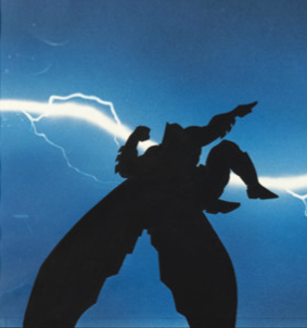 Wait, he's not doing a Moon Knight jump with the blue silhouette of a building blocking part of his cape? |
||
| Post 40 • IP flag post | ||
|
Collector
|
dfoster43 private msg quote post Address this user | |
Quote:Originally Posted by xjagnew LOL Only if you tip the picture on its side |
||
| Post 41 • IP flag post | ||
|
Collector
|
dfoster43 private msg quote post Address this user | |
Quote:Originally Posted by Byrdibyrd @GAC & @Byrdibyrd Maybe its just him getting old. His work on Daredevil back in the day I remember being okay. My memory is old too though. |
||
| Post 42 • IP flag post | ||
|
would be nice to have a snugger fit.
|
Sigur_Ros private msg quote post Address this user | |
 |
||
| Post 43 • IP flag post | ||
 I've spent years perfecting my brand of assholery. I've spent years perfecting my brand of assholery.
|
DrWatson private msg quote post Address this user | |
| That just goes to show that money doesn't guarantee taste. | ||
| Post 44 • IP flag post | ||
|
Where's his Bat-package?
|
Byrdibyrd private msg quote post Address this user | |
Quote:Originally Posted by dfoster43 His work on DD was how I first discovered Frank Miller. Just amazing stuff. Then he started writing the book, too, and it got better. At the time, it was easily one of the best books out there. I started losing interest around the first sequel to Dark Knight. I saw the first DKR as an evolution of his style, and that was great, even though I did prefer his older work. Still fantastic. It was some time after that I noticed that I just wasn't seeing it the same way anymore. Like @dfoster43 says, he may just be showing his age. |
||
| Post 45 • IP flag post | ||
This topic is archived. Start new topic?