The NEW CBCS Label is LIVE!1774
 Collector Collector
|
leesoul21 private msg quote post Address this user | |
| Looks great! Truly cool move listening to the community too. | ||
| Post 26 • IP flag post | ||
 CBCS Head Grader CBCS Head Grader
|
SteveRicketts private msg quote post Address this user | |
Quote:Originally Posted by DertyComix Probably by the end of the week. Anything that goes into slab starting tomorrow morning will have the new label. We flipped the switch to turn them on when we walked out at the end of the day today. |
||
| Post 27 • IP flag post | ||
 CBCS Head Grader CBCS Head Grader
|
SteveRicketts private msg quote post Address this user | |
| Incidentally, guys. I just want to say that the labels look nice in the pictures and video, but just wait until you get them in your hands. They're incredible. When the labels were delivered to us from the printer, the collective comment through the office was "WOW!" I can't wait for these to start getting into your mailbox. They'll blow you away. |
||
| Post 28 • IP flag post | ||
|
|
GAC private msg quote post Address this user | |
Quote:Originally Posted by SteveRicketts Along with the integrity and transparency of your company, it's your communication and listening to your client base that sets you guys apart from your competitors. Well done!!! |
||
| Post 29 • IP flag post | ||
 Collector Collector
|
Bruticus private msg quote post Address this user | |
| Alot better than the old one. Great job CBCS. |
||
| Post 30 • IP flag post | ||
 Collector Collector
|
jrs private msg quote post Address this user | |
| Very nice. | ||
| Post 31 • IP flag post | ||
 Collector Collector
|
zosocane private msg quote post Address this user | |
| This is kick-ass. Gorgeous. The new design honors the rivet-free old label yet gives a sleek, modern look. Bravo, CBCS. |
||
| Post 32 • IP flag post | ||
 COLLECTOR COLLECTOR
|
shrewbeer private msg quote post Address this user | |
Quote:Originally Posted by SteveRicketts Anyone else notice these two key things? 1. From what I can see, the bottom of the label does not look like it was ripped off a sheet (perforated) 2. the entire label looks like it was custom made for each book rather than a generic template with items added to it Cant wait to see them in person, they look MUCH more professional! |
||
| Post 33 • IP flag post | ||
 COLLECTOR COLLECTOR
|
JWKyle private msg quote post Address this user | |
| Good Job on the new label. It looks clean and professional. | ||
| Post 34 • IP flag post | ||
 CBCS Head Grader CBCS Head Grader
|
SteveRicketts private msg quote post Address this user | |
Quote:Originally Posted by shrewbeer The labels are perforated, but we went with a nicer paper stock and a finer perforation, so it's not as noticeable. |
||
| Post 35 • IP flag post | ||
 Collector Collector
|
reggieb private msg quote post Address this user | |
| I wonder if there is going to be a backup in the shipping department from all the orders that were being held for this label. Can't wait to get mine! |
||
| Post 36 • IP flag post | ||
 Collector Collector
|
Resurrection private msg quote post Address this user | |
| Love it! | ||
| Post 37 • IP flag post | ||
|
|
press_the_issue private msg quote post Address this user | |
| YESSSSSAH!!! I'm so glad they premiered. Looks sharp. Simple and sleek. Very displayable, it doesn't take away from the actual encased book. Love the holofoil logo!! Font is great, easily readable. This is the year for CBCS!! | ||
| Post 38 • IP flag post | ||
 CBCS Head Grader CBCS Head Grader
|
SteveRicketts private msg quote post Address this user | |
Quote:Originally Posted by press_the_issue You have no idea, brother. Fasten your safety belts and place your tray tables in the upright and locked position. |
||
| Post 39 • IP flag post | ||
 COLLECTOR COLLECTOR
|
JWKyle private msg quote post Address this user | |
| Just wanted to add the new CBCS home page looks pretty sharp too. | ||
| Post 40 • IP flag post | ||
 COLLECTOR COLLECTOR
|
Foghorn_Sam private msg quote post Address this user | |
| Here's my take on the new label. New logo: 9.4 Colors: 9.0 Grade font: 7.5 Small print details: 7.0 General layout and aesthetic: 8.0 (too much info crowded too close to the grade, looks cluttered) Overall grade: 8.0-8.5 Looks much better than the rivet label, cleaner and less busy. Looks like it will be a good fit with books across any age group: gold, silver, bronze, copper and modern. Really a good job. Thank you for listening to your clientele and fan base to make these changes. It shows you are willing and trying to connect to make the hobby a great community for all of us to be in. I'm sure we all appreciate your efforts and the good will you have demonstrated will go a long way toward building your brand and serving your customers. Once again, thank you! |
||
| Post 41 • IP flag post | ||
|
|
evaluate private msg quote post Address this user | |
| Loving the new look so far. Looking forward to seeing it in person. | ||
| Post 42 • IP flag post | ||
 Collector Collector
|
AndyRexia private msg quote post Address this user | |
| @DarthLego where you been?!? Hiding until new label was revealed?!? | ||
| Post 44 • IP flag post | ||
 COLLECTOR COLLECTOR
|
DarthLego private msg quote post Address this user | |
| Hiding yeah, I had to seek assylum in Russia over some trumped up hacking charges. Nah, I just have been dealing with the real world the last few months and comics fell off the front burner. |
||
| Post 45 • IP flag post | ||
 COLLECTOR COLLECTOR
|
dielinfinite private msg quote post Address this user | |
| I'm not sure if the change was made because of the new label but I'm sad to hear that the convention where a book was signed will no longer be added to ASP labels. I dunno why but I always thought that was a neat thing to know about the book and I'm sad to see it go | ||
| Post 46 • IP flag post | ||
 COLLECTOR COLLECTOR
|
DarthLego private msg quote post Address this user | |
| @dielinfinite I wonder if that might be a Trademark issue with the cons? | ||
| Post 47 • IP flag post | ||
 COLLECTOR COLLECTOR
|
dielinfinite private msg quote post Address this user | |
| @DarthLego If they were using the logo or something I'd be more inclined to think that but it seems like just saying that was where the book was signed should be fine. I wonder, if I crack a previously signed book that does state the location, and I get more sigs and resubmit, will all the signature locations be omitted from the new label? |
||
| Post 48 • IP flag post | ||
 Collector Collector
|
SpiderTim private msg quote post Address this user | |
| Who's said that they are removing the event were the signature was obtained? That is no bueno! | ||
| Post 49 • IP flag post | ||
 COLLECTOR COLLECTOR
|
dielinfinite private msg quote post Address this user | |
I contacted customer service when I saw some sigs on an upcoming book had no event listed and I got the following response:Quote:Originally Posted by CBCS Customer Service |
||
| Post 50 • IP flag post | ||
 I live in RI and Rhode Islanders eat chili with beans. I live in RI and Rhode Islanders eat chili with beans.
|
esaravo private msg quote post Address this user | |
@SpiderTim and @dielinfinite - When I got this today, I was happy with the new label, but disappointed to see no mention of RI Comic Con.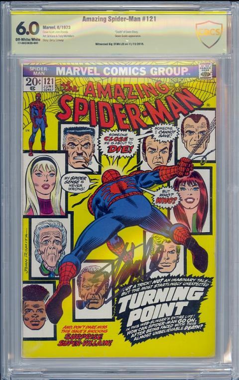 |
||
| Post 51 • IP flag post | ||
 COLLECTOR COLLECTOR
|
DarthLego private msg quote post Address this user | |
| Perhaps @SteveRicketts will chime in and tell us why the change? | ||
| Post 52 • IP flag post | ||
 COLLECTOR COLLECTOR
|
dielinfinite private msg quote post Address this user | |
| @esaravo Hmmm, I'm not a big fan of the new wording "Witnessed Sig:" since it seems a bit redundant with the Yellow Label which itself means the signatures are witnessed. | ||
| Post 53 • IP flag post | ||
 COLLECTOR COLLECTOR
|
DarthLego private msg quote post Address this user | |
| @dielinfinite The new label doesn't say Authentic Signature Series on top, so that's probably why. They have to consider that customers who don't know what the color code means could be looking at the slab in a shop or at a con. | ||
| Post 54 • IP flag post | ||
 CBCS Head Grader CBCS Head Grader
|
SteveRicketts private msg quote post Address this user | |
Quote:Originally Posted by DarthLego This is correct. The verbiage is no longer at the top of the label, but even when it was it wasn't easy to understand for our customers who are newer to collecting CBCS graded comics. When we launched the new label, we wanted to eliminate any confusion associated with signatures on the book, and make it easier to understand the differences in them. We chose to go with new, easier to understand verbiage on the signature lines. Going forward "Witnessed Sigs:" will proceed all signatures that were witnessed, and "Verified Sigs"" will proceed all signatures that have been authenticated. This actually solves a few problems for us. It makes it easy to understand, and it allows us to get more text into those lines, which is very much needed when doing books with multiple signatures. As for the removal of the location; we've been wanting to do this for quite a while and the formatting change allowed us a chance to do it. The reasoning is this, locations, especially multiple location, takes up a lot of room on the signature information lines. It is also a time consuming effort for us to research the locations, dates of the locations, spelling of the locations, is it "Comic Con," "Comicon," "ComiCon," etc. Over the course of a year we spend a LOT of time with the location text. Time that could be better spent grading and encapsulating more books to help get the turnaround times faster. We realize they are cool to have, but they really are a lot of work for us to maintain and keep consistent. |
||
| Post 55 • IP flag post | ||
This topic is archived. Start new topic?

