question about rivet labels15301
Pages:
1
 Collector Collector
|
timberghost private msg quote post Address this user | |
| I've seen people on here really just giving the rivet labels just like trash. Can I ask what the deal is. I see some for sale on e-bay ( in fact I didn't know what people were talking about till I took a close look and it hit me, at least I think I'm seeing what is being stoned) My question is, to me the label doesn't mean much of anything, it's the grade. so is that all it is to the debate, is that some people are offended by the looks of the label to the point of all that?? Asking for a friend. | ||
| Post 1 • IP flag post | ||
 I'd like to say I still turned out alright, but that would be a lie. I'd like to say I still turned out alright, but that would be a lie.
|
flanders private msg quote post Address this user | |
| @sborock is more offended than anyone by the rivet label because of it's hideous appearance. If you don't mind it by all means buy a rivet slab for your collection. I have one, but at some point I may consider getting a reholder for it, which to me is well worth the $10. In terms of labels, there are many customers that won't even use CBCS because they don't like how the current label looks, even though they have nothing but good things to say about everything else about the company. | ||
| Post 2 • IP flag post | ||
 Captain Corrector Captain Corrector
|
CaptainCanuck private msg quote post Address this user | |
| . Riveting  |
||
| Post 3 • IP flag post | ||
 Beaten by boat oars Beaten by boat oars
|
Studley_Dudley private msg quote post Address this user | |
| I've never minded the rivet labels as much when they are in-hand, but they are not photogenic at all. I am slowly reslabbing them to rid myself of the labels. If I sell a slabbed book, the rivet labels tend to sit longer than the others. Probably because it is aesthetically unpleasing. Now, I will buy the books in the rivet label slabs. I would just get enough of them together to send in for reholder order. Those labels were an unwelcome change that came along at a time when CBCS could have made some serious strides because CGC had unveiled their then-new slab that caused issues (no pun intended) with the books inside. | ||
| Post 4 • IP flag post | ||
 Collector Collector
|
dpiercy private msg quote post Address this user | |
| People were going crazy on here during the month(s) that label was in production, lolz. | ||
| Post 5 • IP flag post | ||
 PLOD PLOD
|
theCapraAegagrus private msg quote post Address this user | |
| I either wasn't aware of, or forgot about, this label design. Hideous. | ||
| Post 6 • IP flag post | ||
 I've spent years perfecting my brand of assholery. I've spent years perfecting my brand of assholery.
|
DrWatson private msg quote post Address this user | |
| @timberghost The rivet label is the perfect example of something that sounds great in theory, but fails miserably in practice. There isn't a single redeeming quality in that slab fiasco. I have to wear rose colored glasses when I look at the handful I own. However, after a bit of thought, I do stand corrected. There is one redeeming quality. You are definitely buying the book and not the label. |
||
| Post 7 • IP flag post | ||
 Collector Collector
|
dfoster43 private msg quote post Address this user | |
| Hey Can someone post a close-up of what we're talking about? If I need to avoid buying I may not know what I'm avoiding. Thanks! |
||
| Post 8 • IP flag post | ||
 Collector Collector
|
Bobashek private msg quote post Address this user | |
| I'm not sure I know what the label looks like. If someone is not too offended by it, could you post what it looks like? | ||
| Post 9 • IP flag post | ||
 I've spent years perfecting my brand of assholery. I've spent years perfecting my brand of assholery.
|
DrWatson private msg quote post Address this user | |
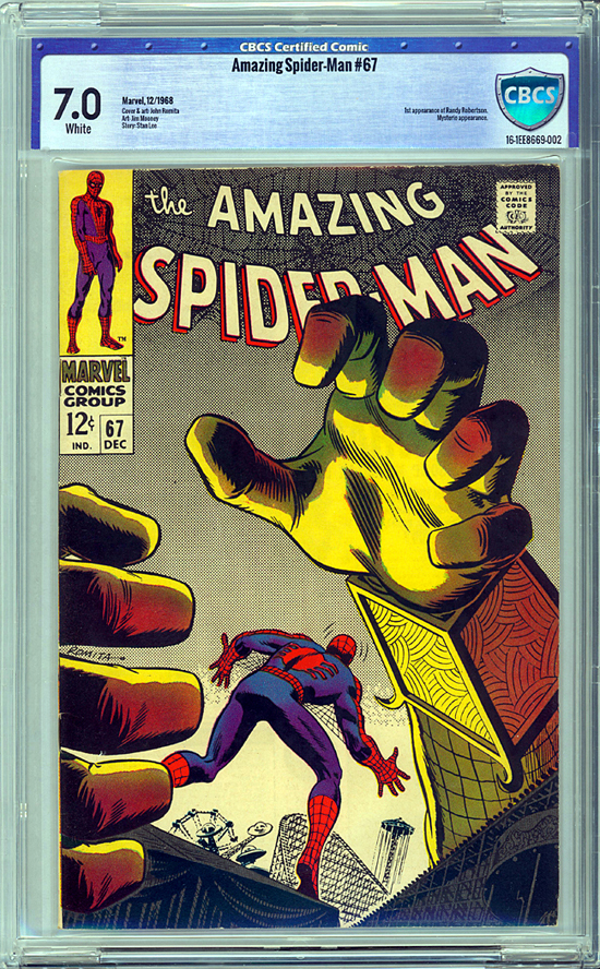
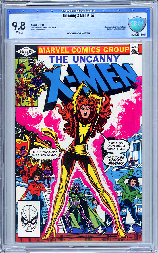
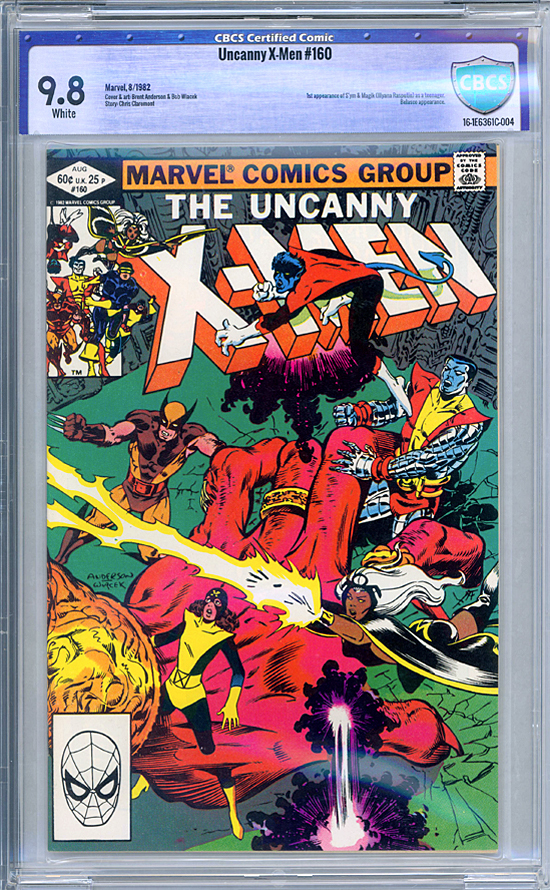
I wouldn't avoid buying one. This little gem was advertised as having a "damaged" case.  |
||
| Post 10 • IP flag post | ||
 I've spent years perfecting my brand of assholery. I've spent years perfecting my brand of assholery.
|
DrWatson private msg quote post Address this user | |
 |
||
| Post 11 • IP flag post | ||
 I've spent years perfecting my brand of assholery. I've spent years perfecting my brand of assholery.
|
DrWatson private msg quote post Address this user | |
 |
||
| Post 12 • IP flag post | ||
 The Fifth Golden Girl The Fifth Golden Girl
|
sborock private msg quote post Address this user | |
| I already explained the Rivet label, but long story short, I was out for weeks and my old partner thought the label needed an upgrade and went ahead with this label even though I would never have approved it. UGH!!!! |
||
| Post 13 • IP flag post | ||
 Collector Collector
|
dfoster43 private msg quote post Address this user | |
| @DrWatson - Thank you! I LOVE LOVE LOVE that ASM 67! GREAT cover! Is that john romita's cover? OK So just to be clear, what people are hating are those little dots that look like 'rivets' surrounding the label and not the physical case characteristics or design itself? So it's a visual thing regarding the label and that's it? Just making sure because I am not seeing anything wrong w/ the slabs. |
||
| Post 14 • IP flag post | ||
 Have I told you about the time I dropped off 3,000 comics at SDCC? Have I told you about the time I dropped off 3,000 comics at SDCC?
|
Scifinator private msg quote post Address this user | |
Quote:Originally Posted by sborock@sborock - I have been on the lurking and then active on the forum coming up on 3 years now and this is the first I am learning of this. Interesting. For me, I think the rivets and brushed blue denot strength and protection but does pull attention from the comic somewhat. But, the part of that grade font is absolutely hideous and definitely pulls my attention from the comic. |
||
| Post 15 • IP flag post | ||
 I live in RI and Rhode Islanders eat chili with beans. I live in RI and Rhode Islanders eat chili with beans.
|
esaravo private msg quote post Address this user | |
| @Scifinator - Yes, it was supposed to represent the ultimate protection for your book, a plastic slab with fake rivets along the top and sides of the label and even around the CBCS shield. I also remember that there was no announcement of the label change, and after customers started getting them, we all were horrified that the books we sent in months earlier were going to receive this label. Thankfully, they canned this label pretty quickly. I know I held off submitting any more books until they switched back. Hey, that gives me an idea on how to improve TAT’s! jk |
||
| Post 16 • IP flag post | ||
 PLOD PLOD
|
theCapraAegagrus private msg quote post Address this user | |
Quote:Originally Posted by dfoster43 The label is what's wrong with the slabs. It's almost like Rob Liefeld was commissioned to design it... |
||
| Post 17 • IP flag post | ||
|
|
GAC private msg quote post Address this user | |
| To me, it's just way too gimmicky. It's not only the rivets but the "stainless steel" or "metallic" look of the entire label. I know what they were after but exactly what @DrWatson stated...theory vs. practice....oh, and the font...I dont like that either. | ||
| Post 18 • IP flag post | ||
 Collector Collector
|
dfoster43 private msg quote post Address this user | |
Quote:Originally Posted by theCapraAegagrus LOL! Full Circle. |
||
| Post 19 • IP flag post | ||
 Captain Corrector Captain Corrector
|
CaptainCanuck private msg quote post Address this user | |
Quote:Originally Posted by sborock It’s like when Stan was away and they killed off Gwen Stacy. |
||
| Post 20 • IP flag post | ||
 Collector Collector
|
timberghost private msg quote post Address this user | |
Quote:Originally Posted by Studley_Dudleyahhh thank you, I understand now |
||
| Post 21 • IP flag post | ||
 Have I told you about the time I dropped off 3,000 comics at SDCC? Have I told you about the time I dropped off 3,000 comics at SDCC?
|
Scifinator private msg quote post Address this user | |
Quote:Originally Posted by sborock@sborock - cool back story - Lesson learned, no time away for you.  |
||
| Post 22 • IP flag post | ||
 The Fifth Golden Girl The Fifth Golden Girl
|
sborock private msg quote post Address this user | |
Quote:Originally Posted by Scifinator Yep! Lesson learned! |
||
| Post 23 • IP flag post | ||
Pages:
1This topic is archived. Start new topic?
