New CBCS Label?1493
 CBCS Head Grader CBCS Head Grader
|
SteveRicketts private msg quote post Address this user | |
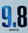
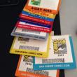
| Greetings from the CBCS team. As you all know; we have been working on a new label for the CBCS product. We are attaching a base concept for you to examine. We are also attaching different fonts that are being considered for the numerical grade on the label. We are only showing one of the colored labels for the sake of simplicity. The logo on the right will still be stamped in holofoil. We are asking for your feedback. Please look at the samples and email us at labels@cbcscomics.com telling us your choice for the label and font, and give a brief description of what you like or dislike about it. We appreciate everyone’s feedback and the fact that you’ve all been so patient. If the images are too small for you to see, please visit our Facebook page. The images there should be larger. www.facebook.com/cbcscomics 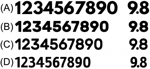 |
||
| Post 1 • IP flag post | ||
 Collector Collector
|
Loiselle313 private msg quote post Address this user | |
| Option D! Loving the CLEAN look of the label. Simplistic, minimalist, spartan, clean. Love that you guys are asking the feedback of the customers! Amazing to be let into the process! |
||
| Post 2 • IP flag post | ||
 Leftover Sundae Gnus Leftover Sundae Gnus
|
CatmanAmerica private msg quote post Address this user | |
Quote:Originally Posted by Loiselle313 Similar reaction (label B, font D); they're obviously on the right track. |
||
| Post 3 • IP flag post | ||
 Collector Collector
|
Sirtoddington private msg quote post Address this user | |
| Label B & font C. | ||
| Post 4 • IP flag post | ||
 Collector Collector
|
BradT private msg quote post Address this user | |
| D! | ||
| Post 5 • IP flag post | ||
 COLLECTOR COLLECTOR
|
JWKyle private msg quote post Address this user | |
| Voted |
||
| Post 6 • IP flag post | ||
 Collector Collector
|
mattness private msg quote post Address this user | |
| ..uum can someone help me both labels look the same | ||
| Post 7 • IP flag post | ||
|
Collector
|
Sirtoddington private msg quote post Address this user | |
Quote:Originally Posted by mattness the top label has a white background & the bottom label has a light blue background. |
||
| Post 8 • IP flag post | ||
|
Collector
|
mattness private msg quote post Address this user | |
| @Sirtoddington ah ok thanks. I just thought they were showing the text on two different color designs, not white vs blue..ugh..going back to bed. | ||
| Post 9 • IP flag post | ||
 You think I'm joking, I'm not. You think I'm joking, I'm not.
|
earthshaker01 private msg quote post Address this user | |
| I really don't care. Appreciate the hard work, but to me it's just a label. Just want my books graded by a respected company (cbcs),but I'll play along. Label "B" Font "C" | ||
| Post 10 • IP flag post | ||
 Collector Collector
|
Jaydknight private msg quote post Address this user | |
| B and D. | ||
| Post 11 • IP flag post | ||
|
|
Rainman1177 private msg quote post Address this user | |
| B and D | ||
| Post 12 • IP flag post | ||
 Collector Collector
|
johnlbelanger private msg quote post Address this user | |
| Label B, font D! | ||
| Post 13 • IP flag post | ||
 CBCS broke up with me over Facebook. CBCS broke up with me over Facebook.
|
CFP_Comics private msg quote post Address this user | |
| Go back to formula. The first label did not need fixing. | ||
| Post 14 • IP flag post | ||
|
|
Comic_guys private msg quote post Address this user | |
| B and D | ||
| Post 15 • IP flag post | ||
 Collector Collector
|
zosocane private msg quote post Address this user | |
| Go back to the original label. If not, label A, font D. The white makes the grade and other label notes stand out more. Plus, CGC already has the blue label. CBCS can distinguish itself more with a white label. | ||
| Post 16 • IP flag post | ||
 I've spent years perfecting my brand of assholery. I've spent years perfecting my brand of assholery.
|
DrWatson private msg quote post Address this user | |
| Post 17 • IP flag post | ||
 Collector Collector
|
dpiercy private msg quote post Address this user | |
| B&D | ||
| Post 18 • IP flag post | ||
 Collector Collector
|
Themaxx35 private msg quote post Address this user | |
| B&d | ||
| Post 19 • IP flag post | ||
 Collector Collector
|
reggieb private msg quote post Address this user | |
| "We are asking for your feedback. Please look at the samples and email us at labels@cbcscomics.com telling us your choice for the label and font, and give a brief description of what you like or dislike about it" People are not good at following directions. |
||
| Post 20 • IP flag post | ||
 Collector Collector
|
The_Curmudgeon private msg quote post Address this user | |
Quote:Originally Posted by reggieb |
||
| Post 21 • IP flag post | ||
|
You think I'm joking, I'm not.
|
earthshaker01 private msg quote post Address this user | |
Quote:Originally Posted by reggieb I don't have email |
||
| Post 22 • IP flag post | ||
 Collector Collector
|
userX745 private msg quote post Address this user | |
| Label A / Font D I would say have the "signed by" centered with the top "Title and Issue number". Other then that I enjoy the simplicity of the label, it's very clean, straight forward. |
||
| Post 23 • IP flag post | ||
 Collector Collector
|
Despain private msg quote post Address this user | |
| Voted via email. | ||
| Post 24 • IP flag post | ||
|
Collector
|
Despain private msg quote post Address this user | |
Quote:Originally Posted by earthshaker01 Just curious. If you don't have email, how did you sign up for an account on here? |
||
| Post 25 • IP flag post | ||
|
You think I'm joking, I'm not.
|
earthshaker01 private msg quote post Address this user | |
Quote:Originally Posted by Despain I use the biometric feature under account setup. |
||
| Post 26 • IP flag post | ||
 COLLECTOR COLLECTOR
|
Foghorn_Sam private msg quote post Address this user | |
| Definite improvement, but still not a nice as the original label (sorry). The smallest lettering is still pretty small. | ||
| Post 27 • IP flag post | ||
|
Collector
|
Despain private msg quote post Address this user | |
Quote:Originally Posted by earthshaker01 That's cool. I didn't see an option for that. I still don't. LOL. |
||
| Post 28 • IP flag post | ||
|
|
Mio private msg quote post Address this user | |
| I still like the original, but this is a step up from V2. | ||
| Post 29 • IP flag post | ||
|
Collector
|
mattness private msg quote post Address this user | |
| Anyone else seem it a bit ironic that as hard as CBCS works to separate themselves (we have all seen that they do work very hard) from CGC, CBCS customers continue to morph the CBCS label into CGC's? |
||
| Post 30 • IP flag post | ||
This topic is archived. Start new topic?