One of the worse covers.11171
 Collector Collector
|
GanaSoth private msg quote post Address this user | |
This is one of the worse covers I have ever seen on a "professional" comic book, besides ones from Rob Liefeld... looks like a high school kid drew it and used colored pencils. Sad thing is, it will probably sell out...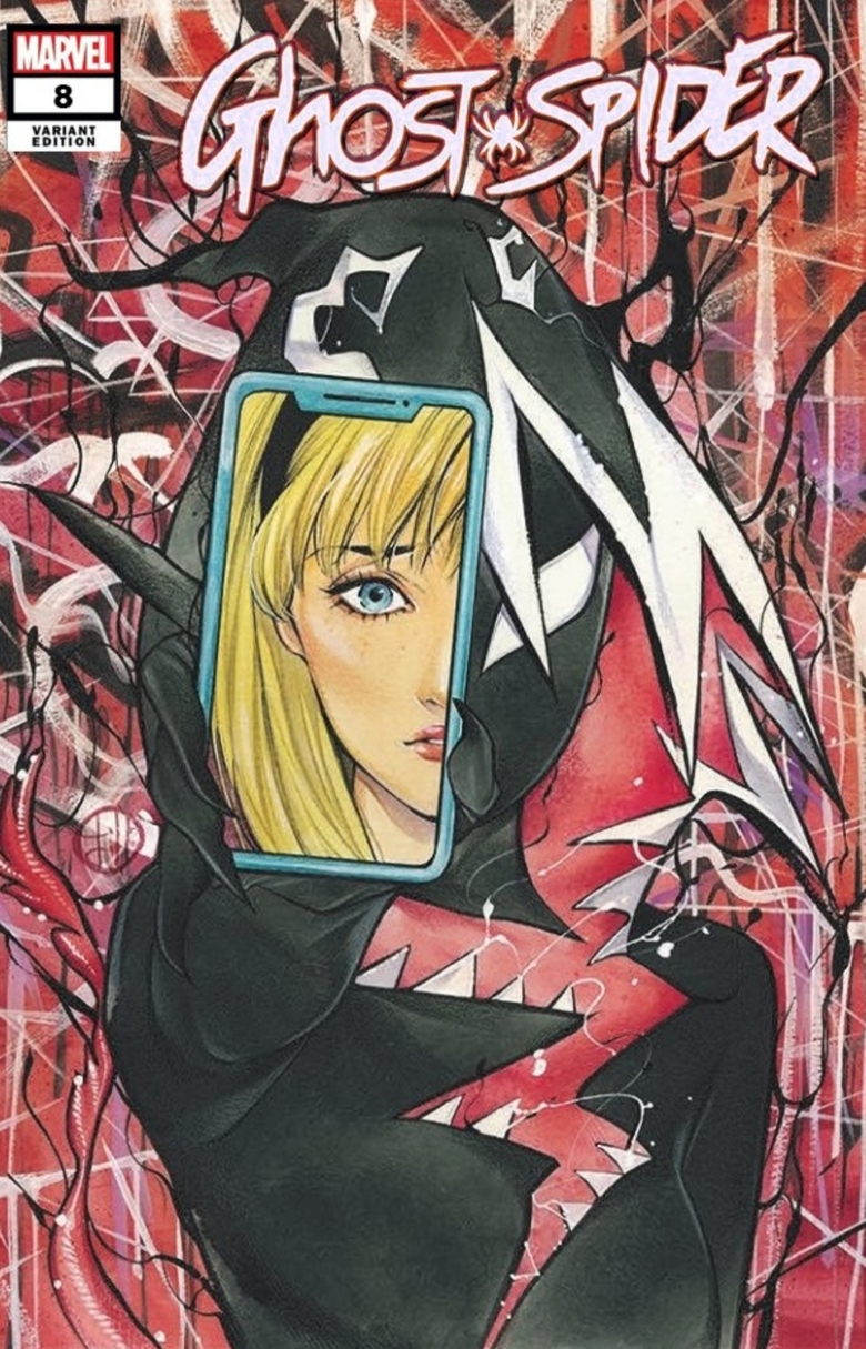 |
||
| Post 1 • IP flag post | ||
 I’m not an ant. I’m a rootin tootin Hornet! I’m not an ant. I’m a rootin tootin Hornet!
|
Zombie_Head private msg quote post Address this user | |
| Have you seen Scottie young’s covers? Horrible. | ||
| Post 2 • IP flag post | ||
 I'm a #2. I'm a #2.
|
BigRedOne1944 private msg quote post Address this user | |
| I love lots of Liefeld's work and would hardly consider it in the same league as the Ghost Spider Book. Regardless what you may think of him as a person, there is no denying he has penned many iconic covers, and some over exaggerated ones as well. A couple of my all-time favs   |
||
| Post 3 • IP flag post | ||
 Pictures? We don't need no stinking pictures. Pictures? We don't need no stinking pictures.
|
brysb private msg quote post Address this user | |
Quote:Originally Posted by GanaSoth I don't see anything wrong with this cover, it is very original. Artistic expression. |
||
| Post 4 • IP flag post | ||
 I'd like to say I still turned out alright, but that would be a lie. I'd like to say I still turned out alright, but that would be a lie.
|
flanders private msg quote post Address this user | |
Quote:Originally Posted by GanaSoth George W immediately came to mind...although I like his artwork.  |
||
| Post 5 • IP flag post | ||
 Collector Collector
|
poka private msg quote post Address this user | |
@GanaSoth same cover artist did the 1:25 of #2. you ought to check the price of that one 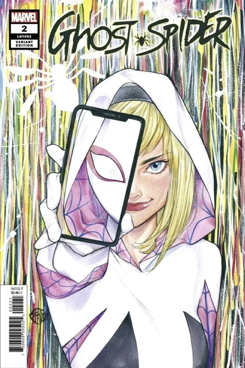 |
||
| Post 6 • IP flag post | ||
 "Forum Overlord" bah ha ha ha... "Forum Overlord" bah ha ha ha...
|
JustThatGuy private msg quote post Address this user | |
 This is one of the worse covers I have seen. There is nothing on it. |
||
| Post 7 • IP flag post | ||
 Have I told you about the time I dropped off 3,000 comics at SDCC? Have I told you about the time I dropped off 3,000 comics at SDCC?
|
Scifinator private msg quote post Address this user | |
| How bout a worst cover contest? | ||
| Post 8 • IP flag post | ||
 Masculinity takes a holiday. Masculinity takes a holiday.
|
EbayMafia private msg quote post Address this user | |
Quote:Originally Posted by GanaSoth I think with some coloring contrasts I could like it a lot better. @poka that one is definitely easier on the eye. @flanders I've seen some decent artwork from W. I'm hoping that piece was one of his early works. |
||
| Post 9 • IP flag post | ||
 Not trying to be an ass since February 12, 2020. Not trying to be an ass since February 12, 2020.
|
HulkSmash private msg quote post Address this user | |
| I tbink Liefeld does great work. that cover is trash though. | ||
| Post 10 • IP flag post | ||
 Collector Collector
|
Darkseid_of_town private msg quote post Address this user | |
| Liefield's work is sloppy and lose.....consider the x men cover above. Notice how Wolverines pants are drawn...ugh. Or the Jacket, with its immensely lopsided collar...one side massive the other properly sized....and who on earth holds a cigar like that? Notice the hand held just above wolverines shoulder to the right in the cover...Thumb then how many digits? Seen a few covers Liefield did well, but generally when you take the time to really look them over, they are mostly drawn off proportion, missing or added digits or limbs, no feet, etc. |
||
| Post 11 • IP flag post | ||
 I had no way of knowing that 9.8 graded copies signed by Adam Hughes weren't what you were looking for. I had no way of knowing that 9.8 graded copies signed by Adam Hughes weren't what you were looking for.
|
drchaos private msg quote post Address this user | |
Quote:Originally Posted by Darkseid_of_town This one is pretty:  |
||
| Post 12 • IP flag post | ||
|
Masculinity takes a holiday.
|
EbayMafia private msg quote post Address this user | |
Quote:Originally Posted by drchaos It's better than average for Liefeld but whoever did the colors deserves a signature spot on the cover. I think the Inkers are often under-appreciated. I heard first-hand from an Inker that Marvel was paying them $70 per book in the '80s. I hope that rate has gone up. |
||
| Post 13 • IP flag post | ||
 I don't believe this....and I know you don't care that I don't believe this. I don't believe this....and I know you don't care that I don't believe this.
|
GAC private msg quote post Address this user | |
| Liefeld is hit and miss....mostly miss and when he does hit it's a triple at best, never a homerun. | ||
| Post 14 • IP flag post | ||
|
Collector
|
Darkseid_of_town private msg quote post Address this user | |
Quote:Originally Posted by GACand then he throws a tantrum and refuses to sign that |
||
| Post 15 • IP flag post | ||
|
I don't believe this....and I know you don't care that I don't believe this.
|
GAC private msg quote post Address this user | |
| @Darkseid_of_town lol! agreed! | ||
| Post 16 • IP flag post | ||
|
Collector
|
GanaSoth private msg quote post Address this user | |
Quote:Originally Posted by drchaos Is this character a transgender? I honestly don't know anything about this character, but the reason I'm asking is because the body is that of a male. The hips are drawn smaller than the shoulders width. Torso is males anatomy. Legs are small, and chest is flat like a males chest. Then there is the feet size. It pretty much looks like a Deadpool's body with a womans head. |
||
| Post 17 • IP flag post | ||
|
I had no way of knowing that 9.8 graded copies signed by Adam Hughes weren't what you were looking for.
|
drchaos private msg quote post Address this user | |
Quote:Originally Posted by GanaSoth What made Hitgirl interesting in the Kick Ass movie was that she was a nine year old girl (played by a twelve year old actress) that would swear like a sailer while evicerating her opponents with bladed weapons and guns. While the character had aged a few years before this comic came out the reason she doesn't have a huge chest is that she is a teenager. |
||
| Post 18 • IP flag post | ||
 I live in RI and Rhode Islanders eat chili with beans. I live in RI and Rhode Islanders eat chili with beans.
|
esaravo private msg quote post Address this user | |
| @GanaSoth - When Hit-Girl first appeared in the comics, she was 10-years old in the storyline. In the 2010 movie Kickass, she was played by a just-turned 12-year old Chloe Moretz. So she’s not supposed to have a women’s figure, as she’s just starting puberty. | ||
| Post 19 • IP flag post | ||
|
Collector
|
GanaSoth private msg quote post Address this user | |
| @esaravo @drchaos thanks for the clarification. Like I said, I didn't know anything about the character, hence the "transgender" remark. Makes sense now. | ||
| Post 20 • IP flag post | ||
 Collector Collector
|
gotham44 private msg quote post Address this user | |
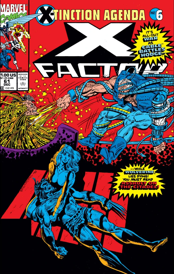 This is one is bad too. cable looks awful |
||
| Post 21 • IP flag post | ||
 Collector* Collector*
|
Towmater private msg quote post Address this user | |
Gets my vote |
||
| Post 22 • IP flag post | ||
 If the viagra is working you should be well over a 9.8. If the viagra is working you should be well over a 9.8.
|
xkonk private msg quote post Address this user | |
Quote:Originally Posted by Scifinator I tried that, it didn't work out well. |
||
| Post 23 • IP flag post | ||
|
I don't believe this....and I know you don't care that I don't believe this.
|
GAC private msg quote post Address this user | |
| clickable text | ||
| Post 24 • IP flag post | ||
 I bought a meat grinder on amazon for $60 and it's changed my life. I bought a meat grinder on amazon for $60 and it's changed my life.
|
kaptainmyke private msg quote post Address this user | |
Quote:Originally Posted by drchaos Chloë Grace Moretz |
||
| Post 25 • IP flag post | ||
|
Collector*
|
Towmater private msg quote post Address this user | |
Jack Kirby - disturbing drawing isn't it? What's going on with the head and the left arm? |
||
| Post 26 • IP flag post | ||
|
Collector
|
GanaSoth private msg quote post Address this user | |
| @GAC omg... the commentary on #38 is hilarious! | ||
| Post 27 • IP flag post | ||
 Collector Collector
|
AndyRexia private msg quote post Address this user | |
Quote:Originally Posted by GAC That was funny. |
||
| Post 28 • IP flag post | ||
 Collector Collector
|
dpiercy private msg quote post Address this user | |
| The original cover...I don’t really like it, but it’s competent illustration, I think. | ||
| Post 29 • IP flag post | ||
 Collector Collector
|
Donnied private msg quote post Address this user | |
| @GAC Best line - "In conclusion, I hate Rob Liefeld and he should be thrown in a well." That was funny stuff there. I completely agree, Liefield was the worst, popular artist ever. | ||
| Post 30 • IP flag post | ||
This topic is archived. Start new topic?