One of the worse covers.11171
 Collector* Collector*
|
Towmater private msg quote post Address this user | |
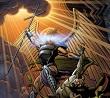
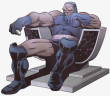
Jack Kirby - disturbing drawing isn't it? What's going on with the head and the left arm? |
||
| Post 26 • IP flag post | ||
 Collector Collector
|
GanaSoth private msg quote post Address this user | |
| @GAC omg... the commentary on #38 is hilarious! | ||
| Post 27 • IP flag post | ||
 Collector Collector
|
AndyRexia private msg quote post Address this user | |
Quote:Originally Posted by GAC That was funny. |
||
| Post 28 • IP flag post | ||
 Collector Collector
|
dpiercy private msg quote post Address this user | |
| The original cover...I don’t really like it, but it’s competent illustration, I think. | ||
| Post 29 • IP flag post | ||
 Collector Collector
|
Donnied private msg quote post Address this user | |
| @GAC Best line - "In conclusion, I hate Rob Liefeld and he should be thrown in a well." That was funny stuff there. I completely agree, Liefield was the worst, popular artist ever. | ||
| Post 30 • IP flag post | ||
 I'm waiting.... (tapping fingers). I'm waiting.... (tapping fingers).Splotches is gettin old! |
Nuffsaid111 private msg quote post Address this user | |
| Honestly - I've had it with the new-fangled digital covers that is the rage these days. They're 10 seconds worth of eye candy (I guess) that I quickly feel the opposite about after the 10 seconds. | ||
| Post 31 • IP flag post | ||
 Collector Collector
|
Darkseid_of_town private msg quote post Address this user | |
Quote:Originally Posted by Towmateractually the cover is attributed to both Kirby and Thibodeux the other artist for the series and it looks like someone altered the original to add the arm..the head itself appears placed properly |
||
| Post 32 • IP flag post | ||
|
I'm waiting.... (tapping fingers). Splotches is gettin old! |
Nuffsaid111 private msg quote post Address this user | |
| Is this that Peach Schnapps artist or whatever? | ||
| Post 33 • IP flag post | ||
|
Collector*
|
Towmater private msg quote post Address this user | |
Quote:Originally Posted by Darkseid_of_town It still looks horrible. Oh, and who came up with the super neat hairdo for Captain Victory? Looks so nice on issue 10.  Wait, while we are at it who came up with the name "Captain Victory"? God forbid anyone ever say/write/think anything bad about Kirby. |
||
| Post 34 • IP flag post | ||
|
Collector
|
GanaSoth private msg quote post Address this user | |
Quote:Originally Posted by Towmater THAT'S ONE OF THE BEST COVERS I HAVE EVER SEEN! Kirby was one of the best comic book artist/writers of all time. Plus, during this comic, was towards the end if his comic book career and he had health issues that affected his art. What's Robs excuse? Anyways, read all about Captain Victory here: Click or Touch here to read about the story of this character. |
||
| Post 35 • IP flag post | ||
 I don't believe this....and I know you don't care that I don't believe this. I don't believe this....and I know you don't care that I don't believe this.
|
GAC private msg quote post Address this user | |
Quote:Originally Posted by Towmater That's correct because if one does it's usually proof of their ignorance to the artform and Kirby's unparalleled contributions to it. |
||
| Post 36 • IP flag post | ||
|
Collector*
|
Towmater private msg quote post Address this user | |
| @GanaSoth Take a look at the left arm and lat. They are jacked up in cover 10 too. | ||
| Post 37 • IP flag post | ||
|
Collector
|
GanaSoth private msg quote post Address this user | |
| @Towmater looks like to me, they cut the arm off the orginal drawing and re-purposed it so it wouldn't cover the comics title on both issues you reference. It looks that the way the arms were drawn, they were originally in the titles vicinity. | ||
| Post 38 • IP flag post | ||
|
Collector*
|
Towmater private msg quote post Address this user | |
Quote:Originally Posted by GAC Your post implies that I'm ignorant. I'm not. To not believe one's eyes in reference to cover 9, and 10 seems to indicate one's ability to hide one's head in the sand. Kirby wasn't what he once was and the work on these books show that. @GanaSoth in reference to your question about Liefeld. I've no idea that I had attempted to provide a reply stating that his work isn't bad at times in this thread. All one has to do is look at the bad representations provided and one can see it for what it is. Thanks for updating your post and the edit with the link. |
||
| Post 39 • IP flag post | ||
|
Collector
|
GanaSoth private msg quote post Address this user | |
| @Towmater you're hostile sir! How dare you imply I did anything to my post! God forbid if I or anyone else updates their post at anytime! My goodness.... that's gotta be against the rules of the CBCS forums. What's this world coming too? I'm at a loss for words... How did we even get to this point in our relationship? I thought you were the one.... until I found out you think this way of Kirby.... you broke my heart! Shame on you sir.. | ||
| Post 40 • IP flag post | ||
|
Collector
|
Darkseid_of_town private msg quote post Address this user | |
Quote:Originally Posted by TowmaterThere does seem some inability to understand how the books featuing Kirby's work on the covers was handled. Kirby drew them yes..and then sent them to Thibodeux who shared pencilibg duties with Kirby Thibodeaux altered edited and submitted the final versions used. Blaming Kirby for alterations done to his art AFTER it was submitted is being less than fair |
||
| Post 41 • IP flag post | ||
 Masculinity takes a holiday. Masculinity takes a holiday.
|
EbayMafia private msg quote post Address this user | |
| Jim Steranko said that Kirby was an "intuitive" artist who didn't have to spend time planning his work. He would often start with the belt, and draw the rest of the character around it. I imagine his work was far less consistent, varied from great to mediocre, much more than a trained graphic designer like Steranko who thought out every detail beforehand. | ||
| Post 42 • IP flag post | ||
|
Collector*
|
Towmater private msg quote post Address this user | |
Quote:Originally Posted by Darkseid_of_town Care to share how you know he altered the areas in question I'm writing about? I don't think we do but if you can provide a link to an interview in which he takes credit for those issue's problems I'll read it. On cover 9 the entire left arm is jacked. How long is that finger on cover 9? If you were Captain Victory's child and he pointed it at you and then he asked you to pull his finger you'd run screaming in fear. On cover 10 the left arm and lat area are out of proportion. Again, how do we know this is just due to Michael's work? I don't think we do. Are you gonna blame him for the hair on that cover too? Wait, are you going to blame him for the hairdo given to him by his creator in the series? Looky here at the long flowing locks of our hero...Yikes!  |
||
| Post 43 • IP flag post | ||
|
Collector
|
GanaSoth private msg quote post Address this user | |
Quote:Originally Posted by Towmater Women would kill for hair like that! It's kinda like Megatron from the 80s cartoon. That's not just a "helmet" but his hair...  Another example of the Hairmet:  |
||
| Post 44 • IP flag post | ||
|
I don't believe this....and I know you don't care that I don't believe this.
|
GAC private msg quote post Address this user | |
Looks freaking awesome!!!!!! |
||
| Post 45 • IP flag post | ||
|
Collector
|
GanaSoth private msg quote post Address this user | |
| @GAC he also put that woman in her place! At least in Kurbys time, that's how things were. He first suggest she's too young & pretty to be wearing this (armour). Her partner speaks up to Captain Victory but the comment Victory made to her angers her and she don't like his sexually charged/male chauvinist comment and tries to take back control of the situation by saying: "I can speak for myself." Captain Victory says to her "You'll speak when I request it." Buwahaha. |
||
| Post 46 • IP flag post | ||
|
Collector
|
Darkseid_of_town private msg quote post Address this user | |
| At this point I think you are back to your old thing with trolling Towmater. Honestly do a bit of research for yourself....the cover you seem so obsessed with is credited as done by KIRBY AND THIBODEUX..so lets turn it around ...show me an interview where it is established Kirby drew the figure itself, or the arm , finger or hair. That's sort of the problem with the attempt you are making here to undermine the idea two people did the art. They did the artwork TOGETHER...who did what ? Get it? If you are going to put Kirby on blast, put them both on blast...instead of singling out Kirby to troll people with. For real.....stop with the silliness. If you are going to argue I dont know who drew that arm, then I am going to flat tell you that you dont know who drew any of it, and blaming Kirby for anything you find wrong is pretty selective fault finding. As for his long flowing locks, he looks quite similar to both Thor and Kamandi...and I see nothing wrong with it whatsoever.I think you are desperately trying to erect some sort of straw man argument here to create a problem . |
||
| Post 47 • IP flag post | ||
|
Collector*
|
Towmater private msg quote post Address this user | |
Quote:Originally Posted by Darkseid_of_town @Darkseid_of_town You seem to be attmepting to throw shade my way because I don't hold the older Kirby in the regard you do. Please do NOT attempt to shape my posts to fit into a BS agenda to limit my opinion about the work in question. I am not "trolling" anyone. The covers have serious proportionality issues. You want to lay the blame on one artist and not the other. Why? I've no idea. We can split the difference and state that both artist may have contributed to the problems in the covers. However, the hairdo shoice for the character can only be placed at the foot of Kirby. BTW, I hold Frank Miller in very high regard. That being said, I don't make excuses for something like the remark he did here... clickable text I can get around fanboy mentality and label it for what it is...That's bad. A very bad drawing, IMO. |
||
| Post 48 • IP flag post | ||
|
Collector*
|
Towmater private msg quote post Address this user | |
Quote:Originally Posted by GanaSoth I knew it reminded me of something. Thank you for posting that. |
||
| Post 49 • IP flag post | ||
|
Collector
|
Darkseid_of_town private msg quote post Address this user | |
| I wasn't attempting to throw anything, I called it like it is...not into "throwing shade"or playing childs games Please show me where I compared how and what regard you hold Kirby in comparison with how I do....obviously you cannot, because you, as your slang stated are "throwing shade" As for laying blame on one artist and not the other, that's been your entire approach despite being repeatedly told both men were responsible for the cover.You also might look up the credits who else contributed art...Romita, Adams, etc. Blame anyone you like ..throw all the shade you want. As far as Frank Miller, he has zero to do with you hammering Kirby alone for what both artists did. Distractions are fun, but who really cares? Noone cares what you think or dont think of a piece Frank Miller did...my point is , was and remains, you do not KNOW which artist did what parts of Captain Victory and blaming Kirby is trolling the forum intentionally and "throwing Shade" on one of the greatest men to create comics. |
||
| Post 50 • IP flag post | ||
|
Collector*
|
Towmater private msg quote post Address this user | |
Quote:Originally Posted by Darkseid_of_town Objectively the artwork has proportionality issues on cover 9 and cover 10 which I highlighted. That isn't "trolling you or the forum" and the fanboy in me has zero issue calling out a hero when his work isn't up to snuff. The thread is about bad/worse covers. I'd say the 2 in question rank as one or two of Kirby's worse covers. Maybe you have other ones in mind? |
||
| Post 51 • IP flag post | ||
 I had no way of knowing that 9.8 graded copies signed by Adam Hughes weren't what you were looking for. I had no way of knowing that 9.8 graded copies signed by Adam Hughes weren't what you were looking for.
|
drchaos private msg quote post Address this user | |
Quote:Originally Posted by EbaySeller The guy that really deserves five stars is whoever colored the cover. |
||
| Post 52 • IP flag post | ||
 I’m not sure they know they’re taking one for the team. I’m not sure they know they’re taking one for the team.
|
Drogio private msg quote post Address this user | |
 Yikes... |
||
| Post 53 • IP flag post | ||
|
Collector
|
GanaSoth private msg quote post Address this user | |
| @Drogio yeah. That's pretty bad too... | ||
| Post 54 • IP flag post | ||
|
I had no way of knowing that 9.8 graded copies signed by Adam Hughes weren't what you were looking for.
|
drchaos private msg quote post Address this user | |
Quote:Originally Posted by Drogio Did one of the artists let their pre-schooler take a stab at the cover art? |
||
| Post 55 • IP flag post | ||
This topic is archived. Start new topic?