mis-wraps, nit-picks & OCD issues11088
 Pictures? We don't need no stinking pictures. Pictures? We don't need no stinking pictures.
|
brysb private msg quote post Address this user | |
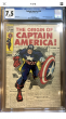
| I have read several threads here where the term "mis-wrap" comes up often, so I was wondering how much that bothers collector's here? And not only mis-wraps, but other defects or obsessive things that bother you about a comic books condition. I am interested in you guys posting pictures of comic books that you currently own and pointing out condition type issues you have and if they bother you or not or if you are looking for a better copy to replace what you have. For me I have comics with minor issues that I am ok with and others I am looking for better copies. I have a modest FF run from the mid 70's to 90's (with lots of duplicates) so I will post some pics of covers and point out any concerns I have and also ask what you guys think. My copy of FF #141 has an obvious mis-wrap, doesn't bother me, but would you have a problem with it? 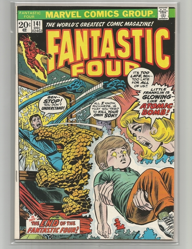 My copy of FF #143...would you consider this a slight mis-wrap? And does too much border white on the spine constitute a mis-wrap? 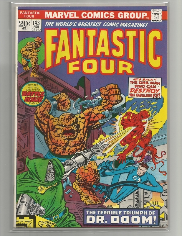 FF #188...look close at the staples and where they are positioned. At first you may think this comic was re-stapled, but it was not, it is a common occurrence/defect for this particular issue. I even seen a copy graded 9.4 like this, so I am wondering...does this not affect the grade?? Personally this bothers me and one of these days I will look to upgrade to a copy where staples are positioned correctly. 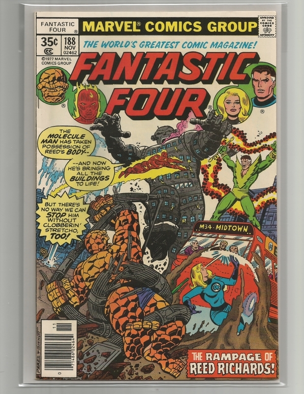 FF #200...both my copies look great, but one has an obvious mis-wrap but does not bother me. 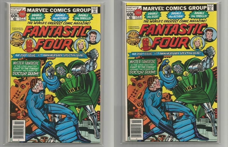 FF #213...I have 2 copies, look close at the issue on the right, see any difference? It may be harder to tell after I scanned it, but the one on the right looks more faded, blacks not as deep. This is a common problem with #213 and not an issue suffering from fading due to sunlight. An ink problem when printed and very common. If I did not already have a better copy this would bother me. 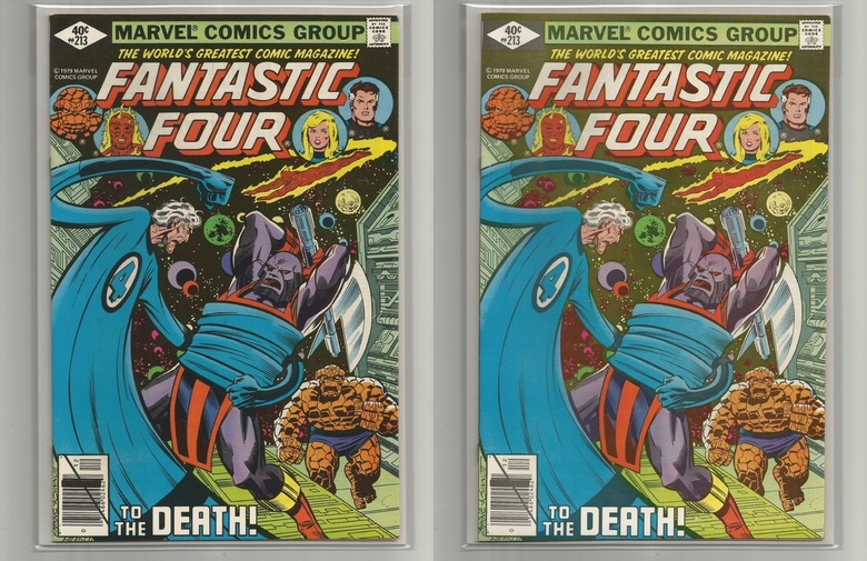 FF #219 & #247...these examples show the wrap way off on the tops (copies on right) where the comics code is cut off but more art on the bottom is shown. In #219 you can see more of Sue Richards boot and in #247 you can see Doom's full foot and where the rubble starts to fade to gray. For me personally, I have an OCD with this sort of thing and if I did not already own better copies I would seek them out. 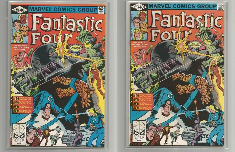 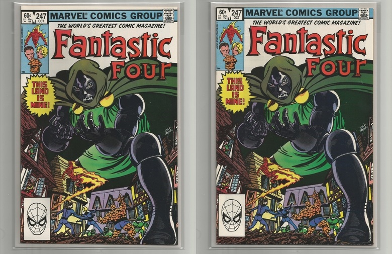 Lastly, Giant-Size Super-Stars FF #1. Should the spine be centered more so that the words should not be readable from the front? And would this be considered a mis-wrap? I am ok with it, but I can see how someone may have a problem with this. 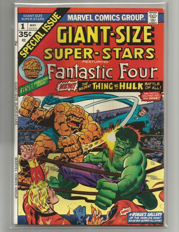 I would love to see your own examples from your collection. |
||
| Post 1 • IP flag post | ||
 I'd like to say I still turned out alright, but that would be a lie. I'd like to say I still turned out alright, but that would be a lie.
|
flanders private msg quote post Address this user | |
These miswraps wouldn't have bothered me but after seeing several posts by @bigredone1944 its now mildly annoying and if I'm looking to purchase a comic I now take this as well as centering into consideration. 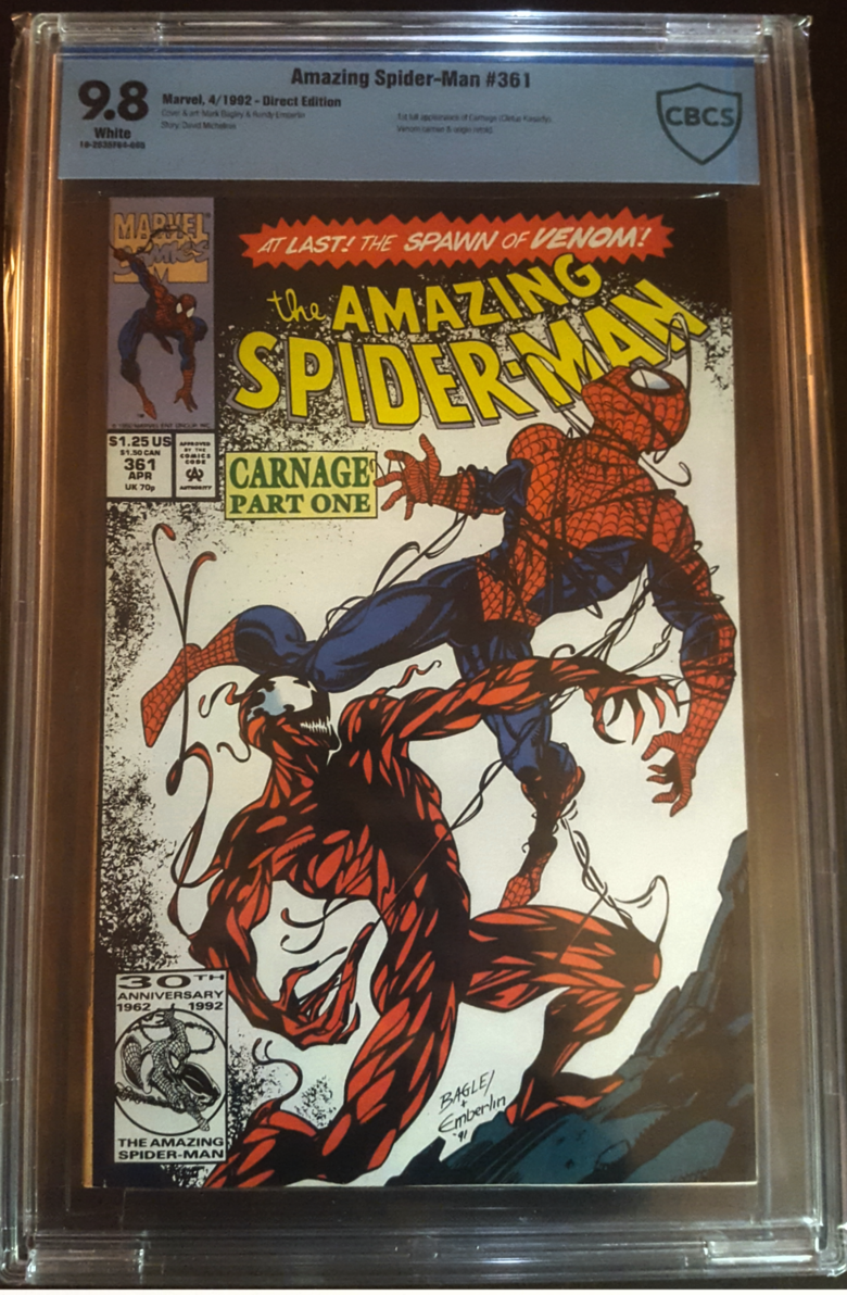 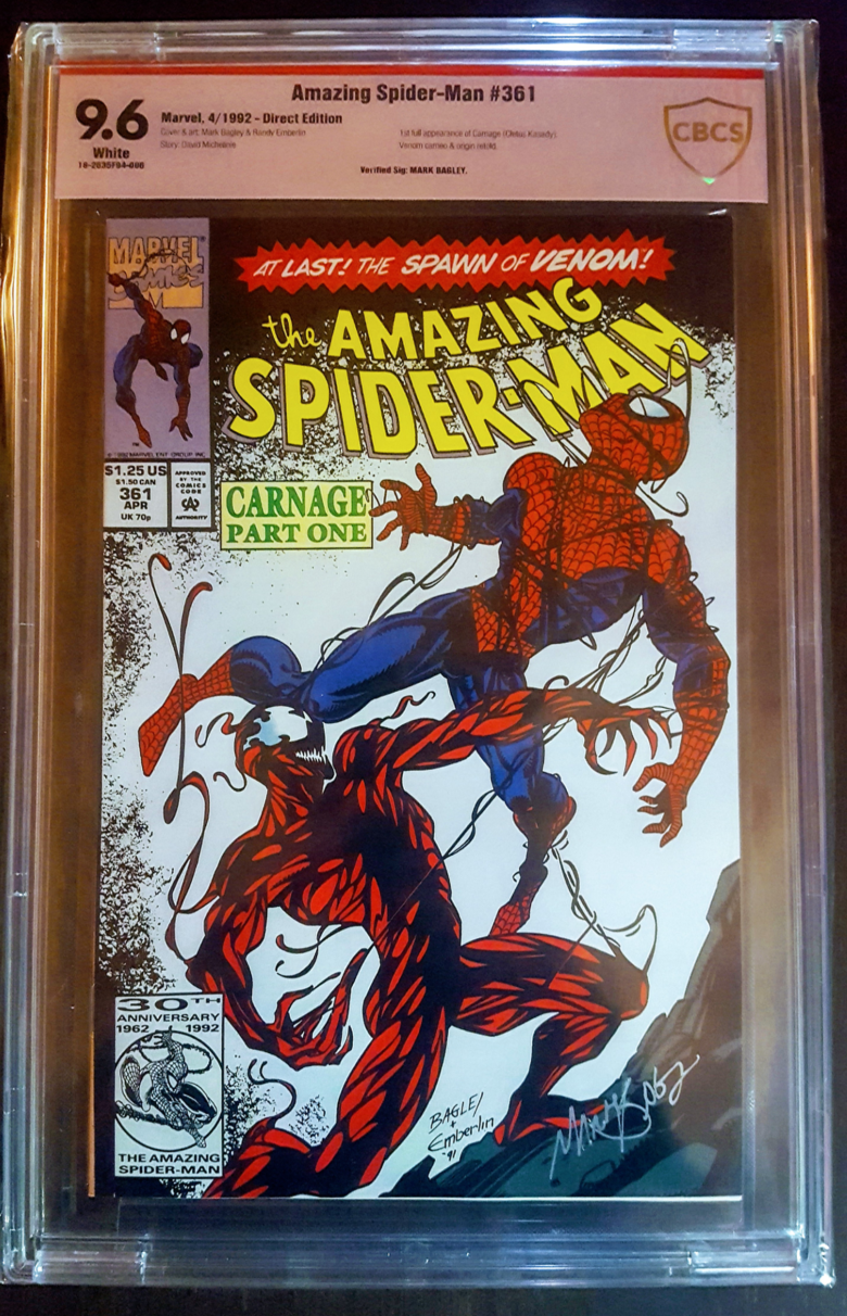 The difference in ink quality would bother me more than a miswrap.  |
||
| Post 2 • IP flag post | ||
 Please continue to ignore anything I post. Please continue to ignore anything I post.
|
southerncross private msg quote post Address this user | |
 Mis wrap but I paid a cheap price already slabbed. And this book is the worse I have for mis wrap. Condition though is nice and I only paid a couple of dollars for it so why not. Wallet wins every time. 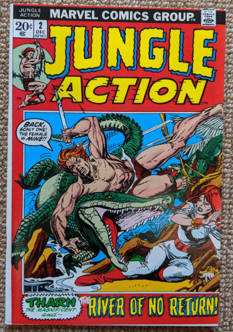 |
||
| Post 3 • IP flag post | ||
 Have I told you about the time I dropped off 3,000 comics at SDCC? Have I told you about the time I dropped off 3,000 comics at SDCC?
|
Scifinator private msg quote post Address this user | |
| Crooked Mis-Wraps bug the cr@p out of me. Like the above ASM 361's and the FF 141 & FF 200 on the right. I just find them too distracting. On left FF 200, whereby it is straight, I find tolerable. I just don't like asymmetry. Take the SS#1 below. Even though that is my grail, a CBCS 9.8, I just couldn't pull the trigger because the title header "Sentinel of the Spaceways" is cockeyed. 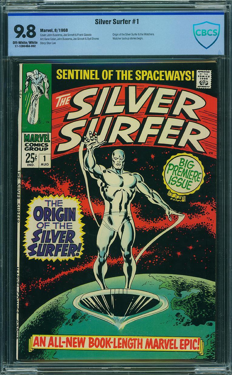 By the way...., I WTB a Silver Surfer #1 9.8 (preferably CBCS) |
||
| Post 4 • IP flag post | ||
 I live in RI and Rhode Islanders eat chili with beans. I live in RI and Rhode Islanders eat chili with beans.
|
esaravo private msg quote post Address this user | |
I honestly don't mind a narrow white stripe along the spine (sorry John). But I prefer it be narrow and fairly straight. Something like this: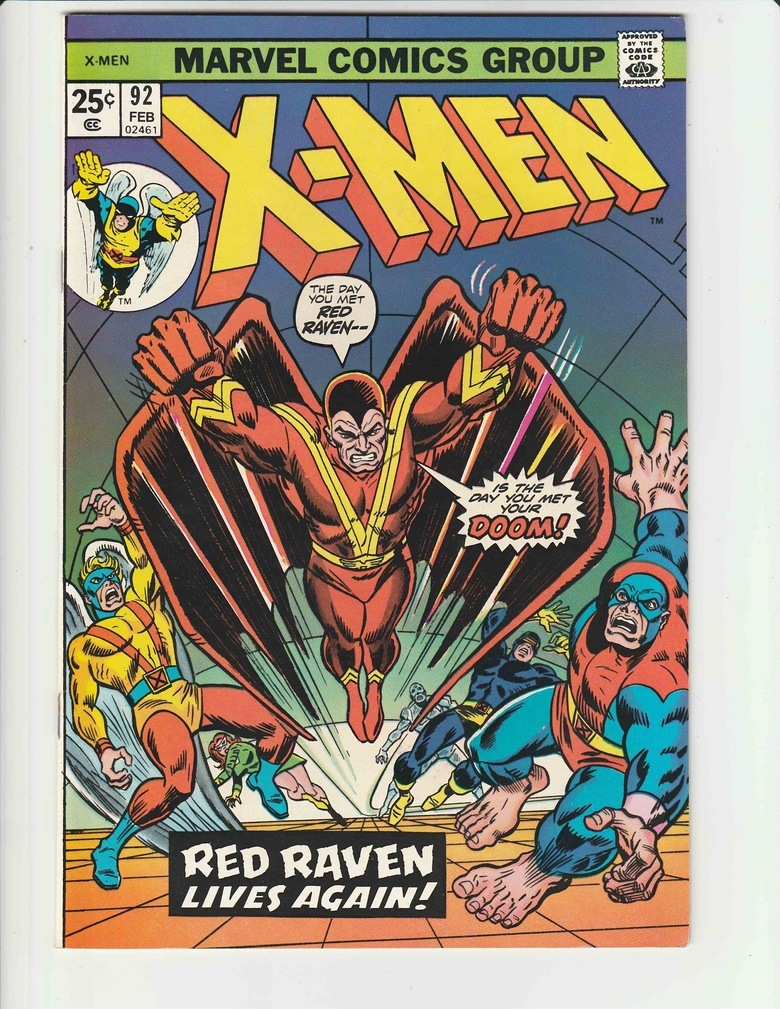 Sure, this one annoys me a bit, but I don't want to spend the money to replace it yet.  |
||
| Post 5 • IP flag post | ||
|
Please continue to ignore anything I post.
|
southerncross private msg quote post Address this user | |
| Sometimes the mis wrap covers bother me. Other times like this Avengers with a black cover I don't mind. 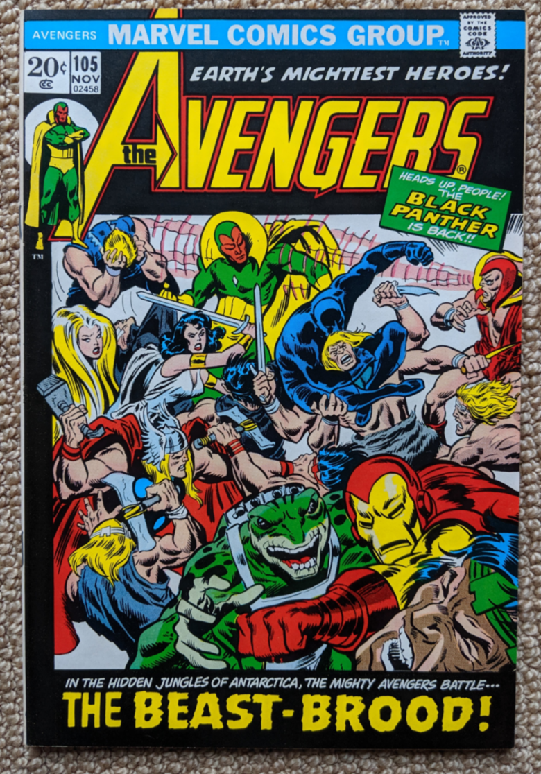 |
||
| Post 6 • IP flag post | ||
|
I live in RI and Rhode Islanders eat chili with beans.
|
esaravo private msg quote post Address this user | |
The SA mis-wraps that annoy me are the "ARVEL OMICS ROUP" ones. Like this one: I ended up buying the following Nick Fury issue (and paying 8.0/8.5 money for a 7.5) because almost every issue of #2 that I came across was so badly mis-wrapped you couldn't even see Steranko's name. (And no, I don't mind the date stamps, but I prefer those over grease pencil dates.)  |
||
| Post 7 • IP flag post | ||
|
Pictures? We don't need no stinking pictures.
|
brysb private msg quote post Address this user | |
Quote:Originally Posted by esaravo At least the words are not missing, just not visible from the front, but if you turn the cover towards the back slightly the words "M C G" are still there. |
||
| Post 8 • IP flag post | ||
|
Please continue to ignore anything I post.
|
southerncross private msg quote post Address this user | |
| arvel comics and 2c covers from the 60s I stay clear of | ||
| Post 9 • IP flag post | ||
 If the viagra is working you should be well over a 9.8. If the viagra is working you should be well over a 9.8.
|
xkonk private msg quote post Address this user | |
| A perfect book is always preferable, but the only one in the original post that bugs me is the 141. The non-uniform mis-wrap is a bit much. The staples in front (188) would be next. | ||
| Post 10 • IP flag post | ||
|
Pictures? We don't need no stinking pictures.
|
brysb private msg quote post Address this user | |
Quote:Originally Posted by Scifinator I see your point with my FF #141, but that SS #1 is a thing of beauty!! the white portion of the spine seems to be fairly symmetrical. |
||
| Post 11 • IP flag post | ||
|
Pictures? We don't need no stinking pictures.
|
brysb private msg quote post Address this user | |
Quote:Originally Posted by esaravo I understand. Both my copies of FF #209 & #215 have similar problems but I am ok enough with it & not seeking out better copies. 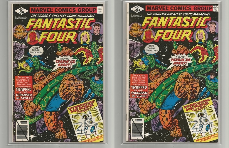 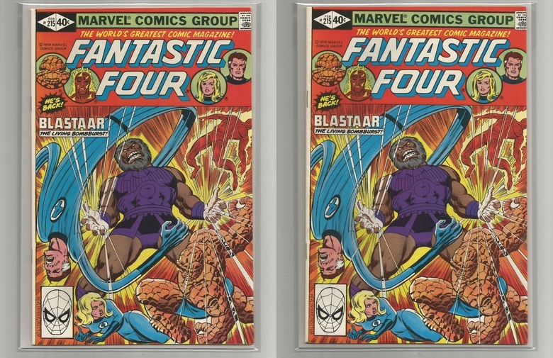 |
||
| Post 12 • IP flag post | ||
|
Have I told you about the time I dropped off 3,000 comics at SDCC?
|
Scifinator private msg quote post Address this user | |
Quote:Originally Posted by brysb I hear ya. But, if I am going to go 5 figures on my grail I have to be able to focus on the art and not the crooked Header and Footer. This one below would be great, but not at 36k, plus, can I trust that it is a 9.8? Let's face it, it just didn't pass @sborock grading table. 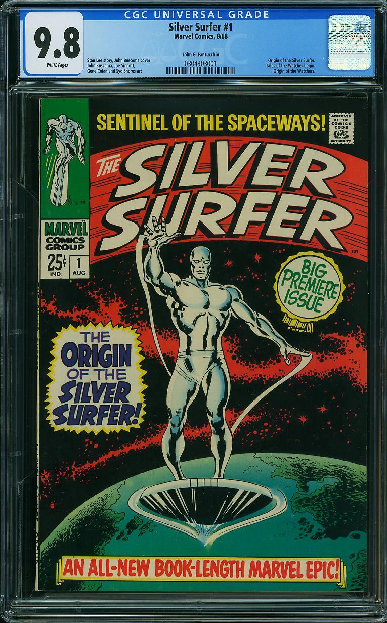 |
||
| Post 13 • IP flag post | ||
|
I live in RI and Rhode Islanders eat chili with beans.
|
esaravo private msg quote post Address this user | |
@Scifinator - If you get a 9.8 Silver Surfer #1 that you just can’t stand to look at because of its cover wrap or CGC label, I will gladly swap you my perfectly wrapped, Steve Borock-approved, 8.0 copy for it.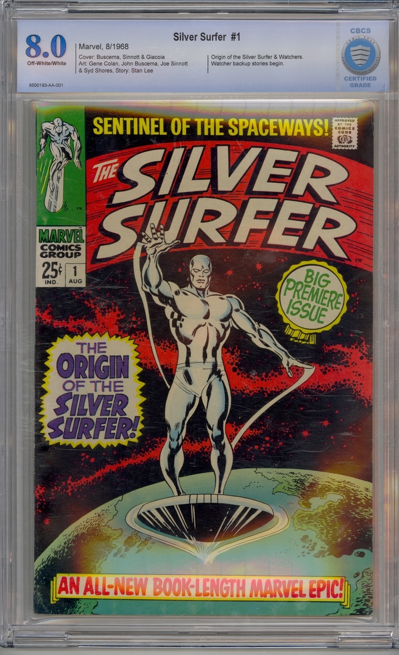 |
||
| Post 14 • IP flag post | ||
 -Our Odin- -Our Odin-Rest in Peace |
Jesse_O private msg quote post Address this user | |
All my collection pictures are on my computer at home. But I found this picture of WW 199 on eBay to illustrate one of my pet peeves. It is when the cover is miswrapped enough to cut letters off word balloons. I've turned down good deals on great comics because of this pet peeve and it doesn't even need to be this drastic. A common occurrence is the cca stamp being cut off. Otherwise, I typically don't mind a narrow, straight back cover showing miswrap. If it's crooked or wide, I still might get the comic, but it would bug me.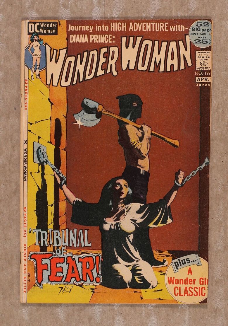 |
||
| Post 15 • IP flag post | ||
 Collector Collector
|
doog private msg quote post Address this user | |
| Allow me to point out that a skilled presser can improve the appearance of nearly any miss wrap. Something to consider if the book is worth it. | ||
| Post 16 • IP flag post | ||
|
Have I told you about the time I dropped off 3,000 comics at SDCC?
|
Scifinator private msg quote post Address this user | |
@esaravo see now, that’s something to look at....and i trust the grade |
||
| Post 17 • IP flag post | ||
|
Pictures? We don't need no stinking pictures.
|
brysb private msg quote post Address this user | |
Quote:Originally Posted by doog Unless the wrap is cut off and no words are present. |
||
| Post 18 • IP flag post | ||
 Collector Collector
|
Darkseid_of_town private msg quote post Address this user | |
| Using the term mis-wrap to cover both mis-centers and covers that were angled badly then miscut as well is perhaps part of the problem. I have no problem with most books that aren't perfectly centered...and it normally doesn't seem to affect the grade one iota either. In most marvels that white stripe adds to the appearance in fact. That being said, there are some books where a mis-centered cover is common and seems more extreme, for instance Iron man 6. Unless the cover is badly mis-centered, there are far worse problems to spend your time and abilities looking for....i.e miscut pages, missing pages, cut coupons, color touch, etc I do see serious defect problems with some books as common, for instance the mis centered and mis cut copies of ASM 361...if the centering is both off and then cut at an angle it really breaks up the asthetic of the vertical lines and makes the book look bad. I generally avoid comics that have that issue , but that is not the same as a simple mis-centered cover. |
||
| Post 19 • IP flag post | ||
 Thank you sir. May I have another? Thank you sir. May I have another?
|
Siggy private msg quote post Address this user | |
Quote:Originally Posted by brysb |
||
| Post 20 • IP flag post | ||
|
Have I told you about the time I dropped off 3,000 comics at SDCC?
|
Scifinator private msg quote post Address this user | |
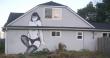
The ultimate mis-wrap: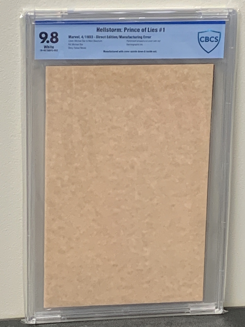 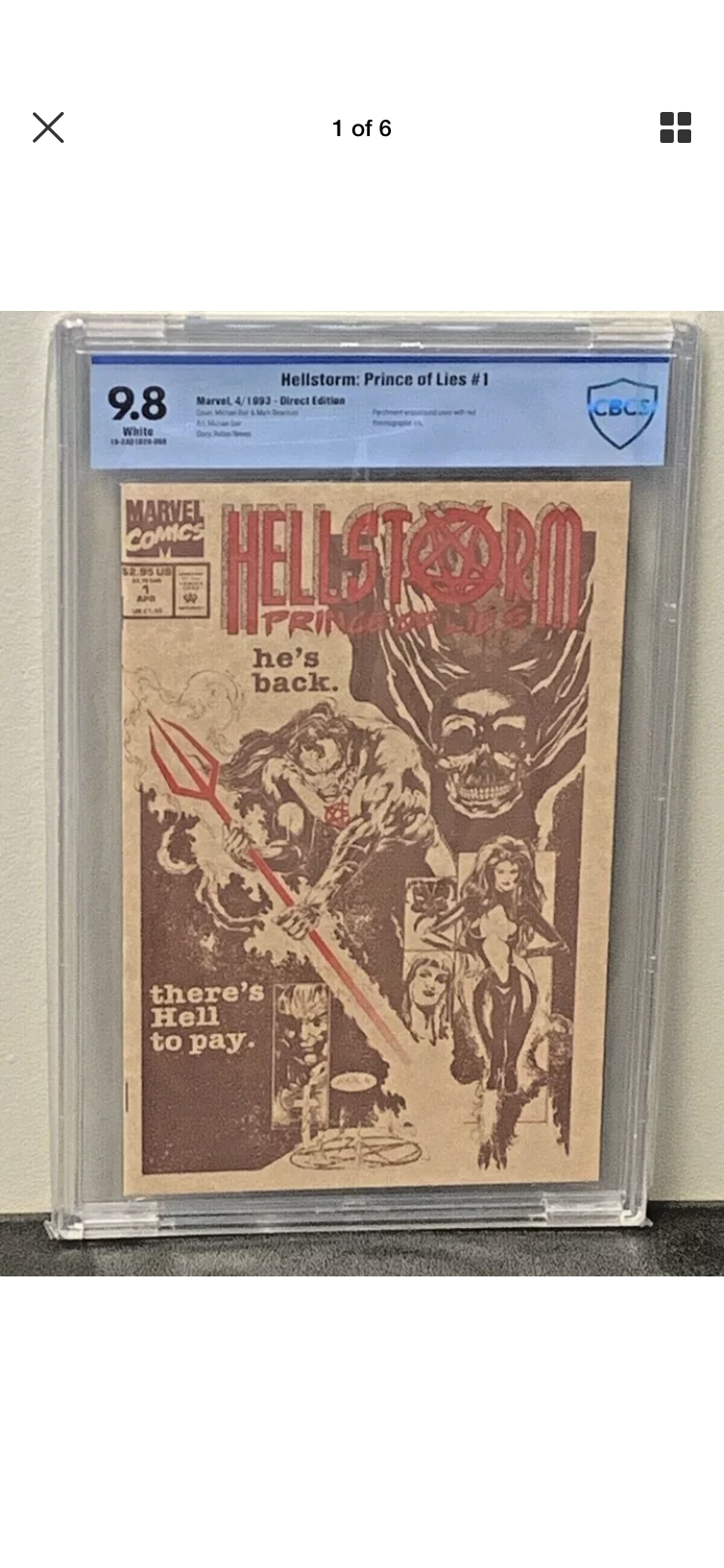 |
||
| Post 21 • IP flag post | ||
 Joined The Club Joined The Club
|
Steverogers11 private msg quote post Address this user | |
| I don’t like miswraps for my PC. If I’m flipping no prob | ||
| Post 22 • IP flag post | ||
 Masculinity takes a holiday. Masculinity takes a holiday.
|
EbayMafia private msg quote post Address this user | |
Quote:Originally Posted by southerncross In the past mis-wraps haven't bothered my peasant eye. But now that I have seen it as a topic of strong consideration on the forum, it would be a point of negotiating leverage for me for sure, the same way page quality would. Same for me as you said, wallet wins every time. Now I'm wondering what would be more important to most here, wrap or a one-level difference in page quality? Page quality has certainly increased in importance to me because it indicates the internal integrity of the book. |
||
| Post 23 • IP flag post | ||
 Collector Collector
|
CatCovers private msg quote post Address this user | |
| @EbaySeller A cockeyed cover and white pages or a perfectly wrapped and cut cover with off-white pages? Give me the perfect cover every time. | ||
| Post 24 • IP flag post | ||
|
Have I told you about the time I dropped off 3,000 comics at SDCC?
|
Scifinator private msg quote post Address this user | |
Quote:Originally Posted by CatCovers @CatCovers---Don't you mean Purr-fect? |
||
| Post 25 • IP flag post | ||
|
Collector
|
CatCovers private msg quote post Address this user | |
| @Scifinator Only Julie Newmar can really pull that off. |
||
| Post 26 • IP flag post | ||
|
Thank you sir. May I have another?
|
Siggy private msg quote post Address this user | |
Quote:Originally Posted by CatCovers +1 EVERY time. Quote: Originally Posted by CatCovers Thank you knowing that lol |
||
| Post 27 • IP flag post | ||
|
Masculinity takes a holiday.
|
EbayMafia private msg quote post Address this user | |
This one probably has a little something for everyone to hate. Mis-wrap, Slanted MCG bar across the top, Grease pencil date and a printing error that makes the cover look sun-faded. Probably explains why I paid about $20 raw for it. I guess I will have to sell it to a collector in China or something: |
||
| Post 28 • IP flag post | ||
|
Have I told you about the time I dropped off 3,000 comics at SDCC?
|
Scifinator private msg quote post Address this user | |
| @EbaySeller - Truly offensive - Ban this comic from the boards! |
||
| Post 29 • IP flag post | ||
|
Masculinity takes a holiday.
|
EbayMafia private msg quote post Address this user | |
Quote:Originally Posted by Scifinator I was shocked when I looked at my recent grades and saw 8.5. I guess because I mostly grade on eye appeal, I just assumed the grade was much lower. |
||
| Post 30 • IP flag post | ||
This topic is archived. Start new topic?