New Logo...Not Good...Sorry849
 Collector Collector
|
IncentiveComic private msg quote post Address this user | |
 Finally saw it in person, I do not like it. My reaction to seeing it was visceral and immediate. It's stunning how bad it is. The info on the label is almost rendered useless by the tiny font. My eyesight is good, I found it nearly impossible to read. The new label does not have that same eye appeal as the old label, which I thought was absolutely perfect. Such a classy look replaced by something less classy. Why fix something that was not broken? |
||
| Post 1 • IP flag post | ||
 Collector Collector
|
Oxbladder private msg quote post Address this user | |
| They are working fixing it and if you visit the two or three other threads and Facebook page you can see the prototype fix revealed at SDCC. I appreciate and accept your POV but understand they are working on it. | ||
| Post 2 • IP flag post | ||
 Collector Collector
|
DertyComix private msg quote post Address this user | |
| @IncentiveComic as Oxbladder stated, there is a new label in the works. Some one had taken a picture of the proposed new label. Steve had pur it out during the SDCC. It looks way better than what is out currently. | ||
| Post 3 • IP flag post | ||
|
Collector
|
IncentiveComic private msg quote post Address this user | |
| Doesn't do much for the 3 books I just got today. | ||
| Post 4 • IP flag post | ||
|
Collector
|
DertyComix private msg quote post Address this user | |
| I know, im in the same boat as you. I have 5 books that will that label. | ||
| Post 5 • IP flag post | ||
 If I could, I would. I swear. If I could, I would. I swear.
|
DrWatson private msg quote post Address this user | |
| Hey, Father Jack. What do you think of the new CBCS label and logo? |
||
| Post 6 • IP flag post | ||
|
If I could, I would. I swear.
|
DrWatson private msg quote post Address this user | |
| Look, it's Rachel from Friends. Hey, Rachel. What do you think of the new CBCS label and logo? |
||
| Post 7 • IP flag post | ||
|
If I could, I would. I swear.
|
DrWatson private msg quote post Address this user | |
| Bart Simpson! Have you seen the new CBCS label and logo? |
||
| Post 8 • IP flag post | ||
|
Collector
|
IncentiveComic private msg quote post Address this user | |
| @DertyComix Look they wanna mess with their label, fine their prerogative. However, my books were there for 5 weeks before the new label thing came down. I didn't have a choice in the matter. Which sucks for these 3 books. | ||
| Post 9 • IP flag post | ||
|
Collector
|
IncentiveComic private msg quote post Address this user | |
| @DrWatson Perfectly said! | ||
| Post 10 • IP flag post | ||


 Collector Collector
|
UF2 private msg quote post Address this user | |
| I'm with you in this one. I sent my first batch of books to get graded and went with cbcs instead of cgc, now kinda of regretting it because of that label and the fact that I don't have a choice. | ||
| Post 12 • IP flag post | ||
|
Collector
|
DertyComix private msg quote post Address this user | |
| @IncentiveComic dont get me wrong im in agreement that the new labels suck my books have just been graded snd im not happy either that i will have this horrible label but i have come to accept that it is what it is. I still would rather have cbcs slab ny books over cgc due to their currebt issues. And cbcs is trying to fix this issue as we speak. | ||
| Post 13 • IP flag post | ||
|
|
zab47 private msg quote post Address this user | |
| if they are still working on developing a new logo who is getting paid all the money to piss every one off these u can file in garabage no comics from me until I see a collectors image on my investment not only in my comic but the item it's packaged in who really wants to show off a great comic in a crappy piece of plastic | ||
| Post 14 • IP flag post | ||
|
Collector
|
UF2 private msg quote post Address this user | |
| The issue i have is this is pretty much a bait and switch. I sent my stuff in and have been charged for a product I was expecting. If they want to change it that's fine, but there should of been a cutoff date on the old labels or a choice with a cutoff date for old labels. | ||
| Post 15 • IP flag post | ||
 I bought a meat grinder on amazon for $60 and it's changed my life. I bought a meat grinder on amazon for $60 and it's changed my life.
|
kaptainmyke private msg quote post Address this user | |
| RIVETING | ||
| Post 16 • IP flag post | ||
|
Collector
|
IncentiveComic private msg quote post Address this user | |
| @DertyComix I have no problems with CBCS. Customer service folks are courteous and professional. They may not always have the right information but they are always courteous. The books arrive at my door packaged great. All that being said, in this particular instance, I wish, as someone who submitted books way before...7-15-16...I'd have been given the old label. That's what I thought I was getting when I submitted my books in May. That is all. |
||
| Post 17 • IP flag post | ||
|
Collector
|
IncentiveComic private msg quote post Address this user | |
| @UF2 I feel the same way. A choice would have been good. | ||
| Post 18 • IP flag post | ||
 Collector Collector
|
TruckJohnson private msg quote post Address this user | |
Quote:Originally Posted by IncentiveComic A new label and OLD logo that are not hideous would have been even better. |
||
| Post 19 • IP flag post | ||
 Collector Collector
|
fat1138 private msg quote post Address this user | |
| my books were subbed at eccc just got them 60 slabbs new label |
||
| Post 20 • IP flag post | ||
|
Collector
|
IncentiveComic private msg quote post Address this user | |
| @fat1138 That sucks. It really is disappointing. | ||
| Post 21 • IP flag post | ||
|
If I could, I would. I swear.
|
DrWatson private msg quote post Address this user | |
| I would rather have a blank piece of paper as that label. | ||
| Post 22 • IP flag post | ||
 Collector Collector
|
Kinzebac private msg quote post Address this user | |
| @fat1138 what do you think about the new labels in person? | ||
| Post 23 • IP flag post | ||
 Collector Collector
|
rickdod3 private msg quote post Address this user | |
| All I want is the option to have the old label put on any new books I submit. I have a ton of old label books...I don't want my OCD to kick in once I get new books back and everything has changed lol | ||
| Post 24 • IP flag post | ||
 Collector Collector
|
zosocane private msg quote post Address this user | |
Quote:Originally Posted by DertyComix That isn't the only concern of the OP. He is saying the new logo doesn't look good. On the prototype label that was revealed at SDCC, the new logo remains the same. I think a majority of CBCS fans would prefer to stay with the old label, and I think the vast majority would prefer to stay with the old logo. |
||
| Post 25 • IP flag post | ||
|
Collector
|
Oxbladder private msg quote post Address this user | |
Quote:Originally Posted by zosocane Honestly? I cannot claim to know what the majority opinion is. I have seen people that like it I have seen people post they don't like it and I have seen people post that they really don't care. The ones who do not are more vocal and emotional about it and are likely scaring the other people's opinions away because they want to avoid conflict. What I THINK that the "majority" opinion would be if independently polled would be a majority fall into the don't care camp. Middle of the road opinion is usually the most common. However, with the lack of an independent poll (ie one where a cross section of customers/members were ask their opinion by an independent party and not some poll run on a forum or on Facebook) I don't know what the true answer is because I have no idea how many customers CBCS customers have. Finally, while I do think that everyone has a right to their opinion I also think that it is time for everyone on every side to take it easy. There is nothing more that can be done and said. CBCS had a prototype out there and has the opinions both ways here and on Facebook. The continual back and forth on this issue is NOT going to achieve any more. I am sure CBCS put out quite a bit of money to do this change and it is going to take a little bit of time to adjust everything to please the opposition. Sorry I just do not see the point of continuing to bite the hand that feeds you. |
||
| Post 26 • IP flag post | ||
 I'll probably wake up constipated. I'll probably wake up constipated.
|
Pre_Coder private msg quote post Address this user | |
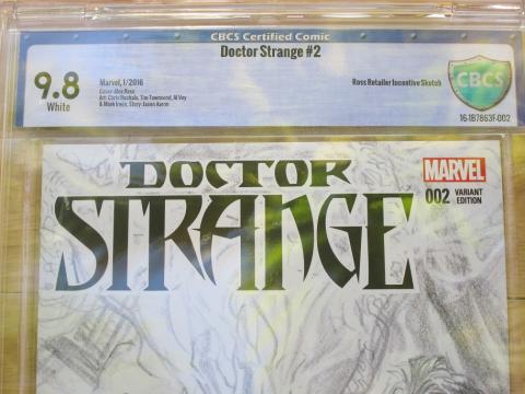
| Last week I was at my LCS buying supplies, hanging out and discussing subjects like - Franken-slabs and Franken-labels. During the conversation I noticed a high grade book in his glass cabinet that I've been sorta-kinda in the market for. It is a Spidey V2 #36 (911). This one was CGC 'Death-slabbed' at 9.8 White, and believe it or not I noticed the book before I noticed the big-ass number. LOL After studying the book the best I could through the shell, it does appear to be a solid 9.8. The Newton issues were very miniscule and the label really didn't bother me so much although I prefer their previous. I did notice some waves forming on the front and back mylar sheets inside the shell but the book 'APPEARS' to be unaffected - but still the pressure is there! I told my LCS I'll buy the book and he can Fast Track it to CBCS for what I consider to be safer encapsulation, and he says "no problem"! But I stopped myself quickly and said, "that means I am going to have that ugly new CBCS label,... never mind, I'll pass"! We both laughed! I am seriously considering going back tomorrow and purchasing the book, cracking it out and placing it in a Mylites2/Fullback (with the label) and just stashing it away. It's the most gorgeous ASM V2 36 I've held in my hands. |
||
| Post 27 • IP flag post | ||
|
Collector
|
fat1138 private msg quote post Address this user | |
| Font size a little on small side.I am sort of middle of road ,i dont mind them.The minimalism of label does not detract from the cover image. | ||
| Post 28 • IP flag post | ||
|
Collector
|
UF2 private msg quote post Address this user | |
| It really is simple when it comes to things like these. Speak with your wallet. I'll see how my first order goes, if I am not happy then I will go somewhere else. Really sucks cause I have a stack of books I want to send out right this moment but I really want to give cbcs a chance because of all the good I have heard up until now. | ||
| Post 29 • IP flag post | ||
 Leftover Sundae Gnus Leftover Sundae Gnus
|
CatmanAmerica private msg quote post Address this user | |
Quote:Originally Posted by UF2 Unfortunately, there's no place else to go for a dependable third party grading service if you want an aesthetically pleasing label to compliment books in your collection. CGC opted for an ugly label on their failed holder. After fixing the holder they doubled-down on the label. CBCS apparently decided to change their label & logo in response to CGC's changes. In both instances, collectors who cared about this weren't consulted in the process. In all honesty, I think the problem is more complicated than we've been addressing here. Both grading services compete for visibility on dealer walls, auction sites and in catalogs. It wouldn't surprise me if outside pressure from dealers and auction houses was placed on both companies by to enlarge and embolden grade fonts even if there was little or no call for it from collectors. The problem is that those folks who see holders and labels only as a sales tool don't share the same interest as collectors. Aesthetics are critical to those for whom presentation and the visibility of comics are more important than the visibility of labels. Most collectors hate overstated road sign grade fonts (both CGC & CBCS). This produces a dilemma for those of us spending large sums on high grade books (pedigrees, etc.) that won't be cracked out. Some of us will probably restrict our purchases to older label holdered books, eschewing new labels altogether. As for resubmissions, the trade off between a possible grade bump and the certainty of an ugly label may come into play. These opinions are difficult to share because I have the greatest respect for CBCS and CGC as steady providers of stability to the markets. The schism comes from a collision of interests, those of the collector and those of market driven economic factors. It is my profoundest hope that some area of compromise can be reached between these two competing interests. |
||
| Post 30 • IP flag post | ||
This topic is archived. Start new topic?