CBCS launches New Logo and Brand756
|
|
RHall1101 private msg quote post Address this user | |
| While the 'new' label isn't perfect, companies rebrand themselves all the time. I'm just excited that my books have done to QC and hopefully will slide through the rest of the process easily. I only have seven books currently in the system, so if CBCS comes out with something better I can always send them in for reholding. |
||
| Post 976 • IP flag post | ||
 Collector Collector
|
Evangelon private msg quote post Address this user | |
| I was told by Customer service that the New, new labels will begin once the supply of new labels runs out. The only thing not working for me with that prototype is the way the white fades to blue and back. Looks like a 70's tydied T-shirt | ||
| Post 977 • IP flag post | ||
|
|
RHall1101 private msg quote post Address this user | |
| It's retro | ||
| Post 978 • IP flag post | ||
 Collector Collector
|
MR_SigS private msg quote post Address this user | |
Quote:Originally Posted by Taco4000  |
||
| Post 979 • IP flag post | ||
 COLLECTOR COLLECTOR
|
DarthLego private msg quote post Address this user | |
Quote:Originally Posted by Evangelon Well if this is the case then they need to make an official statement soon and let us know what's going on, how large the supply is and when they estimate it running out. There's quite a few of us who are holding back submissions because of the FrankenRivet. |
||
| Post 980 • IP flag post | ||
 Collector Collector
|
akionabr private msg quote post Address this user | |
Quote:Originally Posted by MR_SigS This is hilarious! |
||
| Post 981 • IP flag post | ||
|
COLLECTOR
|
DarthLego private msg quote post Address this user | |
No sdccProtolabel news yet? |
||
| Post 982 • IP flag post | ||
 Collector Collector
|
Maverick private msg quote post Address this user | |
Quote:Originally Posted by DarthLego Nothing, getting the silent treatment from Customer Service right now on an ETA. Really looking to get my books or my money back. |
||
| Post 983 • IP flag post | ||
|
Collector
|
Evangelon private msg quote post Address this user | |
| On a positive note CBCS will have on-site grading at the Tampa Bay Comic Con. Nevermind those books that have been sitting around a couple months longer than advertised. At least it'll help get rid of those horrid labels. | ||
| Post 984 • IP flag post | ||
 Collector Collector
|
Quaid private msg quote post Address this user | |
| I do not know a single person who likes the new labels. I'm not a fan of the rivets or the faded color but I especially can't stand the font for the grade. The number looks terrible. Please revamp these labels before my 12 books are encapsulated! | ||
| Post 985 • IP flag post | ||
|
|
Mio private msg quote post Address this user | |
| Please, guys, hurry up and upgrade the label. I have 18 of my best books with you right now (that I sent before the spontaneous swtich) and I really do not want the tacky rivet version atop them. | ||
| Post 986 • IP flag post | ||
 Collector Collector
|
Kinzebac private msg quote post Address this user | |
Quote:Originally Posted by Mio I just want some official announcement, so that I really will know if they are going with the prototype label or not. |
||
| Post 987 • IP flag post | ||
|
|
Mio private msg quote post Address this user | |
Quote:Originally Posted by Kinzebac Seriously - not the biggest fanof the prototype, but it is miles ahead of the rivet version (that looks hideous on GA and SA books in particular). |
||
| Post 988 • IP flag post | ||
|
Collector
|
Kinzebac private msg quote post Address this user | |
Quote:Originally Posted by Mio I totally agree. |
||
| Post 989 • IP flag post | ||
|
|
rckstr1253 private msg quote post Address this user | |
| I think the last label show Is growing on me. I still like the original better but oh well. | ||
| Post 990 • IP flag post | ||
 Collector Collector
|
BronzeAgeBaby private msg quote post Address this user | |
Been posting on the FB page but have bee doing some label design messing ...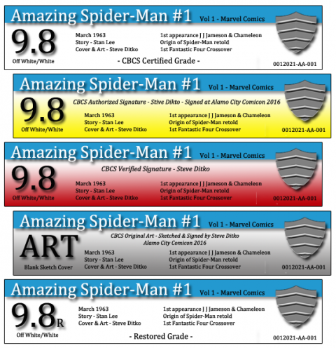 |
||
| Post 991 • IP flag post | ||
 Moderator Moderator
|
Jesse_O private msg quote post Address this user | |
Quote:Originally Posted by BronzeAgeBaby Hahahahaha - now I know the identity of the BronzeAgeBaby!!!! bwahahahahahaha!!! BTW - great to see you here!! |
||
| Post 992 • IP flag post | ||
 Collector Collector
|
silverage_shane private msg quote post Address this user | |
| I liked the old label. It was distinctly different and you could spot a CBCS slab from across the con floor. Can it be revisited? I know it's impossible to please everyone. I liked the old label, however I felt it was seemed a little faded. Keep the same color schemes, just make it a little deeper in color tone. Also the font of the grade could've used a change. And I do like the new holofoil shield (but without the rivets and brushed metal look). So if they went back to the old label, with deeper color tone, font change on the grade, and added the new holofoil shield. I think that would be perfect. Just my opinion. I do believe in this company. I know it is the best protection for books with true archival quality. CBCS do have the collector's best interest at heart regarding comic book protection, indefinitely. | ||
| Post 993 • IP flag post | ||
|
|
rckstr1253 private msg quote post Address this user | |
Quote:Originally Posted by BronzeAgeBaby I'd take that! |
||
| Post 994 • IP flag post | ||
 Collector Collector
|
svgcomics181 private msg quote post Address this user | |
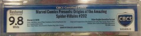
here a comparison of the same book with old & new label, how does anyone think the newer ones look superior???  |
||
| Post 995 • IP flag post | ||
|
Collector
|
Maverick private msg quote post Address this user | |
| No. | ||
| Post 996 • IP flag post | ||
|
|
Mio private msg quote post Address this user | |
| Aweful. | ||
| Post 997 • IP flag post | ||
|
Collector
|
Kinzebac private msg quote post Address this user | |
| Have they run out of the new labels yet? (Insert picture of me praying) | ||
| Post 998 • IP flag post | ||
|
Collector
|
Maverick private msg quote post Address this user | |
Quote:Originally Posted by Kinzebac Idk still getting the silent treatment via customer service. When Zach asked me to wait back in july, when this whole thing started, I was thinking the week after sdcc I would hear/see something. A few weeks later we got nothing and I cant even get him to respond via email. It seems like there might be some activity on their fb page but Im not sure since I dont use fb. An offical statement would be nice. |
||
| Post 999 • IP flag post | ||
|
Collector
|
Maverick private msg quote post Address this user | |
| I would love to wrap this label bs up so cbcs can focus on slabbing magazine size books or fixing the forums.That's something the people could really get behind. | ||
| Post 1000 • IP flag post | ||
 Collector Collector
|
ThisLand private msg quote post Address this user | |
| Post 1001 • IP flag post | ||
|
Collector
|
Kinzebac private msg quote post Address this user | |
Quote:Originally Posted by Maverick Boy, that would be nice. I just would like to know what their plans are, so I can move forward. I know I am not the only one. |
||
| Post 1002 • IP flag post | ||
|
|
monks private msg quote post Address this user | |
| I'm sorry, but the new label design is a total mess. The font, layout, and color seem very juvenile-crayolaish of a design. Rivets, really? C'mon guys! The old label is much cleaner, brighter and overall looks a lot more professional. Please leave it alone. | ||
| Post 1003 • IP flag post | ||
|
COLLECTOR
|
DarthLego private msg quote post Address this user | |
| Ok here's a new question. I can understand them wanting to blow through their label stock. But why are they still using the fonts and negative space layout? All of that is printed on the fly. Why not just apply the font and layout changes from the SDCC prototype to the remaining rivet stock??? | ||
| Post 1004 • IP flag post | ||
 Collector Collector
|
roarzola private msg quote post Address this user | |
| Ok, got my books back with the new label. I have to admit, the rivets, don't bother me. What actually hurts to look at is the print, which is really small and the font for the grade. "9" look really weird with it. | ||
| Post 1005 • IP flag post | ||
This topic is archived. Start new topic?