CBCS launches New Logo and Brand756
 COLLECTOR COLLECTOR
|
dielinfinite private msg quote post Address this user | |
Quote:Originally Posted by D84 Jesus Christ! $500 for 5! https://www.ebay.com/itm/322191093212 |
||
| Post 876 • IP flag post | ||
 Collector Collector
|
D84 private msg quote post Address this user | |
| I know. I just want one for my Batman 9, but I can't find one at a reasonable price. | ||
| Post 877 • IP flag post | ||
 Collector Collector
|
Kinzebac private msg quote post Address this user | |
Quote:Originally Posted by DrWatson Is this the potential new label? Nevermind. I just saw it confirmed in the other thread. |
||
| Post 878 • IP flag post | ||
 Leftover Sundae Gnus Leftover Sundae Gnus
|
CatmanAmerica private msg quote post Address this user | |
Quote:Originally Posted by D84 Books were subject to damage if the screws weren't tightened perfectly. Too little pressure and SCS can blunt corners or worse; too much pressure could potentially pop staples. I have a bunch of 'em; they're collectible, but don't use 'em for comic storage. |
||
| Post 879 • IP flag post | ||
 Collector Collector
|
D84 private msg quote post Address this user | |
| I didn't have those problems with it. I'll admit, I only had one or two and they got sold with the books, but wow! I guess that's why they don't make them anymore. | ||
| Post 880 • IP flag post | ||
 Collector Collector
|
Evangelon private msg quote post Address this user | |
| http://comicskin.com/product-category/slab-it-yourself-kits/ | ||
| Post 881 • IP flag post | ||
 COLLECTOR COLLECTOR
|
DarthLego private msg quote post Address this user | |
| @Evangelon we already have a thread dedicated to discussing that product. | ||
| Post 882 • IP flag post | ||
 Collector Collector
|
zosocane private msg quote post Address this user | |
Quote:Originally Posted by Kinzebac Looks like our grass-roots effort was only partially successful. I will miss the Old Label. |
||
| Post 883 • IP flag post | ||
 You think I'm joking, I'm not. You think I'm joking, I'm not.
|
earthshaker01 private msg quote post Address this user | |
| @D84 Chris Pedrin created them. I have spoken to him. He still has some in warehouse. | ||
| Post 884 • IP flag post | ||
 If I could, I would. I swear. If I could, I would. I swear.
|
DrWatson private msg quote post Address this user | |
Quote:Originally Posted by zosocane They look more like the old cgc labels before those got ruined as well. |
||
| Post 885 • IP flag post | ||
 You think I'm joking, I'm not. You think I'm joking, I'm not.
|
earthshaker01 private msg quote post Address this user | |
Quote:Originally Posted by dielinfinite I spoke with fortress creator in the past and he quit making them and moved on to similar archival cases but on a grander scale for museums protecting tapestries and alike. He said why sell a 1000 fortresses for 40.00 each when he can sell one wall mount for 10k ro a museum. It was labor intensive hauling them around to conventions. If Cbcs and Pedrin got together they could have had something extra special. Pedrin has some left in a warehouse and I almost bout a couple hundred a couple years ago to put my books in but cbcs came around and I decided to get them graded instead. |
||
| Post 886 • IP flag post | ||
 COLLECTOR COLLECTOR
|
DarthLego private msg quote post Address this user | |
Quote:Originally Posted by DrWatson That might be what CBCS is going for, they might be thinking having a familiar look to the old pre-creep CGC will help convert customers. |
||
| Post 887 • IP flag post | ||
 Collector Collector
|
Mathyus_42 private msg quote post Address this user | |
| ..... Got an answer... |
||
| Post 888 • IP flag post | ||
 Collector Collector
|
jdangerc private msg quote post Address this user | |
I hate to be "that guy" but CBCS needs to just start from scratch or go back to the old labels and tweek it just a bit. I think both new labels in the pic look horrible. Maybe it's just me, but I actually passed on 5 CBCS graded comics this weekend because of the crappy looking new labels. 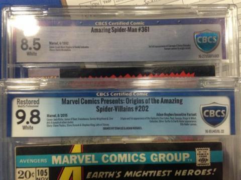 |
||
| Post 889 • IP flag post | ||
 COLLECTOR COLLECTOR
|
DarthLego private msg quote post Address this user | |
| Another thing I like, CBCS fixed the blue on New 2.0. New 1.0 the blue was way too purple. The fact that CBCS has prototyped changes so quickly says alot about them, many other companies would plow forward with blinders on. | ||
| Post 890 • IP flag post | ||
 If I could, I would. I swear. If I could, I would. I swear.
|
DrWatson private msg quote post Address this user | |
Quote:Originally Posted by jdangerc You're not the only person that feels that way. I agree, but I have also come to terms with the idea that the old label isn't (unfortunately) coming back. The new new label is an improvement over the new label with the wide ass CBCS shield logo notwithstanding. It's a shame really. Collecting graded comics is all about aesthetics and once that's gone, what's the point? I think I was slowly progressing toward an end any way. All that was left was an excuse. |
||
| Post 891 • IP flag post | ||
 Collector Collector
|
brianscotch private msg quote post Address this user | |
Quote:Originally Posted by DrWatson They really need to go through a professional design agency. While the upfront costs will be high, this is their brand image that will stick around for years to come. Spend the money now and build a brand that will truly knockout the competion with superior cases, label & web design, and great customer service. |
||
| Post 892 • IP flag post | ||
 If I could, I would. I swear. If I could, I would. I swear.
|
DrWatson private msg quote post Address this user | |
Quote:Originally Posted by brianscotch When you Google or Bing image search "Blue Shield" and see the results, you can almost guarantee that someone found a blue shield clip art and dropped "CBCS" in the middle of it. |
||
| Post 893 • IP flag post | ||
 COLLECTOR COLLECTOR
|
Foghorn_Sam private msg quote post Address this user | |
| Interesting development, and I must applaud them for the quick appearance of a prototype newer label. It looks like the grade font got bigger and is still an unappealing font. The background going across from white to light blue to white again just doesn't work because the white behind the black grade font is garish and still says look at me too much (and it's too much like CGC's new grade label which I absolutely loathe). I still don't understand why the push to make it so you can see the grade on the label from the International Space Station. I think going to a solid background or to a background like the old label where the color gradient is horizontal instead of vertical and making the grade font blue instead of black would give the label better balance. Of course I realize there is going to be no way to make everyone happy because everyone's ideas of aesthetics are going to vary from person to person. I just hope and it looks like they are trying to take things into consideration so that says a lot about them. I think they may have been very surprised at the push back about this new label and how passionate some of us are about how the label looks. They must have done some kind of research in designing the new label because before they revealed it they were saying "We heard you!". I just don't know who they were listening to based on how immediately most people blew up this forum about it. Anyway, thanks CBCS for being open minded and measuring your decisions wisely. |
||
| Post 894 • IP flag post | ||
 Collector Collector
|
svgcomics181 private msg quote post Address this user | |
so many labels they gone through already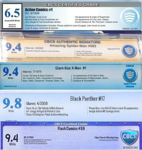 |
||
| Post 895 • IP flag post | ||
 COLLECTOR COLLECTOR
|
DarthLego private msg quote post Address this user | |
I still feel that this would look better without the side borders. |
||
| Post 896 • IP flag post | ||
 Collector Collector
|
DannyBoy private msg quote post Address this user | |
Quote:Originally Posted by DrWatson You are correct - it is very much a shame. CBCS had a golden opportunity when CGC released their new case back in April. All CBCS had to do is not change anything. I thought it was a no-brainer. |
||
| Post 897 • IP flag post | ||
 Collector Collector
|
DannyBoy private msg quote post Address this user | |
Quote:Originally Posted by brianscotch This. The new CBCS graphic brand is competing with PGX, not CGC. If you don't care about your brand image, then you're sending the message that you don't care about your product and service. |
||
| Post 898 • IP flag post | ||
 Collector Collector
|
Kinzebac private msg quote post Address this user | |
| So far in 2016, CGC has had the slab issue and CBCS has had the label issue and we have not hit August yet. That being said, am I the only one that hopes we can make through the end of the year without anymore big announcements from either grading company? | ||
| Post 899 • IP flag post | ||
 Collector Collector
|
Evangelon private msg quote post Address this user | |
| I'm sorry but CBCS just keeps making the label worse. WTH would you change something that isn't broken? Scrap the whole new label idea, revert back to the old one, and never ever give whoever made this decision another opportunity to put in any design ideas ever again, even if it was Steve Borock himself! What do you mean you heard us? The only thing I remember people preaching about was adding the graders notes to the reverse side of the label, not this horrid 80's Miami Vice looking crap. | ||
| Post 900 • IP flag post | ||
 Collector Collector
|
jakecaputo private msg quote post Address this user | |
| This new new label is like putting perfume on a pig. | ||
| Post 901 • IP flag post | ||
|
|
gatwick private msg quote post Address this user | |
Quote:Originally Posted by svgcomics181 And every one of them looks terrible. |
||
| Post 902 • IP flag post | ||
 Collector Collector
|
Thanos_of_Titan private msg quote post Address this user | |
| CBCS, looking back at the history of your labels the facts are clear. You need to hire a professional experienced graphic designer to brand your company once and for all. It's clear to me you are using somebody who fancies themselves a designer but has no formal training or experience in the field. A good pro design usually only needs to be designed once and only slightly tweaked over the years. To do that you need somebody who understands timeless design. CBCS you have a great service and great case but your labels have never looked professional. If you realized that and fixed it, it would put you way ahead of the competition. This new Branding set you back a few steps. I hate to say that but it's true. |
||
| Post 903 • IP flag post | ||
|
|
crossedfan private msg quote post Address this user | |
| I think I have a fortress laying around somewhere if someone wants one.. | ||
| Post 904 • IP flag post | ||
 COLLECTOR COLLECTOR
|
DarthLego private msg quote post Address this user | |
| @crossedfan Someone here was looking for one, I forgot who. | ||
| Post 905 • IP flag post | ||
This topic is archived. Start new topic?

