CBCS launches New Logo and Brand756
 COLLECTOR COLLECTOR
|
JWKyle private msg quote post Address this user | |
Quote:Originally Posted by Stronguyno i'm talking about a supposely new prototype design that is floating around in southern california |
||
| Post 851 • IP flag post | ||
 Collector Collector
|
Stronguy private msg quote post Address this user | |
Quote:Originally Posted by VaComicsGuy You're attributing waaay too much intelligence to the CBCS crew. |
||
| Post 852 • IP flag post | ||
 Collector Collector
|
The_Curmudgeon private msg quote post Address this user | |
Quote:Originally Posted by VaComicsGuy It was the Illuminati. They were also behind CGC's new slab and their "frankenslab." |
||
| Post 853 • IP flag post | ||
 COLLECTOR COLLECTOR
|
Foghorn_Sam private msg quote post Address this user | |
| Machiavellian: Adjective; cunning, scheming, and unscrupulous, especially in politics or in advancing one's career. synonyms: devious · cunning · crafty · artful · wily · sly · scheming |
||
| Post 854 • IP flag post | ||
 Leftover Sundae Gnus Leftover Sundae Gnus
|
CatmanAmerica private msg quote post Address this user | |
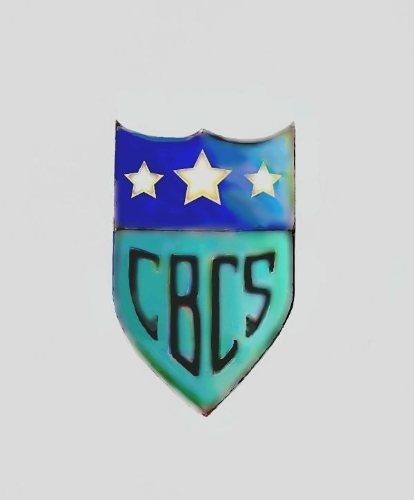
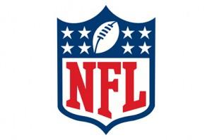
Quote:Originally Posted by Nino_013 LOL! Naw, no similarity 'tol. Besides, the NFL shield looks cheesy. My shield shape is completely different, much closer to the bow plates on old warships circa late 19th century. The NFL wasn't even fully fleshed out as a sport at that time. I don't think the stars can be trademarked, it's a totally different configuration. And the letter design bears no resemblance whatsoever to the NFL font. Heck, the NFL isn't even real "football". Anyway, it was just a design concept. |
||
| Post 855 • IP flag post | ||
 COLLECTOR COLLECTOR
|
dielinfinite private msg quote post Address this user | |
@CatmanAmerica Careful, you might get a sternly worded letter from MLJ about infringing on their trademarks. Just look how that worked out for good ol' Captain America |
||
| Post 856 • IP flag post | ||
 Why just the women? I like bears. Why just the women? I like bears.
|
Gaard private msg quote post Address this user | |
Quote:Originally Posted by CatmanAmerica You might want to run that by CGC's attorneys. Just ask CBCS. |
||
| Post 857 • IP flag post | ||
|
Leftover Sundae Gnus
|
CatmanAmerica private msg quote post Address this user | |
Quote:Originally Posted by Gaard CGC is losing stars as we speak. I think they're down from four to two and a half since redesigning their label/holder. |
||
| Post 858 • IP flag post | ||
 Collector Collector
|
CopperAgeKids private msg quote post Address this user | |
Quote:Originally Posted by Foghorn_Sam |
||
| Post 859 • IP flag post | ||
 COLLECTOR COLLECTOR
|
DarthLego private msg quote post Address this user | |
| I'm actually glad CBCS didn't fight that CGC star trademark BS, I like there circle check much better. | ||
| Post 860 • IP flag post | ||
|
COLLECTOR
|
DarthLego private msg quote post Address this user | |
| @CatmanAmerica I've seen a logo shield before that looks like yours, but I'm drawing a blank on what it was. | ||
| Post 861 • IP flag post | ||
|
Leftover Sundae Gnus
|
CatmanAmerica private msg quote post Address this user | |
Quote:Originally Posted by DarthLego It certainly could've been inspired from some other source, such as the warship prow emblem mentioned, but that shield, like the MLJ costumed character The Shield, has a red, white & blue stars & stripes theme. This'n started as a blank drawing. Granted, most ideas are subject to subconscious influence from other sources, but it's doubtful that there are clear similarities with any known trademark or design. I'd certainly be interested in seeing comparable examples as copyright infringement is something I'd never knowingly do. I don't mind being proven wrong though, even if it's an unlikely coincidence. |
||
| Post 862 • IP flag post | ||
 If I could, I would. I swear. If I could, I would. I swear.
|
DrWatson private msg quote post Address this user | |
| CBCS has shirts with that horrible shield logo on them that they are wearing at SDCC. This does not bode well. | ||
| Post 863 • IP flag post | ||
|
COLLECTOR
|
DarthLego private msg quote post Address this user | |
| I failed to find a similar logo, it's possible I saw it in a previous parallel reality. | ||
| Post 864 • IP flag post | ||
|
COLLECTOR
|
DarthLego private msg quote post Address this user | |
| @DrWatson Sounds like they went all in before any cards were dealt. | ||
| Post 865 • IP flag post | ||
 Moderator Moderator
|
Jesse_O private msg quote post Address this user | |
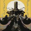
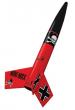
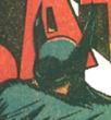
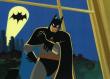
Am I the only one that sees a resemblance in Catman's shield to this one???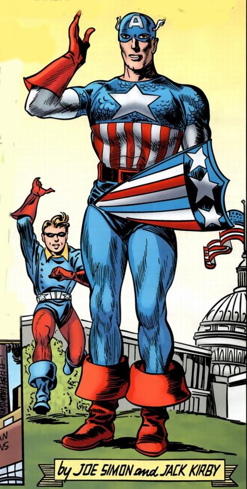 |
||
| Post 866 • IP flag post | ||
|
COLLECTOR
|
DarthLego private msg quote post Address this user | |
 |
||
| Post 867 • IP flag post | ||
|
COLLECTOR
|
DarthLego private msg quote post Address this user | |
 |
||
| Post 868 • IP flag post | ||
|
Leftover Sundae Gnus
|
CatmanAmerica private msg quote post Address this user | |
| Post 869 • IP flag post | ||
|
COLLECTOR
|
DarthLego private msg quote post Address this user | |
| Well since they are already looking at changes, I wonder if the Frankenlabel (I say it love ❤) will become sought after for it's rarity after all this is over? | ||
| Post 870 • IP flag post | ||
|
COLLECTOR
|
dielinfinite private msg quote post Address this user | |
Quote:Originally Posted by Jesse_O No, though I decided to go a tad further back with my reference Quote: Originally Posted by dielinfinite |
||
| Post 871 • IP flag post | ||
|
COLLECTOR
|
DarthLego private msg quote post Address this user | |
| @CatmanAmerica try making your CBCS letters white, I think it will pop more. | ||
| Post 872 • IP flag post | ||
|
Leftover Sundae Gnus
|
CatmanAmerica private msg quote post Address this user | |
Quote:Originally Posted by DarthLego Like the Fortress, it may be sought by rivet collectors. Quote: Originally Posted by DarthLego Thanks for the suggestion, may take a shot at that. I like the dark lettering, but I have no idea whether it would stand out on a holographic sticker. (Thumbs up emoticon) |
||
| Post 873 • IP flag post | ||
 Collector Collector
|
D84 private msg quote post Address this user | |
| Wait, what was wrong with the Fortress? I liked those. | ||
| Post 874 • IP flag post | ||
|
If I could, I would. I swear.
|
DrWatson private msg quote post Address this user | |
Quote:Originally Posted by DrWatson Yep. Doomed.  |
||
| Post 875 • IP flag post | ||
|
COLLECTOR
|
dielinfinite private msg quote post Address this user | |
Quote:Originally Posted by D84 Jesus Christ! $500 for 5! https://www.ebay.com/itm/322191093212 |
||
| Post 876 • IP flag post | ||
|
Collector
|
D84 private msg quote post Address this user | |
| I know. I just want one for my Batman 9, but I can't find one at a reasonable price. | ||
| Post 877 • IP flag post | ||
 Collector Collector
|
Kinzebac private msg quote post Address this user | |
Quote:Originally Posted by DrWatson Is this the potential new label? Nevermind. I just saw it confirmed in the other thread. |
||
| Post 878 • IP flag post | ||
|
Leftover Sundae Gnus
|
CatmanAmerica private msg quote post Address this user | |
Quote:Originally Posted by D84 Books were subject to damage if the screws weren't tightened perfectly. Too little pressure and SCS can blunt corners or worse; too much pressure could potentially pop staples. I have a bunch of 'em; they're collectible, but don't use 'em for comic storage. |
||
| Post 879 • IP flag post | ||
|
Collector
|
D84 private msg quote post Address this user | |
| I didn't have those problems with it. I'll admit, I only had one or two and they got sold with the books, but wow! I guess that's why they don't make them anymore. | ||
| Post 880 • IP flag post | ||
This topic is archived. Start new topic?