CBCS launches New Logo and Brand756
 COLLECTOR COLLECTOR
|
dielinfinite private msg quote post Address this user | |
| @DarthLego My lips are sealed @Kinzebac I didn't think to ask but I'd imagine they can't be too far away |
||
| Post 801 • IP flag post | ||
 Leftover Sundae Gnus Leftover Sundae Gnus
|
CatmanAmerica private msg quote post Address this user | |
Quote:Originally Posted by Foghorn_Sam I made a slight change to your image that softens the bracket and adds a slight color graduation. This gives the label a bit more elegance without taking away any of the clean design elements... 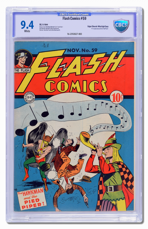 Since we're still tossing around ideas, I'm trying to find some area of compromise from which to build a consensus. |
||
| Post 802 • IP flag post | ||
 I bought a meat grinder on amazon for $60 and it's changed my life. I bought a meat grinder on amazon for $60 and it's changed my life.
|
kaptainmyke private msg quote post Address this user | |
 Wait - I leave the forum for 2 DAYS and it jumps from page 24 to 32 and now there's going to be a NEW NEW Label?! My orders are both on "PROCESSING" so i'm like michael jackson and whatnotz  |
||
| Post 803 • IP flag post | ||
 COLLECTOR COLLECTOR
|
Foghorn_Sam private msg quote post Address this user | |
Quote:Originally Posted by CatmanAmerica Say, I think you're onto something here, I like it. I tried to do a gradient in the background, but I was afraid it would look too busy. I never thought of doing the gradient on the border but it seems to work. |
||
| Post 804 • IP flag post | ||
|
Leftover Sundae Gnus
|
CatmanAmerica private msg quote post Address this user | |
| @Foghorn_Sam Thanks! These are good ideas to bounce around. |
||
| Post 805 • IP flag post | ||
 COLLECTOR COLLECTOR
|
DarthLego private msg quote post Address this user | |
| @kaptainmyke Processing is not a status, click on your invoice number to see the status of the books inside the invoice. | ||
| Post 806 • IP flag post | ||
 If I could, I would. I swear. If I could, I would. I swear.
|
DrWatson private msg quote post Address this user | |
Quote:Originally Posted by CatmanAmerica The Super Nintendo logo of doom has to go away. |
||
| Post 807 • IP flag post | ||
 Collector Collector
|
zosocane private msg quote post Address this user | |
Quote:Originally Posted by Mio Bump. |
||
| Post 808 • IP flag post | ||

|
If I could, I would. I swear.
|
DrWatson private msg quote post Address this user | |
Quote:Originally Posted by DrWatson Actually, it does remind me of the legion of Doom's Hall of Doom.   |
||
| Post 809 • IP flag post | ||
 Collector Collector
|
Stronguy private msg quote post Address this user | |
Quote:Originally Posted by DrWatson The logo looks like a stock image for a home security service. |
||
| Post 810 • IP flag post | ||
 Collector Collector
|
Oxbladder private msg quote post Address this user | |
Quote:Originally Posted by CatmanAmerica Yeah the gradient on the border is a lot better but I would still eliminate the border on the sides and shorten the top border a bit. |
||
| Post 811 • IP flag post | ||
|
|
Mio private msg quote post Address this user | |
Quote:Originally Posted by zosocane I guess someone likes this one! |
||
| Post 812 • IP flag post | ||
 Collector Collector
|
matterus023 private msg quote post Address this user | |
Quote:Originally Posted by CatmanAmerica Seems that your last gradient attempt has led you to a better end result. This is an improvement for sure. |
||
| Post 813 • IP flag post | ||
|
Collector
|
matterus023 private msg quote post Address this user | |
Quote:Originally Posted by Mio It is sexy. For me just a few tweaks and jackpot |
||
| Post 814 • IP flag post | ||
 Collector Collector
|
Kinzebac private msg quote post Address this user | |
Quote:Originally Posted by DrWatson Brilliant Reference |
||
| Post 815 • IP flag post | ||
|
Collector
|
Kinzebac private msg quote post Address this user | |
| @dielinfinite you going to take any con pictures for the boards? Pictures of wall books are most appreciated. | ||
| Post 816 • IP flag post | ||
|
COLLECTOR
|
dielinfinite private msg quote post Address this user | |
| @Kinzebac I'll do a round and post them after I get done with a signing this morning | ||
| Post 817 • IP flag post | ||
 Collector Collector
|
MR_SigS private msg quote post Address this user | |
Quote:Originally Posted by Mio And another- with either logo. I like the balance of two 'boxes' on the left and right. And the wide open space on the right doesn't throw things off balance for me, strangely. It feels like a space reserved for 'special' notations, and (for me) works whether it's empty or full. |
||
| Post 818 • IP flag post | ||
|
Collector
|
Kinzebac private msg quote post Address this user | |
| @dielinfinite you rock man. Thanks | ||
| Post 819 • IP flag post | ||
 I'll probably wake up constipated. I'll probably wake up constipated.
|
Pre_Coder private msg quote post Address this user | |
Quote:Originally Posted by MR_SigS And another - Agree with what Scott said above. How about tweaking the shield and the above/below text to match the same shade of blue as the grade number. The shield area seems to be just a bit too subtle. Be nice to see how it looks. |
||
| Post 820 • IP flag post | ||
|
|
Mio private msg quote post Address this user | |
| I still like the top one better than second from the top. But here it is... and the other types of labels. Blue border on the top is the light blue from the old CBCS logo. Next one down is the blue from the 9.4 font. Yes, I took time out of legal practice for this! 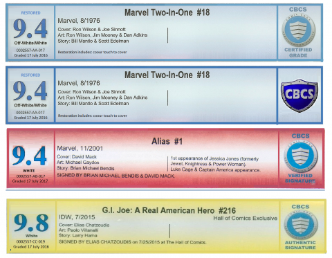 |
||
| Post 822 • IP flag post | ||
|
If I could, I would. I swear.
|
DrWatson private msg quote post Address this user | |
Quote:Originally Posted by Mio They all look great except for the second one. |
||
| Post 823 • IP flag post | ||
|
If I could, I would. I swear.
|
DrWatson private msg quote post Address this user | |
| If the shield was elongated, lost the rivets, lost the muscle car font on CBCS, and looked less Medieval Times Dinner Theater, it might be okay. Emphasis on the might. I would take the old logo hands down... any day. | ||
| Post 824 • IP flag post | ||
|
Collector
|
Kinzebac private msg quote post Address this user | |
Quote:Originally Posted by DrWatson This plus 1000 |
||
| Post 825 • IP flag post | ||
|
COLLECTOR
|
DarthLego private msg quote post Address this user | |
| I see your 1000 and raise you +MysteryScienceTheater3000 | ||
| Post 826 • IP flag post | ||
|
Leftover Sundae Gnus
|
CatmanAmerica private msg quote post Address this user | |
Quote:Originally Posted by DrWatson I could design that shield in an hour or so. |
||
| Post 827 • IP flag post | ||
|
Collector
|
Kinzebac private msg quote post Address this user | |
| @DarthLego good one. | ||
| Post 828 • IP flag post | ||
|
COLLECTOR
|
DarthLego private msg quote post Address this user | |
Quote:Originally Posted by CatmanAmerica And with an hour lunch thrown into the middle too. |
||
| Post 829 • IP flag post | ||
 Collector Collector
|
SilverAgeFan private msg quote post Address this user | |
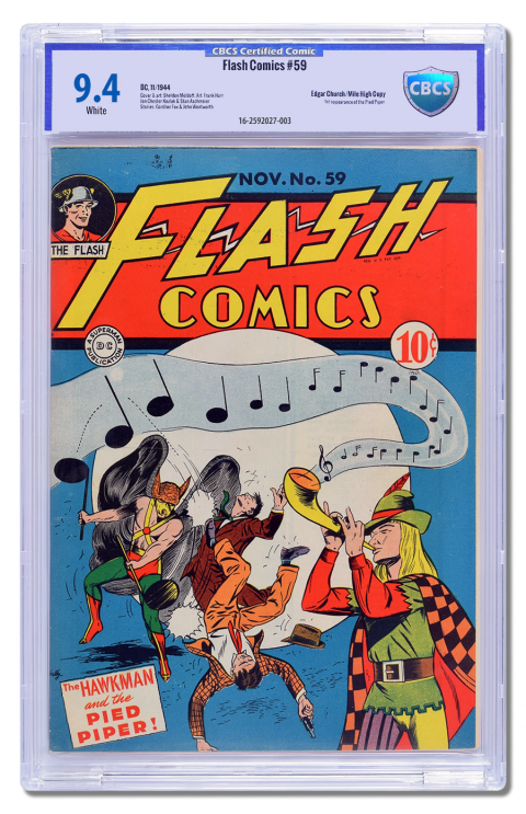
Here are the 7 books I received back from CBCS yesterday. They went in process on May 10th. 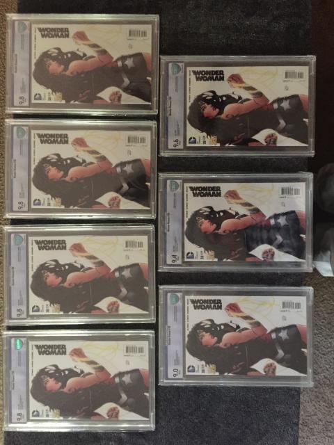 |
||
| Post 830 • IP flag post | ||
This topic is archived. Start new topic?