CBCS launches New Logo and Brand756
|
|
TimesChange private msg quote post Address this user | |
Quote:Originally Posted by DarthLego I know, I agree and I struggled with that, but in the end I liked pedigree issues to stand out, and it does:-) What about this to balance it? it would just be on pedigree issues, actually I thought about the idea of changing the entire label color for pedigree.  |
||
| Post 701 • IP flag post | ||
|
|
TimesChange private msg quote post Address this user | |
Quote:Originally Posted by Foghorn_Sam The font I used was Myriad pro, condensed and condensed bold, It's a very nice basic font. |
||
| Post 702 • IP flag post | ||
 Leftover Sundae Gnus Leftover Sundae Gnus
|
CatmanAmerica private msg quote post Address this user | |
Quote:Originally Posted by TimesChange My personal preference would be a softer blended color scheme that compliments the new hologram shield without competing with the comic for attention. Something simple and elegant, perhaps with a touch of art deco... 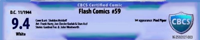 The Church pedigree would've been on the right side just under the first appearance attributions. The solid color bracket is one of the elements that doesn't work for me (on the rivet design as well). Your grade font and color background improved on the CBCS design. IMO, emphasizing the pedigrees at the top in a different color is ...well, over the top, but I have a lot of pedigreed books in my collection, so I do appreciate what you did there. BTW, I don't mind criticism of this. It's a rough design based on another suggested label template. My expectations are as low as the methods used to fascilitate the design. |
||
| Post 703 • IP flag post | ||
|
|
Mio private msg quote post Address this user | |
10 minutes with MS Paint, and I like this one better. Minor tweaks to the original, and we are all set. I don't even mind working for free on this one!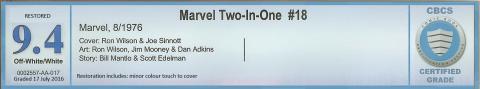 |
||
| Post 704 • IP flag post | ||
 Collector Collector
|
Spideyfan73 private msg quote post Address this user | |
Quote:Originally Posted by SteveRicketts I'm sure it will be riveting. Anyone remember some years back KFC tried changing their name unannounced to Kitchen Fresh Chicken? And.... how'd that go? They obviously didn't learn with the imposter Colonel. Great that CBCS is taking it all under advisement to sort this out. |
||
| Post 705 • IP flag post | ||
 COLLECTOR COLLECTOR
|
Foghorn_Sam private msg quote post Address this user | |
I worked on my version of the label a little more, removing the rivets and changing the font of the grade. Thinned the border down at the top on each side of the "CBCS Certified Comic". Probably would look better with radiuses in the corners of the blue border, but I couldn't figure out how to pull that off, once again my photo shop prowess is a little limited, but it has been fun experimenting with this.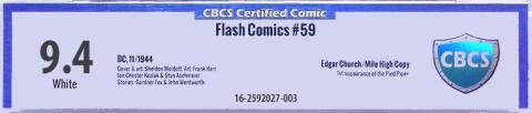 |
||
| Post 706 • IP flag post | ||
 Collector Collector
|
Stronguy private msg quote post Address this user | |
| It's the color that's killing it for me. It looks like the old CGG/PGX label with that electric blue and solid background. | ||
| Post 707 • IP flag post | ||
 Collector Collector
|
matterus023 private msg quote post Address this user | |
| I still can't help but think they were pretty much there before. Make the CBCS logo holofoil, create a thin blue border around the edge (slightly deeper blue so frames it) and drop the grade lower and have things like restored above. Much like @Mio has done but with the holofoil so it pings their logo (which I still feel is far better then this new one) and make the border a darker hint. This is the old label. I only wish I could use computers better to have a go myself. Mio would you be so kind to darken the border so I can see what it looks like. Not dark blue just enough to overpower the other colours Plus putting the restored above the grade not below it and the page quality makes it stand out more. I know for some they prefer it not to stand out etc but listening to others I feel that it should be easier than it is to spot. 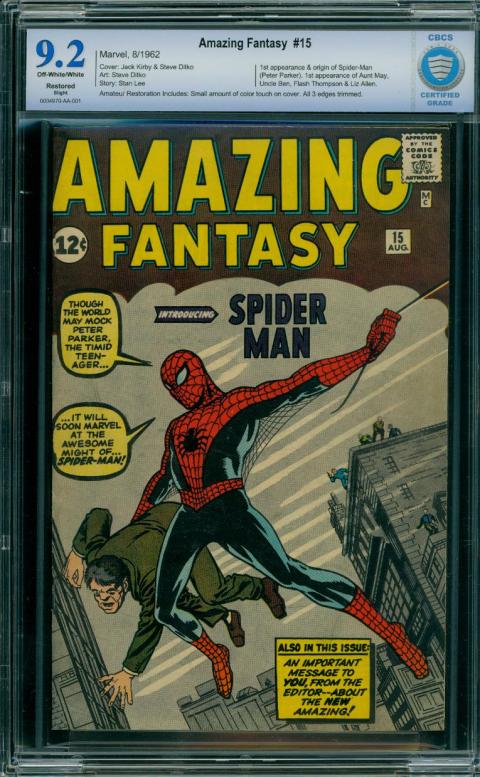 |
||
| Post 708 • IP flag post | ||
|
Collector
|
matterus023 private msg quote post Address this user | |
Quote:Originally Posted by CatmanAmerica I have liked many of your comments @CatmanAmerica so remember that as I say this........I really don't like the concept. Looks very odd to me. |
||
| Post 709 • IP flag post | ||
 Collector Collector
|
Kinzebac private msg quote post Address this user | |
| I like a lot of what I am seeing from these potential labels. We have some talented people on these boards. My take home message: any one of these examples is better than what CBCS rolled out. | ||
| Post 710 • IP flag post | ||
 Collector Collector
|
MR_SigS private msg quote post Address this user | |
Quote:Originally Posted by Mio I still like this grade font the most. It's a nice color balance for the original shield. All black seems to make it heavy on the left. |
||
| Post 711 • IP flag post | ||
|
Collector
|
Kinzebac private msg quote post Address this user | |
Quote:Originally Posted by MR_SigS I agree. With all the examples that have been presented, including the two CBCS lables, this font is the best. |
||
| Post 712 • IP flag post | ||
|
|
Mio private msg quote post Address this user | |
Quote:Originally Posted by Kinzebac It looks like we have a winner! |
||
| Post 713 • IP flag post | ||
 Collector Collector
|
zosocane private msg quote post Address this user | |
Quote:Originally Posted by Mio [INSERT SIGN-HOLDING "WINNER" EMOTICON HERE] ^^ This looks outstanding. Absolutely love it. Mio's design maintains the overall look and feel of the "old" label and adds some minor polish to give the new label a razor-sharp finish. Give Mio a year of free slabbing services! |
||
| Post 714 • IP flag post | ||
|
COLLECTOR
|
Foghorn_Sam private msg quote post Address this user | |
Nice propositions and well done I might say. Here's my offering again, this time with the grade in blue. I'm afraid whether we like it not, I believe they are committed to the new logo so I'm going with that on my creations. It seems almost unanimous no one likes the rivets at the top. If they are just on the logo then it seems to be ok. I'm ok with the brushed steel if it is only in the darker blue frame. Since I cut the width of the top frame, it doesn't make the empty or frameless bottom seem so bad. What seems to be unpopular is to have the grade with an all white background or in a box with an all white background, it just stands out too much. 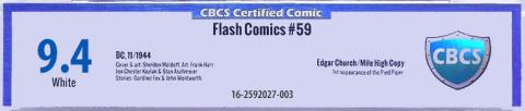 |
||
| Post 715 • IP flag post | ||
|
Leftover Sundae Gnus
|
CatmanAmerica private msg quote post Address this user | |
Quote:Originally Posted by matterus023 That's fine. I was trying to demonstrate something stylistically unique with complimentary colors and no harsh edges or brackets. I'm glad to see that others have joined in with their own ideas. I may tweak this later or design another. Appreciate the feedback. 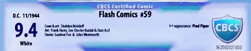 Note: The image has been tweaked, with better contrast and lighter color gradient. Without access to Photoshop, my designs won't be slickly rendered, but maybe they'll inspire some new ideas outside the box ...and brackets. What's productive is seeing concepts from a variety of sources. It may also give CBCS management a few ideas moving forward. Mio's design works well for me as it holds close to the original. Would like to see it with the new shield logo for comparison. Foghorn Sam's design is clean, and improves greatly on the proposed CBCS "ribbit" version, but I'm still not in love with the dark blue top & side color bracket. Would enjoy seeing more ideas. |
||
| Post 716 • IP flag post | ||
 Collector Collector
|
Oxbladder private msg quote post Address this user | |
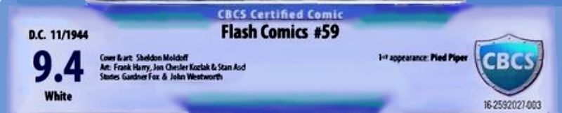
Alright I said I would post images of various age books with the new labels here you go: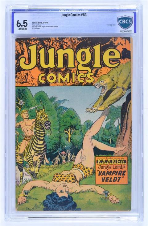 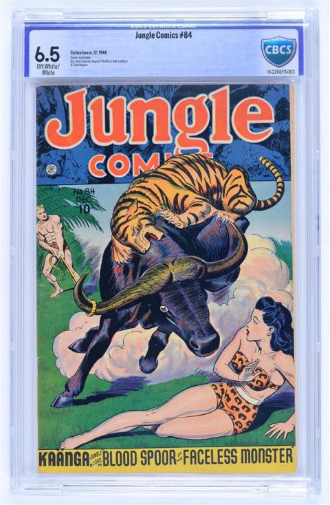 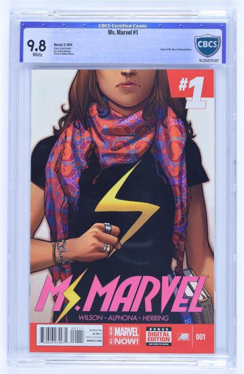 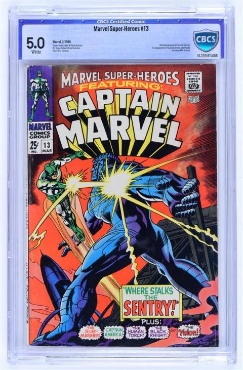 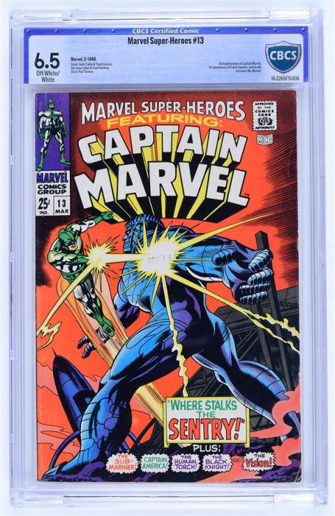   |
||
| Post 717 • IP flag post | ||
|
|
Mio private msg quote post Address this user | |
| Nice books. Uggy labels. | ||
| Post 718 • IP flag post | ||
|
Collector
|
Oxbladder private msg quote post Address this user | |
Quote:Originally Posted by Mio Thanks! I don't have any major problem with them (the labels) other than the dark border. Again I prefer the old but all in all they do not bother me a great deal. |
||
| Post 719 • IP flag post | ||
|
Collector
|
MR_SigS private msg quote post Address this user | |
Quote:Originally Posted by Mio Just don't like the grade font :deadhorse: |
||
| Post 720 • IP flag post | ||
|
Collector
|
Oxbladder private msg quote post Address this user | |
| I don't expect the images to change anyone's mind nor am I trying to say anything with posting the images other than doing what I said I would and post images of the new label with different era books |
||
| Post 721 • IP flag post | ||
|
Collector
|
matterus023 private msg quote post Address this user | |
| @Oxbladder Thanks for uploading those pics. For me this truly shows that they don't work. But I am just going over the same thing here. @Mio Top job as I said (if not heavily hinted at before). I still think make the border slightly darker and with the old logo holofoil. I appreciate you can't do that with the holofoil but overall WINNER for me anyway. If you could make the border a lightly deeper blue for me that would be great. @CatmanAmerica I understand what you are saying fully about the design you came up with. All of these efforts help massively I feel. Plus as you said you don't have the best tools to hand. I need to learn how to use basic art tools on the computer so I can't say anything. |
||
| Post 722 • IP flag post | ||
|
Collector
|
MR_SigS private msg quote post Address this user | |
Quote:Originally Posted by Oxbladder  |
||
| Post 723 • IP flag post | ||
|
COLLECTOR
|
Foghorn_Sam private msg quote post Address this user | |
| Aieeee.... now that I've seen this new label on more books I'm cringing more than ever, waaaaaaaaaaaaaaaaaaaay too much dead space in the middle of the label. | ||
| Post 724 • IP flag post | ||
|
Collector
|
Oxbladder private msg quote post Address this user | |
| I just wanted to make a suggestion to those folks trying their hand at tweaking label images. I think it is helpful to try and associate the book image with the label as well. I can see guys playing around with the label and getting something they like only for it to associate an image of a book with it and realize it doesn't work. I wonder, perhaps, if this wasn't part of the problem when they were designing the label in the first place? So hopefully the images above can help everyone out in their graphical endeavors. |
||
| Post 725 • IP flag post | ||
 COLLECTOR COLLECTOR
|
dielinfinite private msg quote post Address this user | |
Here's a blast from the past. This is from an article announcing CBCS in mid-2014. I don't think any books actually went out with this label but it's interesting to see how labels have progressed  |
||
| Post 726 • IP flag post | ||
|
Collector
|
Oxbladder private msg quote post Address this user | |
| There have been a couple of tweaks the middle style, too. There was someone on the FB page that had an image of the various iterations of the middle label. | ||
| Post 727 • IP flag post | ||
|
COLLECTOR
|
dielinfinite private msg quote post Address this user | |
| I wasn't going for a comprehensive history, just the broad strokes | ||
| Post 728 • IP flag post | ||
|
Collector
|
Oxbladder private msg quote post Address this user | |
| Right. | ||
| Post 729 • IP flag post | ||
 Collector Collector
|
D84 private msg quote post Address this user | |
Quote:Originally Posted by dielinfinite I personally like the label on the Action Comics 1. Wonder why that was dropped? |
||
| Post 730 • IP flag post | ||
This topic is archived. Start new topic?