Label Critique5501
 Collector Collector
|
ozonetv private msg quote post Address this user | |
| As a relative newbie to collecting (I've just gotten back into it after about 40 years), the whole idea grading makes a lot of sense, for protection and resale of high value books. I get it. But as a graphic designer I'm dismayed by the label design and grading system being used by all the grading companies. It seems obvious that labels should inform and not compete or distract from the book. The massive size, content and especially the color don't fit the bill. For example, whats the point of a color grading system if its redundant to the information printed on the label. Why use color at all? Not to mention the psychological effect of a purple, green or other qualifying color making the books owner feel like they own a lesser quality copy. It ruins it. Why not just label it with simple text? Anyway, I'd love to hear others thoughts on this...just to kick things off I'm posting an idea how to improve on the labels...and I'm sure theres a lot of better options. 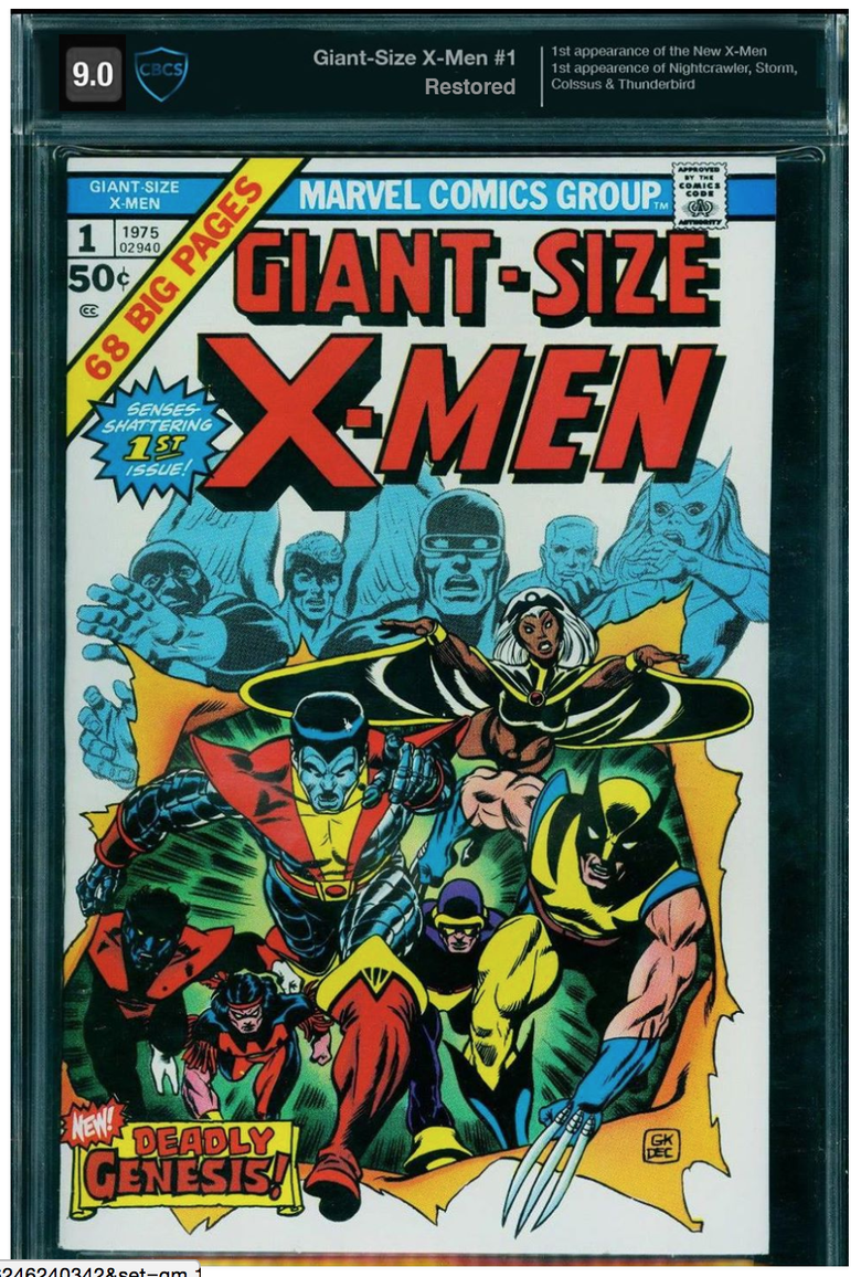 |
||
| Post 1 • IP flag post | ||
 Collector Collector
|
ComicHaulics private msg quote post Address this user | |
| That label looks nice! Personally, I like the different colors. It may be redundant but I still think it is necessary. The newer CBCS labels are nice, as well as the newer CGC labels. I love the big bold grade on the CGC ones, perfect, I wouldn't change a thing. New ones are a HUGE improvement over the old ones. They finally look crisp and clear! New: 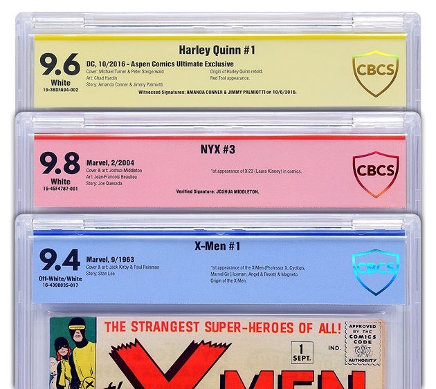 Old: 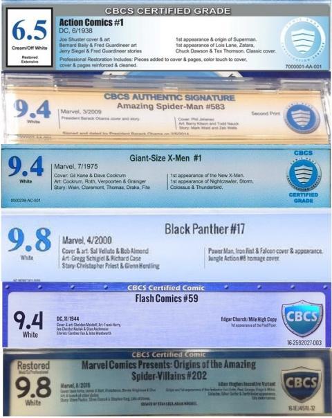 |
||
| Post 2 • IP flag post | ||
 Collector Collector
|
Scorpion private msg quote post Address this user | |
| i like the color labels there easy to identify, as to having all labels black then try to read through them as to whether there restore, signature and so on, one fast look and you know yellow is a authentic signature. i think point made. |
||
| Post 3 • IP flag post | ||
 COLLECTOR COLLECTOR
|
shrewbeer private msg quote post Address this user | |
| @ozonetv totally with you on this one. There’s been plenty of discussion about the labels across the street, and I’m on the side of CBCS when it comes to the damn purple (nonexistent). PGX has a grey label I think. Idk if they have more than that. Dont care really, but now it may be worth looking at lol |
||
| Post 4 • IP flag post | ||
|
Collector
|
ozonetv private msg quote post Address this user | |
Quote:Originally Posted by ComicHaulics Lets put aside the question of which design is better for a sec (I agree with you the simpler new ones are better). If you're a collector chances are you have books graded by different companies, and each company has gone thru multiple iterations of their labels (some trendier than others). If your collection is hanging on a wall, those labels are going to take away from the visual impact of the display. Roughly 1/8 of the space is occupied by labels of various designs and colors. Whats important is the book, not the grade or grading company. Thats secondary info. Go to a museum and see how they handle labels...cause I guarantee you, most collectors feel like they own a museum. |
||
| Post 5 • IP flag post | ||
|
Collector
|
ComicHaulics private msg quote post Address this user | |
| @ozonetv I guess I just don't think they take away or take up that much space. Going back to the colors quick. To me, if a book is missing a page or has been restored, I think it should for sure have a different color. You had mentioned it makes the owner feel like they own a lesser copy, well unfortunately they do. I don't know. I think the labels are just as important as the book, to me anyways. | ||
| Post 6 • IP flag post | ||
 COLLECTOR COLLECTOR
|
conditionfreak private msg quote post Address this user | |
| When I go to a show. I always go for the graded comics on the back wall. Having the labels color coded lessens the questions I have to ask the seller and lessens how many books the seller has to hand to me so that I can inspect the info on the label. Not all of us can read that small writing from 8-10 feet away. Now, what would really be messed up, is if CBCS or CGC changed the color coding midstream. Imagine "universal" graded books all of a sudden being in slabs with red labels. (If memory serves me correctly, CGC stated out with universal grades with red labels) And besides, I HATE CHANGE. AND GET OFF MY LAWN! |
||
| Post 7 • IP flag post | ||
|
COLLECTOR
|
conditionfreak private msg quote post Address this user | |
| But that black label does look nice. So it ain't all about info. Label looks matter. |
||
| Post 8 • IP flag post | ||
|
|
DWeeB1967 private msg quote post Address this user | |
| ...Personally, I like the color difference at least in some case. I like a different color for restored comics, for example. Makes it very easy to notice that the book has been restored. | ||
| Post 9 • IP flag post | ||
 Collector Collector
|
MR_SigS private msg quote post Address this user | |
Quote:Originally Posted by ozonetv The colors help those with poor eyesight at conventions, I imagine. A collector will recognize the cover of a book they're seeking, even from the average distance between the book and the buyer (unless their eyesight is really bad off), and if they're looking for an unrestored copy, the color on the label can be a time saver for both seller and buyer alike. I'm sure one of the last thing dealers want at something as hectic as a convention are unnecessary distractions. Too many stories of inventory being stolen while busy with a customer. I crack some slabs I buy, so the label makes no difference to me, and the books I keep slabbed aren't on display, so it's really not an issue. As long as the info that matters is there, I'm good. But your label does look nice. |
||
| Post 10 • IP flag post | ||
 Forum Crier Forum Crier
|
OGJackster private msg quote post Address this user | |
Quote:Originally Posted by ozonetv Looks like a business opportunity. Wide custom-made top loading frames that block out the top portion of the comic. Hummmm? |
||
| Post 11 • IP flag post | ||
|
COLLECTOR
|
shrewbeer private msg quote post Address this user | |
Quote:Originally Posted by OGJackster Dave over at comicbookdisplays.com makes a nice black toploader frame. He could potentially make it cover the label I would think |
||
| Post 12 • IP flag post | ||
|
Collector
|
ozonetv private msg quote post Address this user | |
I think a color label can work in a more subtle way- but it doesn't have to scream it with a bullhorn. Also would be cool to have the label printed white on acetate so its transparent....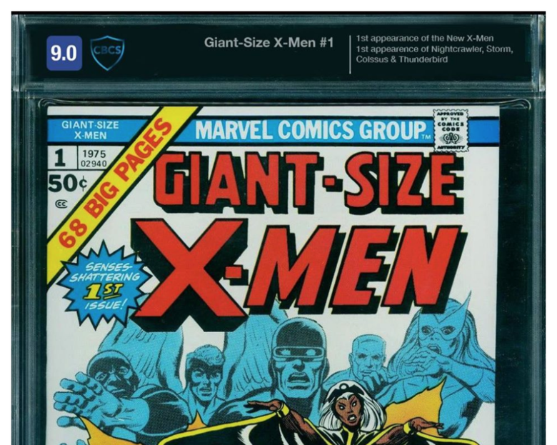 |
||
| Post 13 • IP flag post | ||
|
|
DWeeB1967 private msg quote post Address this user | |
| @ozonetv Oh, yeah. Something like that would work fine. Just some easy color identifier that can be recognized and understood from a short distance away. What you have there looks very nice. | ||
| Post 14 • IP flag post | ||
 COLLECTOR COLLECTOR
|
Foghorn_Sam private msg quote post Address this user | |
Right now I'm not a big fan of anyone's label. The newer CBCS labels are a huge improvement over the "Rivet" label, but I still prefer the one before that; the one that looks like this: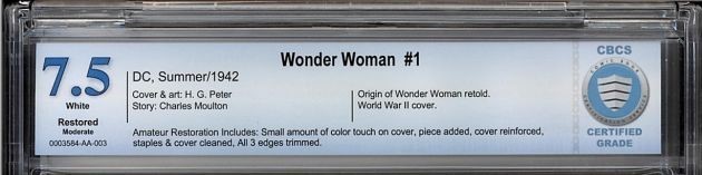 |
||
| Post 15 • IP flag post | ||
 I'll probably wake up constipated. I'll probably wake up constipated.
|
Pre_Coder private msg quote post Address this user | |
| @Foghorn_Sam whenever I see that label it makes me wish I had gotten off my duff and had my ASM 1 and 129's slabbed sooner. |
||
| Post 16 • IP flag post | ||
 Collector Collector
|
DJC_II private msg quote post Address this user | |
| Does anyone else here feel like the blue label for CBCS is too bold, too strong? | ||
| Post 17 • IP flag post | ||
|
Collector
|
ozonetv private msg quote post Address this user | |
Quote:Originally Posted by DJC_II I'm sure the solution is a balance between what everyone is saying...visible but not too bold, fonts that don't draw attention or go out of style, subtle use of color, clean and not trendy design (rivets, bevels, dropshadows, etc). Even the current flat design might feel dated in a few years when that gives way to the next big thing. If they use Swiss design as a standard (eg. Helvetica) they'll be heading in the right direction. |
||
| Post 18 • IP flag post | ||
 If I could, I would. I swear. If I could, I would. I swear.
|
DrWatson private msg quote post Address this user | |
Quote:Originally Posted by Foghorn_Sam Me, too. All the labels after that one have blown. Horrible label, Methuselah TATs, no Registry set, and difficulty of sale have pushed me back to submitting to the cgc. |
||
| Post 19 • IP flag post | ||
|
Collector
|
DJC_II private msg quote post Address this user | |
Quote:Originally Posted by DrWatson |
||
| Post 20 • IP flag post | ||
|
Collector
|
DJC_II private msg quote post Address this user | |
 |
||
| Post 21 • IP flag post | ||
 Collector Collector
|
thelastbard private msg quote post Address this user | |
| @ozonetv I like the colored grade idea (top left corner) from your last update, just make the overall color and grade larger and it could be a winner. Makes the grade AND color coding visible from a distance. The rest of the details become necessary to read up close anyway. | ||
| Post 22 • IP flag post | ||
|
Collector
|
ozonetv private msg quote post Address this user | |
Quote:Originally Posted by DJC_II A good example of the label calling way too much attention to itself- Gradation, crappy color combo and logo with a dropshadow. This needs to be taken out to the woodshed and put out its misery. |
||
| Post 23 • IP flag post | ||
|
Collector
|
thelastbard private msg quote post Address this user | |
@ozonetv So, maybe this big? Color and grade visible from a distance... Aesthetics more pleasing overall.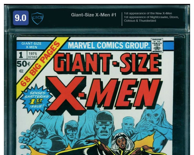 |
||
| Post 24 • IP flag post | ||
|
Collector
|
ozonetv private msg quote post Address this user | |
Quote:Originally Posted by thelastbard Yeah- theres an argument to be made that the size of the labels should be consistent with the old labels, so the slab sizes are consistent with the old slabs. The example I posted has a shorter label. These proportions are use the old label size...it might be more what everyone is used to: [img]https://e3effa51eee72fd900e3-2fb779bd12ec72d4612275342f2c9187.ssl.cf1.rackcdn.com/5d5769d60bf252578c110ca8d2cca6b6.jpg[/img |
||
| Post 25 • IP flag post | ||
|
Collector
|
thelastbard private msg quote post Address this user | |
@ozonetv Oh yeah, that looks pretty good.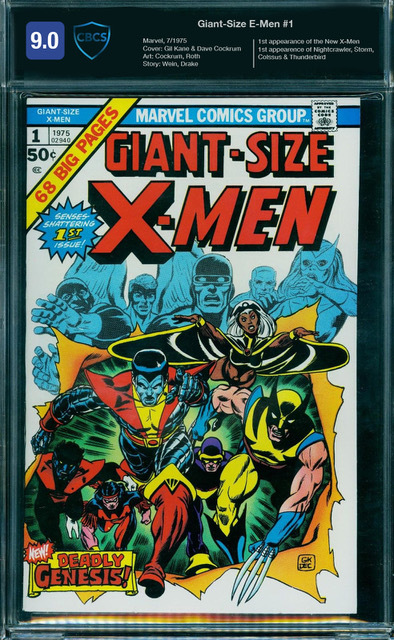 |
||
| Post 26 • IP flag post | ||
|
COLLECTOR
|
conditionfreak private msg quote post Address this user | |
Quote:Originally Posted by thelastbard Who are the "E-Men"? |
||
| Post 27 • IP flag post | ||
|
Collector
|
ozonetv private msg quote post Address this user | |
| HA! I know...they're the guys behind e-cigs and e-commerce. :-) | ||
| Post 28 • IP flag post | ||
|
Collector
|
DJC_II private msg quote post Address this user | |
Quote:Originally Posted by ozonetv I agree. But again, I think like you pointed out, some more timeless features should be used instead for labels I also think the red labels are harsh looking in general. They should be: Blue for regular Yellow for SS Orange for SS unverified Black for restored |
||
| Post 29 • IP flag post | ||
|
Collector
|
MR_SigS private msg quote post Address this user | |
| I agree labels are being made busier than they really need to be, but I guess I'm just lucky that I'm able to focus on the comic. | ||
| Post 30 • IP flag post | ||
This topic is archived. Start new topic?