Unusual Comic-Related Items4369
 Forum Crier Forum Crier
|
OGJackster private msg quote post Address this user | |
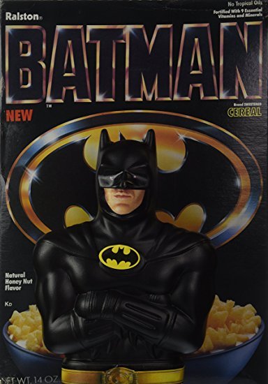
BURGER KING 1988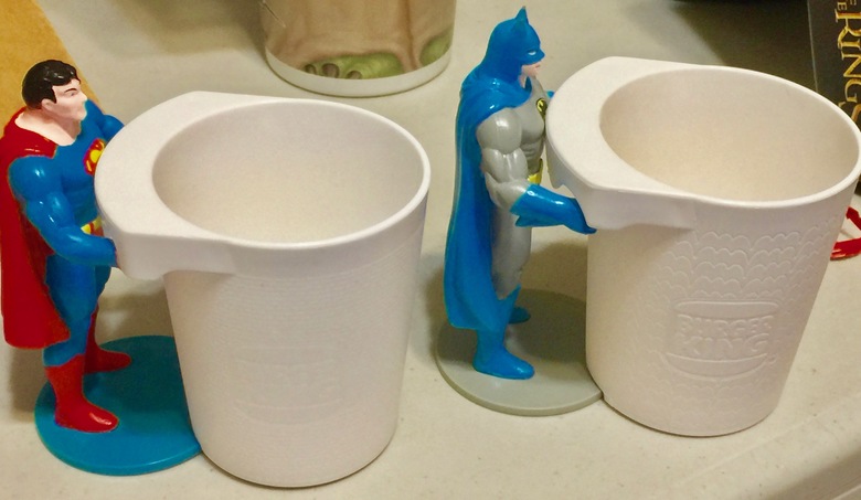 KFC/PIZZA HUT/TACO BELL STAR WARS EPISODE 1 "YODA" 1999 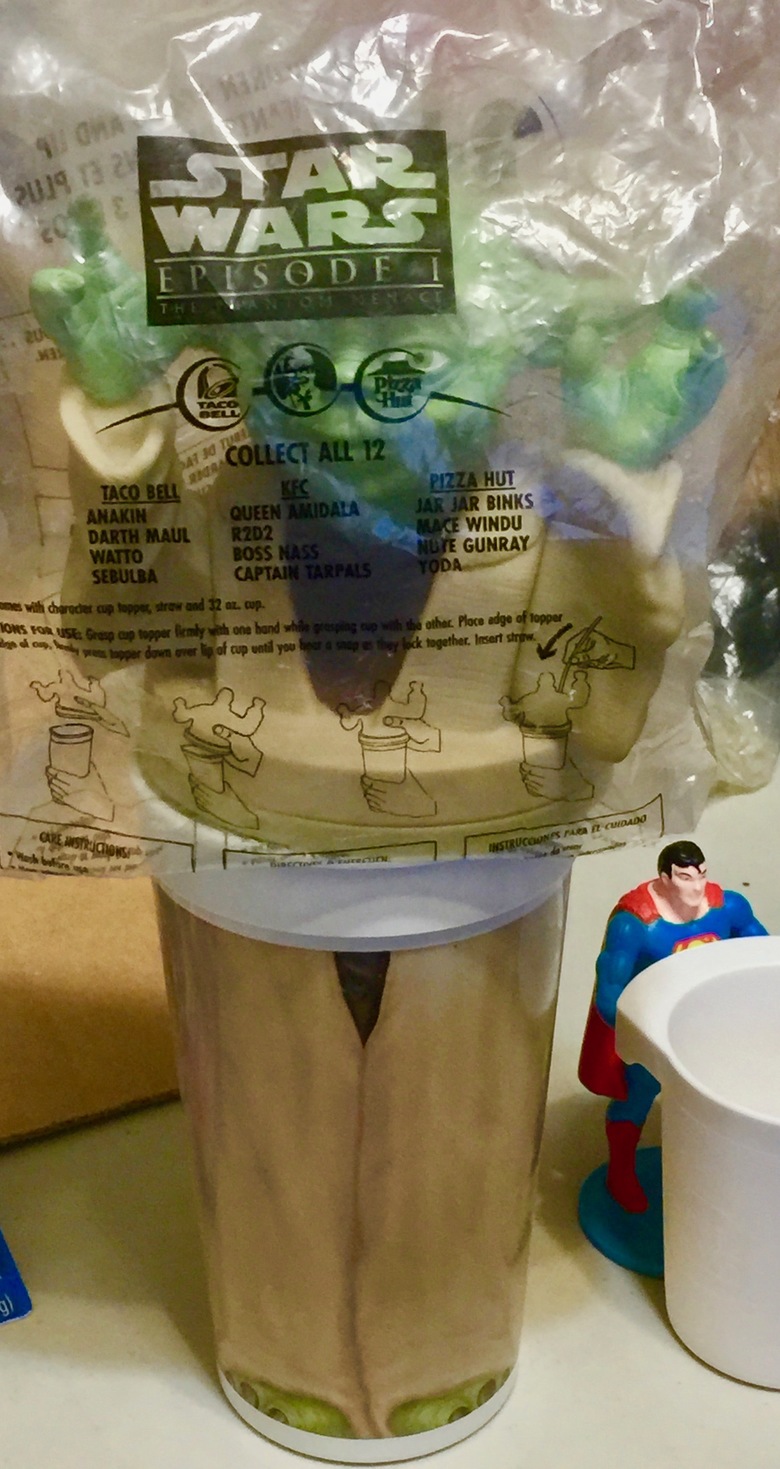 |
||
| Post 26 • IP flag post | ||
|
Forum Crier
|
OGJackster private msg quote post Address this user | |
ARGH! I CAN'T FIND MY STAR WARS PEZ DISPENSERS 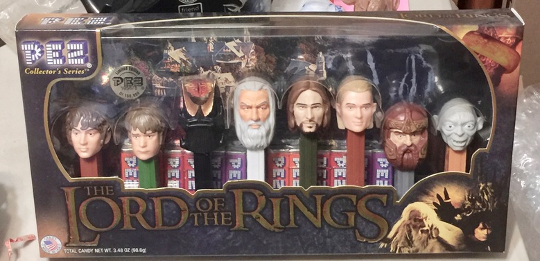 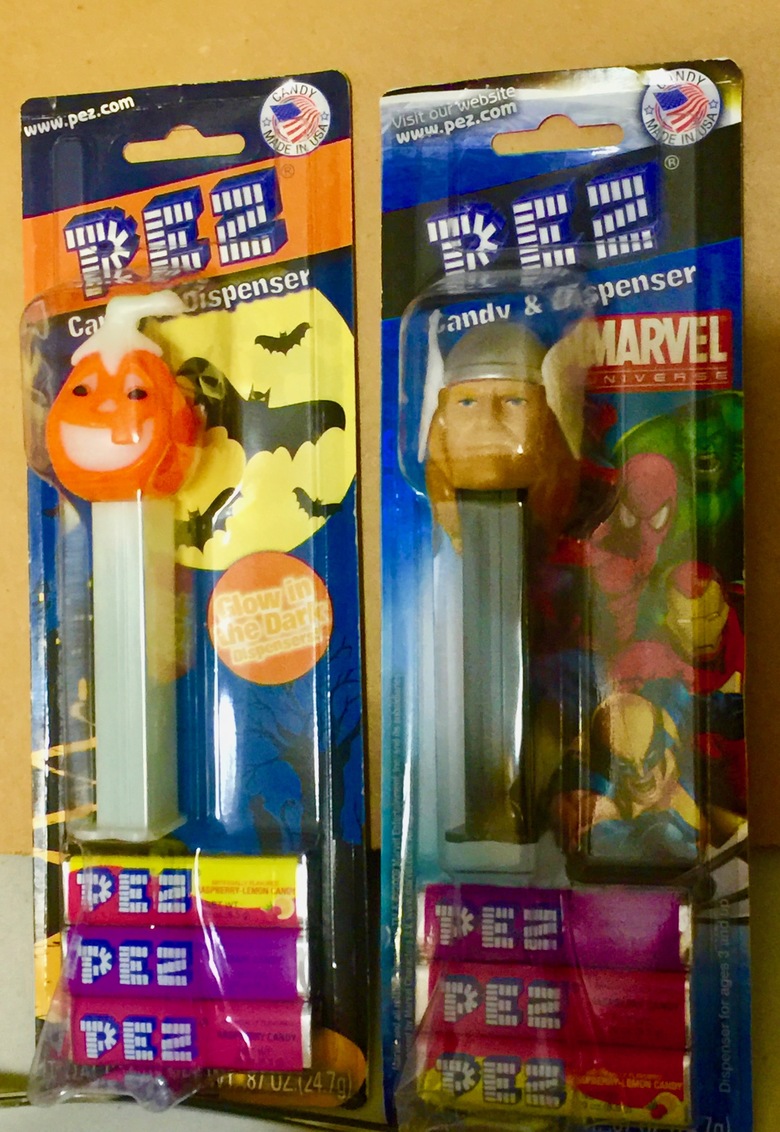 |
||
| Post 27 • IP flag post | ||
 Collector Collector
|
Drogio private msg quote post Address this user | |
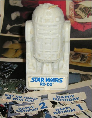 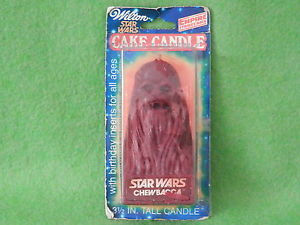 Anyone remember these? I believe there were also darth Vader, Luke sky walker and c3p0 candles as well. |
||
| Post 28 • IP flag post | ||
 Collector Collector
|
KCBatmanFan private msg quote post Address this user | |
| Here are a few fun promo things I had at hand in the comic room. Death Promotional Postcards and Standee from 1993 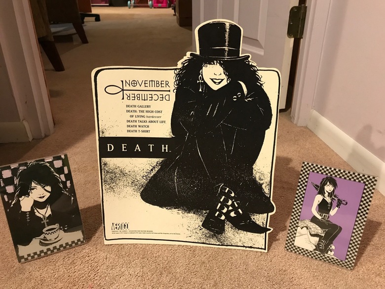 Retailer Poster for "Gothic" the second Legends of the Dark Knight arc. 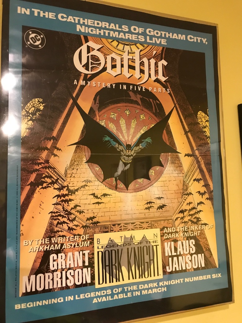 The whole rainbow of Lantern rings and Barry's for good measure. 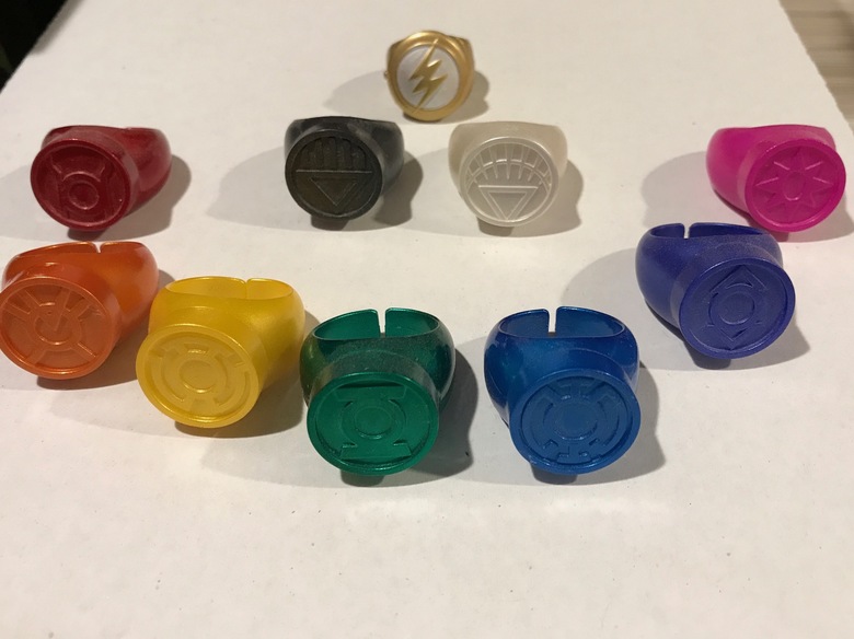 |
||
| Post 29 • IP flag post | ||
 Collector Collector
|
X51 private msg quote post Address this user | |
Quote:Originally Posted by Drogio I think I remember that. |
||
| Post 30 • IP flag post | ||
|
Collector
|
X51 private msg quote post Address this user | |
Quote:Originally Posted by OGJackster I bought a whole Star Wars Pez display stocked full through Diamond when they first came out. I'm still eating the 10 year old candy occasionally. |
||
| Post 31 • IP flag post | ||
 Moderator Moderator
|
Jesse_O private msg quote post Address this user | |
I once had this 45. Seeing it on eBay reminded me of it. Just thought a picture of it belonged here.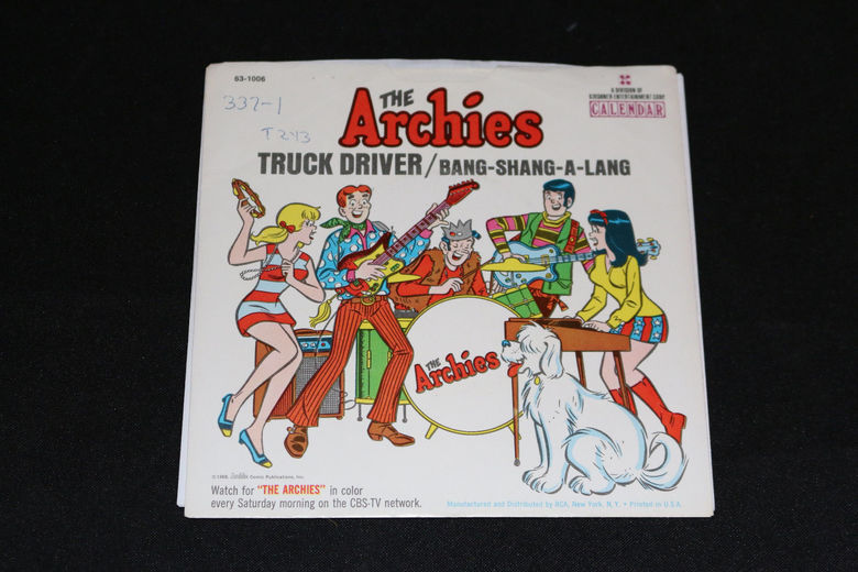 |
||
| Post 33 • IP flag post | ||
 PEDIGREED... Again! PEDIGREED... Again!
|
martymann private msg quote post Address this user | |
| This book was included in the BARNES & NOBLE Classic MARVEL SUPER HEROES Collector's Edition of four statues...CAPTAIN AMERICA, THE HULK, WOLVERINE and SPIDER-MAN. 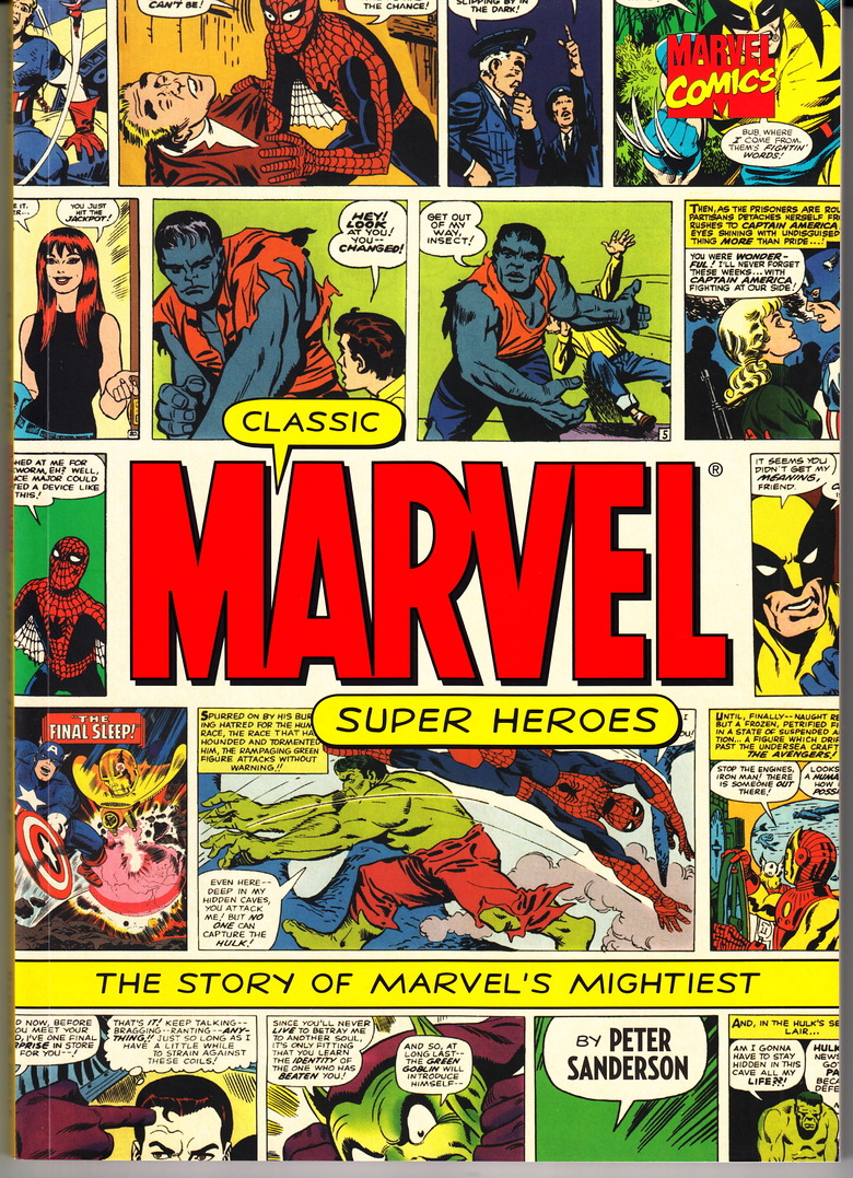 mm |
||
| Post 34 • IP flag post | ||
|
Collector
|
X51 private msg quote post Address this user | |
Statues aren't unusual, but this is unusual to me because it's coated in real silver.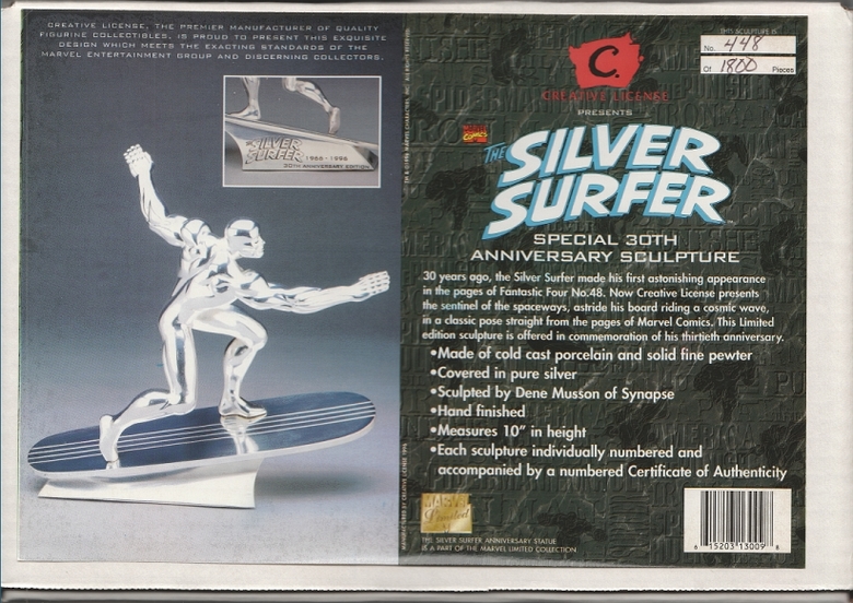 |
||
| Post 35 • IP flag post | ||
 I live in RI and Rhode Islanders eat chili with beans. I live in RI and Rhode Islanders eat chili with beans.
|
esaravo private msg quote post Address this user | |
Not sure why I kept them, but here's a few catalogs from 1982 and 1984.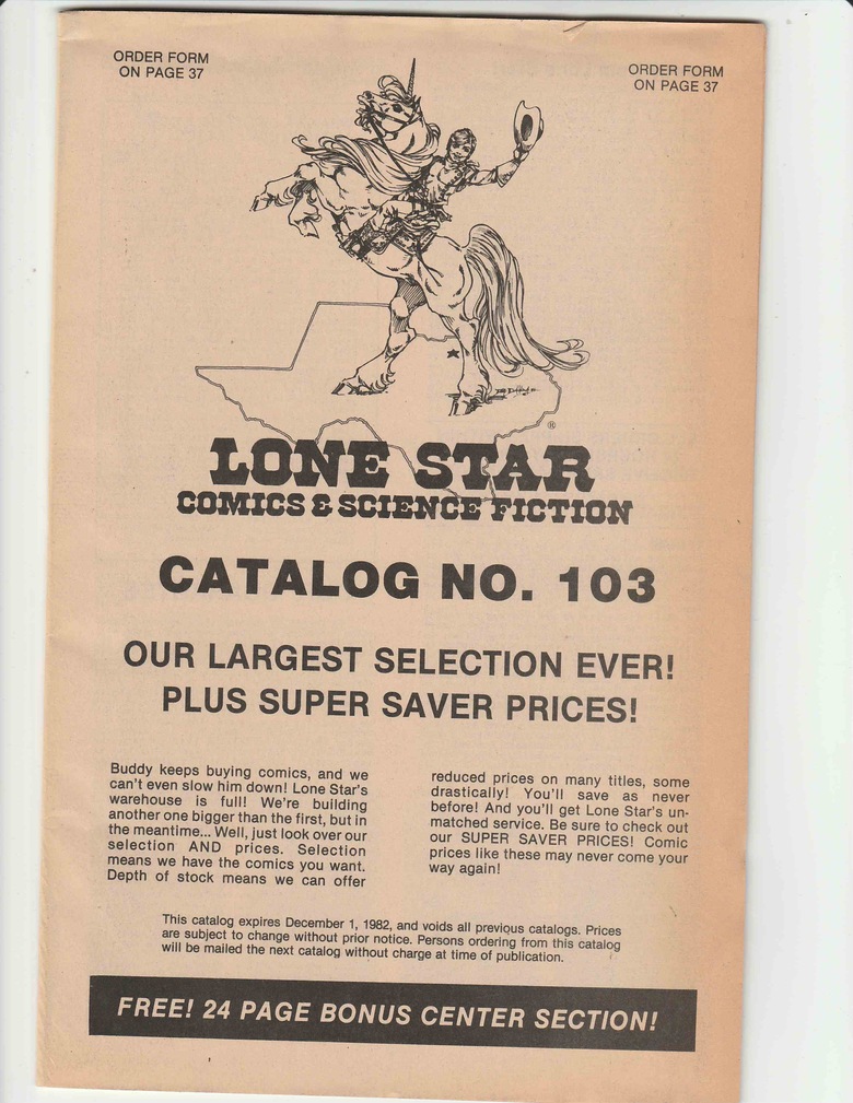 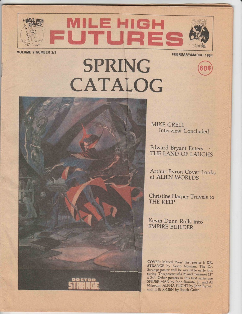 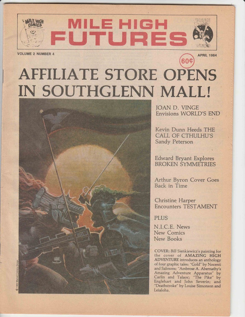 |
||
| Post 36 • IP flag post | ||
|
I live in RI and Rhode Islanders eat chili with beans.
|
esaravo private msg quote post Address this user | |
How about an un-opened Superman puzzle from 1983?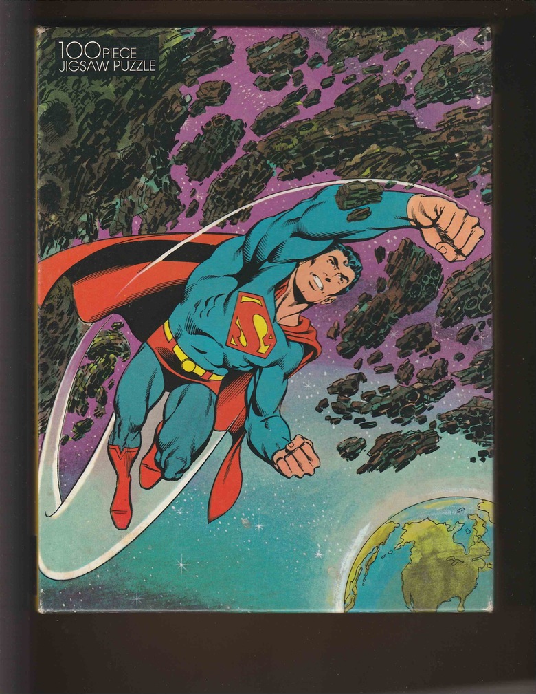 |
||
| Post 37 • IP flag post | ||
 Suck it up, buttercup!! Suck it up, buttercup!!
|
KatKomics private msg quote post Address this user | |
Quote:Originally Posted by X51 Ooooo shiny ...I want |
||
| Post 38 • IP flag post | ||
 Collector Collector
|
DocBrown private msg quote post Address this user | |
Quote:Originally Posted by esaravo Now THOSE are AWESOME! If you ever don't want them, please let me know. I'd love to add to my research library! |
||
| Post 39 • IP flag post | ||
|
Collector
|
DocBrown private msg quote post Address this user | |
Quote:Originally Posted by esaravo Is that Byrne...? It looks like Byrne and Swan...but...Byrne Supes, in 1983...? That would be very cool. |
||
| Post 40 • IP flag post | ||
|
I live in RI and Rhode Islanders eat chili with beans.
|
esaravo private msg quote post Address this user | |
| @DocBrown - I actually think it's Adams. The Curt Swan /Murphy Anderson supes from that time looked different, thicker and even more muscular, in my opinion. Here's the info from the side of the box. 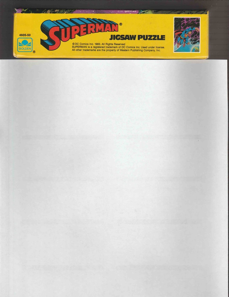 |
||
| Post 41 • IP flag post | ||
|
I live in RI and Rhode Islanders eat chili with beans.
|
esaravo private msg quote post Address this user | |
Quote:Originally Posted by DocBrown Send me a PM with your address and they are yours. I just wish I could still buy an Avengers #4 NM for $110, Daredevil #1 NM for $150, Hulk #181 for $18, Iron Man #55 for $4, and Iron Fist #14 for $2.50! |
||
| Post 42 • IP flag post | ||
|
Collector
|
X51 private msg quote post Address this user | |
Quote:Originally Posted by esaravo It looks more like John Byrne art to me. |
||
| Post 43 • IP flag post | ||
|
Collector
|
DocBrown private msg quote post Address this user | |
Quote:Originally Posted by esaravo Yeah, it looks like it could be Adams. The face is not Byrne, but the rest of it...well, here, here's a shot from Byrne:  The face wasn't quite right, which is why I thought it might be Swan inks...but I think you're right, it looks like Adams. |
||
| Post 44 • IP flag post | ||
|
Collector
|
DocBrown private msg quote post Address this user | |
Quote:Originally Posted by X51 Yeah, there's something distinctly Byrneish in the feel of the piece...mostly in the anatomical perspective, I think. Maybe inks...? I can't say for sure, though. It's a great piece, and I would love to own it. It appears to be a painted piece. I wonder if it still exists? |
||
| Post 45 • IP flag post | ||
|
Collector
|
X51 private msg quote post Address this user | |
Quote:Originally Posted by DocBrown I've got a crapload of stuff by Neal Adams and I don't see anything that looks like Adams art in that image. Byrne's art has changed. He goes with standard expressions sometimes. There used to be more variety in his style back then. The rocks are what really look like Byrne art to me. It could be someone who was copying Byrne's style back then. |
||
| Post 46 • IP flag post | ||
|
Collector
|
DocBrown private msg quote post Address this user | |
Quote:Originally Posted by X51 Yeah, I tend to agree with you, especially about the rocks. But, I do see Adams in the face:  |
||
| Post 47 • IP flag post | ||
|
Collector
|
X51 private msg quote post Address this user | |
| The chin is too wide in my opinion. I was looking up Giffen art from that time period. Couldn't find any images to compare. The inking makes it look generic. Keep in mind that a lot of the big name artists worked for Neal Adams over the years. They would have picked up some of his style, but I'm not seeing it here. | ||
| Post 48 • IP flag post | ||
|
Collector
|
DocBrown private msg quote post Address this user | |
| Giffen was very distinct, even in the early 80s. Remember when he was a "hot new artist"...? That lasted for all of 20 minutes. Legion #287 was a "hot book" at one point, if you can believe it. Sigh...gone are the days of the hot artists....hopefully not forever. When a Byrne drawn issue was worth 10 times a surrounding issue. Now...pffft. If it's not a first appearance, TRASH! |
||
| Post 49 • IP flag post | ||
|
Collector
|
X51 private msg quote post Address this user | |
Quote:Originally Posted by DocBrown I think Giffen started on Defenders. His art had more of a Kirby feel to it. By the time he was doing Legion and Lobo's first appearance, it was a lot cleaner style. I'm sure the inking made all the difference in the world. This does look like Swan or Win Mortimer influence is present. It may have been a Western Publishing artist. Artist can draw in different styles. |
||
| Post 50 • IP flag post | ||
|
Collector
|
X51 private msg quote post Address this user | |
| As a side note, Neal Adams draws (or did draw) like Tom Scheuer who is best know as being a writer for Murder She Wrote on television. He uses the pen name Thomas B. Sawyer. http://todaysinspiration.blogspot.com/2008/04/comic-strip-ad-artist-tom-scheuer.html http://thomasbsawyer.com/ |
||
| Post 51 • IP flag post | ||
|
Collector
|
DocBrown private msg quote post Address this user | |
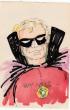
Quote:Originally Posted by X51 Yes, Giffen's first published work was Marvel Preview #4 (Jan 76 cover date.) He worked at Marvel for a few years, most notably on Defenders, where he co-created...Lunatik!...who bore an interesting resemblance to....well, I'll leave it a mystery for now... 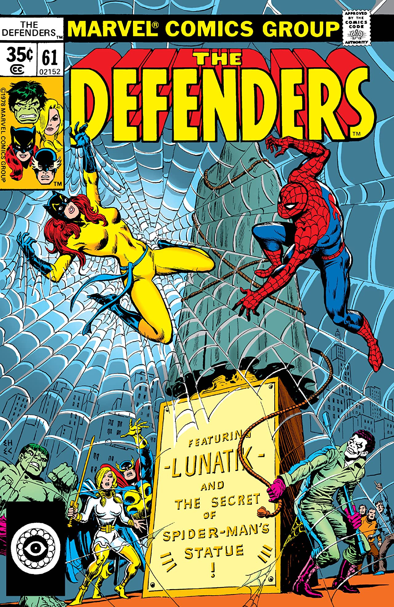 By the time he reached Legion in 1982, his art had developed his familiar blocky style...frankly, I preferred that look in Legion from 1982-1984 to his later stuff...but I still love his later stuff, too, especially Legion #1-20ish (1989.) Speaking of unusual comic related items, I have these two:   (not my pics) Comic beer! |
||
| Post 52 • IP flag post | ||
|
Collector
|
X51 private msg quote post Address this user | |
| I have Armstrong Ale, but no box and no card. | ||
| Post 53 • IP flag post | ||
 Collector Collector
|
Logan510 private msg quote post Address this user | |
Quote:Originally Posted by X51 I posted on Byrne's site asking if it was his work. It doesn't look like his work to me ( or Adams for that matter ), but sometimes if you get a certain type of inker, they can take away a lot that's normally recognizable from a penciler. One of Byrne's first Marvel jobs was in Giant Size Dracula #5 and as inked by Rudy Nebres it is virtually unrecognizable as Byrne art. |
||
| Post 54 • IP flag post | ||
|
Collector
|
Logan510 private msg quote post Address this user | |
Quote:Originally Posted by Logan510 Direct from John Byrne: "no, that is not my work" |
||
| Post 55 • IP flag post | ||
This topic is archived. Start new topic?